Hi everyone, welcome. Thanks for choosing to come to this session. I am happy that this conference takes place in the Sphinx cinema as it is one of my favorite locations in Ghent.
Johan Ronsse, Frontend United Ghent, May 27 2016
Hi everyone, welcome. Thanks for choosing to come to this session. I am happy that this conference takes place in the Sphinx cinema as it is one of my favorite locations in Ghent.
Today I will be talking about HTML prototyping, and kind of tell the story about how I got to the workflow that I am using today to do most of my work.
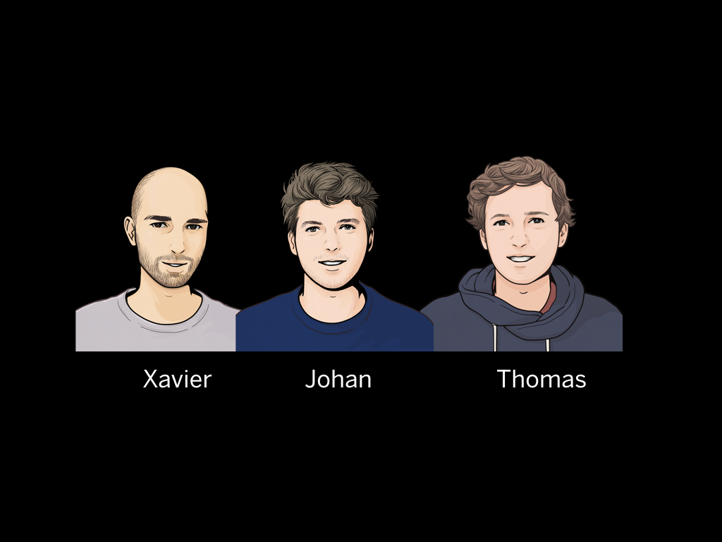
I want to give a very very brief introduction about myself, my name is Johan, the guy in the middle here. I am a user interface designer.
I was a web designer for five years and then switched over to application design for the past five years.
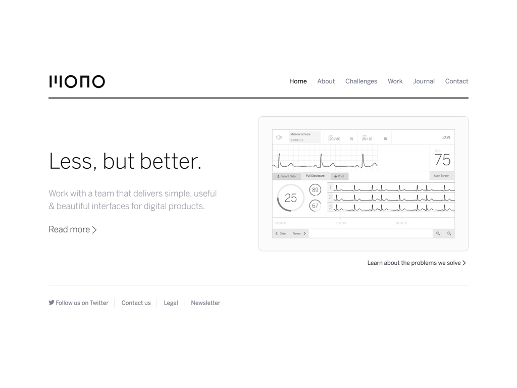
I work for Mono. This our website at mono.company . We are a team of specialized consultants trying to make the world's best software.
In short, we design useful software that supports business processes.
To give you a very brief idea of what we do, I want to show you are three examples of what we worked on.
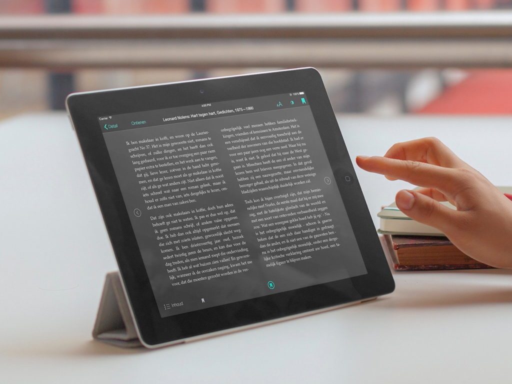
This first one is an app to read e-books on your tablet.
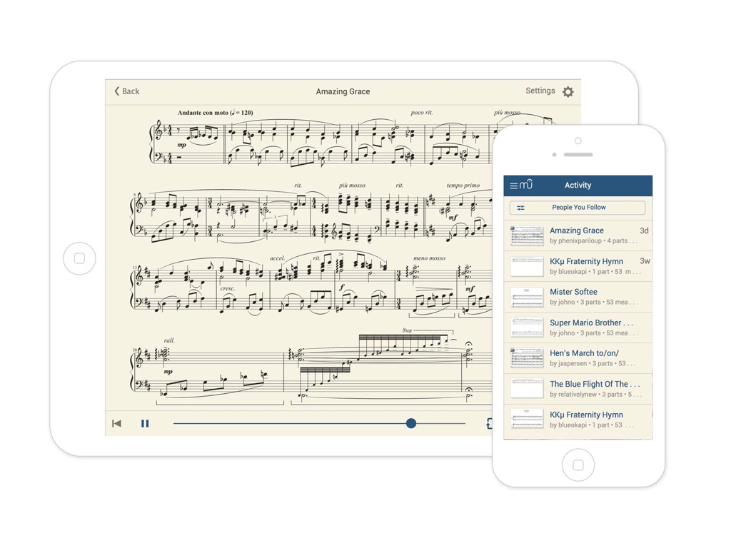
This slide shows an app to display music notation on your phone or tablet to learn to play an instrument. (Case: MuseScore)
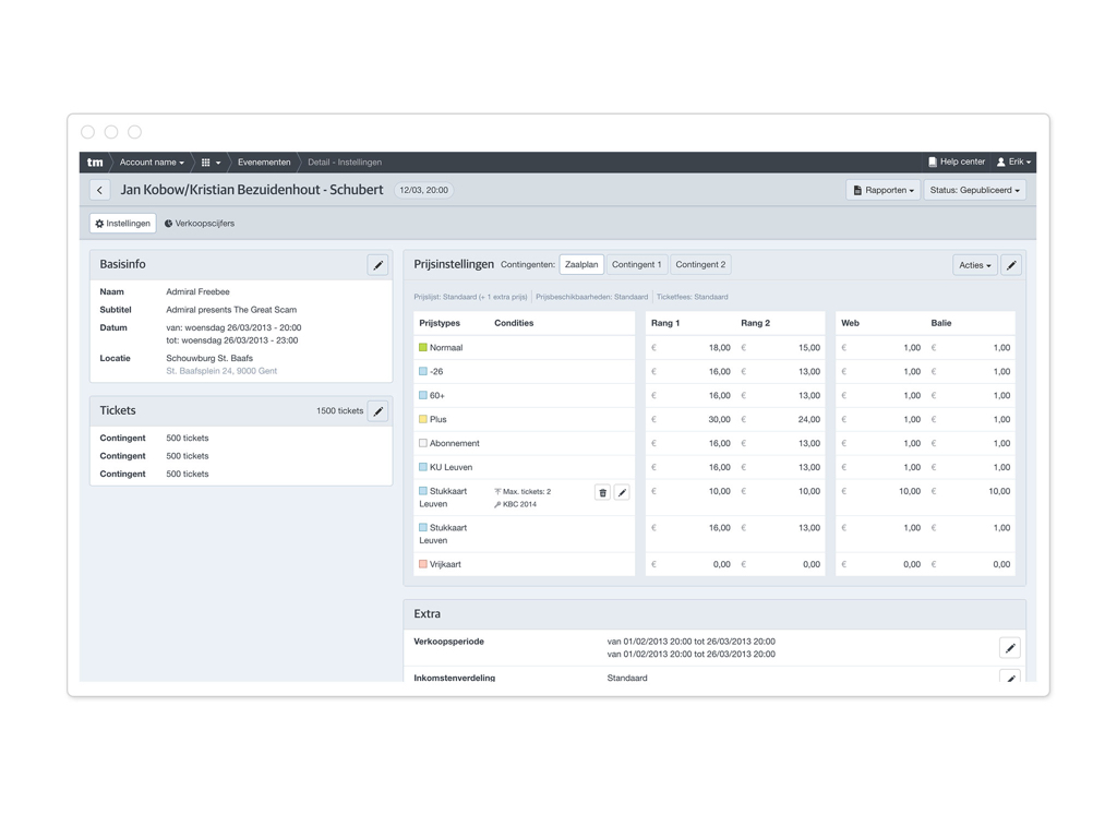
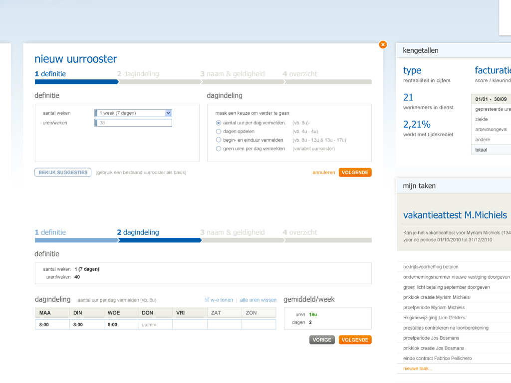
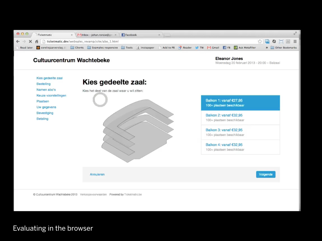
And lastly this screenshot shows a tool to manage the prices of events for a concert organiser. (Case: Ticketmatic)
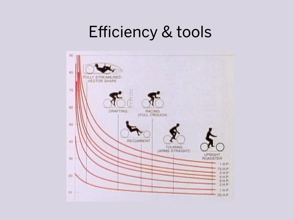
I am always looking for more efficient ways to do things. I think that's a natural thing to do when you are working with computers.
I think what we came up with in the last few years is a workflow to efficiently design software that I don't believe many other teams are using. And today I will explain all of it... hopefully to your benefit.
(This was a subtle reference to computers are like bicycles for the mind)
So. I want to tell you a story.
A couple of years ago, I was working on this huge software project.
It had a massive budget... and it was pretty ambitious. Over 50 people were working on this project. It went on for years.
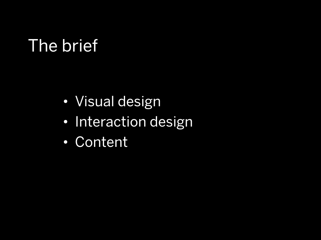
I was hired as a user interface designer. Together with a few other people we worked the aspects of the software a designer would be concerned with:
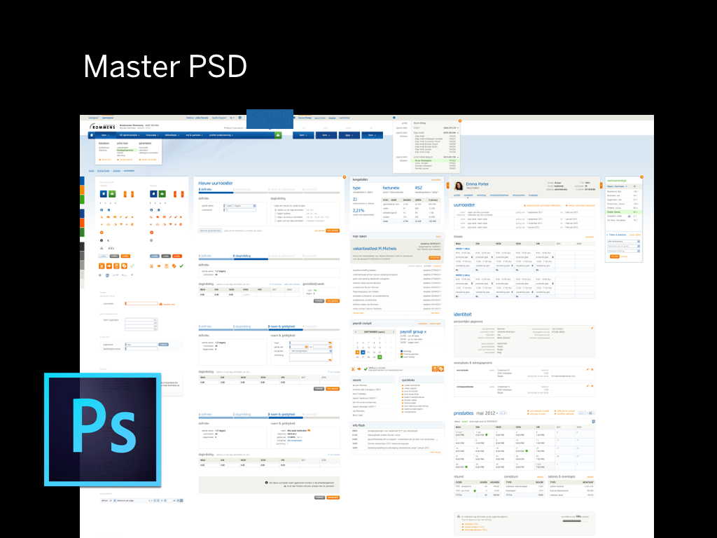
I was working with a big advertising agency, and received this huge component styleguide made in Photoshop. This “master PSD” was going to be the base for the user interface within the project.
It contained a lot of guidelines on what things should look like: for example, a wizard should look like this...
A table with data should look like this… and so on...
It was decided that we would use Adobe Fireworks to make the user interface designs.
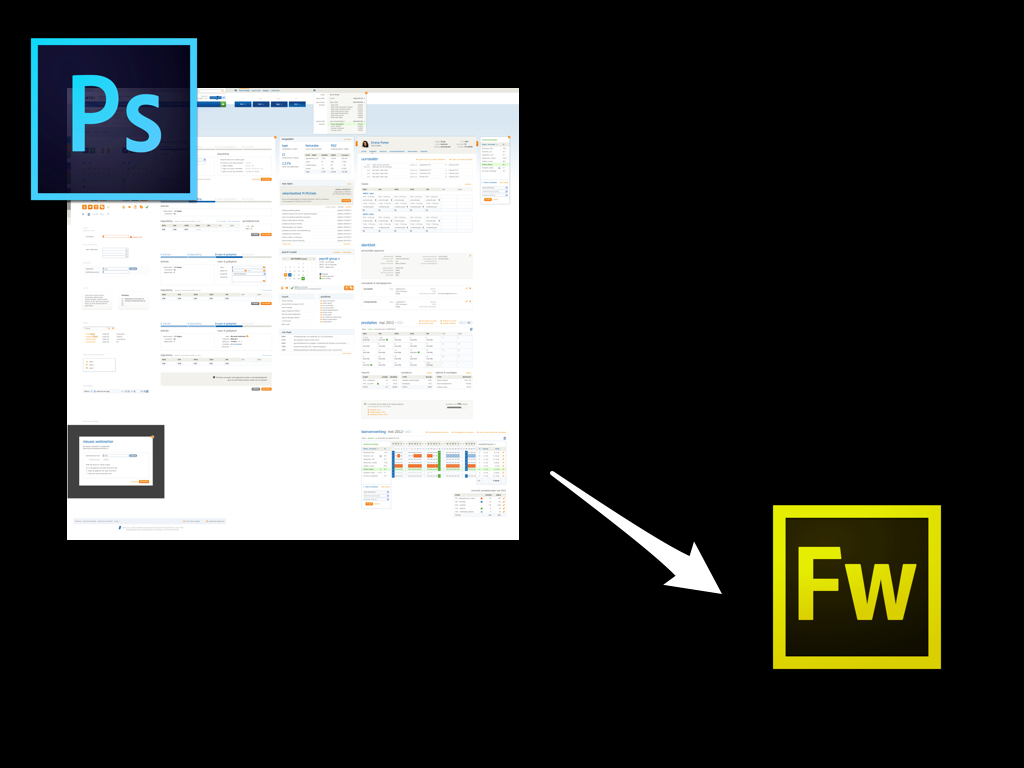
So we copy pasted various bits and pieces from the master PSD to the Fireworks files to construct the interface.
There were 3 people working in multiple Fireworks files.
It is important that this was a team effort, because that is where most software starts to break down.
Fireworks in itself was a pretty interesting program because it was entirely made for screen design.
It displayed pixels in the way you would expect, it had the concept of pages and you could add these hotspots to make an interactive prototype.

These are the main features that make the current crop of UI design tools — like Sketch — work well.
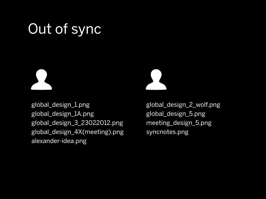
Using Fireworks worked for a while, but after some time this method of working caused a lot of problems.
Everything quickly got out of sync. We had over 30 Fireworks files in the end and we were struggling to combine and recombine them.
Even if you sync everything to each other the tools don’t allow you to work together. There has to be a “master” file somewhere.
Tools that allow you to work on a design at the same time are coming… but at the time, they were nowhere to be seen.
We were having these long meetings about changing the main navigation, and what we would be discussing would have implications on all the design files.
Parts of the user interface would already be implemented, and you'd know you'd have to go into 10 different files to change the color of a button. Despite your best intentions, after a while you just start to leave things alone because they are unrealistic to change.
So you end up piling on things but never structurally evaluating the interface as a whole.
This is problematic; you can't ever reach a level of quality if you can't change things. To create the best software you need to iterate, iterate and iterate again.
This was problematic; you can't ever reach a level of quality if you can't change things. To create the best software you need to iterate, iterate and iterate again. This inflexibility to change frustrated me, so I decided to try and turn around the situation.
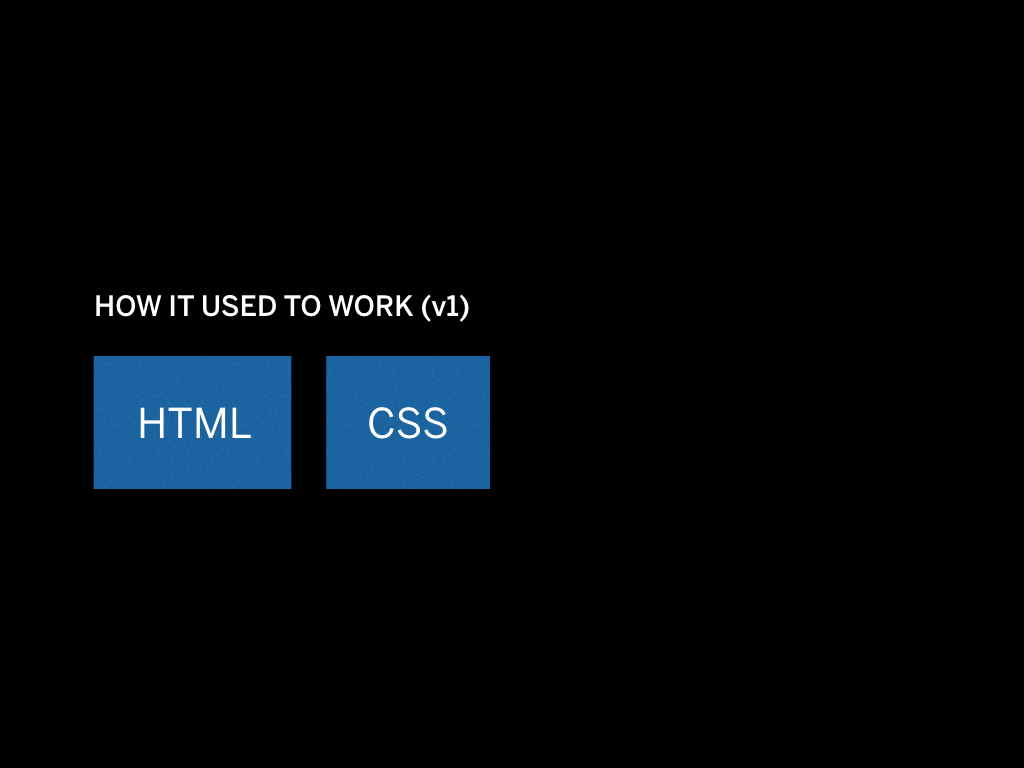
I happened to have a lot of HTML and CSS knowledge from my previous job as a web designer, so I came up with an idea to fix the design workflow.
The basic idea was very simple: use CSS! It's whole concept is that it's great at making global changes.
So I took some time to recreate the user interface in HTML and CSS. First in bits and pieces, which I would copy back to my design files. But after about a week I had recreated the full user interface in HTML and CSS.
The team was impressed that there was a clickable version of the software in the browser. It was decided that this would be the new deliverable to the developers, and the HTML/CSS prototype would represent the latest “design”.
This solved a few problems: when you are designing software, you are really designing at scale. Using HTML and CSS — with some tooling in between — ultimately allows you to scale.

Another problem that the HTML/CSS handoff fixes is that the concerns are in the right place. The designer is concerned about visual things, and CSS is a the direct application of the visual language.
It doesn't make any sense to hand over a back-end developer a PSD. In my opinion, developers have to worry about making things work, making sure the logic is there, making sure the database is well structured and everything is fast. But they should not be color picking values out of Sketch files.
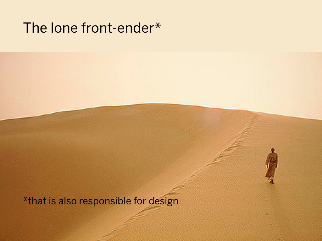
What wasn't so great was that I was the only one in the team who knew CSS, so in the end I had to apply everyone's design work.
I am sure many front-enders feel like they are some kind of “bridge” in between other roles. As a designer I've had to fight to keep my design role, it was often very easy to get pushed into a developer role.
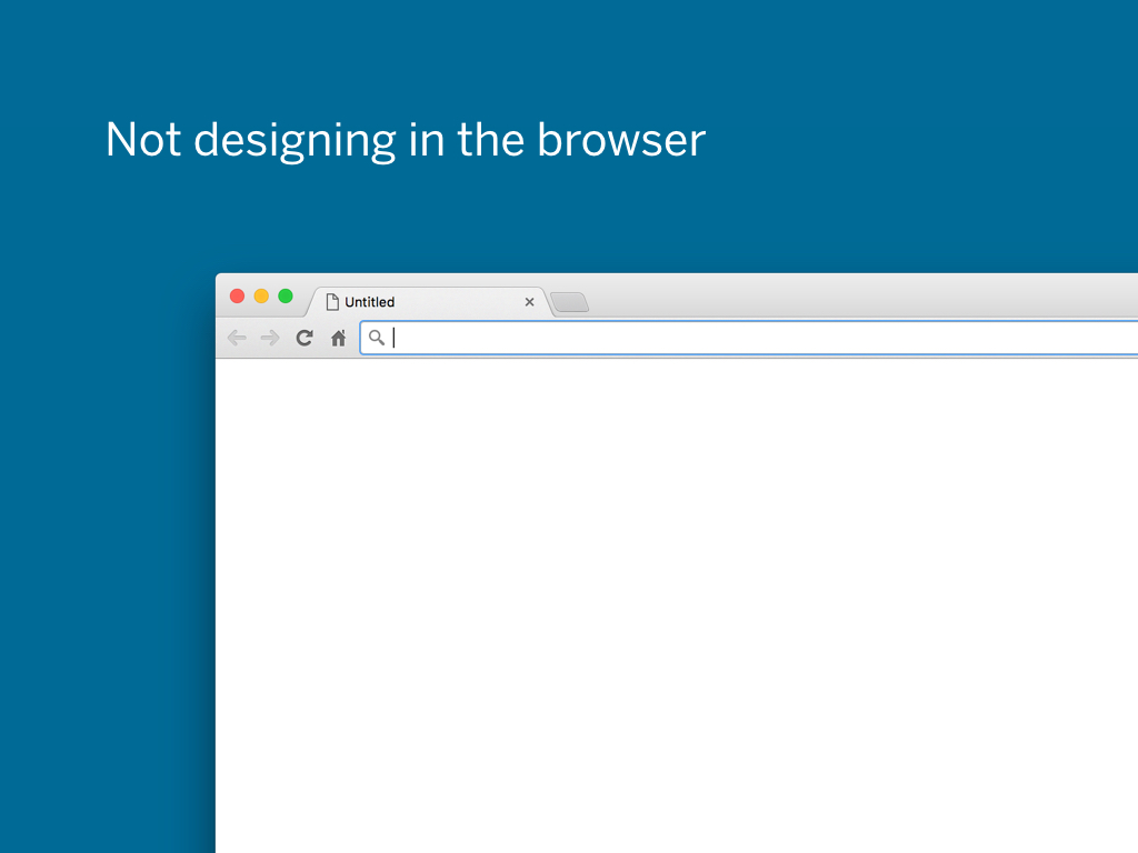
Now, just because I made an HTML/CSS prototype didn’t mean that I designed in the browser. Of course sometimes it was more efficient to do parts of the software in the browser. But in general there would still be visual mockups depicting what the interface should look like.
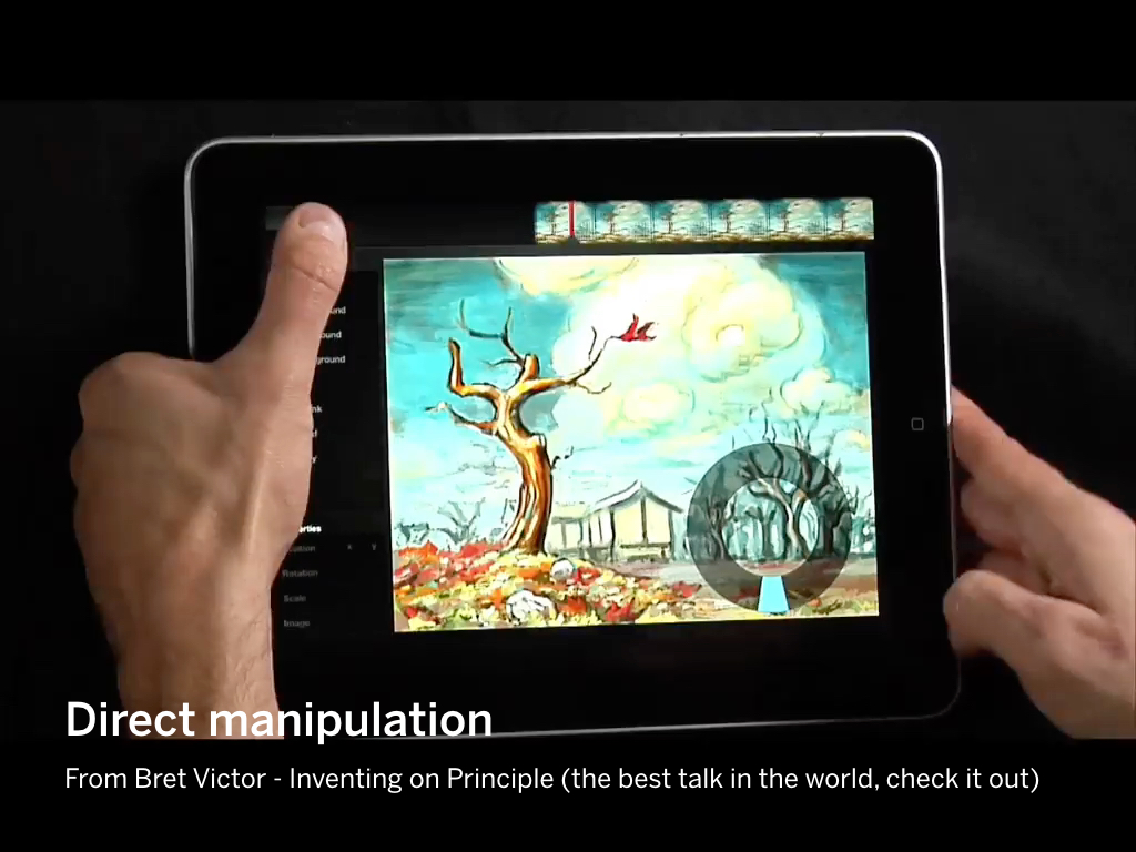
The reason I don’t like designing in the browser (by which I mean designing by coding) is very simple: there is no direct manipulation of the objects.
(At this point in the presentation I heavily promoted Bret Victor's Inventing on Principle, which is a very important presentation to me.)
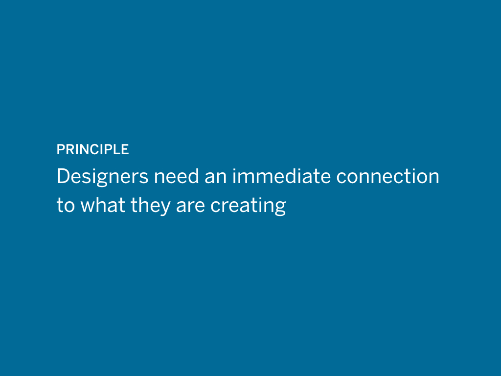
Designers need an immediate connection to what they are creating
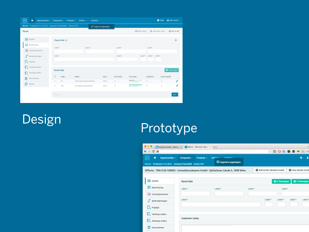
Up until this day I have the basics of the interaction design laid out in an application like Sketch, and in parallel there is the prototype which is the interactive version of the design. We use both to show our work to clients. Often the designs get developed in parallel with the prototype, sometimes the prototype is made after an intensive round of design work to validate our ideas. It all depends on the situation.
For me, the crucial thing that the HTML prototyping method solved was evaluating the actual interaction design.
It's very hard to talk about things scrollable areas and focus states to a person who's not so involved with UI design. But if you can show and tell, that works.
There are things that are really difficult to show in a static mockup.
Like the hover interactions on this seating plan.
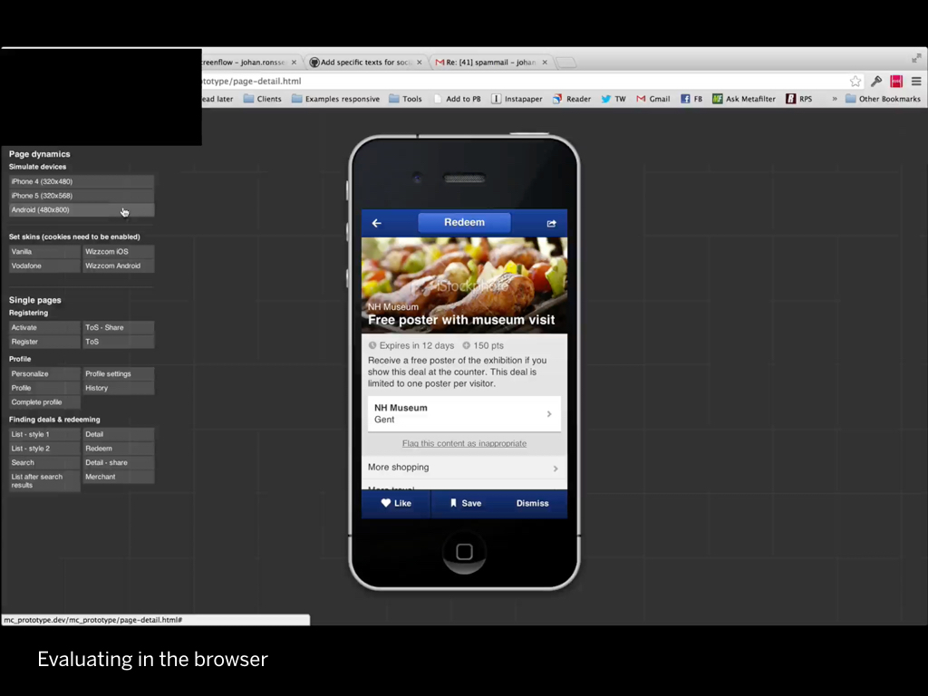
Or how this interface was skinnable, and scaled from a small to a large phone:
Or how animations are supposed to behave (video).
It's terribly time consuming to draw tables with large amounts of data in a graphics program, but it's quite easy to do in HTML/CSS.
I want to give a demo of how our current HTML prototyping process works, so you have an idea of what I am talking about. I think it’s best to do this live, so you see how it works.
(You can find a live demo here but the one shown in the presentation was cooler. Sorry.)
So you’ve seen the demo, now I want to get a bit technical.
The large project I described at the beginning the presentation was the start of something that I like to call HTML prototyping.
Since the initial project I've applied this technique to almost every web project for the last 4 years.
In the beginning, I just built on my existing skills, which was just plain and simple HTML and CSS.
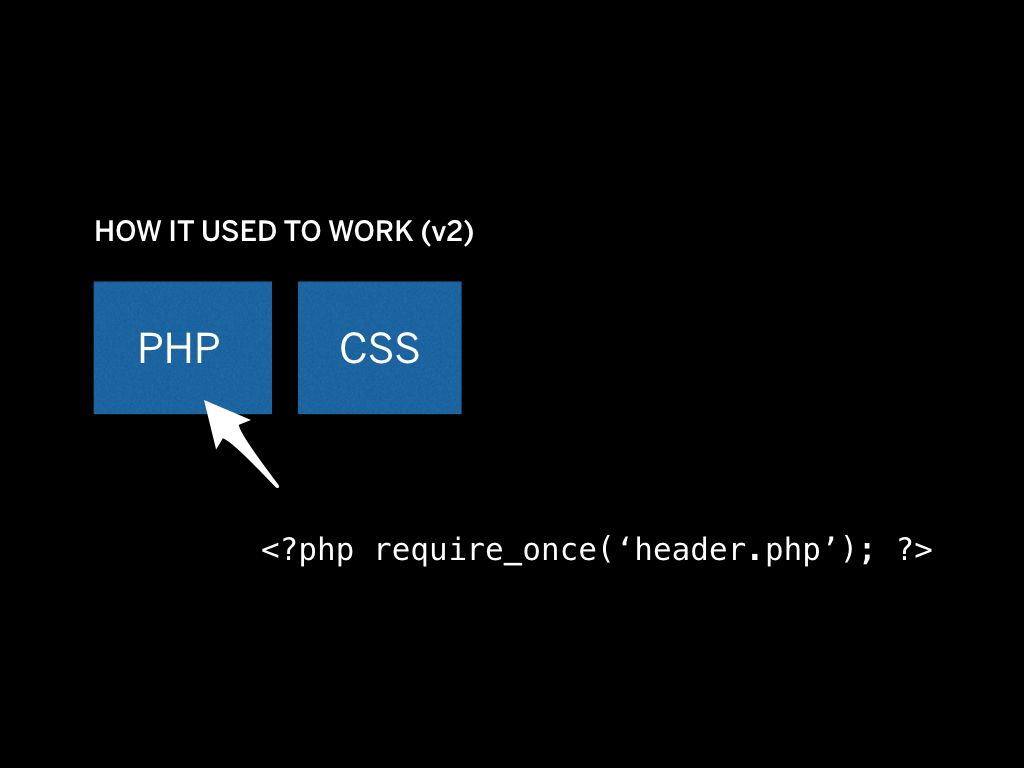
Now, soon enough I wanted includes, so I switched over to PHP.
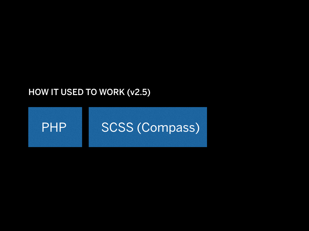
And then I wanted to use SCSS, so I added in Compass.
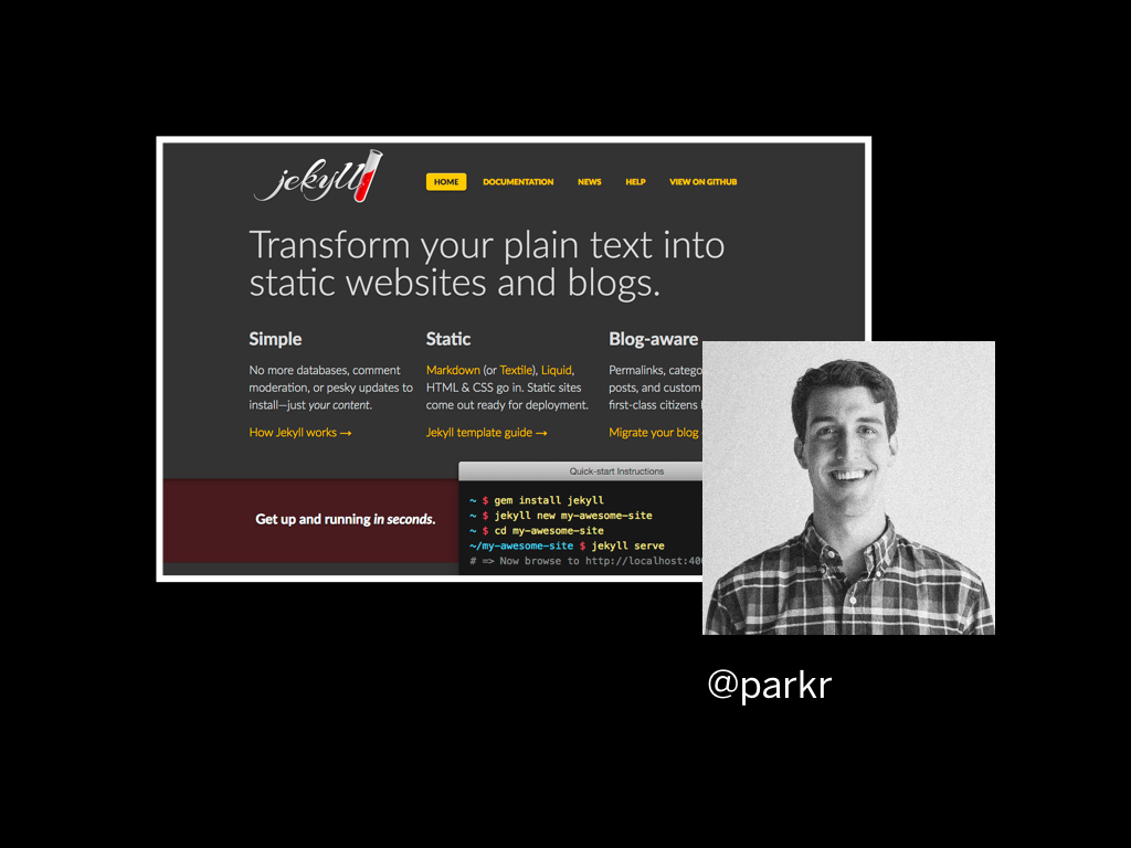
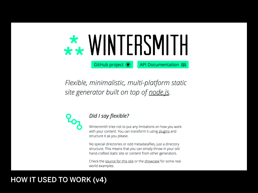
Then I discovered Jekyll. This was really great. Once I understood it - and it took me a long time to understand - it really changed the way I could work.
I didn’t have to run a PHP server, I could apply logic, and as I went deeper — and Jekyll evolved as well — many more features opened up.
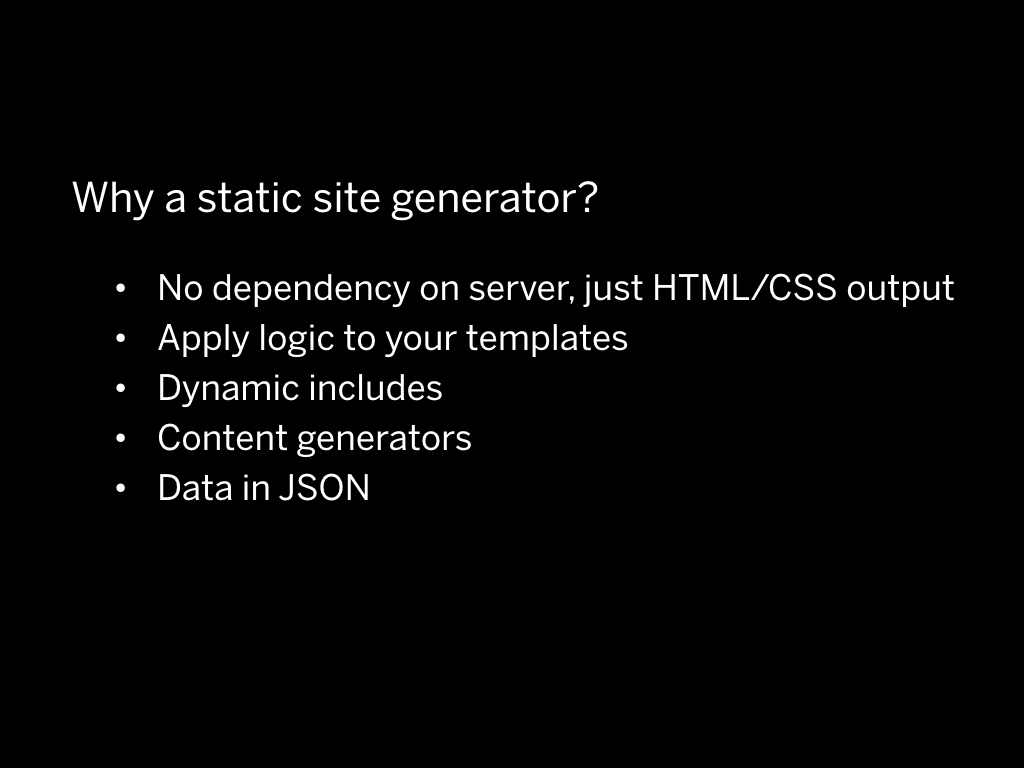
Jekyll allows you to apply logic to your templates, to have dynamic includes, and to work with content in a better way by rendering data from content generators or from JSON files.
If all of this didn’t make sense to you, no problem, it took me quite some time to get it.
(I have a long intro to Jekyll on Youtube here.
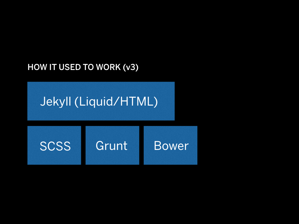
Ultimately the system evolved once again. We started using Grunt to run Javascript tasks such as minification, and Bower to manage external Javascript plugins.
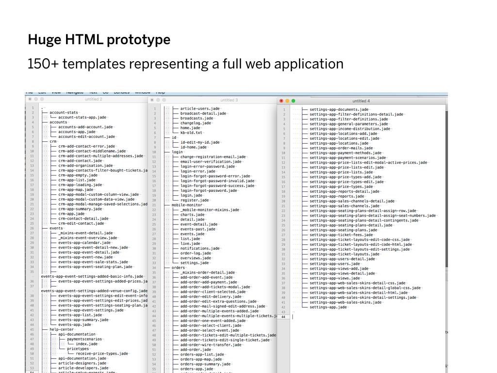
But, we encountered a problem. Some of these HTML prototypes became really big: the biggest one had more than 150 templates.
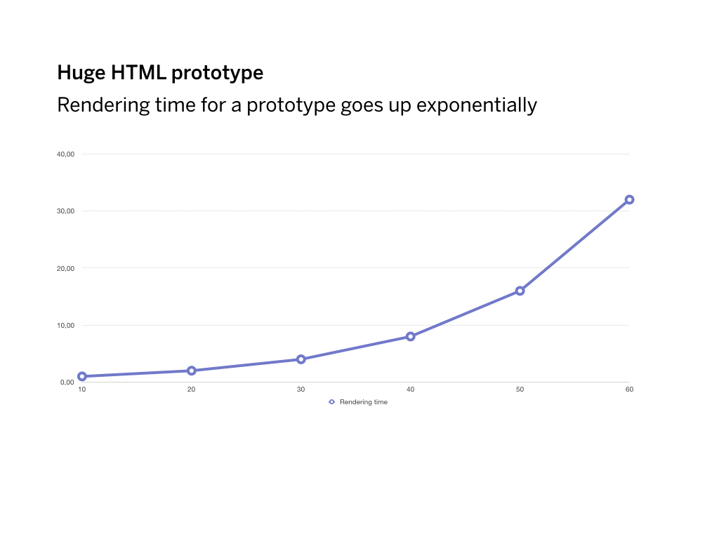
After a while, Jekyll became too slow to render… because it always rendered everything. I had to wait up to 20 seconds to actually see a change on the page. So we tried to fix it.

We thought it was Ruby that was slow, and switched to a another static site generator built on Node, but that didn’t really help.
We thought it was Ruby that was slow, and switched to a another static site generator built on Node, but that didn’t really help.
A colleague of mine even built his own static site generator to try and fix the speed. It worked, but only for a while.
The trick that we needed to actually make it fast again was using a server.
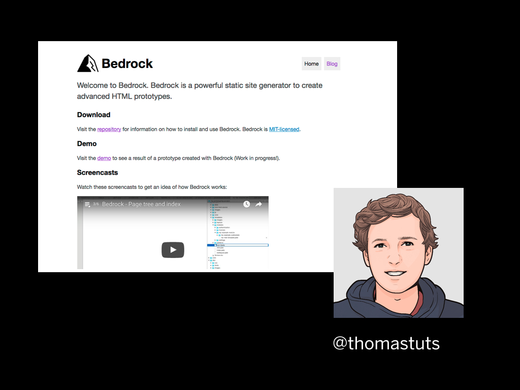
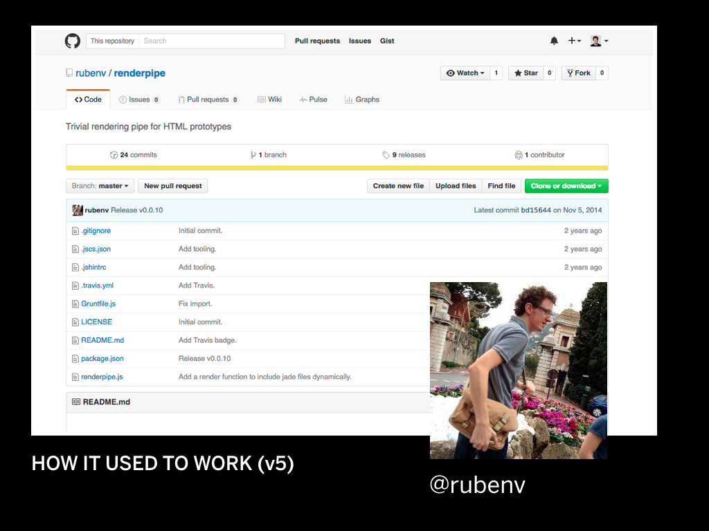
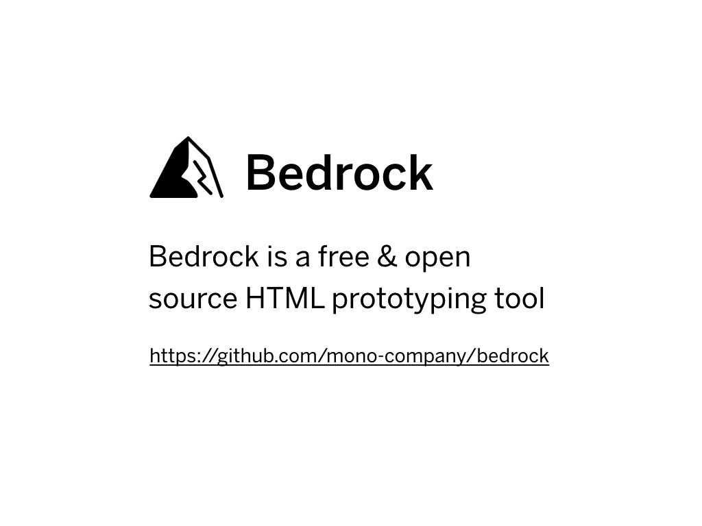
My colleague Thomas helped build the next version of our prototyping system which utilized Express. We called it Bedrock.
This is what you saw running in the demo earlier.
It's open source and free for anyone to use. You can download it at bedrock.mono.company.
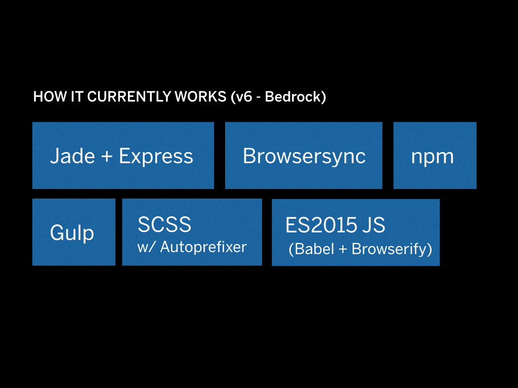
This is how it currently works. Things got a lot more complicated but also more powerful.
The basic lowdown is this: whenever files change Gulp to execute commands such as building SCSS, compiling Javascript, and rendering Jade templates. The changes are injected using BrowserSync.
Templates are rendered on the fly using Express so we don’t have those slow build times anymore. Except when you render the full prototype to static HTML, that is.
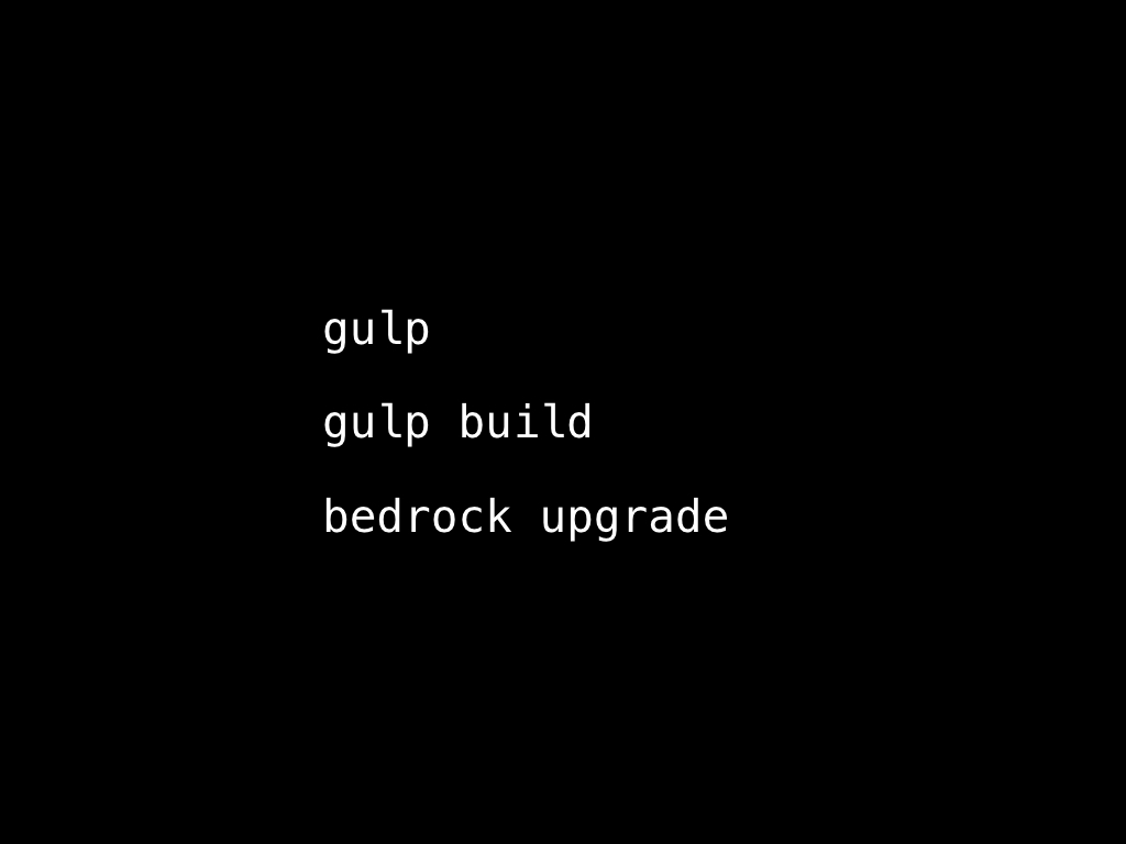
There are three basic commands to know about, gulp watch which
runs a watcher, gulp build meant to make a full build that you can
upload to a web server, and bedrock upgrade which is a small
command line tool to update Bedrock to the latest version.

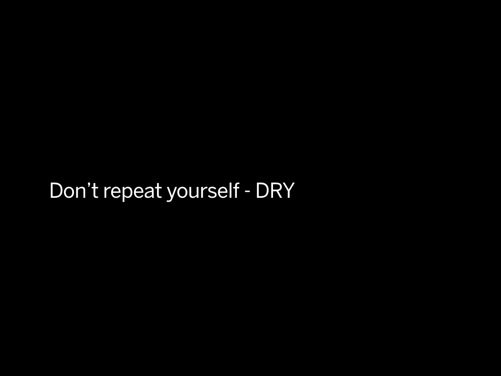
The way to maximize your efficiency is by staying DRY. Do not repeat yourself. This is a common mantra in programming; but it's also true in user interface design
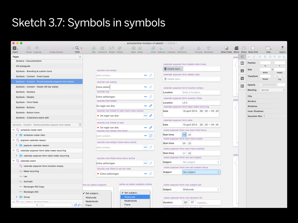
Graphic design tools offer various methods to minimize repeating yourself: you can store text styles, graphic styles, symbols etc.
A super powerful concept is the “nested in symbols” feature. This recently introduced in Sketch. This is the #1 feature that will allow you to never repeat yourself.

The equivalent in an HTML prototype is the “include within include”. Or even better: template extension.
But what's interesting when you are dealing with code is that you can start to apply logic. So you can have a page that shows a sign in form, but also one that shows the same form with an error.
No duplicate code has been written, and this allows you to work in a very DRY way.
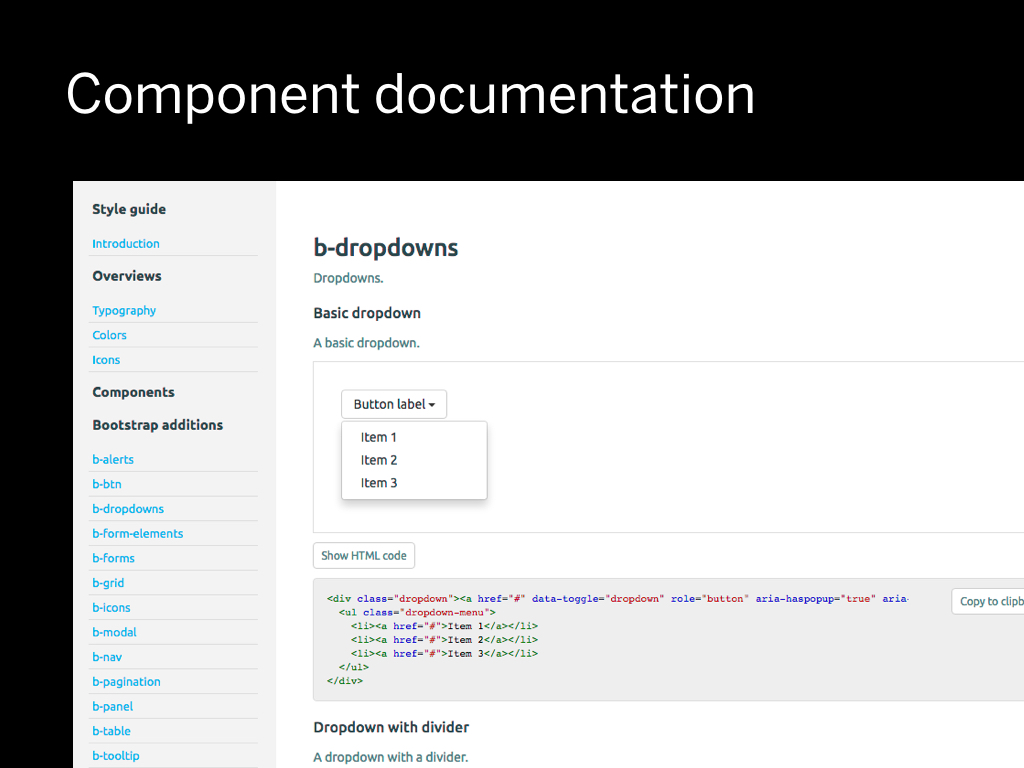
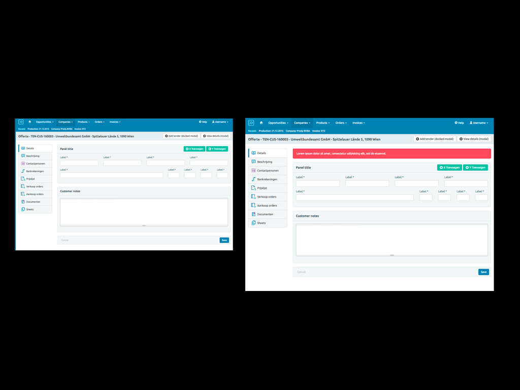
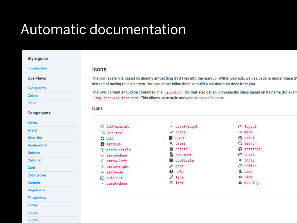
We found out that as prototypes grew larger we needed to start documenting things. We needed the equivalent of that master PSD from the beginning, but in code.
What does a dropdown look like in this project? What's the code behind it? So I started making these separate pages to list the components. These pages would show the code behind a component.
Component styleguides have become very popular lately, but at the time it wasn't so obvious that maybe we should also make them in HTML and CSS.
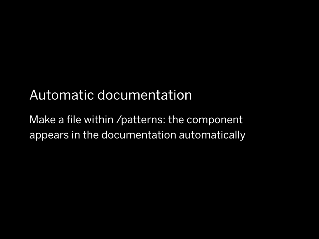
What’s handy about Bedrock is that when you make a file within /patterns: the component appears in the documentation automatically.
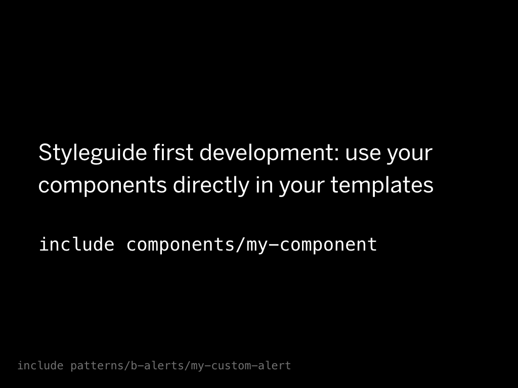
Lately I've been doing something I like to call styleguide first development.
Instead of having a duplicate of the component in the codebase, the codebase directly references the component in the styleguide. This way everything stays in sync.
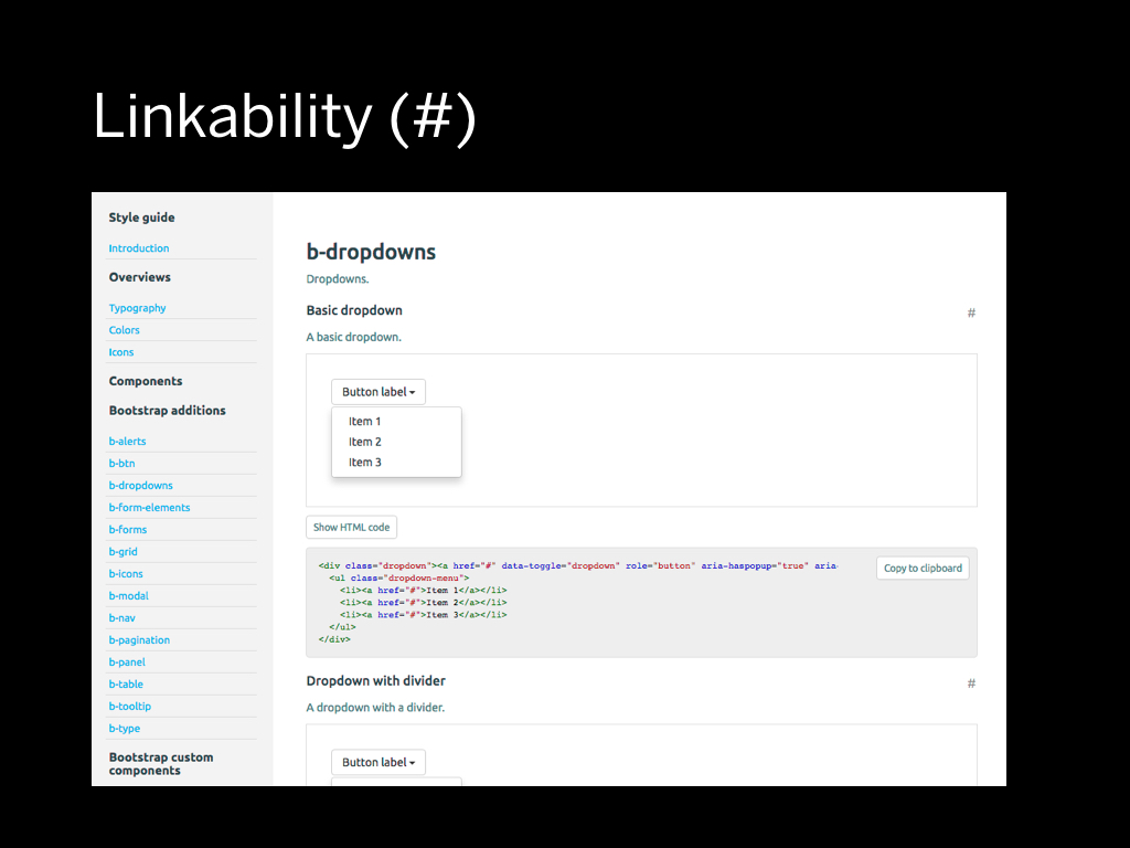
One small detail I would like to point out is linkability: it is crucial to be able to link to a specific component in the styleguide. So within our current system we made sure we have the ability to link to every part.
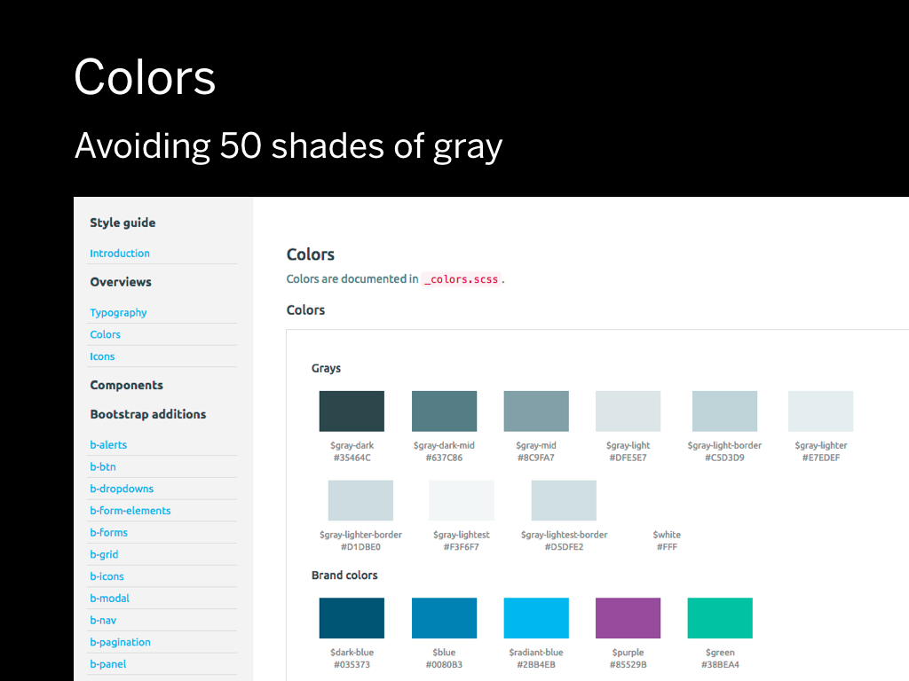
Wat about colors?
What happens a lot within a project is a problem I like to call “50 shades of gray”. If somebody needs a color, they just pick something and run with it. The problem is that you end up with all these inconsistencies in the final implementation.
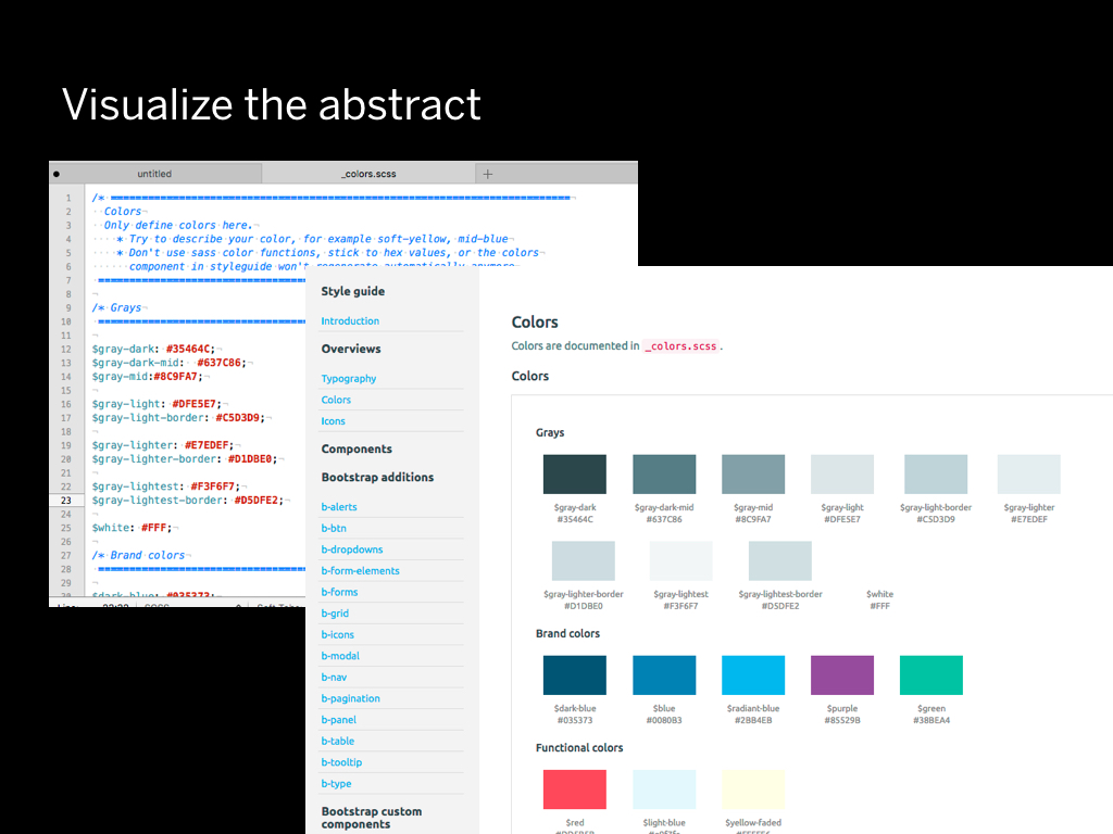
Ideally there should be about 4-6 shades of gray in an entire project. The problem with CSS is that it's an abstract of something visual. I decided I would need tooling to see the abstraction visualized. Within our latest prototyping tool, we have a way to visualize the colors from SCSS variables.
Ideally there should be about 4-6 shades of gray in an entire project. The problem with CSS is that it's an abstract of something visual. I decided I would need tooling to see the abstraction visualized. Within our latest prototyping tool, we have a way to visualize the colors from SCSS variables.
We spent a lot of time on icons.
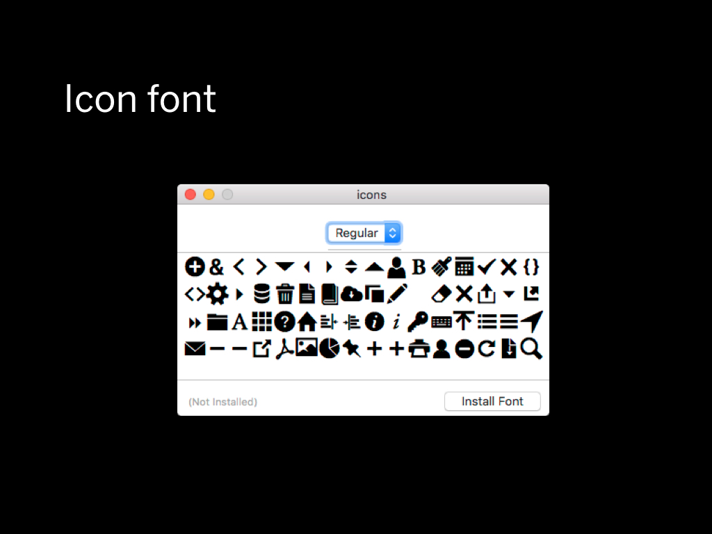
For a while, the preferred method to displays icons in our projects was to use an icon font.
What we wanted for making prototyping fast and easy was that you would drop an SVG into a folder, and the icon font would regenerate.
What we also wanted was that you would have “automatic” documentation of every icon within the project.
In the end we achieved this, but there were so many problems with it.
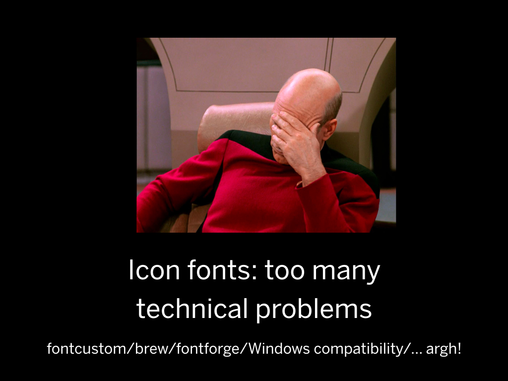
First of all, it was very hard to get the icon font code to run on everyone's systems. Most of the code depended on a Ruby project called Fontcustom that was pretty hard to run on Windows.
It also added another layer of dependency management: at some point in the project we had both RubyGems and npm as dependency managers.
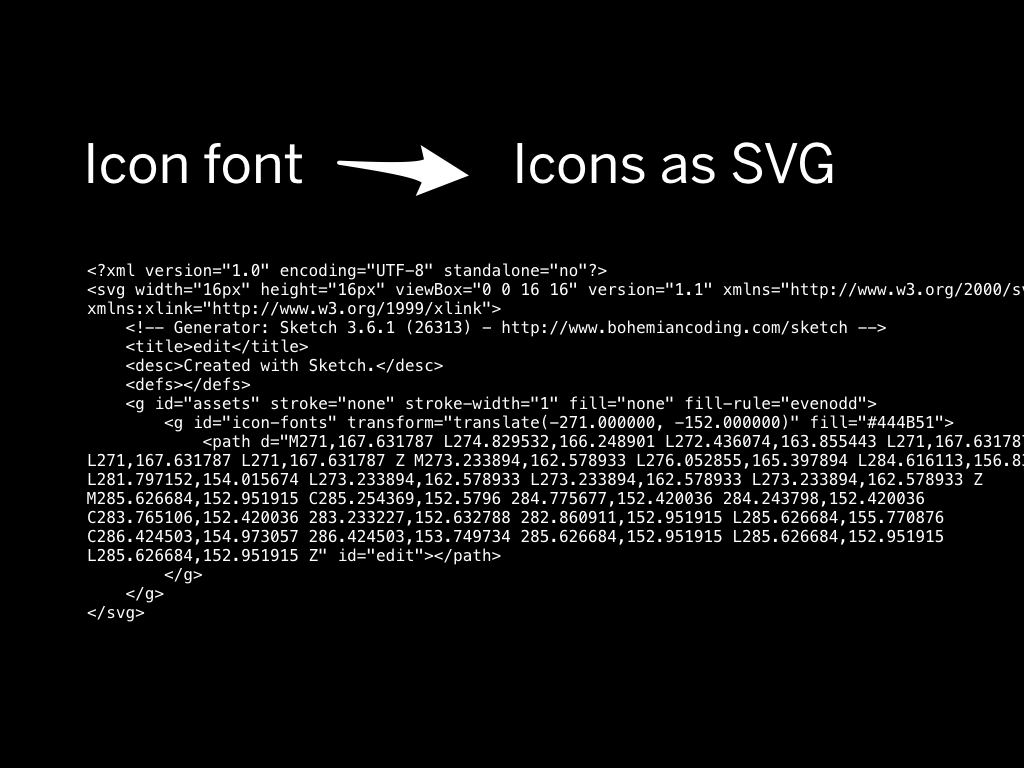
Ultimately we dropped the whole system in favor of SVG icons that are directly embedded on the page.
This system works well for us and we have the added benefit to be able to use multi colored icons without any hacks.
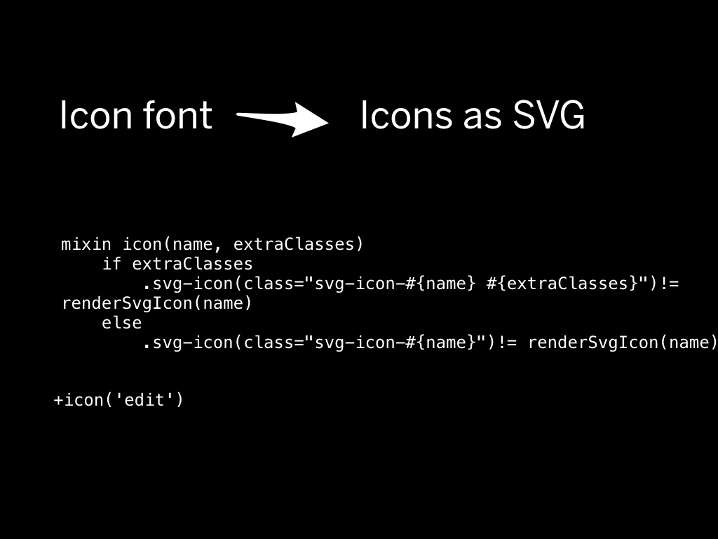
It's very simple, basically the entire SVG code is directly on the page. Using a templating system we extract away some of the cruft that comes with that to make things readable in our templates.
The current way we do prototyping is a result of many choices along the way. We've switched technologies many times to ultimately develop a system that works for us.
HTML prototyping helps us to deliver more value to our clients. But, we use many methods to get to the ultimate software. HTML prototyping is just one of them.
I always think designers and developers should grow closer together. You have a lifetime to learn new skills, so don’t just confine yourself to one box.
We are looking for a user interface designer to join the team. If this talk was appealing to you, come talk to me during the break! (see the job ad)
Thanks for your attention!
(Follow me on Twitter)