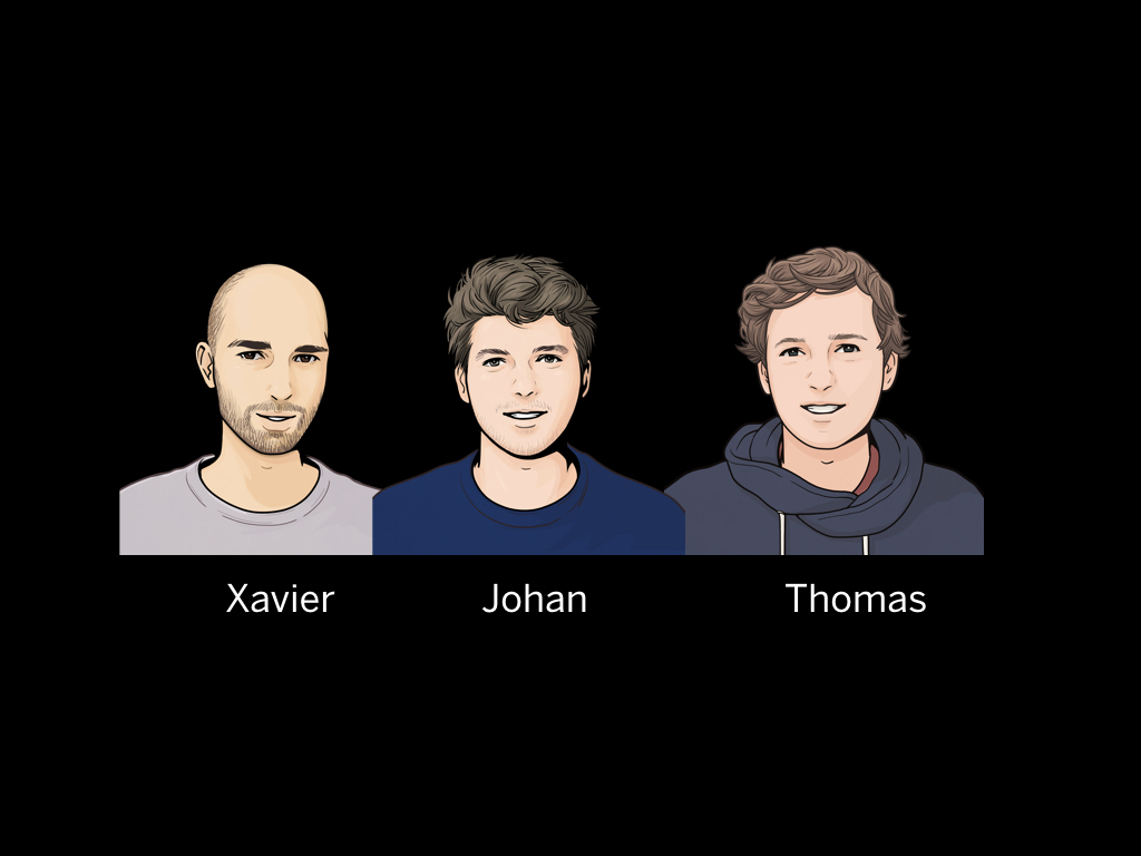
Hi everyone. My name is Johan; this is Xavier.
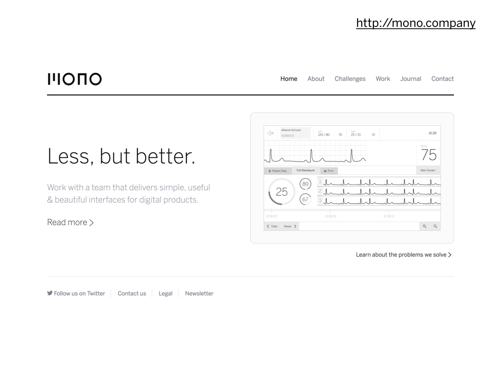
We work for Mono, a company specialised in user interface design. This is our website which you can visit at mono.company .
We are 3 people: Xavier, Thomas and me.
What I want to talk about today is the good, the bad and the interesting in user interface design.
I want tell you a bit our mission to create the world's best interface designs.
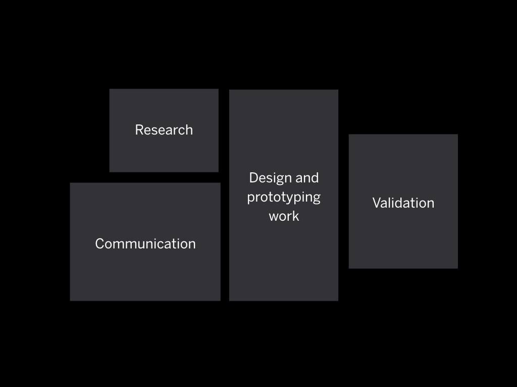
I want to show you some of the tools and methods that we use to do our work; and talk about some of the things that influence our work.
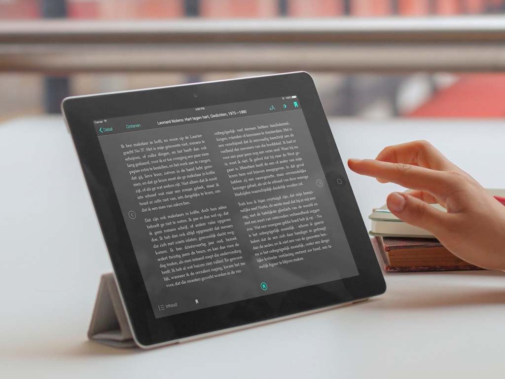
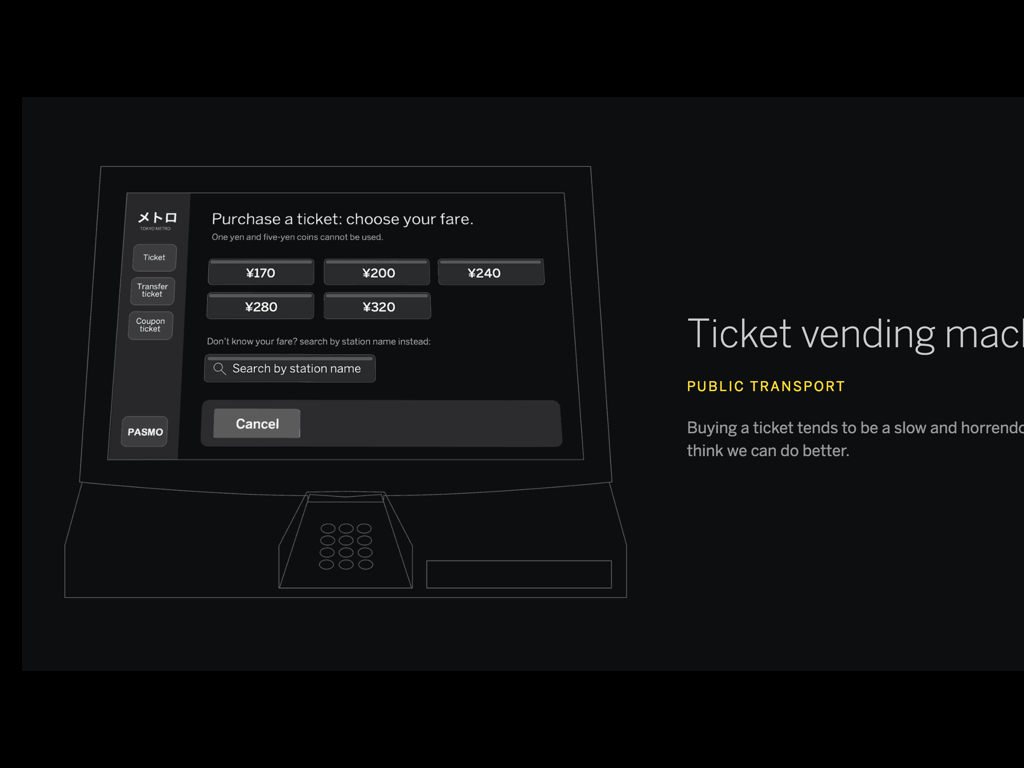
To give you a very brief idea of what we do, here are three examples of what we worked on. This first one is an app to read e-books on your tablet.
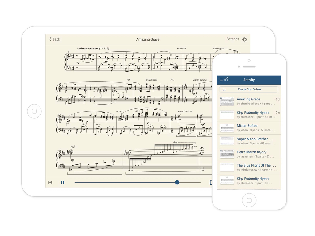
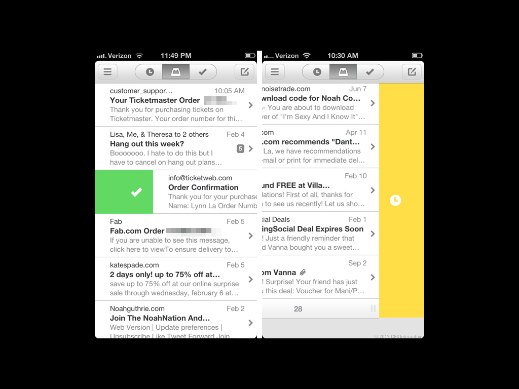
This screenshot shows an app to display music notation on your phone or tablet.
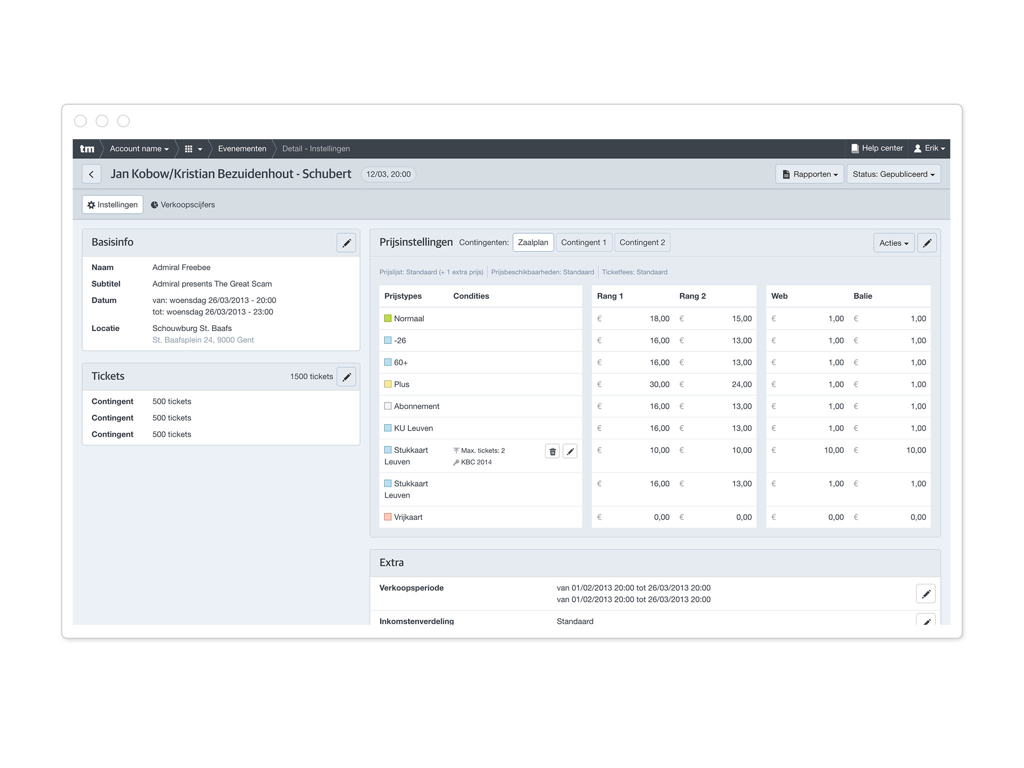
And lastly this screenshot shows a tool to manage the prices of events for a concert organiser.
We design useful software that supports business processes.
But… a few years ago we had a problem.
As a designer you will be hired for what you did before. Your portfolio shows certain things, and clients will choose you based on that portfolio. But what if you want to do something new?
My dream is to build the world's best software.
Xavier and me used to be web designers. But the problem was that a few years ago we only had website designs in our portfolio. We couldn't show those websites because they didn't show where we wanted to go. To combat we put a page on our website that's called challenges.
We made this page to give people a good idea of what we are trying to do as a company. The challenges page displays a few different examples of what we do:
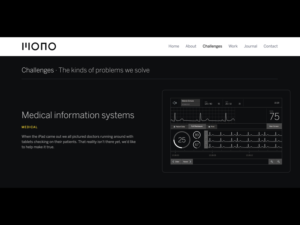
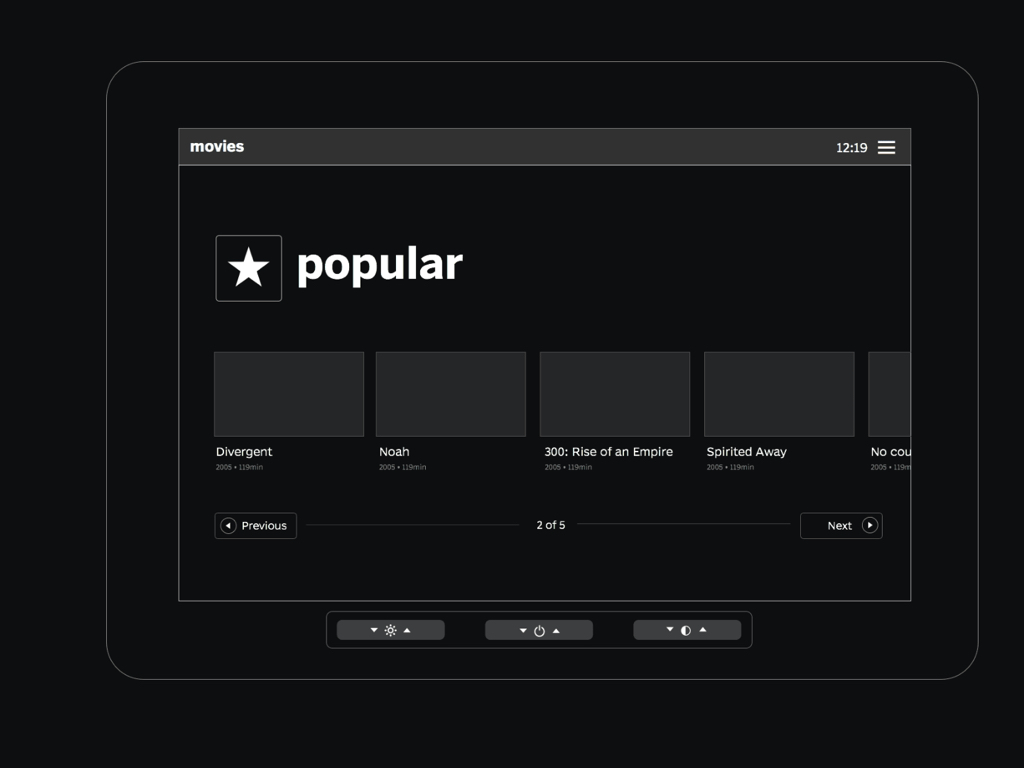
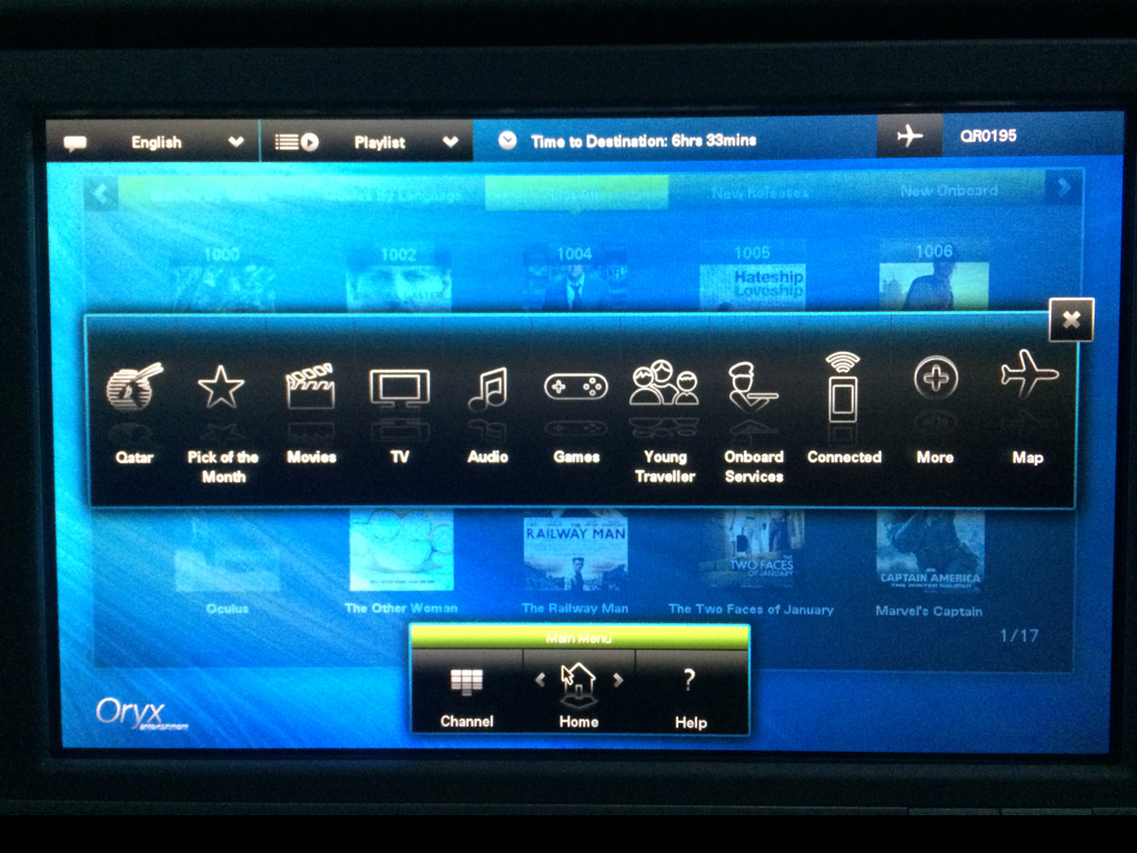
I am happy to report that by now we have worked on some of these types of projects. I want to zoom in a bit on this last one, in-flight entertainment systems.
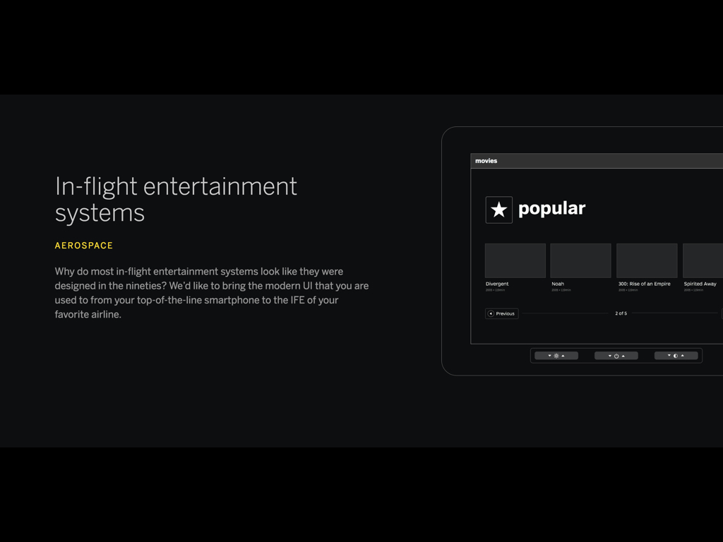
This is basically the computer you use to watch movies on a plane.
So, why did I choose to feature such a system in our challenges section? As it happens, ideas are usually born out of frustration.
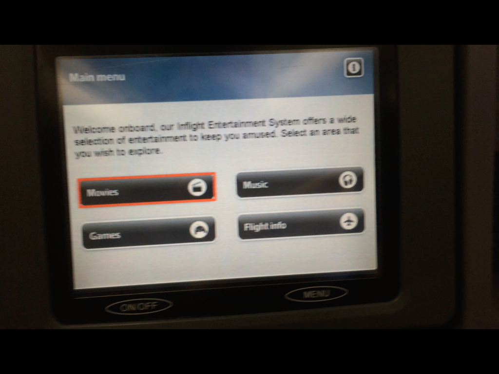
A few years ago I was on a SAS flight (this is Scandinavian Airlines) and their system was the absolute worst. This video shows me struggling with their system.
There were so many problems with it. I got interested in why it was so bad.
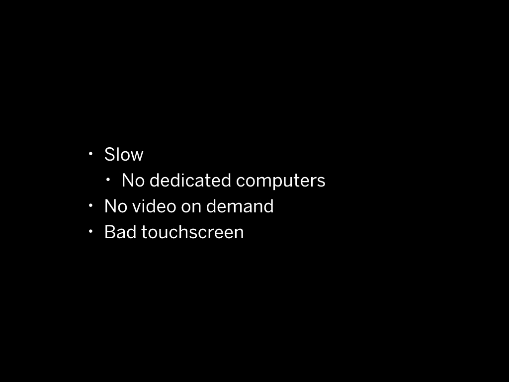
So Slow
Why was it so slow for example?
I learned that these old systems are not dedicated computers in your seat, like I expected. So there was actually a single computer working for the entire plane. This system must have been pretty old.
They are streaming content from a single server inside the plane to a screen in front of your seat.
Only in the newer there are dedicated computers per seat.
No video on demand
For example, you couldn't start a video on demand. Like regular old TV, the movies played on channels and in repeat, so when you chose a movie in most cases it would already be halfway
There was one movie I really wanted to see, so I set an alarm on my phone to see when it would start again. And... when the person has to go to the toilet, of course you are missing your movie.
Bad touchscreen
The touch screen had a limited number of points where it could be touched. You could see this in the video - the problem was that when a a button didn't align with a touchpoint it was really difficult to press
What about giving iPads?
The main problem with these old in-flight entertainment systems is that they use old touch screen technology that is nowhere as good as what's in an iPad.
You could think about: why not just give people iPads?
Australian budget airline JetStar did just that – and it's not a good experience. You already don't have a lot of space on a flight and then you have this extra bulky protected iPad to deal with.

So I embarked on a mission to try more in-flight entertainment systems.
I deliberately booked a flight with other airlines than I regularly used to check their IFE. Only when I actually needed to travel of course.
This is the system of Russian airline Aeroflot.
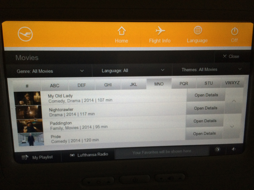
This for example is Lufthansa's system. It's not bad, but it's also very dry.
There wasn't one IFE that I liked until I was on an Emirates flight, and to my surprise the IFE worked really well.
The major part that made it work well was that it wasn't slow, and the touchscreen actually responded to what I did.
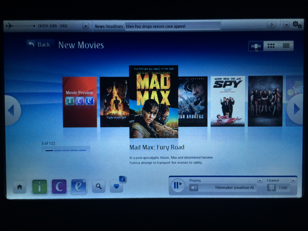
This is just one example where the hardware has to work together with the software.
There's many more. Every time I find something I don't like, I take a photo and I note it down.
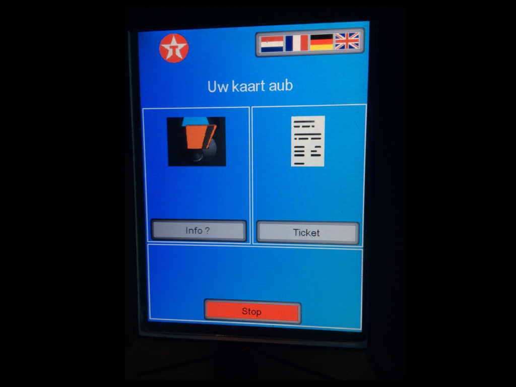
There is a computer when you are getting gas from a pump. The interface could use some work.
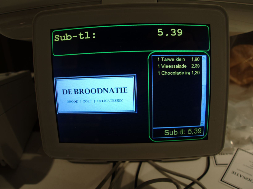
There is a computer when you are buying bread.And when I see these things I think there's still a lot of room for improvement... and that's where interface designers should come in.
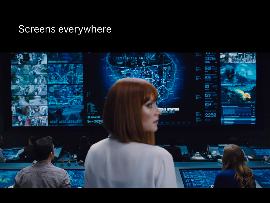
There are so many screens involved in everything we do in our lives these days. There’s literally screens everywhere.
There's a lot of talk about bots, artificial intelligence and virtual reality; but screens running software aren't going away anytime soon.
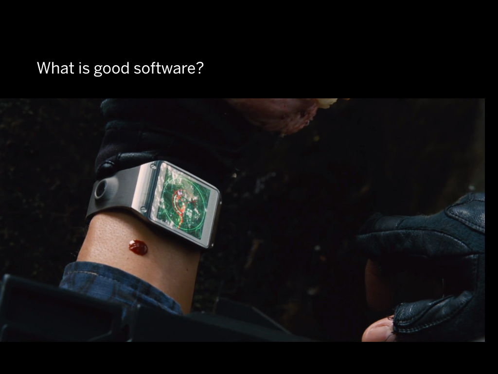
I think if I want to talk about how to make better software, I need to define what good software really is, so I prepared a few examples.
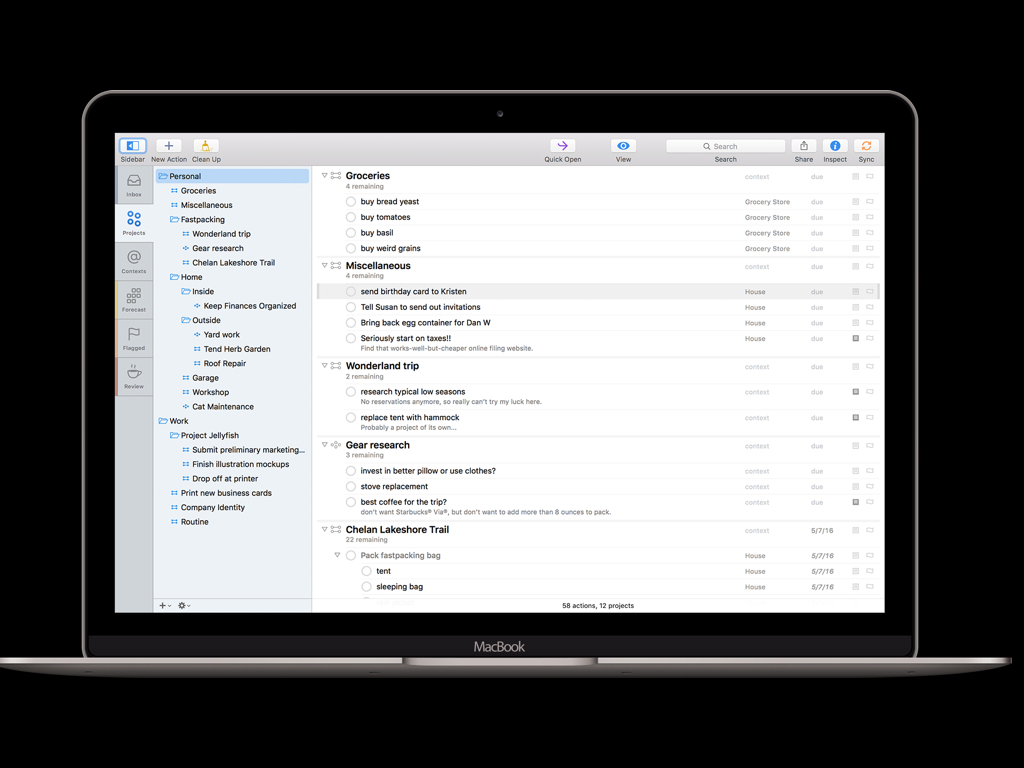
There is this company called The Omni Group and they make a todo list application called OmniFocus. Their application basically helps me manage my life no matter how busy it gets. I love it.
It is so much better than any other to do software out there. They are on another level. For example they made todo sync work across multiple devices before Apple ever did.
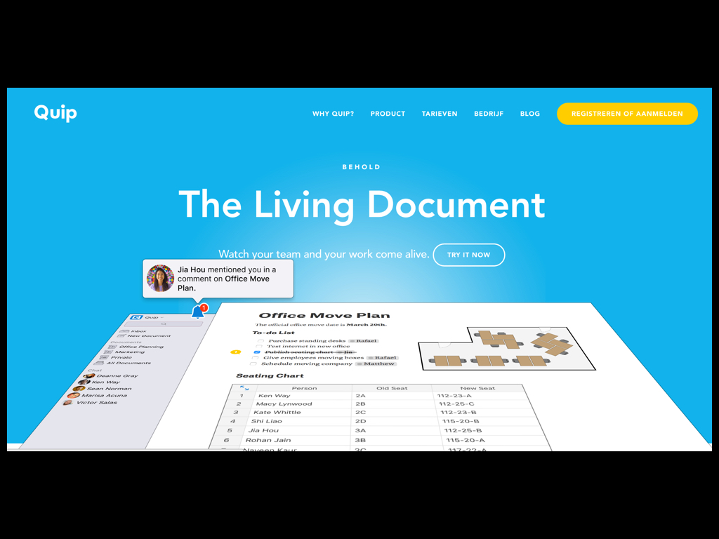
I made this talk in web application called Quip. It is pretty great.
In a nutshell, it combines a word processing, spreadsheet and chat application to make collaborative documents.
It fixes a lot of problems, but it also introduces new ones. For example, you have to be online all the time to use it - so when I wanted to continue to work on my slides on the train, too bad for me.

Software is hard.
When a piece of software gives you the feeling that it's pretty great to use, that's quite the accomplishment for the designers.
Sometimes that feeling comes from using it for the first time. But usually you start to like software over time.
When I first got a Mac, I absolutely hated it. I couldn't stand it. But I realized it was because I didn't understand it yet.
After a few months I couldn't go back to Windows anymore.
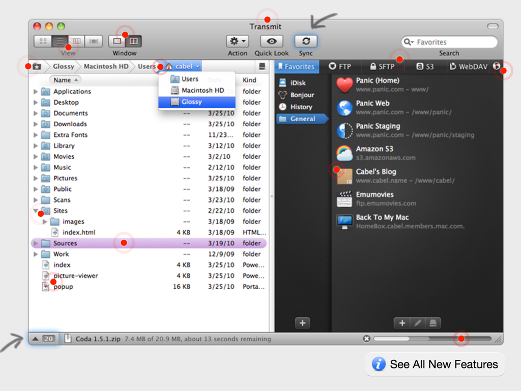
The Mac has all these quality applications that you just can't run on Windows, like Transmit.
Transmit is an FTP client by a company called Panic that is just really well designed.
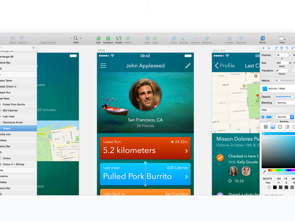
Another example of good software is of course every designer's current favorite tool, Sketch. This tool has become indispensable for my daily user interface design workflow.
What I want to be working on is software that is on the level of the applications I just mentioned - or the next level. The level where it can change someone's life for the better. We are working towards that.
Both me and Xavier come from a web design background.
It took me a while to see the real differences between software design and web design.
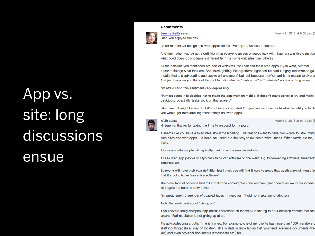
For years I struggled with this. It didn't help that one of my heroes Jeremy Keith always proclaimed that there is no difference between a “web app” and a “web site”.
For years I struggled with this. It didn't help that one of my heroes Jeremy Keith always proclaimed that there is no difference between a “web app” and a “web site”.
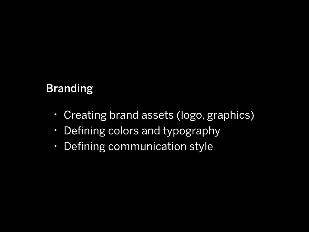
When I say web design, what I actually mean is marketing design. Marketing design is about spreading a message. The work involves thinking about copy that will convince people; about making graphics that look great; about giving structure to information.
What comes before marketing design is branding. You create brand assets, you define the communication style.
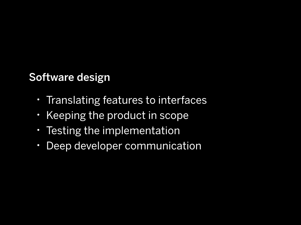
But the thing is, what you do on a daily basis when you design software is really very different.
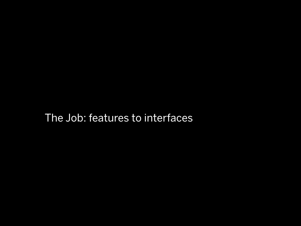
Your main job is translating features to interfaces.
Obviously because what you are doing is design – there is an overlap between what you do when you design a website or a piece of software.
You are still drawing things on a screen. But the focus is on other things.
And the process is also wildly different.
One difference between typical website work and software design work is that designing software takes years.
The first version of an ambitious software project is typically built over a span of 2 or 3 years. Most website projects I worked on lasted 2 to 3 months, even the bigger ones would never take longer than 6 months.
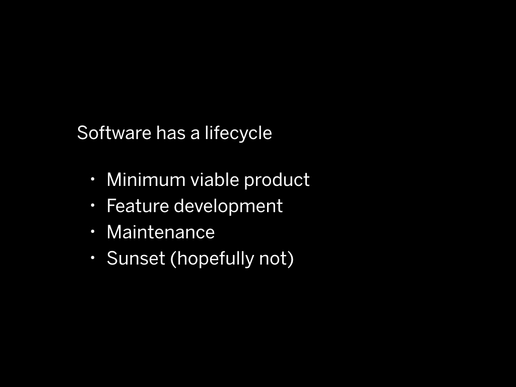
Software has a lifecycle, a roadmap. There is an MVP, there is a 2.0 version, there is maintenance mode, there is new feature development.
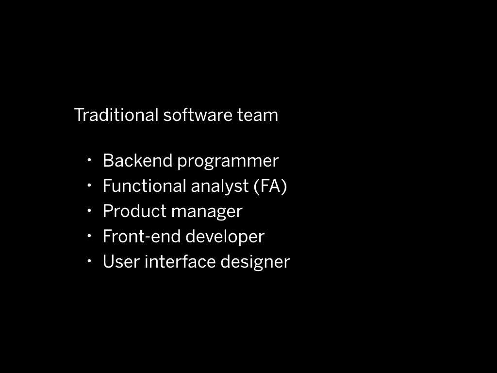
In traditional software design, there are a few defined roles.
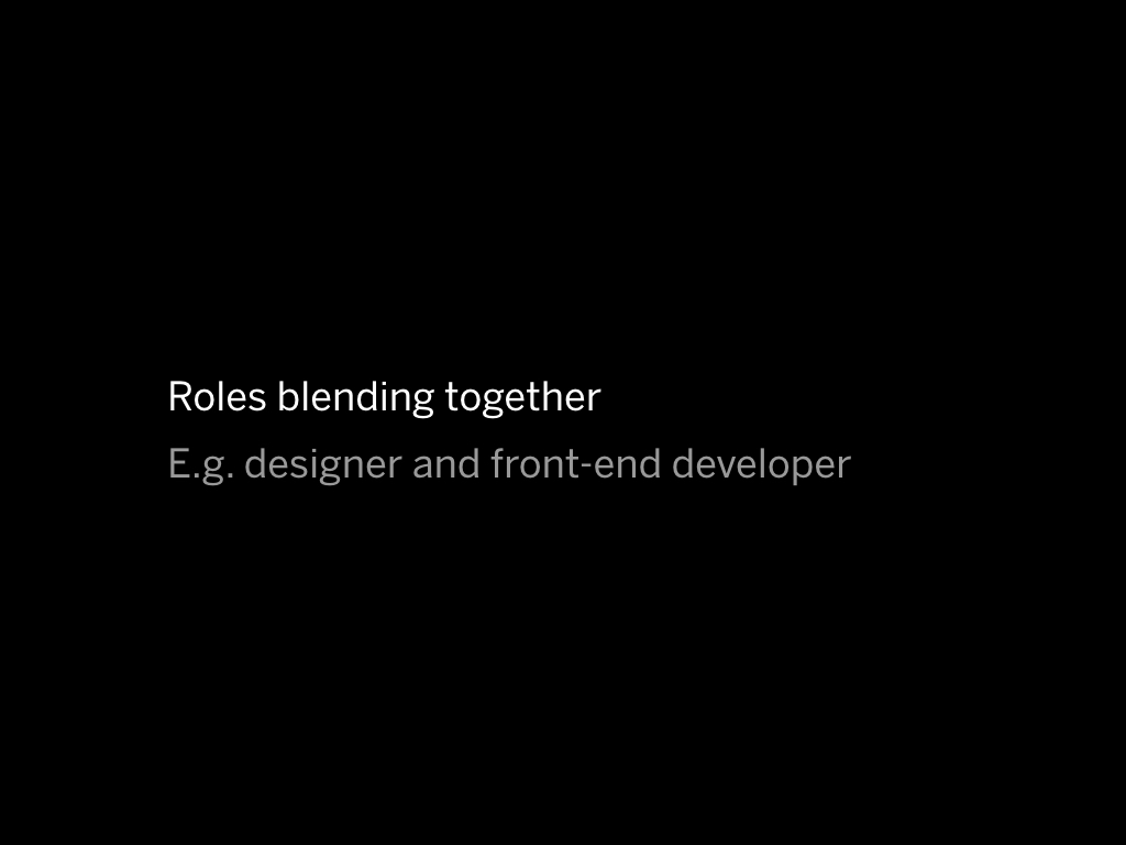
In modern software design, a lot of these traditional roles blend together.
Using modern JS frameworks like React and Angular a front-end developer typically can't escape the backend because it's so inherently tied to the design of these frameworks.
If you do any sort of native app development you are doing front -and back end development at the same time.
The designer often does a little bit of the front-end.
At Mono we often deliver HTML/CSS packages so the developers don't have to worry about visual styling, something they usually don't pay much attention to.
As user interface designers, the main thing we do is translate features into interfaces.
We also help deciding whether a feature should be there in the first place.
When it is decided that the application must do "X", we think about the way that someone will do X.
We draw the user interface.
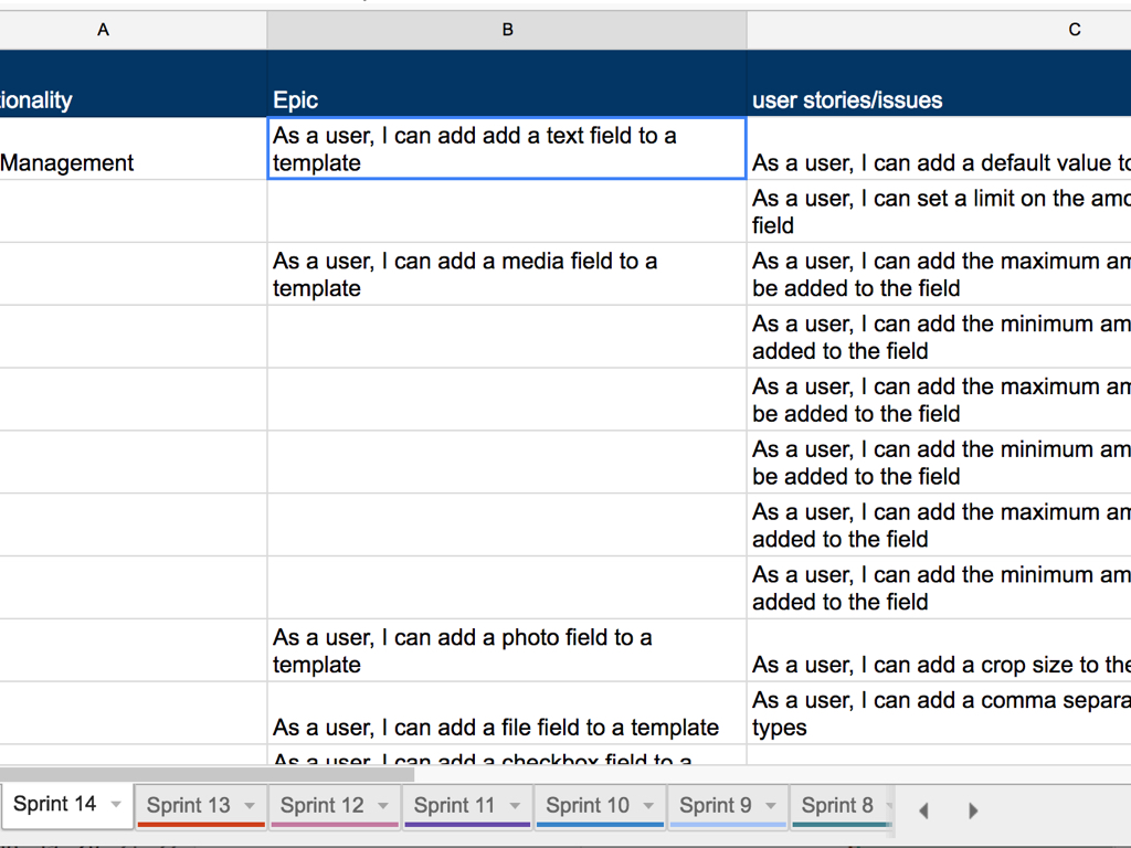
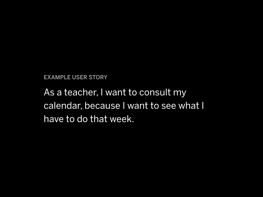
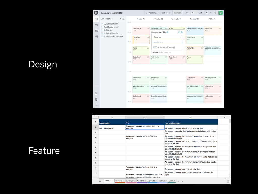
What you see here is a user stories document. It's structured in a very simple way:
*As a {type of user}, I want to {do x}.
Sometimes the reason why you would want to do is added, but more often than not it’s left out because it’s too complex to describe.
So for example
As a teacher, I want to consult my calendar, because I want to see what I have to do that week.
The work around a user story usually involves a few things. What is discussed really depends on the phase of the project.
There will be discussions about:
The deeper and more complex the software is, the harder these discussions get.
If we think of a single user story as a "unit", a software project typically has between 20 and 100 "user stories" that end up being a version of the software.
What gets thrown around a lot is the term "minimum viable product" or the "1.0".
This is the version of your software where there are enough features that the software as a whole becomes useful.
I used to think that I knew all about software and I didn't want people interfering with that process. But the reality is that you need to understand the user's problems... then you can design the interface.
We are working on a project to build planning software for teachers. The only way to be able to understand how a teacher plans their week, is to talk with them.
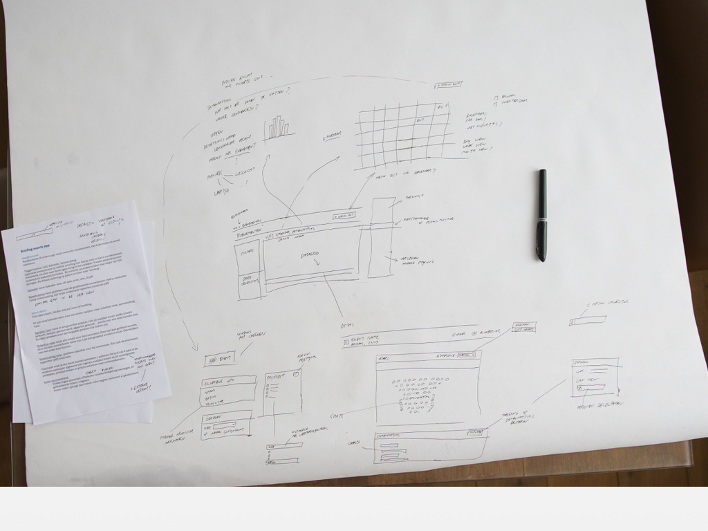
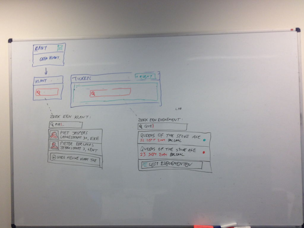
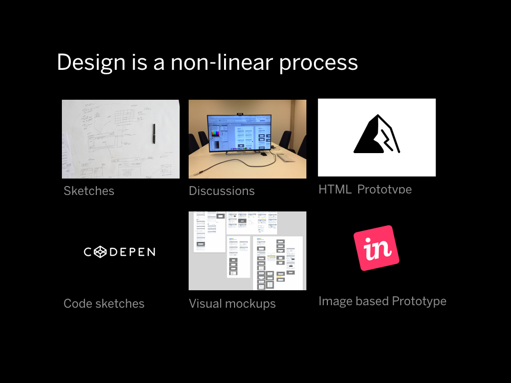
For me, a traditional design process starts with sketching, based on a briefing.
It consists of gathering requirements from your clients, and discussing the designs with them. I like to do lots of calls and to go over every detail.
In the process I will be drawing many boxes and arrows… seeing many whiteboards…
… ultimately ending up with a lot of screen designs.
I feel that every interaction that is in an application has to be designed. If a user interface element exists, it has to be considered. As a designer you need to be able to argue why it's there and what it's for.
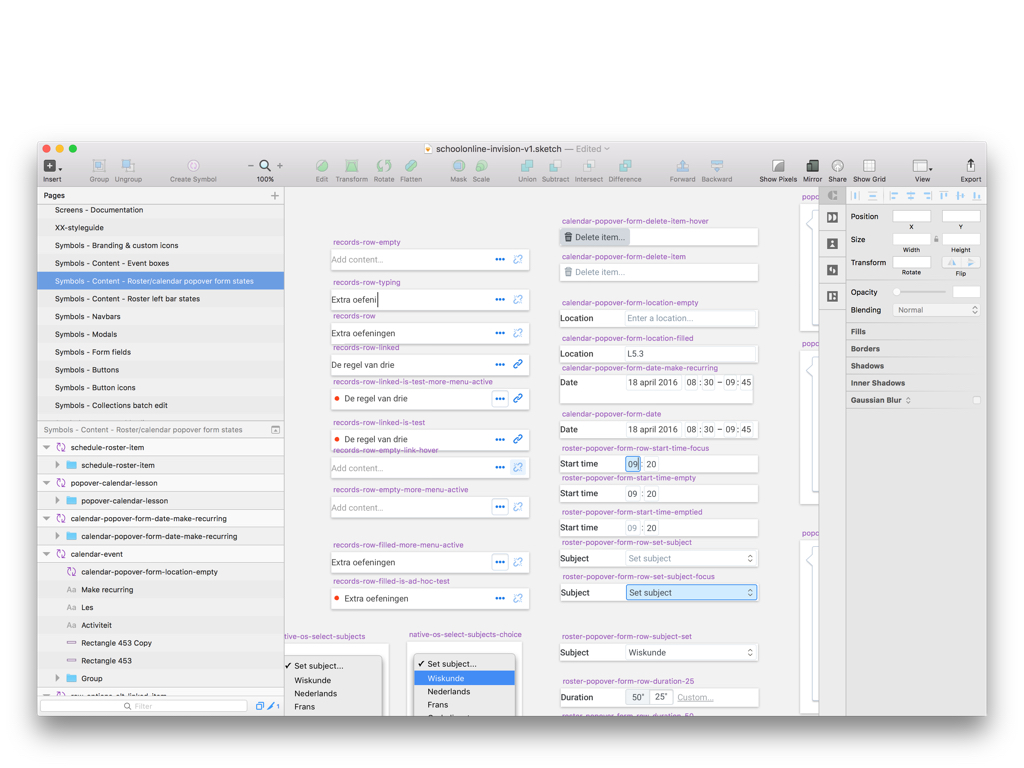
There are many ways to get to a design. The methods we use are sketching, designing in a visual design application, making Invision prototypes, making demos of interactions in the browser and full-on HTML prototypes.
The proces is defined as linear, but in reality things get mixed up depending on the situation. A small HTML/CSS demo will inspire a part of the visual design. An external idea will lead to a major information architecture change. We have to adapt a flexible process.
Let’s look at one of those key areas: designing at scale.

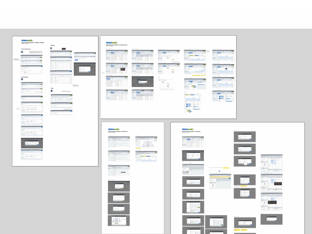
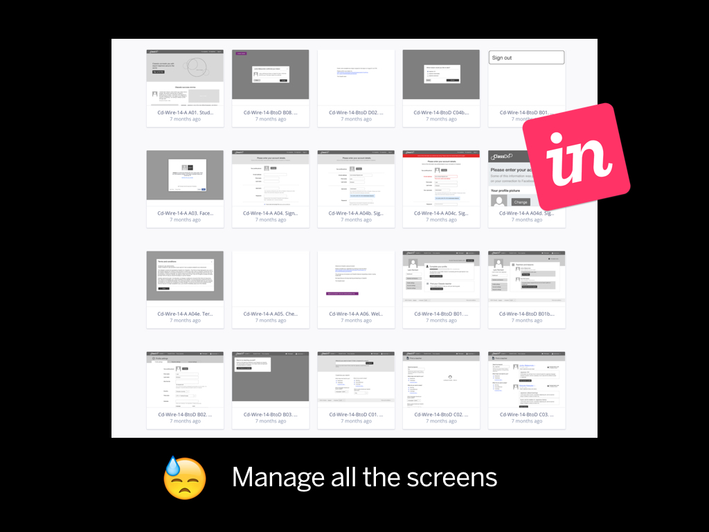
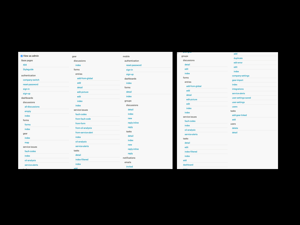
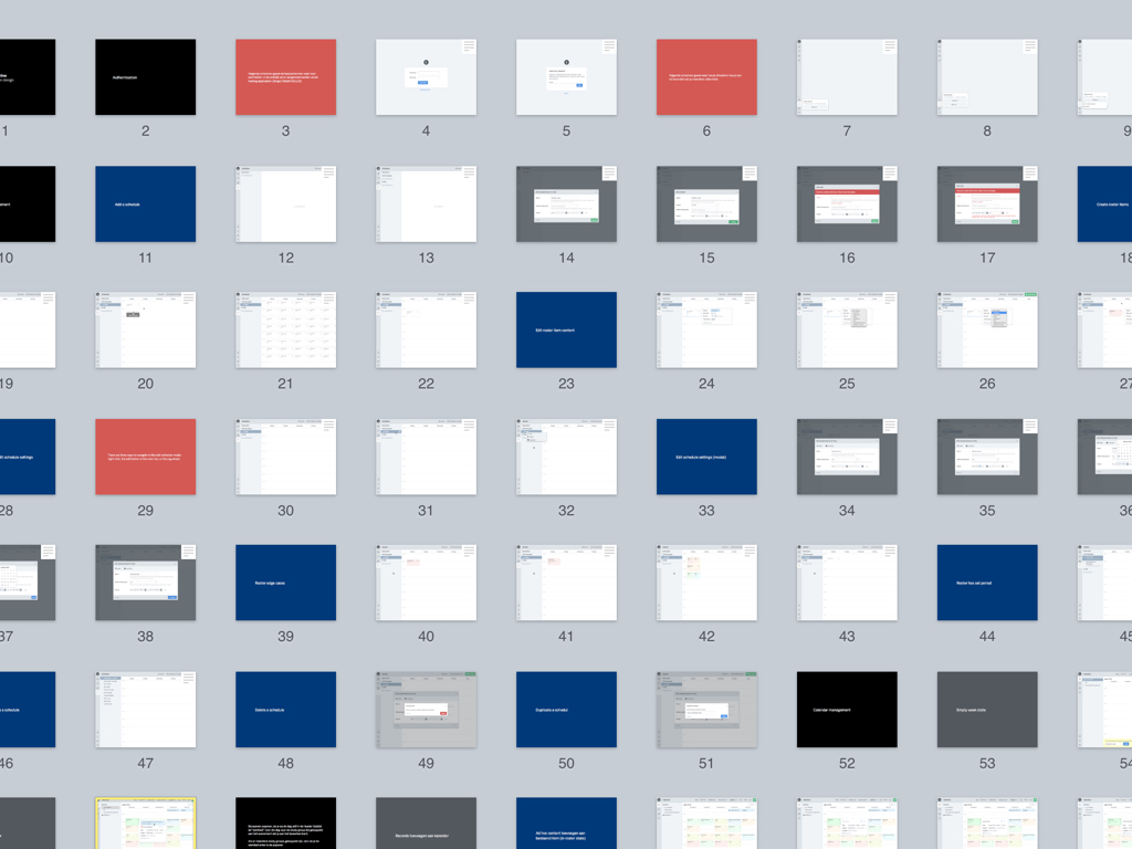
You have to manage all the screens. This is a recent prototype that had 72 screens. When something goes wrong you have to re-wire all of the screens, you look a bit like that guy here.
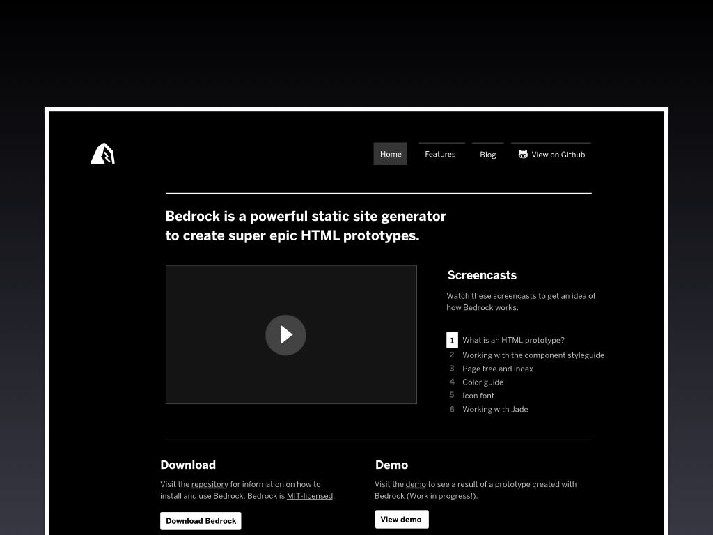
Bedrock
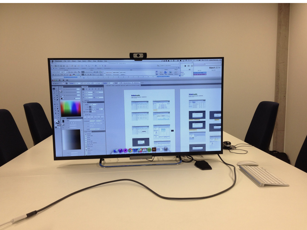
This is a list of all the pages I made in a recent prototype. This prototype had over 80 individual screens. This is a screenshot listing all the screens in a prototype generated with Bedrock, so it's from an HTML prototype. We will get to the HTML part later in this presentation.
Software is getting better
People are always looking for the “Wow” but I think it always comes later... when you see how something works and how it can help you.
My partner Xavier wrote a blog post on this topic called “Sexy UI design”. He argues that interfaces should both be useful and beautiful.
From the moment you first see something, to the moment you have been using it for a while. A design can be sexy and we should embrace that.
The meat of the work for a designer is drawing the user interface. But the biggest job is communicating what you did and why.
Recently I've been going back to a very classic format: the design presentation in which I explain the work I did.
The main goal of a design workshop for me is to present the designs in a meeting, and to find out the missing pieces of information you need to make a great design.
You could theoretically make the best design in the world but if it doesn’t get implemented it’s not worth anything. We regularly plan meetings with the people who develop the software we design to go over the implementation.
It’s not always easy to do this since there’s often a ton of design work to do, but we are striving to do this as best as we can.
I find it helpful to make video recordings of prototypes. Video can easily show people what’s new - you can go through the designs or the prototype software to point out what changed. Recording yourself using the software prototype is also a good way to find the mistakes in it.
What's also a big part of the work in software design is validating your work.
As a company we've started to do more usability tests.
We've toyed with remote usability tests, but most usability tests happen in a real physical location where the designer works together with the participants.
We create a prototype for the usability test participant to use. We've successfully employed HTML prototypes to give people a high fidelity experience that is almost like using the real software before it's actually developed.
What I learned is that you have to be careful when running usability tests: you have to split people's opinions from their needs.
What I learned is that you have to be careful when running usability tests: you have to split people's opinions from their needs.
I don't care about usability test participants' opinions about colors, or typography, or navigation structure. I assume I am the expert in this. But what I care about is to see how they interact with the interface, to see if they get it, to check if they can actually use it.
I don't actually worry about style so much. Most of the things I design have exactly the same style.
A few years ago a client asked me: why do you always design the same button? He noticed that in every design I used a button that had a 4 pixel radius, that was 32 pixels high, and that had a certain font in it.
I said: because that's what I believe is a great button.
I don't really create a lot of custom graphics.
Most icons I use I've used before.

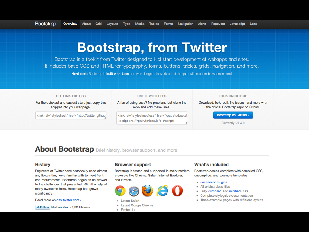
People give Twitter Bootstrap a lot of shit because it makes websites look exactly the same.
But the end goal in interface design is clarity. There is a lot to be said for familiarity.

The best software for OS X uses big parts from the default UI library and deviates where it makes sense.
The software packages I listed at the start e.g. Omnifocus, Transmit, Sketch all apply the right parts of the human interface guidelines, but deviate where it made sense.
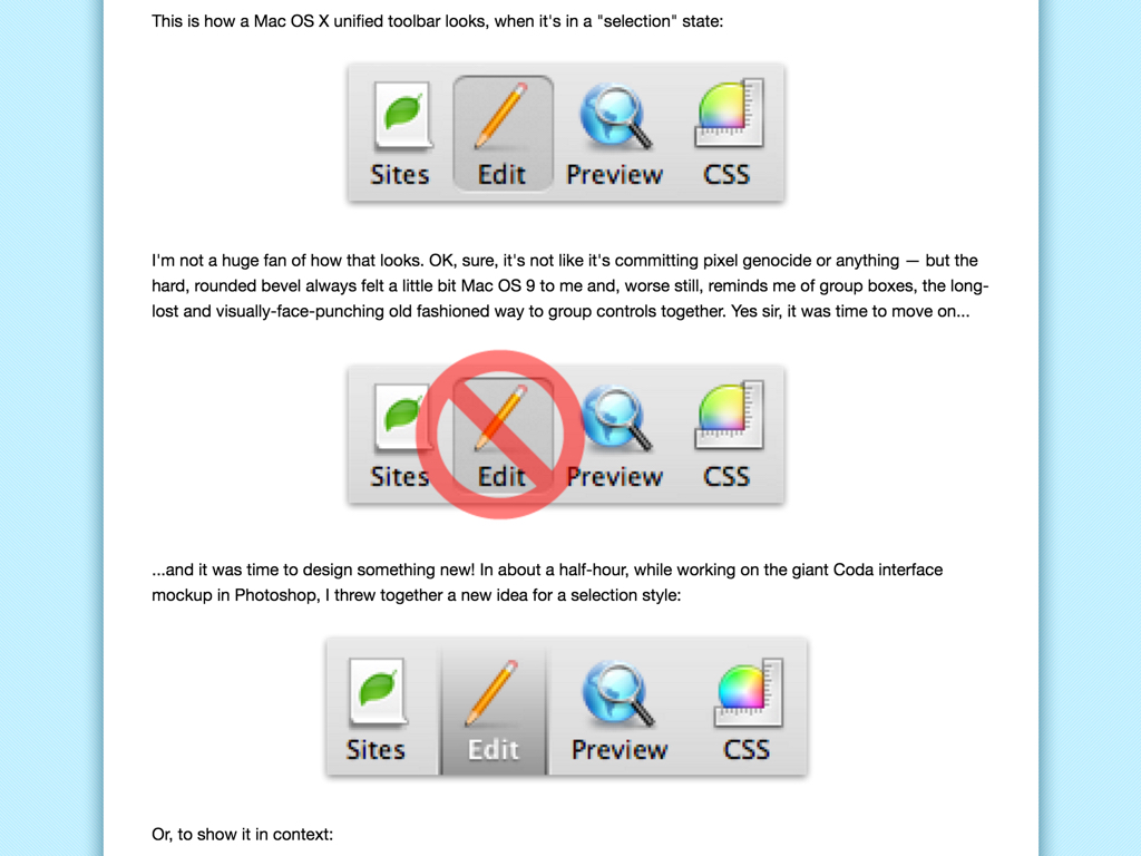
I will never forget the blog post from Panic called “Coda Toolbar and the Three Pixel Conundrum”. It's from 2007, nine years ago by now, and it's still relevant.
Basically what happened is that Panic coded a custom toolbar, but they had this problem: there were 3 pixels that the system didn't allow you to touch.
They submitted this as a bug to Apple - that custom toolbar actually ended up becoming the new default in Mac OS X.
Every interface has been learned at some point.
As an interface designer You have to know what's out there, what has been made historically, and how people are using it.
If you never had an Android phone you are not doing your job.
The traditional term to know that “something can do something” is affordance.
What exactly shows the user how they can use something?
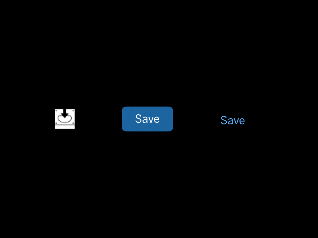
All of these three could be a button:
We used to have these applications where it was very clear what a button was.
At least, we thought so.
The old idea was that a button should look like a button.
In newer interfaces we tend to use color as the only differentiator; sometimes even the location of the interface element.

Look at the new instagram interface where the tab bar isn’t even blue… everything is black but people already know how to navigate the app.
If we assume that every interface is learned, we can hide some of the obviousness of clickability to go for an interface that is visually more peaceful and as a result more pleasing to use.
But, there needs to be a convention, and it has to be consistent.
A good convention for me is: if it's blue, you can interact with it.
Non standard interface design choices are confusing.
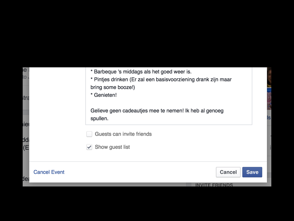
I was recently making a Facebook event... and I noticed these fields at the bottom. They look greyed out, but actually they are just regular checkbox fields.
The non-blue checkbox threw me off guard... and UI design is my profession. If I can't spot these things, who will?
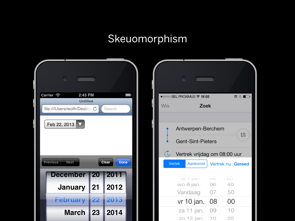
One of the things that made the first version of iOS so powerful is the lack of mystery meat.
Mystery meat is when something is hidden in a menu and you have to hunt for it.
For years we've had interfaces where you have to look in menus whether an option exists or not. But iOS did away with all of that.
There is often a lot of discussion about skeuomorphism, but the real usability win in iOS was that every button had a label, and you could clearly see what it was going to do in 90% of cases.
This was a huge usability win, but it also meant that it was much harder to put a lot of functionality into your app.
Over time, things were introduced.
In iOS if there is a table view that goes to a detail view, there is a good chance you can swipe on a table cell to see if there is a faster way to apply some action to that detail view (e.g. deleting an e-mail).
But, the action is also available from the detail view.
Everyone can use the interface... the person who knows the "trick" will just be faster.
These conventions are iOS specific.
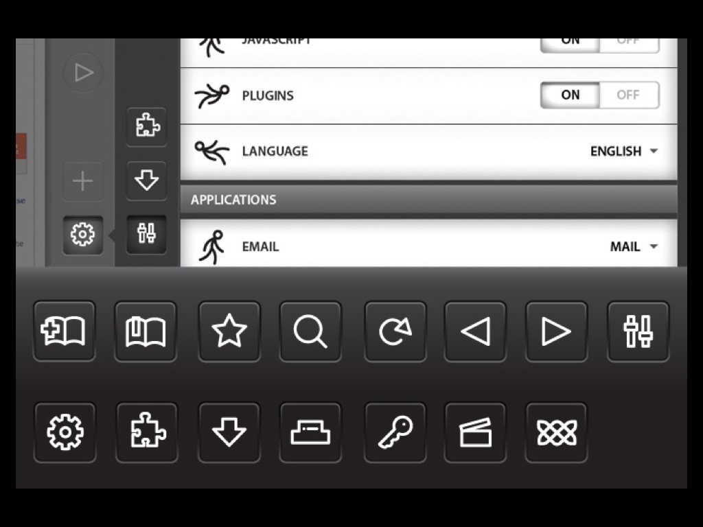
One problem is that there are few conventions on the web.
The good news is that most users don't care whether they are on a site or in an app.
As designers we think of a "Mac OS app" or "a website" having totally different conventions.
I ran a usability test for a web application and people were double clicking things all the time.
People say that you should avoid multi level dropdowns.
People say that there shouldn't be right click on the web.

But as more and more complex software moves to the web, we have to look at our user interface options.
Consider Sunrise. You are basically looking at the equivalent of a full calendar application in the browser.
If you can right click to delete an event, that is the most direct action you could take. But it's not possible.
You have to click three times to delete an event. For me, that's not acceptable.
Why would I ever use web software if native software does things in a faster way? If we want to write software on the web that is better than native software we have to fight with the same weapons.
Within the application I used to make this presentation I found a right click menu on images and once I knew it I used it many times.

There is this article called Apple's Flatland, in which the author argues that as Apple's software is progressively getting easier to use, it also becomes less usable over time.

I hate this comic that is going around:
It's very easy to point to hundreds of Google and Apple-made software parts that are just as complex as the above screenshot.
It is so easy to go down a rabbit hole of complexity. When you are solving complex problems, and you don't fully grasp the problem yet, in my experience you will come up with a complex solution.
When your design solution gives your user complex logic choices, take a step back.
I come up with complex solutions all the time while trying to understand a problem. But then I spot myself having made something complicated I try to take a step back and figure out why I arrived at that solution and how I can make it simpler.
Is there some complexity that we can handle for the user?
The key is hiding and showing the right parts of the user interface at the right time. What you are essentially doing is managing complexity.
There is probably something wrong when your user interface design solution is a direct replica of your backend.
There's probably something wrong when you can't explain your solution in simple words.
Through iteration your interface will become better.
John Gruber is absolutely right when he says that people misunderstand Apple when they say that Apple should come out with another break-through product. What Apple does is iterate over products every year, and make them better in the process.

The logical deduction here is that if you take everything away there is no interface, and that is the best interface.
I don't agree with this.
As a user you need some level of certainty that you are doing the right thing, through the right affordances and the right feedback.
If there is no affordance, how are you supposed to know what to do?
Screens are here to stay, and they need better software. We’re ready to work on this challenge. Are you?
Thank you.
Are there any questions? Thanks for your attention!