So, contrast. It’s one of the most important success criteria for passing WCAG.
It was top of mind in this design project recently where a lot of the branding was orange, and the problem was that white text on orange buttons didn’t pass WCAG 2.1. The project was government-related and for a large audience so I felt like I had an extra responsibility to do things right.
In a design like this the button at the bottom would totally fail accessibility tests:

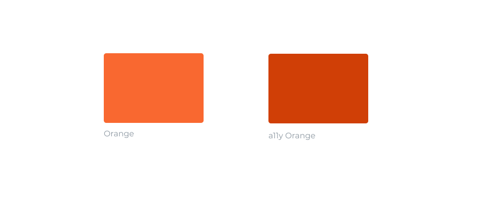
I wanted a simple way to switch the orange in my designs to a darker orange (a11y orange) in order to pass WCAG requirements.
Basically I wanted to write CSS like this… (warning, pseudocode, this does not actually work!)
.button {
    background: #F96830;
}

@media (prefers-high-contrast) {
    .button {
        background: #D03F06;
    }
}
…to get a result like this:

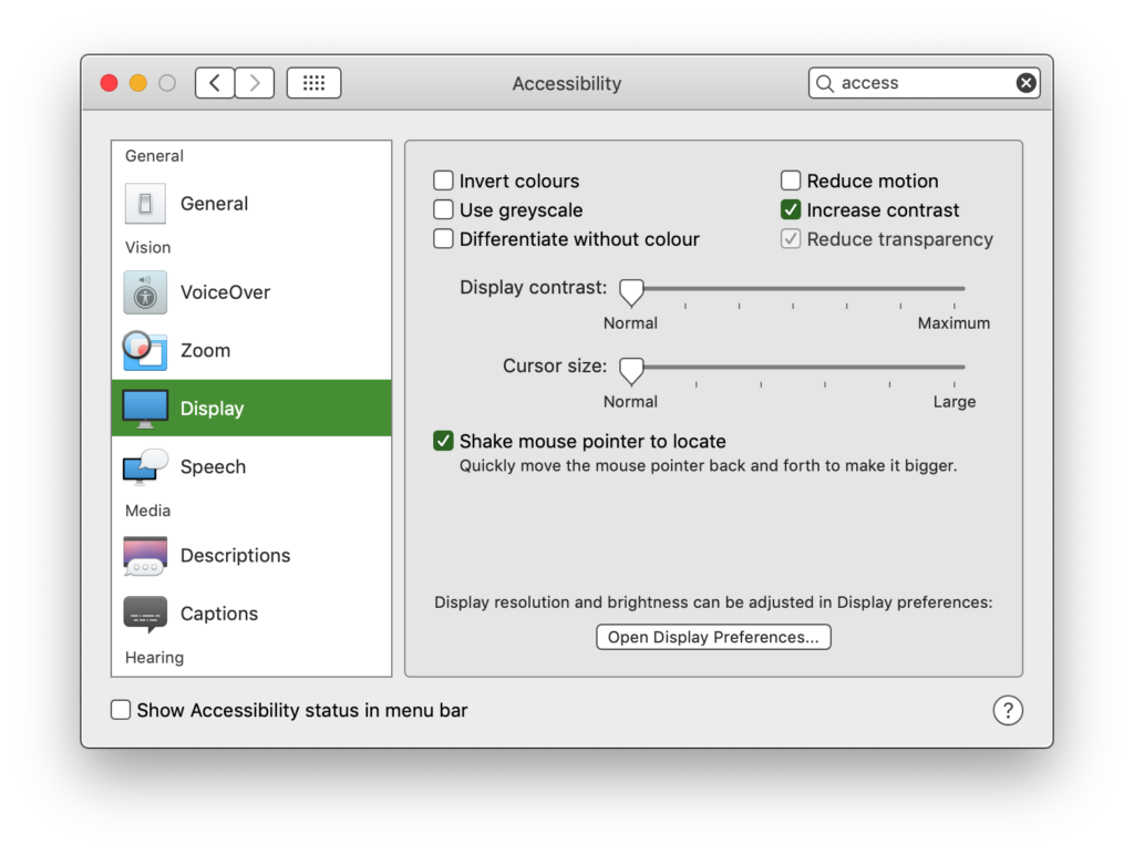
The @media (prefers-high-contrast) would check if high contrast mode is turned on in the user’s OS. For example in macOS, it looks like this:
Currently, there is no standards-based way to detect high contrast mode. There is an old implementation that only works on Windows (and I suppose only in IE) – which ties into the Windows theme settings I believe:
@media (-ms-high-contract: active) {}@media (-ms-high-contract: white-on-black) {}@media (-ms-high-contract: black-on-white) {}
I wished this was available in a standardized way. Now I often have to choose between accessible or ugly.
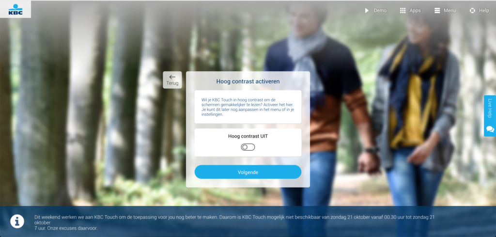
Some applications try to solve the high contrast problem with their own implementation. In KBC Touch (banking app) this is a global on/off switch:
In teamweek there are more fine-grained settings, that also help with other disabilities (e.g. color blindness).
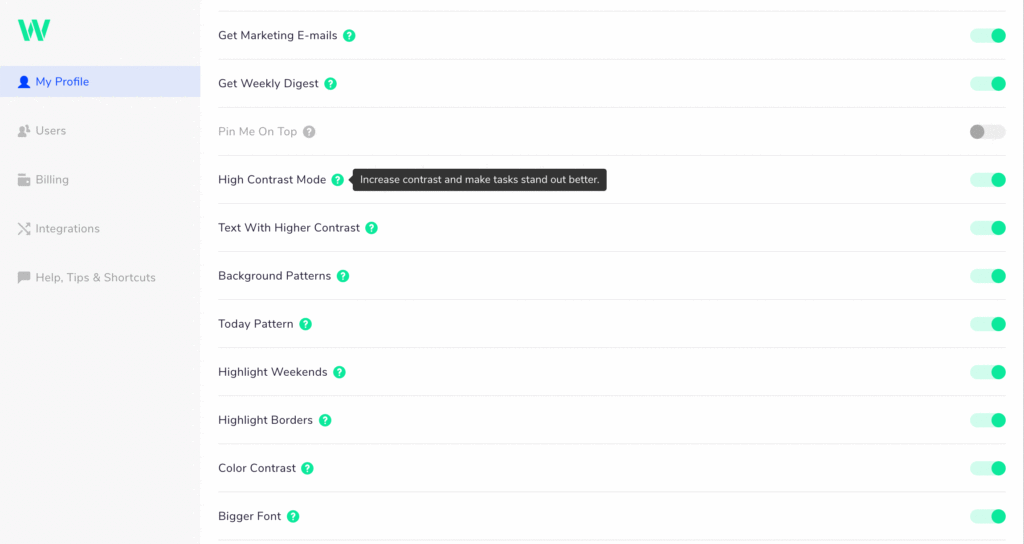
But in my opinion a setting per app is kind of pointless. What’s funny is that in the above Teamweek example the control to check the high contrast doesn’t have high enough contrast itself.
It’s super great that the team of the two above apps thought about accessibility, which makes them already superior to most apps out there. But local settings in apps for teams that think about it and go great lengths to make a custom implementation, that’s not good enough.
We need a standards-based way to tie into an OS system setting; and the persons suffering from low vision need to be educated to put this setting on. It will help them across the board.
I filed some bugs and participated in discussions but I need your help to bring this to the attention of browser vendors.
Here are some links:
- [mediaqueries-5] high-contrast media feature
- Bug 1506364 – Implement the prefers-contrast media-query.
If you have an account on Github and/or Bugzilla please participate in the discussion or voice the need for this from the standpoint of web developers.
You can also share this post, hopefully it can reach the right people that way.