Earlier this week I thought through the contour feature for Screenshot to Layout . This is a future feature, that essentially adds a second layer of output to the plugin, with the goal of visualizing clear shapes in the processed screenshot, so that the designer can use it as a reference point for further work.
Right now I am thinking through how this should work by doing various experiments and prototypes.
I’ve had the comment that my Figma plugin Screenshot to Layout is essentially “image to text”, and that is true for sure at this point in time.
Someone else asked me: is it your goal to convert a whole screenshot to its original design? The answer to that is no. The goal is to provide designers with the ultimate starting point from a screenshot that fits into their workflow.
The output of the Screenshot to Layout plugin should be a starting to point to continue whatever work you have to do. As a designer you will likely have a file with all kinds of attached text and colour styles as well as library components. It doesn’t make sense to try and recreate the actual layout. What makes sense is to provide a starting point that enables you to put the output into your design system faster.
So given that, let’s look at how the contour feature would ideally work. I tweeted this to ask the community what they think:
This screenshot shows a dialog with 4 radio buttons and 3 actual buttons.
Personally, I think what would help me most is to see the contours of shapes that are very clear and isolated to understand a processed screenshot in a better way. In this example I would want to see the text (coming from the existing OCR features), but then from the contour feature the buttons, maybe the radio circles, but not much more.
As an another, if you have a screenshot of a contacts list, you might want to see grey circles in the place of the actual avatars. This way you know you have to replace those with your “avatar” design system component.
With this idea I mind I did some experimentation and wrote a script to recognize shapes in images. Specifically rectangular and circular shapes.
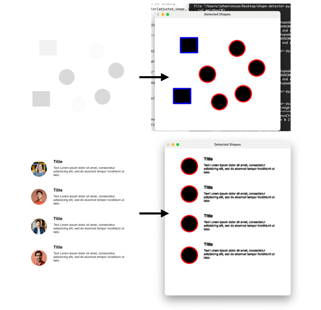
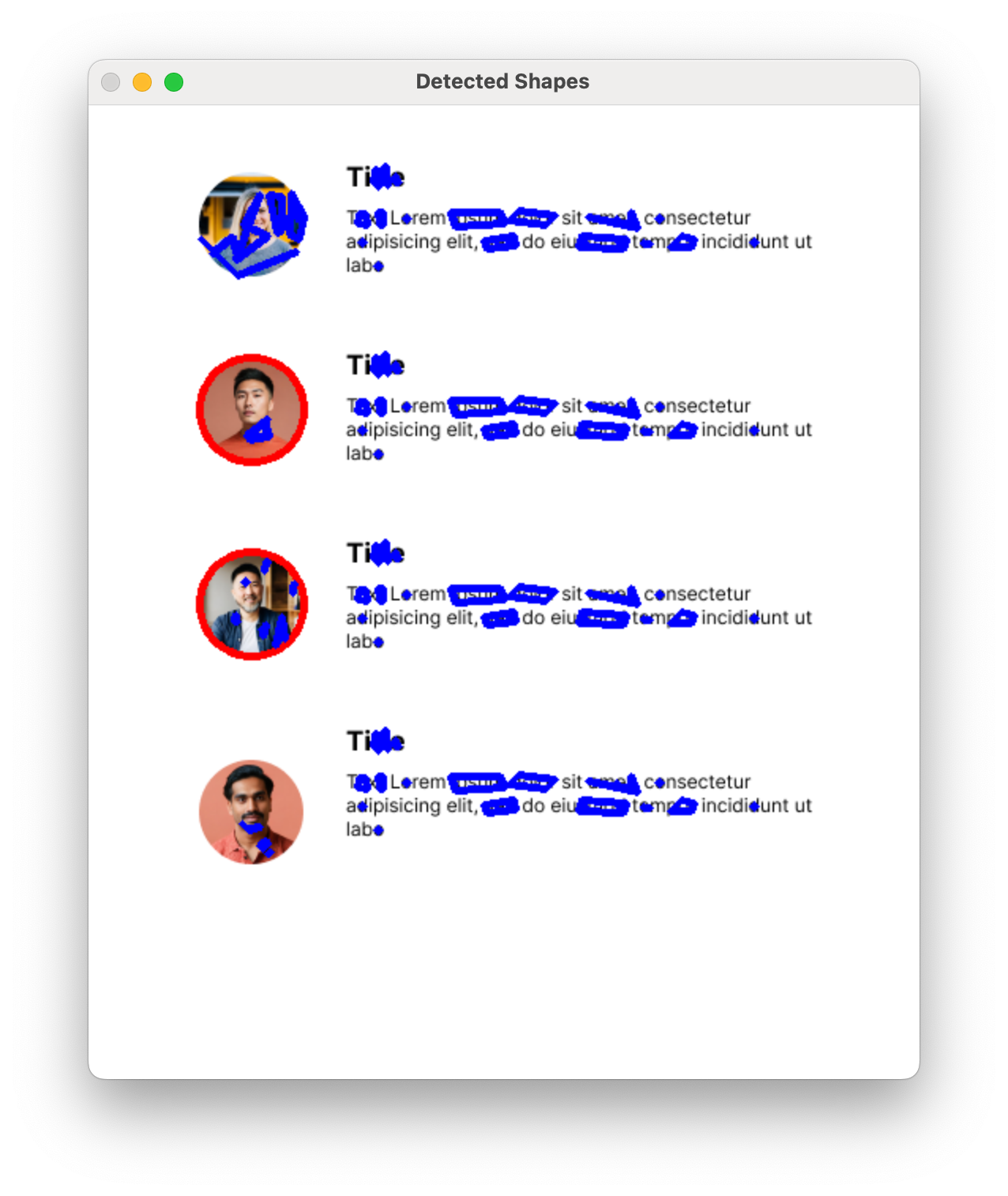
The current problem I have is that this is fairly fickle. You need some exact settings to not detect text (e.g. an “o” is also a circle); in UI design there’s often overlaid elements etc. So you find that it’s easy to get to a lot of unusable output like in the screenshot below (red strokes are circles and blue strokes are “rectangles”)
One can wonder in general how much can the computer “see” and how much has to be determined by the designer? The “seeing” part could potentially be enhanced by a custom machine learning model.
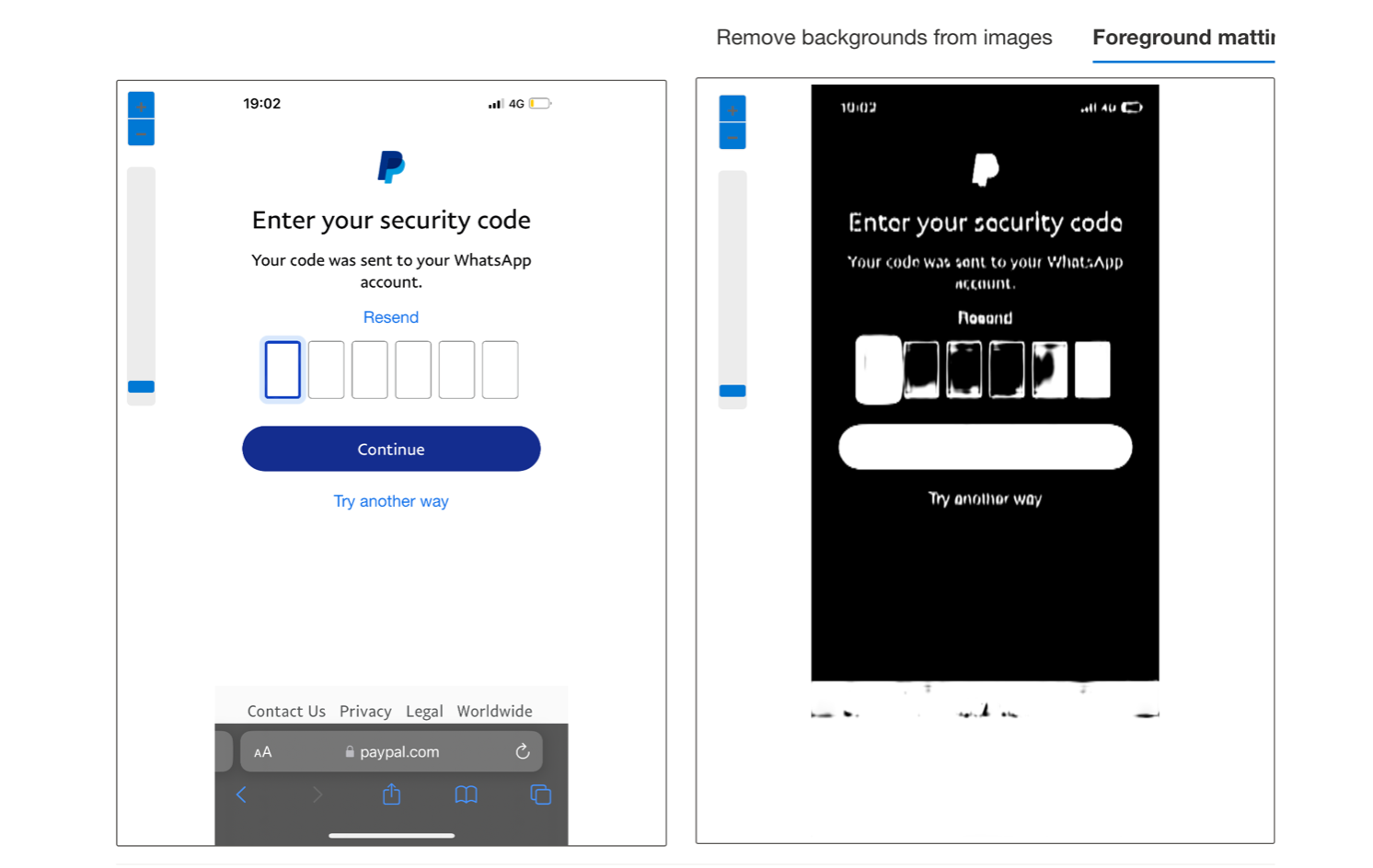
Another experiment I did involved testing Microsoft’s Cognitive Services for the use case of recognising shapes, but I saw fairly quickly that this probably won’t help me.
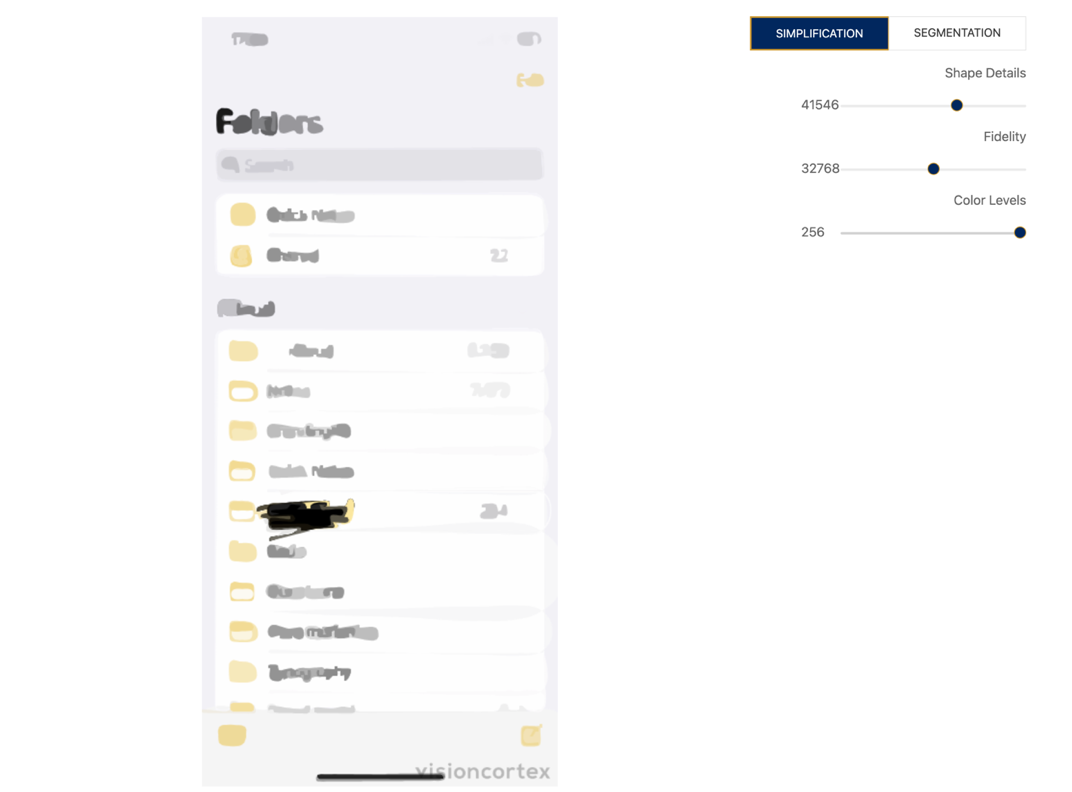
Another thing I looked into was segmentation and simplification. I think there might be something there for parts of the script, but I would have to find out where exactly it would help.
All in all there is still lots of work to determine how to move this feature forward.
I thought I would document these early steps in the evolution of this feature. I’ve always admired game development “devlogs” as well as for example Garret‘s blog posts about the early design decisions in Sifter. If I don’t document it now, I will surely forget.
This is complex computer science topic which is quite new for me. If anyone has their own ideas, or feel they can offer some help, feel free to reach out!