This is a preview of the Obra Icons 2.0 blog post. Obra Icons 2.0 has not actually been released, but I am looking to gather feedback via this blog post about the changes and the proposed API.
I started working on Obra Icons in August 2023 with a first release in november 2023.
Now one year later, the project is stronger than ever with it’s 2.0 release. It grew from 350 icons to over a thousand icons; and the quality of the set has vastly improved.
Just two weeks ago, we released a React package and a Figma plugin, to be able to use the icons in more contexts.
So why 2.0? There was still a missing piece in the drawings, where I found the quality of some filled icons subpar, especially for the different stroke weights. To fix this I revised the drawing technique of the icons in full. The errors are very apparent in this example from 1.0. Notice that when changing the weight, the outside shape would not change along:
This was a fundamental problem caused by the way they icons were drawn. In the new version, the icon variants looks like this:
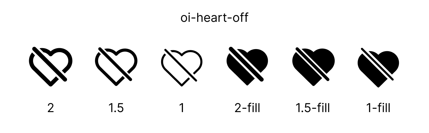
When I started Obra Icons, I was looking for a way to be efficient in icon creation and to have variants of icons generated from the same source. The idea was to generate the three stroke variants (2px, 1.5px, 1px) from the thickest variant (2px).
However, for filled icons, to get to the desired equivalent of a stroke icon (one that looks good when hovering over it), you often need to do a few operations:
- find any enclosed shape
- fill the equivalent stroke shape, but with a stroke on the outside
- flatten that shape
- apply boolean operations (often subtract) for whatever is inside these enclosed shapes (often a + icon, an arrow, something small)
The result of these boolean operations on the top level of the boolean operation is a filled layer, where it’s not possible anymore to adjust the thickness. You can keep the source in Figma for easy adjusting, but when exporting boolean groups, you will always end up with a fill-based path anyway.
The source of Obra Icons 1.0 was a flat list of icons where an icon might or might not have a filled version. You would have a frame called oi-umbrella and another one called oi-umbrella-fill.
In the source of Obra Icons 2.0, every icon has a top level frame, for example oi-umbrella, with 6 child frames: 2-stroke, 1.5-stroke, 1-stroke, 2-fill, 1.5-fill, and 1 fill.
Through a combination of plugins, scripts and a ton of manual work, I converted all 1000+ Obra icons to this new format.
The new format leads to a much higher quality level.
On the website you will see that there is a switch between “stroke” and ”fill”. The stroke icons contain the original lines, and can also easily be changed to other stroke widths — like 0.75 or 1.25 — by changing stroke-width in CSS. The filled icons contain a flattened version of the vectors and are restricted to the three base sizes. Changing strokes will have no effect since everything contained in those icons are fills.
For the website imports, every existing import will still work without changing anything.
import { IconAdd } from 'obra-icons-react'When you change the icon through the props, you will be served a different source:
<IconAdd weight={2} type="fill" />The strokeWeight prop was changed to an overall weight prop (defaults to 1.5). A type property was added. It defaults to stroke, but you can set it to fill.
The size and color attributes stay the same (where color accepts any CSS color):
<IconAdd weight={2} size={64} color={red} />If you would look at the source of every Svelte or React components, you will see that it actually contains multiple sources to allow for the flexibility of changing the weights and having it look correct. You will see that these give an error when trying to use combinations the set was not designed for.
Make sure you use a bundler that removes unused code paths (which should be any bundler nowadays). This logic provides the best developer experience: you can tweak the style of an icon easily, and never have to rearrange your imports.
Migrating existing projects
To migrate existing projects, install the relevant obra-icons package with a new major version number:
npm update obra-iconsTo migrate existing projects, you would change every strokeWidth prop to a weight prop. Every import of an icon that is a filled icon, for example IconAddRoundrectFill, you would take of the Fill part and add a type="fill" as a prop.
All in all, I am happy with this quality improvement, and to take Obra Icons to the next quality level. Onwards!