On Twitter I’ve seen people complain about the new information systems from the Belgium railways, so I decided to take a closer look.
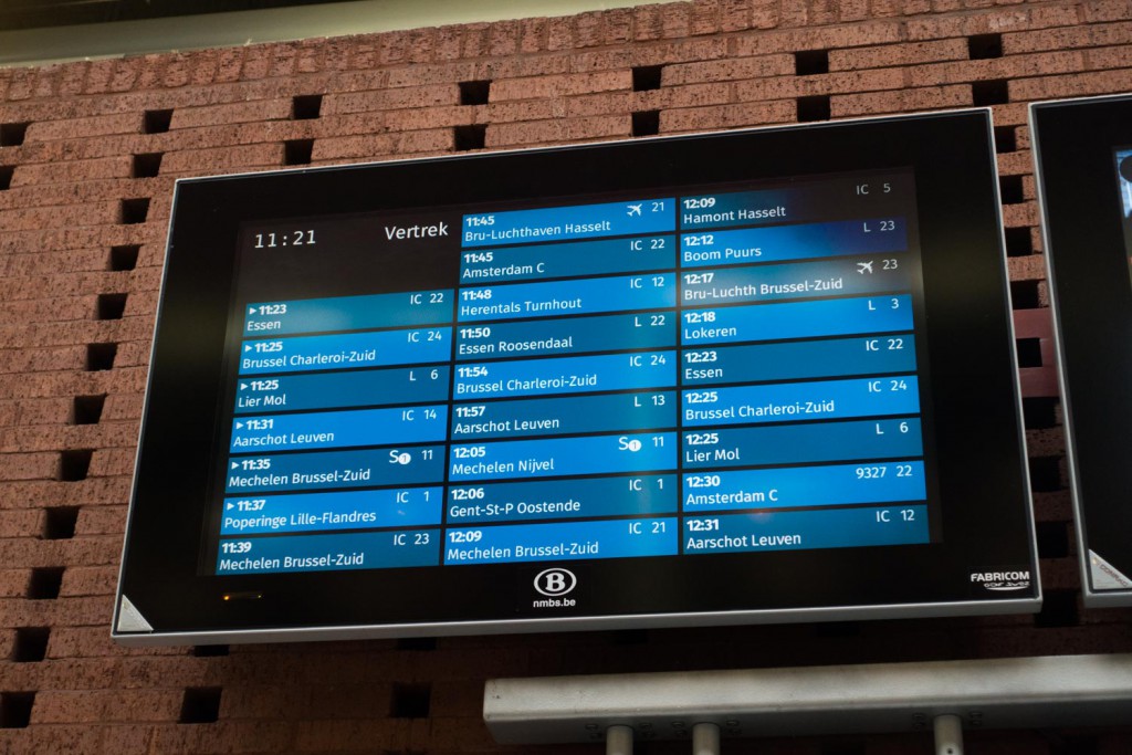
This is what the new signage looks like:

I think there are 2 main issues with the design:
- the “hours” are not so scannable because they are not aligned
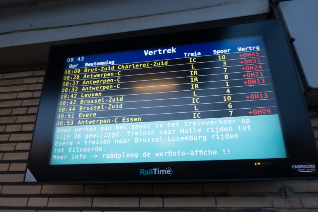
- there is not enough contrast. The old panels had yellow on black which provides high contrast. These new panels have either white on mid blue or white on gray. The problem with a display is that you don’t always see it in optimal conditions.
Here is what it used to look like: (sorry, I only had a picture with massive delays :)):

This is the “big” panel which does have the hours in one column:

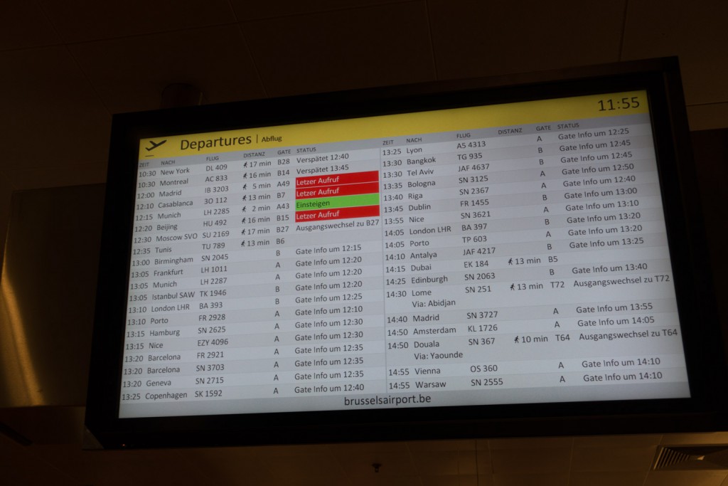
And just for fun, similar signage at the airport:
