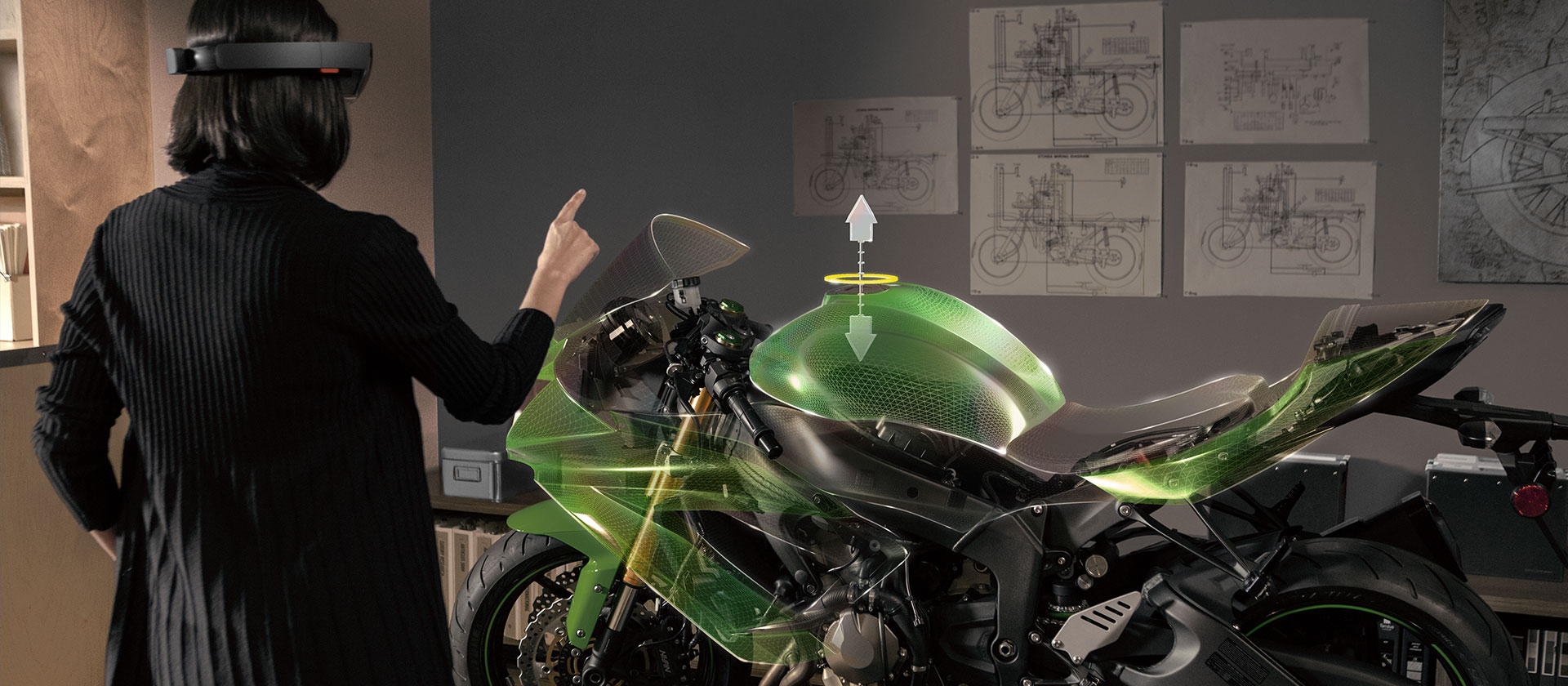
Windows 10 came out a few weeks ago. Microsoft is touting a theme of “One Windows”, which basically means that when you create an app it is able to run across many devices, from smartphones to tablet to crazy upcoming augmented reality devices like the Hololens.
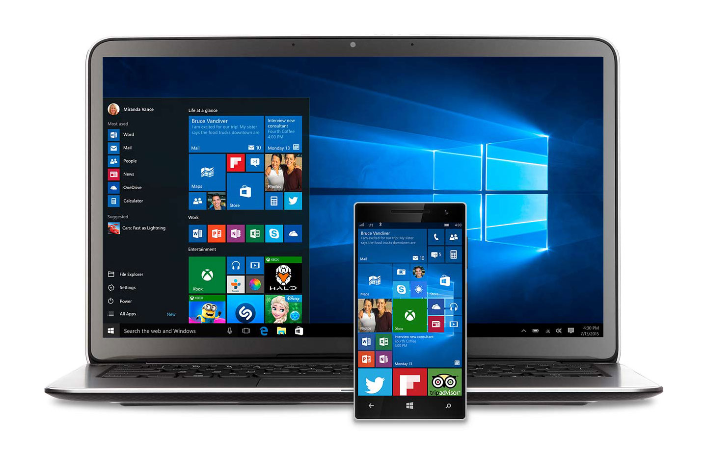
Your app will be a “universal binary”, meaning that the same codebase is used to run the app on different devices. Compare this to the past, where you might have an separate desktop app and a separate mobile app. In the UWP (Universal Windows Platform) context, this application is the same.
Because we are talking about applications for a broad of range of devices and input methods, design becomes a hard topic to discuss. Just like responsive design made web design a much more complicated topic, this UWP thing makes talking about Windows pretty complex.
On the other hand — once you understand it — you might be ready for a future where your app can run across many devices and be the best experience it can be in many contexts. Whether Microsoft’s strategy will pan out here is to be seen; but it’s surely interesting.
To understand the vision here, I think it’s important to have seen the Continuum demo in which a phone is used to power Excel on a second screen, completely independent from another computer.
For me, after many years of shrugging my shoulders at Windows related news, Microsoft is cool again. It’s exciting to design for a platform that’s about to take off. Windows enthusiast site Windows Central reports record adoption numbers compared to Windows 8.
In this article I am going to attempt to explain how to start designing UWP apps. I will do so by explaining you how Windows 10 has an evolving design language, guiding you towards some resources and basically getting you on your way to learn more.
This is by no means a comprehensive guide to designing for Windows 10. If you really want to know all about the topic, the best way is to go to MSDN and get reading. While this article will surely have an expiry date, MSDN will keep on evolving. At the end of this article there is a list of resources used to compile this article.
An evolving design language
Before I continue, I want to give a little backstory on why I wrote this article.
I am a user interface designer that mostly designs applications that help with business processes. This can be anything from software used in a hospital, to a touchscreen interface for a big industrial machine.
I was designing an application that had to have the Windows 10 visual style. I had some background knowledge about designing Windows 8 applications, so I felt I had a bit of a head start when researching the design.
However, I couldn’t wrap my head around how to design for Windows 10.
At the time, I was participating in the Windows Insider programme to get some insight into Windows 10. This is a programme you can sign up for that will automatically update Windows 10 to a pre-release version. It’s a bit like Webkit Nightlies: you are seeing a version of the software before it’s actually released.
This Windows Insider programme has been a staple of the Windows 10 strategy, where Microsoft is really committed to listening to its users. There is a dedicated feedback app to send feedback over where people can vote on the most pressing issues.
From a design standpoint looking at these Insider builds was wholly confusing. Things would change visually and a few weeks later they would change again. Some apps looked unfinished at best.
A source at Microsoft US said they usually do the user interface last and looking at things from a UI designer standpoint, that seemed pretty obvious in retrospect.
In July, when I opened the release version, things looked a lot better. There were still some rough edges but things seem to be improving every week. In order to finish up this article I am updating my Windows virtual machine again to see what changed. That’s how you should think about Windows: ever-changing.
Updates will be pushed and things will evolve. In a way how Windows 10 works is a lot like how most web browsers work these days, where updates are pushed automatically to give you the latest version. Obviously Microsoft wants to prevent some of the legacy situations that they’ve had to deal with in the past here, like lingering old versions of Internet Explorer.
Now, where does that leave you when it comes to design guidance? Because of the evolving nature of the platform, this also means that the design documents concerning Windows 10 are ever-evolving. As a consequence, it’s harder to give clear and direct advice.
A return to the familiar on the desktop
Before we dive into the design guidance (it’s coming, I promise) it’s important to understand how Windows 10 is used on the desktop and how that relates to earlier versions of Windows.
In short, Windows 8 was (and still is) really confusing. Remember when you first taught someone how how to use the start menu? And then they upgraded to Windows 8 machine and everything was different again?
That might not have been your experience but it’s certainly mine. A few weeks ago my mother couldn’t Skype me because “everything has been displaced”. She said: “I don’t understand how to launch Skype anymore”. I knew she got a new computer and I knew why she couldn’t find her stuff: the new machine was running Windows 8.
Windows 8 was quite radical in its interaction design. Applications had to work full screen. They had to be adapted to a very specific design system that included a lot of new concepts like charms, pivots and hubs. Furthermore, to use it efficiently you had to learn about very specific movements like swiping in from the side to open specific menus.
One of the main concerns of Windows 8 was that it felt like it was made for a tablet context only. It might as well have been a good interaction design for tablets, but the duality between the “Metro” context and the desktop context didn’t land well with users.
(By the “Metro” context, later renamed to Windows Modern, we are referring to the full screen start menu with live tiles, as well as full screen Windows Store apps here. See – it’s even hard to explain Windows 8.)
Most people don’t spend nearly as much time on their computers as the target audience for this article, and don’t want to be bothered to learn new interaction patterns.
Windows 10 does away with all of that, and returns to a much easier interaction design. Click the start menu to launch apps; click the control center to manage things about your computer; resize your windows like you’ve always been able to pre-Windows 8. Done.
There are more advanced features like multiple desktops and something that looks like Mission Control on the Mac, but these features are layered on top of the basic system. You don’t need them to use Windows 10.
A lot of guidance vs. a little guidance
Now, when Windows 8 came out Microsoft gave designers a lot of design guidelines to make their applications work in this unfamiliar context.
On the MSDN site you can find a huge PDF with over 300 pages about designing for Windows 8. Around the Windows 8 release Microsoft organised tons of design sessions and hackathons style events to educate people on how to design for Windows 8.
Unfortunately the design patterns that Microsoft provided didn’t really combine well with the applications that companies already had. Few companies invested into redesigning their applications for Windows 8.
I believe this was because of a combination of a slow user adoption rate and the radicality of the Windows 8 interaction design.
To give you some numbers, the amount of Windows users who upgraded to Windows 8 stayed as low as 12% of the global operating system market share. Over 50% of the global marketshare is held by people using Windows 7. But in just a little over one month, almost 5% of the global marketshare has been taken up by Windows 10.
Now with Windows 10, the strategy of giving a lot of guidance has been turned around and changed completely. Microsoft is giving a different message now. They are saying: “Look, here are some building blocks. This is the new UWP context. Now go do what is best for your app.”
UWP (Universal Windows Platform) and responsive design
UWP has been mentioned a few times so far, but I feel it’s worth explaining it a bit more.
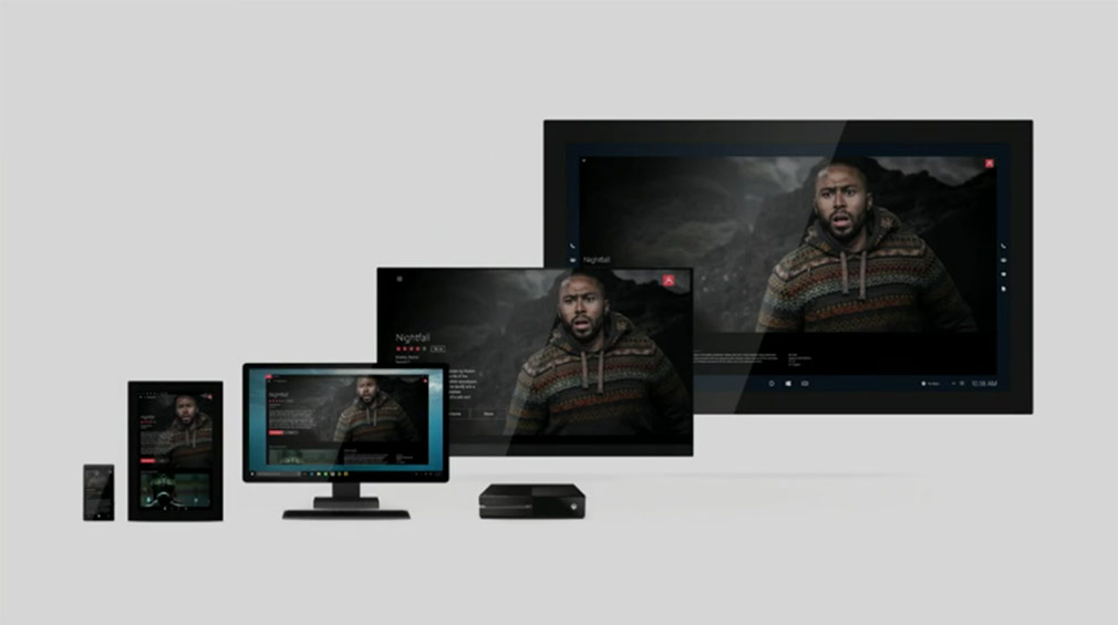
What the “UWP” idea comes down to is that your application – a single application – can work in various contexts from the same codebase. These various contexts are Microsoft’s different platforms: Windows 10, Windows Phone and Xbox One.
This also include upcoming platforms like HoloLens, Microsoft Band and the Surface Hub.
The easiest way to think about this from a design standpoint is as responsive design for applications.
When the screen size changes, the application layout changes to make the content fit the screen. There are various strategies on handling this responsiveness, from the traditional “reflow” (fitting the content to 1 column) to the more hardcore “re-architect” where you change the interaction design. Strategies for this are outlined within this article.
The screen size is just one consideration to make a design change to an application. There are many other considerations, such as the input type (think touch vs. mouse) and connectivity. Being native apps there is the advantage of asking the system for things like internet speeds. Windows 10 even contains an API to detect the prevalent input type.
In the Build session “Design: UX Patterns and Responsive Techniques for Universal Windows Apps“, Windows 10 designers Carmen Zlateff and Jeff Arnold detail how this works. This 1-hour session is a must see for everyone designing Windows UWP applications.
Common controls and navigation patterns
Microsoft provides a lot of building blocks for designers and developers to get started with their Windows applications.
These building blocks are called the common controls. They are UI elements like radio buttons, checkboxes, and context menus.
Most of these controls have a long history dating all the way back to Windows 3.1 or even the original Windows. However, they’ve all been completely rewritten for Windows 10.
There are also some new controls. For example, the split view resembles the “hamburger menu” you might know from responsive websites. Another new one is the date picker provides developers with a system-provided way to pick dates.
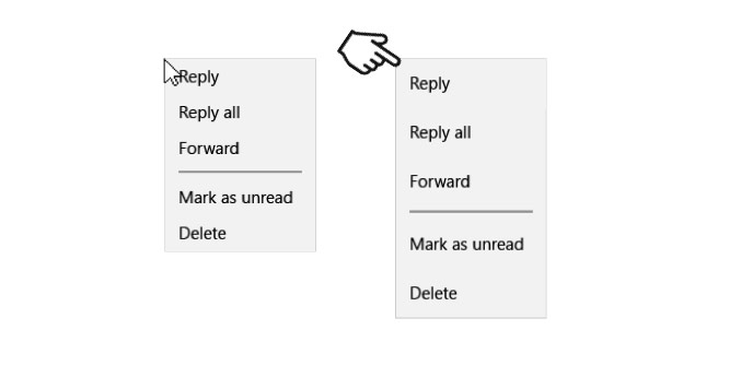 The context menu in Windows 10. In a mouse context (left) is is smaller than in a touch context (right). Windows 10 automatically detects the primary input method and adjusts the context menus accordingly.
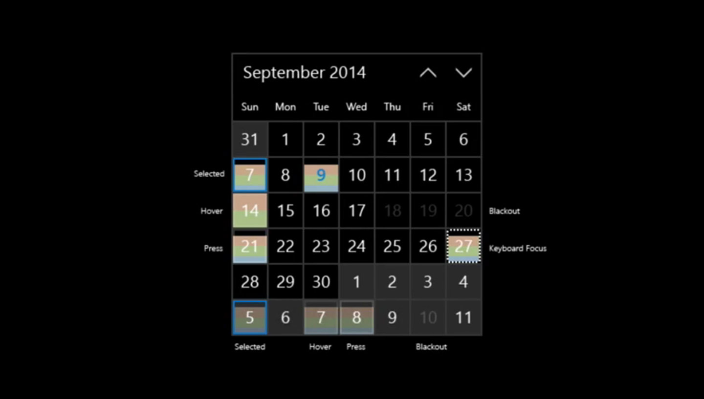
The month calendar (date picker) is a new control in Windows 10.
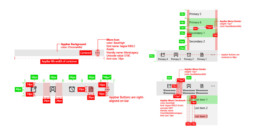
A command bar in Windows 10. A command bar can be placed anywhere and has an overflow (•••) menu that shows the items that can’t fit in the bar. Icons labels are hidden by default, when the overflow menu is clicked, they are shown.
These controls are very important when designing an application. Sticking to the defaults they might save you a lot of time and also provide good defaults in underappreciated areas of application design and development like accessibility.
There are a ton of resources concerning these controls.
For a complete listing of the common controls, please refer here.
A full list of UX guidelines for the common controls and patterns can be found here.
Microsoft provides a few design templates for download that show how the controls look. They provide them in Illustrator and Powerpoint format. You can download these here.
Navigation patterns
How do you lay out the navigation in your app?
It all depends on what you are doing. There is no defintive answer. Microsoft is not pushing specific navigation patterns, and leaves it to developers to find out what is best for their app.
In this MSDN article, the navigation basics are laid out. One important part consideration to note here is how your app works together with the system-level back button.
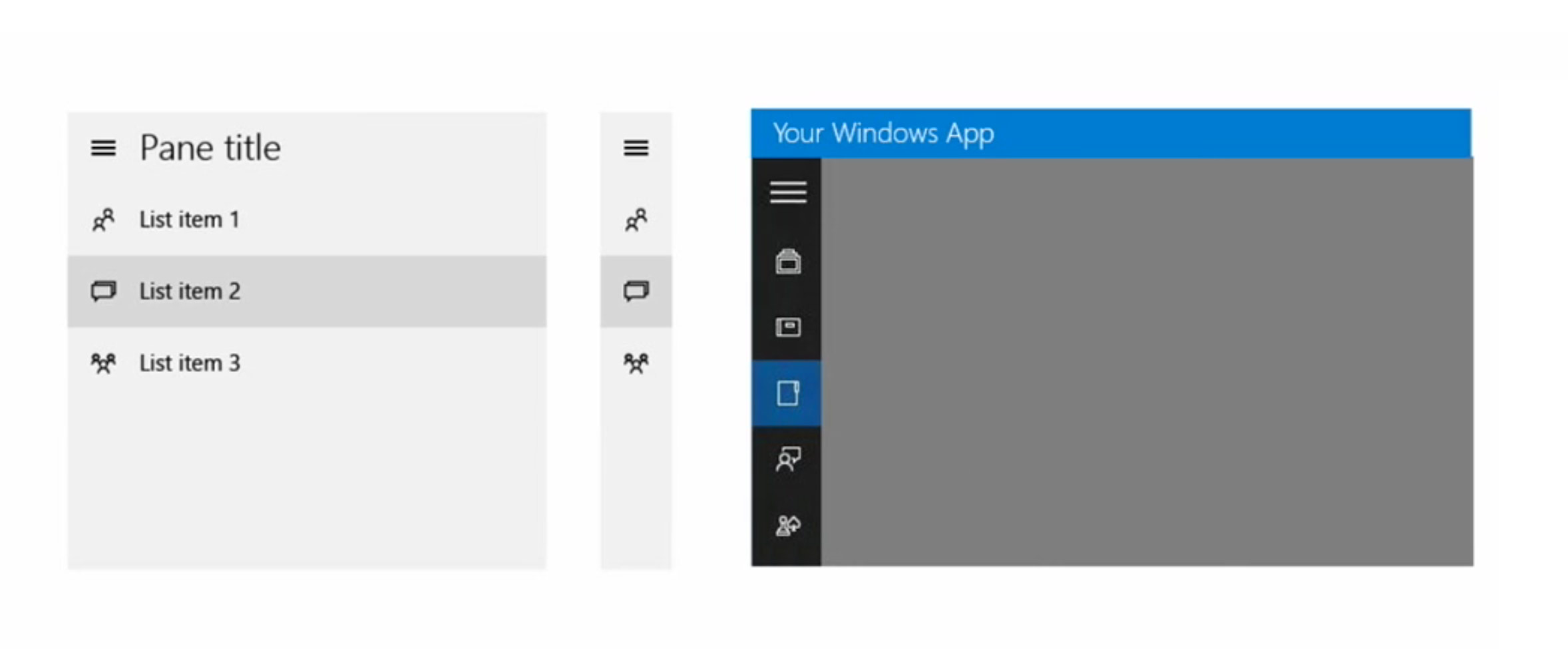
The split view is a new control used for navigation in Windows 10. It’s a bit like a hamburger menu that can be collapsed to an icon-only view.
To get to know a bit more about navigation, it’s helpful to watch the talk called “Designing and Developing the Ultimate Windows App Experience“. In this talk Microsoft’s Lynette Reed and Rob Cameron dissect the design of a media application.
The focus in this talk is on the “hub” navigation pattern. This is a navigation pattern that is mostly helpful for very visual applications.
The example they provide is called the Universal Windows Media Sample and it is an example of a simple media application that scales across the different devices.
Microsoft provides a lot of samples on Github for developers to test. From a designer standpoint, it is also helpful to explore how these work.
App Icons (live tiles)
As we noted before, the start menu makes its return in Windows 10. In Windows 10, the start menu combines the live tiles from Windows 8 with the start menu from earlier versions of Windows.
Users can “pin” their favorite apps to the start menu and can choose how big they want to make the tiles. A user can have a few big app icons or an intricate layout of app icons; it’s all customizable and dependant on the user.
These app icons can be “live”, meaning they can contain extra data, for example a calendar application live tile could contain your next appointment.
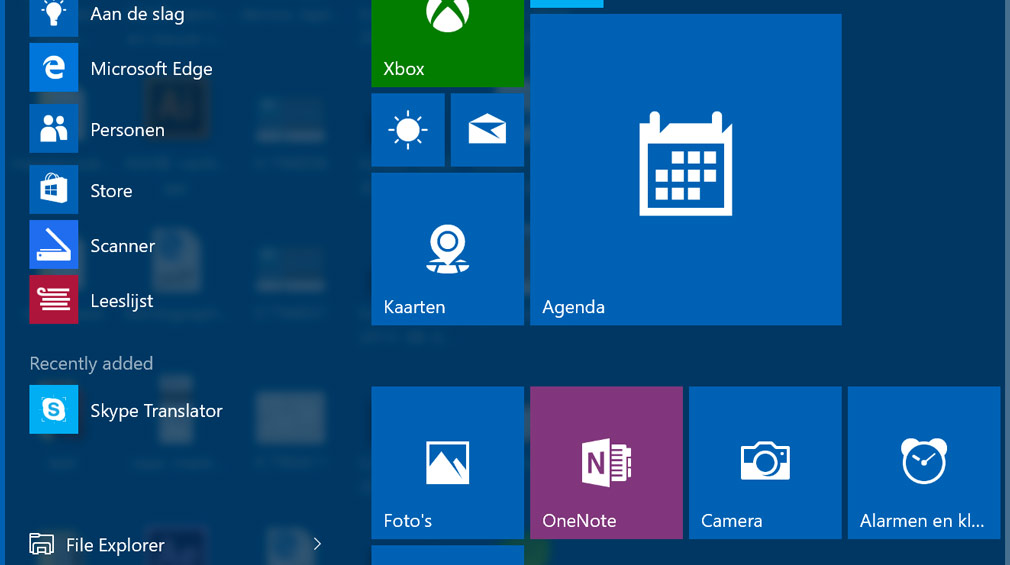 The Windows 10 start menu with a few live tiles. The calendar is a large size, OneNote for example is the medium size and the sun icon (weather) shows the small size.
Most utility apps typically have a simple icon and a flat background. But games and branded applications can have very visual app icons.
You are free to design your app icon the way you want, but take note that if you go for the simple style, you don’t need to include your app name in the visual asset. It can be added programatically.
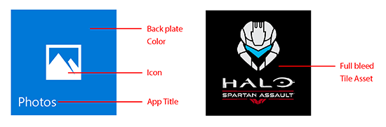 Left: the simple style mostly used for utility applications. Right: the branded style.
See this MSDN article for further guidelines and a table of sizes.
Adaptive live tiles
There is also something new called adaptive live tiles. Basically this allows you to have more you flexibility on which content is displayed on the Live Tile. In a way these adapative live tiles remind me of Android Widgets.
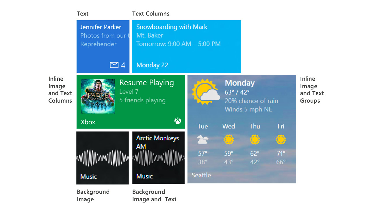 Adapative live tiles allow for more flexible content. The weather tile is the best example: it displays a lot of information that was nearly impossible to do before in Windows 8.
Refer to this talk for more information.
Effective pixels and dynamic sizing
Universal Windows Platform apps work across a variety of different screens. Those screens have different pixel densities. Furthermore, they are used in different ways. A TV is usually pretty far and a smartphone is pretty close.
To alleviate the problem of designing an interface that works across all of these contexts it’s important to know about the concept of “effective pixels”.
 Pixels are perceived in a different way depending on the distance between you and your device.
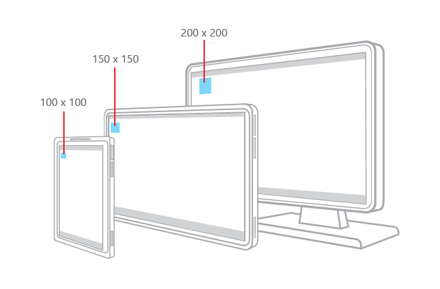
Microsoft recommends that when you are designing, you should design at 72dpi, working on a 4px grid. This way, Microsoft’s scaling algorithm can take over to apply the appropriate scaling depending on the device’s size class:
Effective pixels enable you to focus on the actual perceived size of a UI element without having to worry about the pixel density or viewing distance of different devices. For example, when you design a 1” by 1” element, that element will appear to be approximately 1” on all devices. On a very large screen with a high pixel density, the element might be 200 by 200 physical pixels, while on a smaller device like a phone, it might be 100 by 100 physical pixels.
The aformentioned grid logic is detailed within the article on responsive design. If you wish to know more, Steve Wright of Microsoft provides a very detailed explanation in this video from Build 2015.
Icons in Windows 10 applications
Microsoft provides an icon font called “Segoe MDL2 Assets”, which contains a set of glyphs you can use for the icons in your application. Notably, one of these glyphs is a hamburger one.
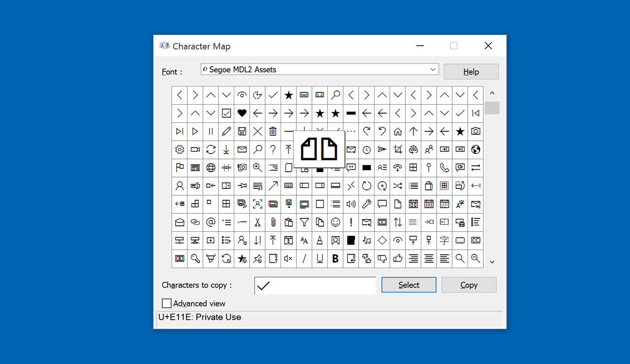 The Segoe MDL2 Assets icon font displayed in the Character Map application.
Most icons in Windows 10 are flat, single color icons with 2 pixel strokes. This is the most common UI style for icons. While some of the assets look similar to Windows 8 assets, the whole icon set has been refreshed.
For reference, the icon older font was called Segoe UI Symbols. This one shouldn’t be used anymore.
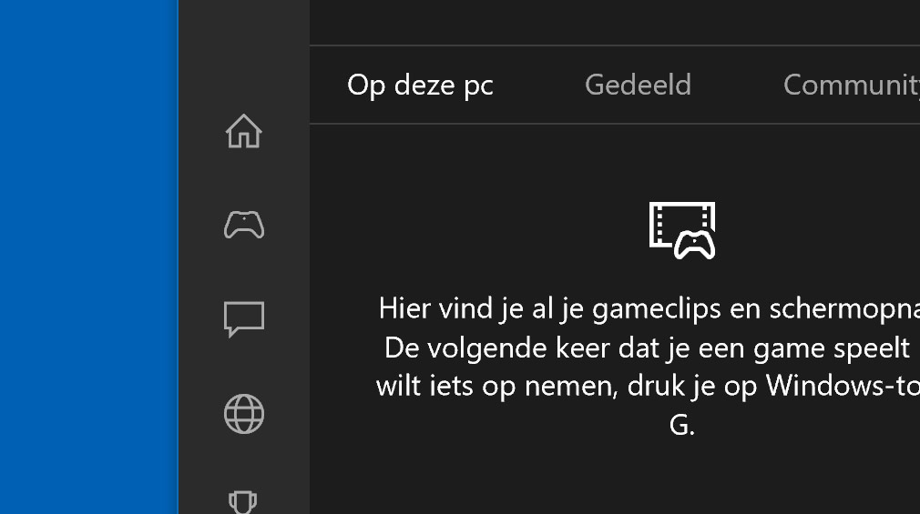 The Xbox application showing the icons in action.
When you look around the OS, you’ll see that not every application chooses to use the icon style proposed by the Segoe MDL2 assets font. Some productivity apps — most notably Office — choose to go for icons that are a bit more colored.
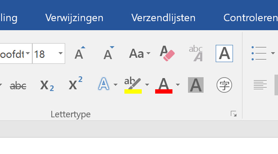 Colored icons in Microsoft Office 2016.
Typically this choice is made because offering a bit of color is helpful in the icon’s context. So once again, it’s up to you to decide what’s best for your application.
For more information about the Segoe icon font, please refer to this article.
Typography
Windows 10 uses the Segoe UI font family for the user interface. This is the same font that has been used in Windows for quite some time.
This is a font family that comes in a few different weights: there’s light, semilight, semibold, bold and black.
Windows users have in on their machines and can find it in C:/Windows/Fonts. It’s not available to download freely, so Mac designers will have to be a little creative here. One strategy is joining the Insider programme and running Windows using virtualization software. Another thing to note is that Segoe comes with Office for Mac.
There is a recommended “type ramp” which shows the sizes Microsoft recommends for titles:
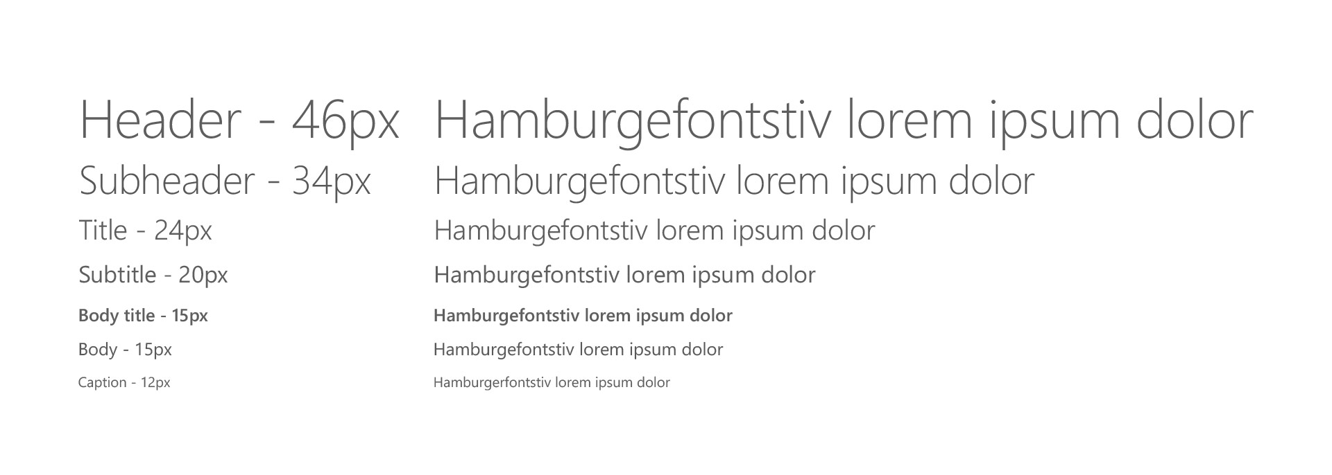
Keep in mind that this is a recommendation, you don’t have to use it. You are free to choose your own font sizes. App designers are also encouraged to use their own brand typefaces. It’s the same as with the icons really: either you depend on Microsoft’s resources which you can use freely, or you do your own thing.
Conclusion
To design for Windows, you need to know about a lot of concepts. There’s effective pixels, responsive design for apps, live tiles, the set of common Windows controls, iconography and typography.
Given the evolving design language, it doesn’t stop there, and you need to stay up to date. Keep an eye of the official design resources on MSDN, but also unofficial sources like WinBeta.
I hope this article helps you on your way. If you have any questions, send me a message on Twitter: [left out for Smashing magazine].
Thanks & Credits
This article was written independently from Microsoft, but sources at Microsoft were consulted to verify certain recommendations.
Thanks to Stijn Michiels at Microsoft Belgium for reading an early version of this article, and Dave Crawford at Microsoft US for correcting some mistakes.
Resources list
Video content from Microsoft Build:
- Design: UX Patterns and Responsive Techniques for Universal Windows Apps
- Designing and Developing the Ultimate Windows App Experience
- Display Scaling: What It Is and What You Need to Know About it to Have Great Visuals
Details about the implementation of UI controls
Articles from MSDN
- Guide to Universal Windows Platform (UWP) apps
- Guidelines for command bars
- Responsive design 101 for Universal Windows Platform (UWP) apps
- UWP apps – Controls and patterns
- Live tiles guidelines
Other: