I made a side project, showing off my favorite things released in 2017.
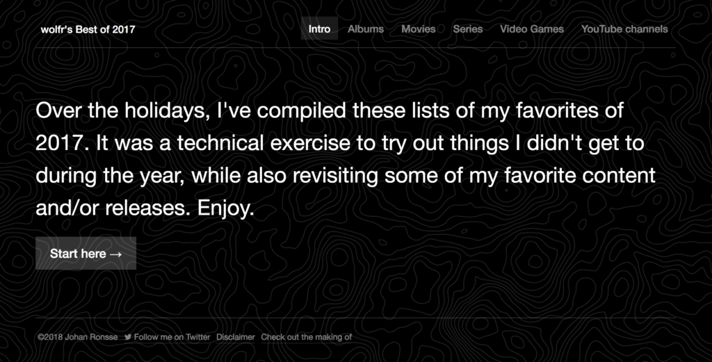
If you don’t care about the details and/or technicalities and just want to see the result, check out the project here.
Intro
I love end of year lists. It’s always nice to have a backlog of great movies to watch or albums that you should really check out.
And every year around this time, I suddenly find myself with some free time. I want to take a break and stop working on commercial work, but on the other hand I can’t help to want to catch up with what I wanted to learn this year.
A small side project seemed like the ideal way I could learn something new.
I worked on this project on and off during the Christmas break. In this blog post you’ll find some of the details.
Concept
In the beginning I came up with a concept: do a basic end of year listing. The idea was to list albums worth listening to, movies worth watching and games worth playing. In the end the concept evolved a bit to include more, but this was the start.
Now, just to list my favorites in a “static” way wouldn’t be very challenging — I mean, I could make a Google document and then be done with it — so I wanted to incorporate some technical challenges into it.
Challenge 1: Use CSS Grid in the design
I knew I wanted to use CSS grid, because I didn’t get enough of a chance to practice with it during the year.
In terms of “research” I watched Miriam Suzanne (of Susy fame) talk about grid systems and read Jonathan Snook’s post on laying out a calendar using Grid.
I also consulted this auto-fill vs. auto-fit video by Mr. Snook again. After finishing my own code I saw this post by Sara Soueidan on the same topic.
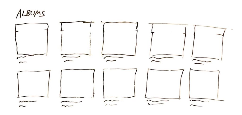
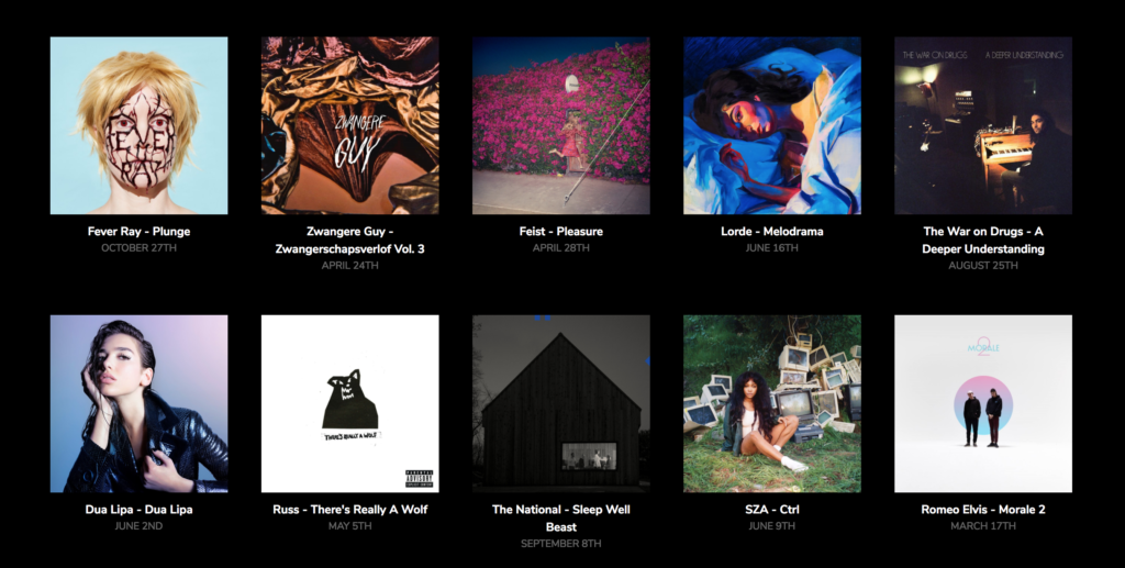
If you look at possible layouts, the most obvious layout for showing off albums for instance is a grid:
I took my layout ideas to Figma to figure out what to do:
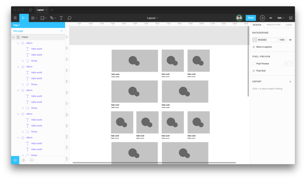
Using Figma to figure out a good layout
After this I wrote some code in Codepen to figure out how it would work.
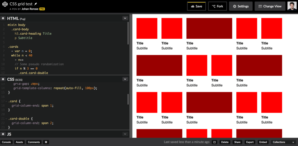
Using Codepen to check out what’s technically possible.
If you are interested in the code, the source is here.
This was written using Pug, my favorite templating language, and of course, SCSS.
I envisioned a Masonry style grid for the project page, but in the end I decided against that.
There’s tons of CSS grid experiments floating around the web, but a lot of them depend on extra Javascript implementations. Thanks, but no thanks. I have been down that rabbit hole and it’s not pretty.
I also scrapped the idea of mixing the different types of content with each other, so in the end, I ended up with something that looks like the initial sketch:
Challenge 2: use JSON for the data
I knew I wanted to use some kind of structured data. JSON seemed like the perfect candidate.
After a failed attempt in coda.io, I created a table in Airtable.
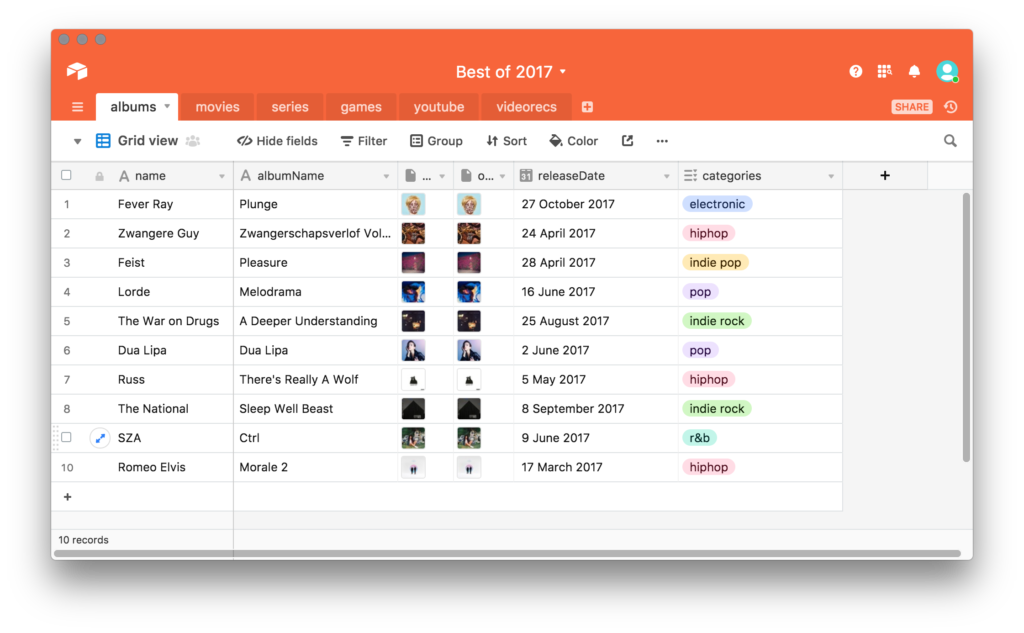
Figure: the albums table in its infancy.
Airtable is a really cool app that allows you to create structured data. After creation, you can get the data out of an Airtable document (called a “base”), because every Airtable document comes with its own API documentation, generated from the data itself.
I wrote a small shell script to get the data from Airtable as JSON:
curl "https://api.airtable.com/v0/appPNWkaKNwNCBVrH/Movies?maxRecords=99&view=Grid%20view" -H "Authorization: Bearer YOUR_API_KEY" -o content/data/albums.json
The JSON for 1 item looked like this (abridged for clarity):
{
  "records": [{
    "fields": {
      "name": "Paterson",
      "image": [{
        "url": "https://dl.airtable.com/QRjAVScATg6EX6jLtpv1_paterson.jpg",
        "filename": "paterson.jpg",
        "type": "image/jpeg"
      }],
      "releaseDate": "2017-05-08"
    }
  }]
}
After I had the JSON, I rendered the result using the Pug template language in a Bedrock project.
Since I am not really a Javascript expert, I spent some time trying to figure out how to get the URL of the image. It’s an object in an object, which makes it a bit more difficult.
Eventually I found it, but I am not 100% happy with the code (it’s on line 10). If anyone has a suggestion I would welcome it.
table
    tr
        th Image
        th Name
        th Release
    each item in contentData.movies.records
        tr
            td
                if item.fields.image
                    img(width="200" src=item.fields.image[Object.keys(item.fields.image)[0]].url)
            td #{item.fields.name}
            td #{item.fields.releaseDate}
In the final result, the markup changed to be something else than a table.
Parsing the data
As I mentioned, to generate the site, I used Bedrock.
Bedrock is a static site generator that we use daily at Mono to build application prototypes. But if you strip it down a bit, it’s actually also a really good static website generator.
Technically, Bedrock consists of an Express.js node server and a series of Gulp-based tasks to generate a static site.
I “hacked” Bedrock core to be able to use Moment.js to parse dates to my preferred format.
I also used Marked to be able to parse markdown. The reviews sometimes contain multi paragraph content, or formatting like italics & bold. The easiest way to handle this is to write the markdown directly into the Airtable database.
(This makes me think we could easily use AirTable as a CMS, but that’s another story…)
It’s nice to be able to use these off-the-shelf implementations for things that are tricky to do right. This is a major +1 for working in a Node environment (especially for novice programmers like me!).
Data and image optimization
I noticed some of the images were quite heavy to load, so I optimized some of the images by hand in Photoshop, and then re-uploaded them to Airtable. I kept the source images in Airtable as well.
To keep the data in Airtable is the easiest solution, but it does some come with some limitations, like the manual re-upload.
I also had to manually resize a ton of images in Photoshop to bring the filesize down. In a classic CMS environment (i.e. WordPress) this could be automated, but in this case I have no idea how I would efficiently automate it.
Cross-referencing tables
At some point, I created a table that cross-referenced another table in Airtable. When you do this, Airtable generates id’s that can be cross-referenced in the relevant JSON files.
From line 18 on, you can see I am first checking if there are any cross-references, then looping through them.
each item in contentData.youtube.records
    .cover
        if item.fields.name
            .cover-image
                +image(item)
            .cover-info
                h2.cover-heading
                    | #{item.fields.name}
                ul.c-horizontal-list
                    each subitem in item.fields.categories
                        li
                            .c-tag #{subitem}
                        li Subscribers: #{item.fields.subscriberCount}
                .cover-review
                    //- Here we are using marked to render markdown
                    div!= marked(item.fields.review)
                    //- Video recommendations
                    if item.fields.Videorecs
                        p.caps Video recommendations
                        ul.styled
                            //- We are cross referencing a table here
                            // - First we loop through the relevant items
                            each subItem in item.fields.Videorecs
                                each subSubItem in contentData.videorecs.records
                                    // - We check for existence along the way
                                    if subItem == subSubItem.id
                                        // - And then render our item
                                        li: a(href=subSubItem.fields.url)=subSubItem.fields.name
Coding this required some trial and error, and I am pretty sure this can be written in a much more legible way. I suppose this is the JSON equivalent of combining tables with something left a LEFT JOIN, but honestly, I am such a SQL/database noob that I’m not even sure if that’s true.
Summing up my feelings when doing this kind of work:

Challenge 3: use a new app — Pixelmator Pro — to edit the images (#fail)
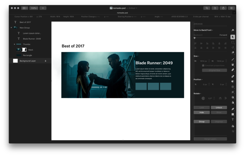
Figure: trying to make something decent with Pixelmator Pro
Last month, Pixelmator Pro came out. Whenever a new Mac app that looks well-designed comes out, I just buy it, mostly for research reasons. I had this one lying around but didn’t use it yet.
I’ve been meaning to get rid of my Adobe Creative Cloud license, looking at alternatives. I don’t really want to pay €600 a year for software that I barely use.
In 2017, I mostly used Figma, and a bit of Sketch, and a litttttle bit of Photoshop and Illustrator.
Potentially Pixelmator Pro was the answer for my bitmap editing needs.
I tried to create some basic things in Pixelmator but I kept hitting the limits of the program. It is obviously made for photo editing and not for my intended purpose, which is a composite layout.
The feature that I missed most was “clipping mask” from Photoshop. What I was also worried about was what’s called “smart objects” in Photoshop. If I resize a bitmap, I don’t want to have any quality loss in relationship to its original image.
In the end I switched back to Photoshop for any editing. The truth is that it’s very hard to counter 10 years of Photoshop habits and all of the little little nice things that have landed in the application over the years.
People might look at Photoshop as a bloated beast but in my opinion it’s still hands down the best image editing app in the world.
Challenge 4: Make it look good
Good visual design comes from a few different things, but mostly it’s the right combination between layout, type and colour.
Fonts
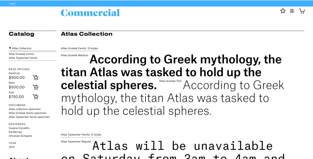
Starting with type, I figured I already licenses for several great looking fonts, like Atlas from Commercial Type:
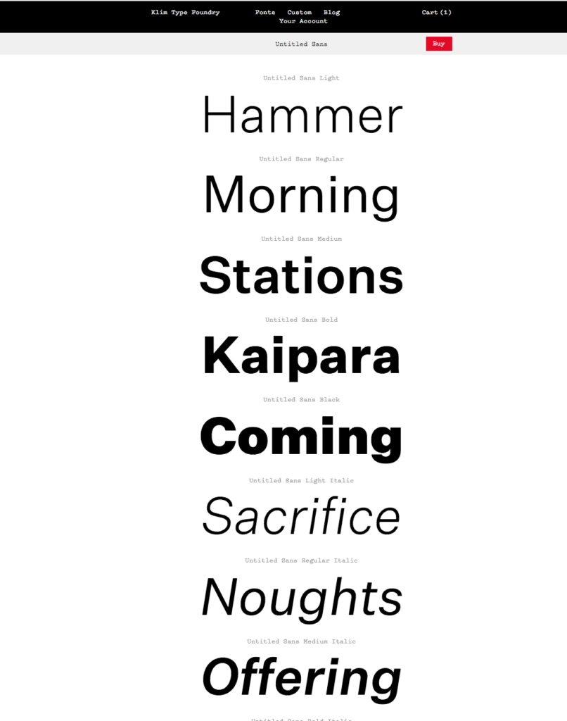
And also Untitled Sans from Klim Type Foundry:
The problem here is that I don’t actually have their equivalent web font licenses, and I am not willing to shell out the $300+ this will cost for a simple side project.
Since I do pay for Adobe Creative Cloud, I could use Typekit for my fonts (knowing that the design will not be intact when I ever stop paying ☹️)
An alternative was to use an open source font, but this is the solution I’ve been using all year, and things are getting a bit boring (at some point I wanted to write an essay called “Tired of Roboto”).
I experimented with Google Fonts, because it was the easiest to implement quickly. But honestly I am not a fan of putting Google’s code on every site I build. Google is already big enough, and font import code is the equivalent of a tracker.
So, maybe poorly so, in the end I decided to match the typography of this site — johanronsse.be — and it’s just good ol’ Helvetica (Neue).
One thing I was wondering about, is when you want to use the medium weight of a font, but the bold weight if that font doesn’t exist locally (and thus the fallback font is loaded). I am not sure if this can be done, if anyone has any tips, let me know.
Colour
At some point, I changed the overall colour scheme to be white on black instead of black on white. I noticed the visuals looked much better with a black background, so I stuck with that experiment. I didn’t specifically bother to do anything else related to colour.
In general, as a designer, I am super uninterested in colour (Mono is not accidental), unless it can actually improve/enhance the look based on its content.
One example is the design of rdio (RIP), where the album art gets blurred for added “atmosphere”.
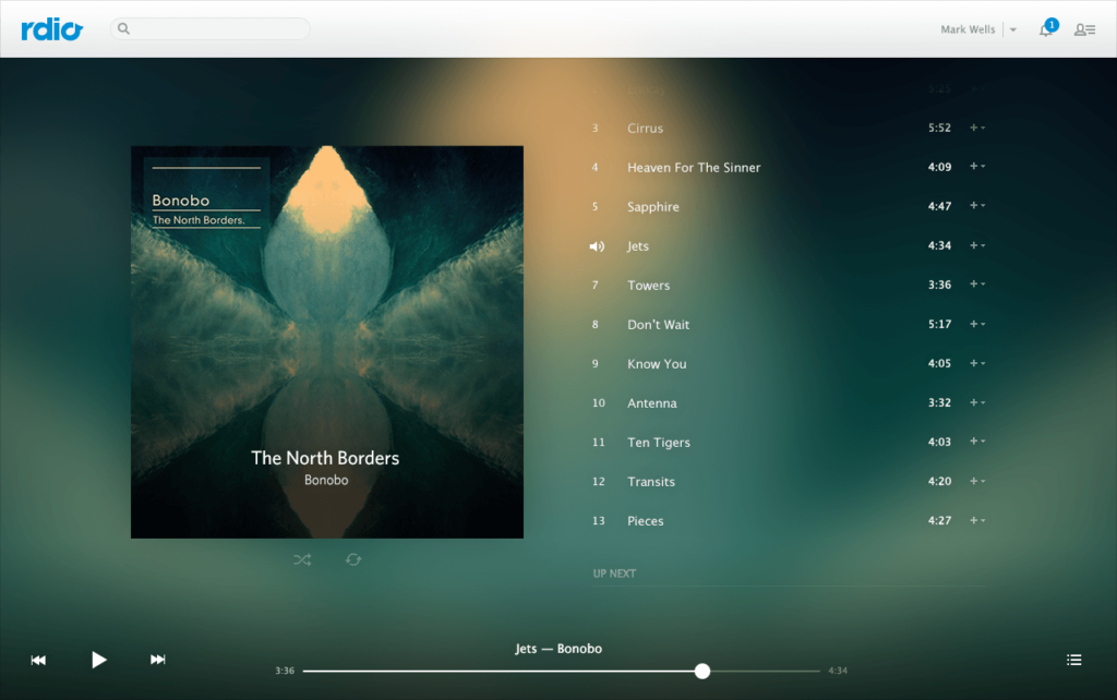
This effect can work but this can also go horribly wrong. In iOS, this effect is used quite a lot, but if you take a close look at the gradient images created in the process they’re only pretty in some cases. At some point time I dubbed this effect “rainbow puke”.
So in the end, I decided to do nothing, and just work with a black background. I spiced up the homepage with a bit of a topographic background image to make it look more interesting, since this page has the least amount of other content.
Maybe sometimes restraint is the best thing.
Animation
I experimented with tilt.js and at some point I even had some kind of glitchy text for the sote’s logo in the code, but I removed these.
My feeling is that if an animation is just an effect, what’s the point? These 2 experiments also added to rendering time, and sometimes created layout bugs. I didn’t want to bother fixing these, so I scrapped both.
Again, a bit of restraint. If it’s not objectively better, what is the point?
Layout
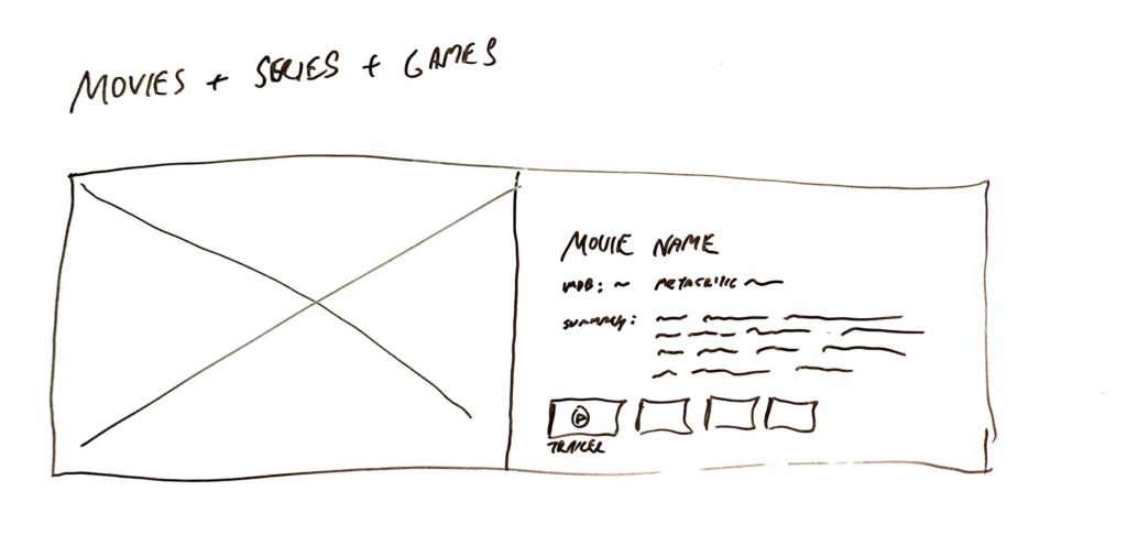
When I was sketching, I felt like this kind of layout would work for showing off images from movies, games and TV series:
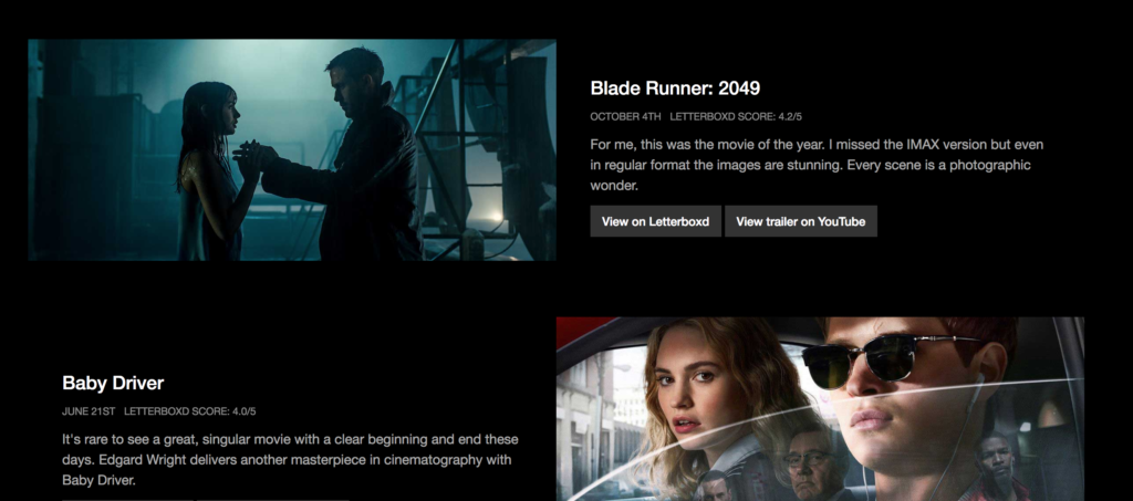
After a few iterations I ended up with something like this:
I had some ideas to evolve it by showing more images for every movie, but I found it difficult to source the right images in the same resolutions. In the end I just ran out of time as well.
Side thoughts: content first?
At some point during the process, I had working lists of series, albums, games etc… basically the content was just an image showing off the particular item, its name and its release date.
I felt this was a bit lifeless… visitors would probably wonder why a particular item was the list? To counter this, and give it a bit more life, I started writing short reviews/comments for each of the items.
I also created a homepage to explain what the project is and to lead people into it with the right expectations.
Looking back, a project like this should start from the content first. Now it started as a technical exercise and I added the content later on.
Challenge 5: Make it a progressive web app (didn’t do it)
During the year I saw lots of talk about progressive web apps. I researched making this a progressive web app, but because the content is quite static, I didn’t see any advantages to it, and didn’t do it.
Something for another project next year!
Final thoughts
In the past, I approached this kind of project as a manual graphic design exercise. I would go into Photoshop and design the individual pages. This was a lot of fun but the approach would break down when you wanted to make things responsive.
This time, I’ve approached the design from a more technical standpoint, where I had a database of items that I could get info from easily, and I designed almost everything in the browser.
New techniques like CSS grid make things a lot easier, and knowing how to loop over (any?) JSON data is a powerful tool in my toolset. However, I think things could look better in general, but this wasn’t specifically my focus for this project.
I am also happy with a reusable data format. Making a similar website next year will be a lot easier!
1 Comment
Beautiful pages. Well done. Enjoyed the write-up of your process as well.