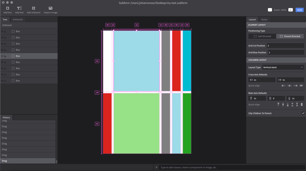
While preparing a potential talk for the UI design tooling meetup* I took a look at Subform.

It recently entered beta, with a monthly $25 fee to test the app. At first this move felt weird to me, but I know how hard independent software development is, so I understand this decision.
Subform was announced as a Kickstarter project in 2016 and got about $112k in backing. It has a very interesting premise, where it tries to fight the standard conceptions of what a UI design tool should be. Instead of putting rectangles and text boxes in the correct spots, you use alignment tools on parent groups to basically put things into place.
In general, when you’re designing a UI, there’s a certain point when changing something becomes quite the daunting task. Depending on your tools, project setup and team expectations of “file cleanliness” (i.e. proper layer naming) making a seemingly small change can sometimes take hours.
The co-creator of Subform wrote about how pushing pixels is quite miserable here. His point is that the computer should do that pixel pushing instead.
In a way, it’s a lot like using a UI to do something like working with Flexbox and CSS grid; or like setting up constraints in Xcode.
I think there’s a lot of work to be done to make it handier to design a UI with Subform, because I had a lot of trouble doing something reasonably simple. I do think that once everything works, you get all the concepts, you can work really fast.
Doing something new will always require learning something new as well, so I am curious where this will go.
*After a long hiatus, I announced a second meetup about UI design tooling. It takes place January 10th in Antwerp. We are still looking for a great location. If you have something to say about UI design tools, please send me an e-mail – I want this to be a community event with input from everyone. RVSP here!