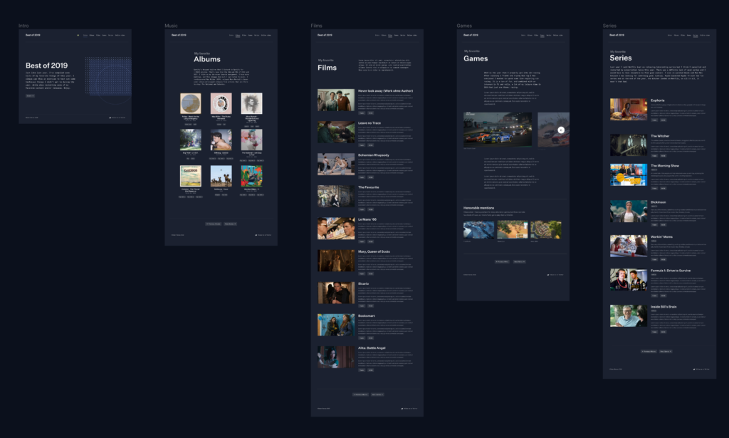
Just like last year, I made a list of the best media I enjoyed over the year. This includes music, films, series and games.
You can view the result at bestof2019.johanronsse.be.
The structure is more or less the same as other years.The content might be interesting to some (as if there are not enough end of year lists already ;)), but for me it’s my personal excuse of the year to play with some technology.
This post is a technical write-up of some of the aspects of building this website.
Powered by Svelte
This year I got really interested in Svelte, so it was only natural to use Svelte for my yearly tech exploration. Svelte offers an incredible developer experience and highly optimized bundle sizes.
I used the Svelte starter template together with a new file-based router project called Routify.
?Svelte lovers, head up. I started a new meetup group called Svelte Society Belgium. We are organizing the first event in March. You can join the group and find out more here.
The main advantage from a viewer standpoint is no page reloading – the changes from page to page are instant. Using Svelte in general led to some new possibilities in regards to animation and smoothness, but also led to new problems. Nothing that we can’t fix of course!
Design
In 2018 I went content-first, but this year I went design-first. I more or less created all of the designs first, then implemented them as opposed to last year.
I tried out the new AutoLayout features in Figma to create an accurate design. It was quite handy to have a few auto-resizing components
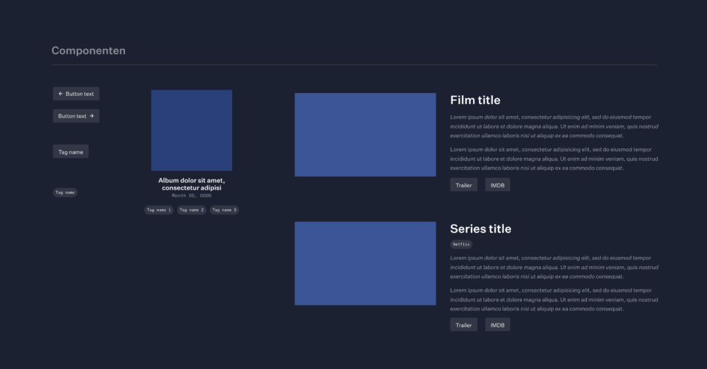
As my colleagues will know, I am not the one for clean design files, I just visualize what I need to visualize as fast as I can then and then move on.
So if you are curious, you can check out the design file here; but don’t expect a document full of clean layers.
?Commercial break. I am giving a new Figma workshop on January 30, 2020. You can find out more here.
Content
During the year I logged the films I saw in Notion. This has been an incredible tool for us at Mono and I also use it for my “personal” things. Here’s a screenshot of my film log.
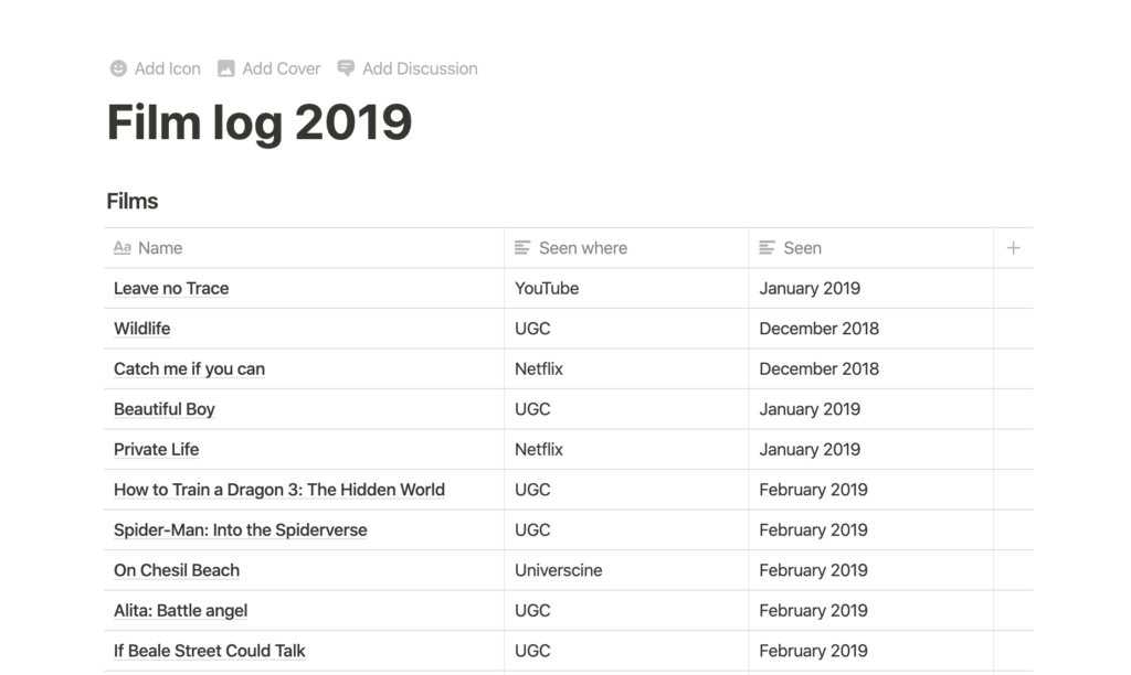
Looking at this I should really add Spider-Man: Into the Spiderverse to my list. Talking about missing content, the series page should also include Succession.
I also thought about a podcasts section but didn’t get to it (even though I listened to a lot of podcasts!).
I used images I found on Google Images, and some of the content is from IMDB. I hope that’s alright and put the usage of this in the disclaimer.
Typography
For the typography, I went with Untitled Sans by Klim and Atlas Typewriter by Commercial Type. This was after carefully considering my options.
Klim offers test downloads for all of their fonts. You can download the package of test fonts on their site.
What I like about these foundries is that they have permissive licenses that are just a one-time purchase. When I make a website I don’t want to worry about the font licensing for years. With our Mono website we use Benton Sans and every year I have to deal with the bill and administration for that.
I plan to change the typography of this website to Untitled Sans as well. I have my own personal “brand” that no one ever sees (except the recipients of my invoices :D), and I slowly want to transfer it over to this website as well.
Routing
I put a version of the source code on Github that people could use for learning purposes.
You can see in /pages/ that the different routes are simply files: albums.svelte, series.svelte etc. There is a _fallback.svelte for the 404 and a _layout.svelte which contains the general layout used by every page.
The Routify examples site provides more examples. My needs were rather simple, and I got this up and running quite fast.
Animation
An example of animation is the fading of the albums on the albums page. Implementing this was as simple as writing this:
<script>
    import { fade } from 'svelte/transition';
</script>

<div
     class="o-container-vertical"
     in:fade='{{ duration: 500}}'
     out:fade='{{ duration: 0}}'>
   <!-- content -->
</div>
Notice that when animating out, we set the duration to 0, as otherwise the animation will delay the routing.
Another example of animation is the slider on the games page. I implemented it based on this REPL I had made before, which in turn was based on someone else’s work. If you are that person, please tell me so I can credit you.
For the slider, I am using a custom easing function called hslide.js.
It has to be noted that Svelte’s easing functions are simply mathematical functions, such as this one:
function expoInOut(t) {
	return t === 0.0 || t === 1.0
		? t
		: t < 0.5
			? +0.5 * Math.pow(2.0, 20.0 * t - 10.0)
			: -0.5 * Math.pow(2.0, 10.0 - t * 20.0) + 1.0;
}
You can import functions from Svelte, and then use them:
import { expoInOut } from 'svelte/easing'The slider as it is is nicely abstracted away to its own component.
Within that component, there are scripts and styles specific to the slider. In this case, I chose to keep most code related to the slider local to the component.
I quite like the clamp function in this code:
let cur = 0;

function changeSlide(slide) {
    cur = slide;
}

const clamp = (number, min, max) => Math.min(Math.max(number, min), max);
function prev(e) { cur = clamp( --cur, 0, slides.length-1 ) }
function next(e) { cur = clamp( ++cur, 0, slides.length-1 ) }
What is “clamping” then? clamping is used to restrict a value to a given range.
A clamp function clamps a value between an upper and lower bound. It takes three parameters: a minimum value, a preferred value, and a maximum allowed value.
Side note: Svelte and the power of the REPL
Think of Svelte’s REPL as a sort of codepen to save your Svelte experiments. The REPL provides shareable links to Svelte code.
Throughout the year I am saving bits of code here and there which I can reuse in my projects. For example, I can’t wait to use this radial selector or do something with maps.
Scrolling: set the scroll to top when visiting new pages
Since an SPA simply reloads the content, but the visitor’s expectation is that when you visit a new page you end up at the top, I had to set the scroll position manually:
import { afterUpdate } from 'svelte';
afterUpdate(() => {
    window.scrollTo(0, 0);
});
(A new version of Routify will support this automatically.)
Responsive images
When you have a few days to make something, you have to make some choices, and implementing responsive images did not make the cut.
What are responsive images?
First of all, what do I mean by responsive images? In short, it’s loading the right image based on the viewport. For example, if you have a viewport of 320px wide, and a screen that has a pixel density of 2x, the widest image you will ever need (bar zooming) is 640px. If you see something on a 4K screen, at 3840×2160, but the website image container maxes out at 1280, and the screen is 1x, then the max width you will need is 1280.
Thus, given a combination of instructions to the browser and providing the right images on your server, you can provide the end user with a highly optimized experience. Instead of loading lots of heavy images they could load specifically the images that are optimized for their environment without any quality loss.
Implementations
I thought about responsive images a lot though. In our current implementation of the Mono website, and also this very website, responsive images are handled in part by WordPress itself.
The server generates image sizes on upload, and when used in a post, provides the right markup automatically.
You can provide sizes to WordPress:
// (Responsive) image sizes
set_post_thumbnail_size(500);
add_image_size( 'my-size-1', 3840 );
add_image_size( 'my-size-2', 2560 );
add_image_size( 'my-size-3', 2160 );
add_image_size( 'my-size-4', 1920 );
add_image_size( 'my-size-5', 1650 );
add_image_size( 'my-size-6', 1280 );
add_image_size( 'my-size-7', 1024 );
add_image_size( 'my-size-8', 768 );
Now, in a Svelte environment, there is no CMS, there is no server doing thing for you, so you have to do it yourself.
Generating the smaller images
In the past I have used packages like gulp-imagemin and others to generate images. I read up about Sharp now (thx Jérôme), but didn’t use it much except for a small experiment (thank you @Coma).
In my experiment I noted that Sharp is blazingly fast, but generating the right mages is creating workflow problems in itself. Something that I would only want to work on for a larger project.
I’ve always thought that putting the implementation work with the user was a bad idea. My colleague and business partner Xavier wrote about this a long time ago “The Responsive Image Solution Does Not Belong in HTML”.
Responsive images conclusion
In the end I didn’t get far with actually implementing responsive images, and the images in the deployed version are not responsive.
I used a combination of Save for web using Photoshop CS 2020 (I hate paying so much yearly for only using a few functionalities but OK) and the website TinyJPG.com to get to smaller images.
Dark mode
Naturally, with all the dark mode hype, I had to implement a dark mode.
I didn’t use CSS variables or anything, just manually declared an alternative in the context of the SCSS.
h1 {
  color: #000;
}

@media (prefers-color-scheme: dark) {
    h1 {
        color: #FFF;
    }
}
I find this to be more manageable than cross-referencing lots of variables, especially because there are often subtle tweaks that you need to make to the colours.
This also falls nicely in line with my philosophy of keeping code portable across projects.
Deployment
This was my first time deploying an “Single Page Application” (SPA) with multiple pages (confusing, isn’t it?); so I ran into a little problem where links wouldn’t work. Then I remembered that I would probably need to redirect all requests to index.html. On an Apache server, you can do that as follows:
RewriteEngine On
RewriteBase /
RewriteRule ^index\\.html$ - [L]
RewriteCond %{REQUEST_FILENAME} !-f
RewriteCond %{REQUEST_FILENAME} !-d
RewriteRule . /index.html [L]
Then later on, I wanted to link to images directly, and the requests to images would be caught by this RewriteRule, so I had to extend the rewrite conditions:
RewriteCond %{REQUEST_FILENAME} !\.(png|jpg|jpeg|mp4|gif)$Routify is a new-ish project, so I had some small implementation issues, but Jakob, the author was super responsive on Github. Eventually we even got into a chat and I started logging issues and thinking about how they could be solved to move this project forward.
CSS strategy: framework for general components + local, scoped CSS through Svelte
Svelte has built-in CSS scoping to a Svelte component. But just because a language has a feature doesn’t mean you have to use it for everything. I see this a lot in other people’s SCSS code: they go crazy with all the Sass features and in the end have a bunch of complex code.
For most of the CSS, I went with a separate SCSS file that got compiled separately. I found it quite handy to have an existing div-based grid implementation readily available (code), as well as a setup for differentiating between “styled” HTML and HTML that should be left unstyled (a simple version of this logic can be found in Ygdir here).
This past January I wrote about the need for a new CSS framework. These thoughts have crystallised into a new project called Ygdir, which is pretty early stage now. The general idea behind Ygdir is that is a convention-first framework.
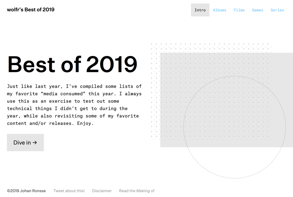
Home page graphic
For the home page graphic, I was trying some things with generating SVG with Svelte. This kind of code generates a bunch of SVG circles:
<script>
    let gridSize = 14;
    let dotSize = 1.5;
    let countCols = 30;
    let countRows = 10;
</script>

<svg>
    {#each Array(countCols) as _, i}
        {#each Array(countRows) as _, j}
        <circle cx="{dotSize+(i*dotSize*gridSize)}" cy="{dotSize*gridSize*j}" r="{dotSize}" />
        <circle cx="{dotSize+(i*dotSize*gridSize)+10}" cy="{dotSize*gridSize*j+8}" r="{dotSize*1,2}" />
        {/each}
    {/each}
</svg>
You can see a version of this idea in this REPL.
I had lots of ideas for this graphic, for example what I wanted to do is animate the circles based on whether you were hovering over them, and then animating nearby circles, creating some a sort of “shockwave” pattern.
For the globe (circle) in the illustration, I was thinking I wanted to animate a radial gradient in some way. I had this concept of the sun rising, or a 3D sphere full of stars.
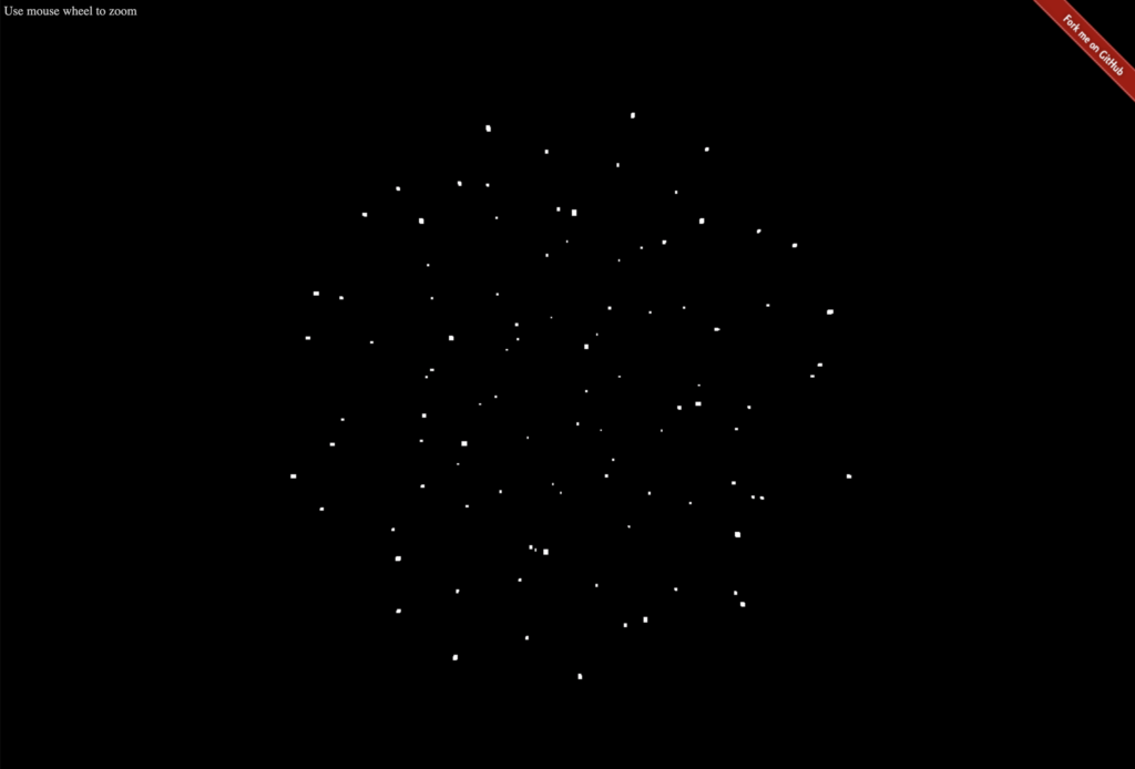
I also wanted it to react to mouse movement in a natural way. I didn’t get to this, and I also believe implementing that requires a lot of studying first to get smooth with graphics programming.
I ran out of time so these graphics programming experiment will be something for 2019. For the responsive version, I even completely hid the graphic on the homepage because I didn’t want to work on making a responsive dynamic graphic with animated layers. Pick your battles I would say.
Data logic
I am directly importing JS data in my Svelte templates:
<script>
    import items from './series.js';
</script>

export default [
  { "dataPoint": "dataValue" },
  { "dataPoint": "dataValue" },
  { "dataPoint": "dataValue" }
]
In 2017 I experimented with using AirTable. In 2018 I looked into using a headless CMS.
The thing here is that the data is simple enough to manipulate directly, so I couldn’t be bothered to set up a big technology stack for the content.
This does remain an interesting issue to work on. Where do you manage the data? How do you link it properly? What is the “backend” and how do we provide the right mix between editability by devs and non-devs? We do not create a lot of content websites in our company, so we don’t have to deal with this problem often, but it’s an area that interests me.
I would love to experiment with a headless CMS, but the current offering does not really inspire me. Although to be honest I only gave Netlify’s CMS a real try. Maybe I should do more tests. There’s a lot of tech out there: TinaCMS – Contentful – Forestry etc. – or I should maybe just do a test with headless WordPress.
Conclusion
In my 2018 writeup I wrote: In a lot of ways the end result is exactly what I made last year, but the technical underpinnings have changed.
You could say the same about this year’s version. In a lot of ways the result is similar, but under the hood, a lot of changes have been made. The biggest one this year is using Svelte, which in my mind is a big upgrade from using a static site generator.
In some ways it’s also a downgrade – I’m from the school of progressive enhancement, and a JS error might just break this site, making is quite fragile. I’m also not sure about the accessibility of it all. But I felt like I needed to make some moves and move on from regular old HTML/CSS/JS; the industry is moving towards a certain way of building things and you have to work with it to form your opinion. Maybe in a few years I’ll decide that this “SPA” thing was a really bad idea.
Please comment with your thoughts – I am curious as to what people think about this project, whether I should continue doing it, what you picked up from my technical write-up.
Enjoy the rest of the Christmas break!