To draw a line, use the line tool. Sounds logical, doesn’t it?
However, since year and day, I’ve avoided using the line tool and I don’t think I am the only designer to do so.
If you’re using a line for a border, do yourself a favor, and just draw a rectangle instead. What you’ll get in return: maintainability. Precision.
This is for a Figma context but I remember doing the exact same in Sketch.
Why? It will most always be perfectly on the pixel grid, unless you started manipulating the exact values or did some kind of weird transform.
You can also use ⌘ (or Ctrl if you’re on Windows) plus the arrow keys to change a 1 pixel line into a 2 pixel line very fast. No need to go into a side menu.
I love direct manipulation and I’ll use any workflow that allows me to manipulate the canvas directly. I love to hide Figma’s UI and do a lot of design work without every going into a menu.
So dear designers. Use rectangles for borders, not lines.
For the inner shadow people…
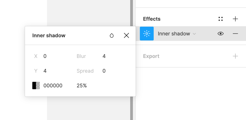
Some designers think they are clever and use an inner shadow to prevent the pixel being off-center.
Stop the madness! Who wants to open a lil’ popup and manipulate popup with 7 fields to make sure that you have a line somewhere?

No one ;)!