I wrote so much about CSS day that I decided to split the content in multiple blog posts. I posted the intro yesterday. Now it’s time to get into the talks.
CSS day is a 2 day conference. Day one was the “UI day” with a focus on design talks, often zooming in on the intersection of design and development.
Day two was the actual CSS day with mostly technical talks about CSS itself. In this post I will cover the first four talks of the first day.

Sara Soueidan was the M.C. for day one and opened with the intro and practical things.
My colleague Emily had visited Sara’s accessibility workshop earlier this week about accessible front-end patterns. I would have loved a talk by Sara (remembering the splendid talk about SVG filters from CSS day 2018), but unfortunately she did not present. I do have to say she did a splendid job at MCing.
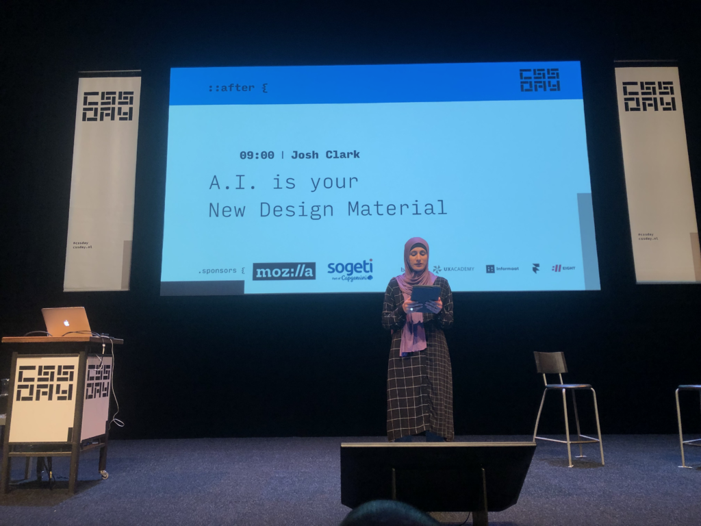
1.1 Josh Clark – A.I. as your new design material
The first day opened with Josh Clark talking about “A.I. as your new design material”. He argued that we should be thinking about things like machine learning as another ingredient to add into the mix when designing.
I thought this was really interesting as an idea, but I cannot see a practical way in front of me to try and incorporate machine learning into the interfaces that we make. I am also not sure whether machine learning is really a “design ingredient”, unless you assume “the design” means “the thing”.
Josh had lots of good (and bad :)) examples to basically give the audience a chance to start thinking about how they could use machine learning.
He explained us that we have to teach the machine (well, computers — the model — you know what I mean) what is “normal” and that doing that is a challenge in itself. We need to anticipate the problems that machines will have and set the right expectations for ourselves.
Machine learning is a probabilistic tool and should be treated as such. 80% certainty and 95% certainty are 2 different things. Machines don’t think like humans. They uncover other connections. Since the machines are weird, we can sometimes draw insights from the unexpected.
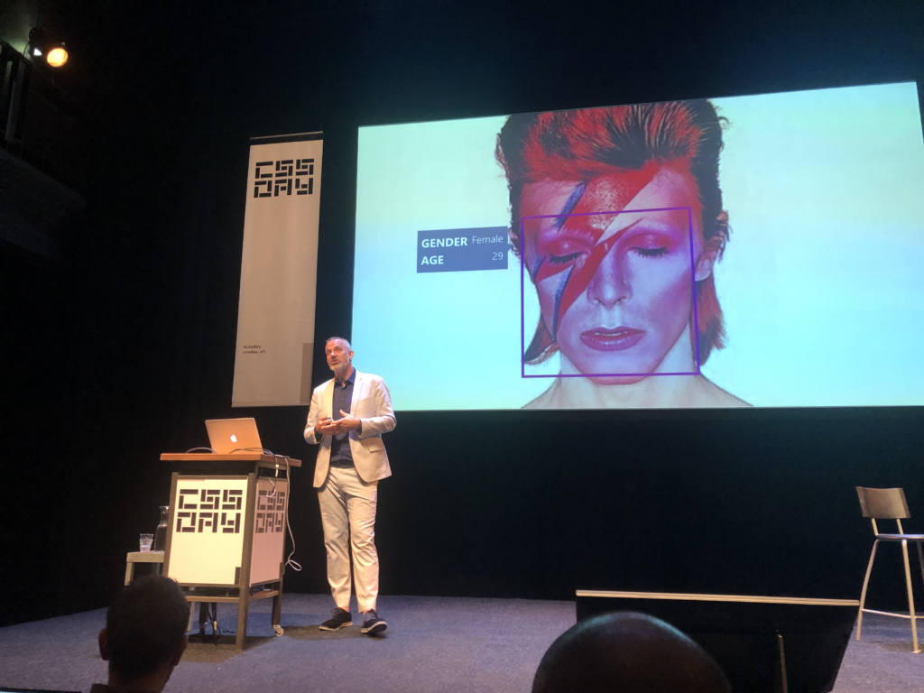
He pointed to some cloud services anyone can use to experiment with machine learning – most interestingly Microsoft’s Cognitive Vision cloud services which you give a photo as input, and then it would return in text format what is on the photo (or at least sort of what is on the photo).

I really liked the slide were David Bowie is identified as female, 29 years old by a machine. This slide is about so much in one simple looking slide.
I had already read a summary of this talk at Michel’s blog before seeing it, but it was interesting nonetheless. People obviously repeat their talks if they are a speaker, and I don’t have a problem with that.
Josh is such a skilled presenter. I was in awe about the way he juggled his slides with his words. CSS day was off to a great start.
1.2 Stéphanie Troeth – Behind the Story
Next up was Stéphanie Troeth who talked about storytelling in her presentation “Behind the Story”.
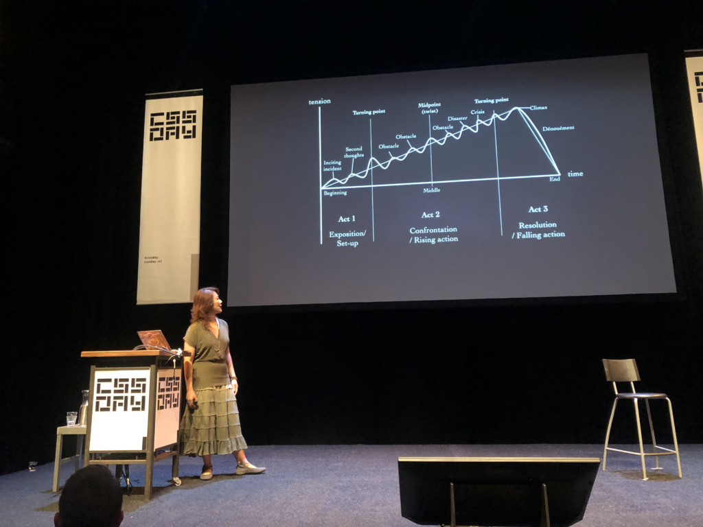
Stéphanie used to be head of research at Clearleft. She talked about story arcs, first talking about a personal story about something that happened with her at an AirBnb – then moving on to different story arcs – which was all based on some Kurt Vonnegut video.
This is curious since I had read about a talk from Erika Hall at UX London on the aforementioned UX London report that used the exact same video.

It’s sometimes good to surface old good stuff (I think more people should know about the mother of all demo’s for instance) but maybe if I ever give a presentation I would kind of avoid showing someone else’s presentation in my presentation? I dunno. I am on the fence.
Now, her main point was that something needs to be a story to be remembered, because we humans are terrible at remembering stuff. I thought this was interesting – the point about story arcs might be useful to make some of my writing a bit more exciting – and it was well presented as well.
Then Stéphanie tried to make the connection to design and things got a bit vague in my opinion. She went on a trip down memory lane. She asked “What happened to storytelling in design?” She argued that lots of things happened between 2010 and 2013 (and a bit in 2016) but lately it is rare to find storytelling in design. She mostly referred to news articles like this one from the NY times.
My main thought, but this was also a thought I had about the talk before this was: what does this have to do with UI? There was not a lot of relationship to the main topic of the conference.
Now, I wrote down my extended thoughts on that in a separate blog post, because that opinion got way too long. So that’s something for later.
(I am going to skip over talk 3 because I honestly do not know how can I summarize it, it was like 3 talks in one talk.)
1.4 Hakim El Hattab – Building better interfaces
Let’s move on to the fourth talk of the day, by Hakim El Hattab. This was a real highlight for me. You might know Hakim as the creator of Reveal.JS. His personal website is at Hakim.se . He turned his work on Reveal.js into a product called slides.com, which is cloud software to make presentations.

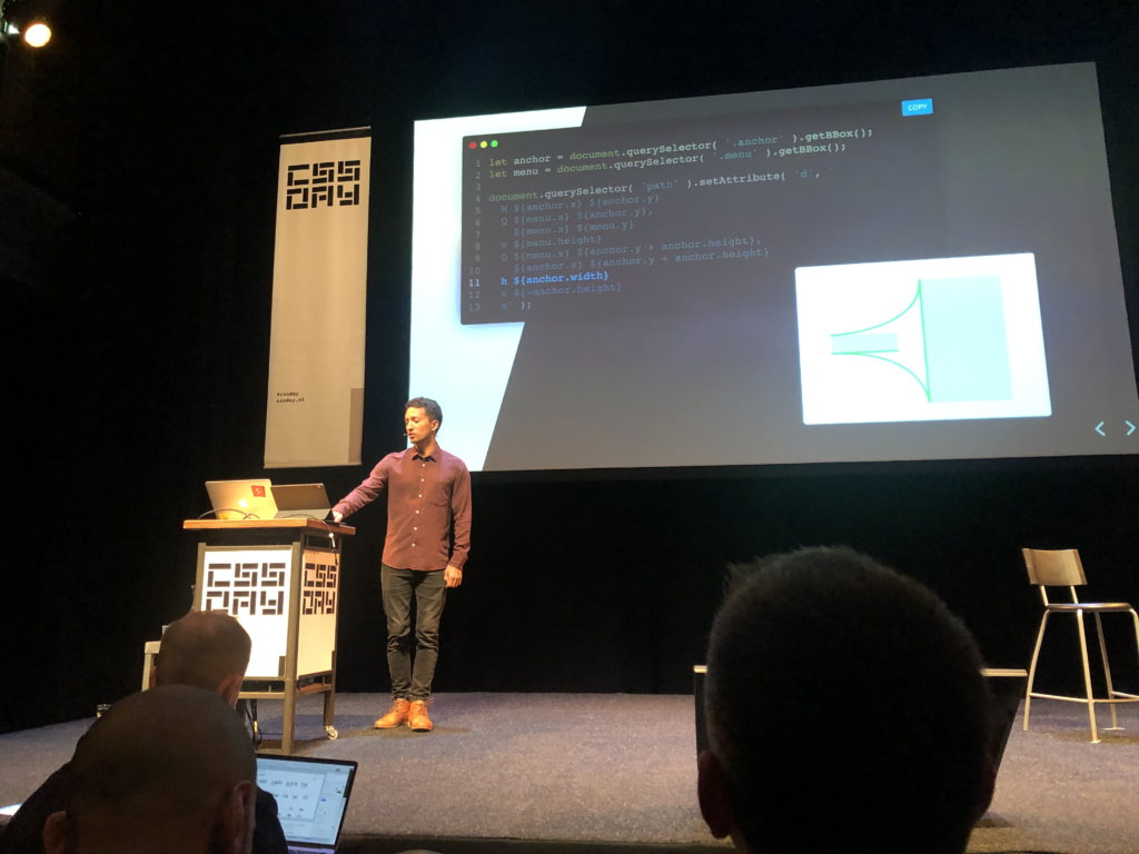
Hakim’s topic was how to build better user interfaces. First Hakim walked us through some of his UI experiments which you can also see at his website. A simple example is turning a button into a loader. Your eye is already focussed on that spot, so it make sense to give feedback there.
There’s only 2 people working on that product – they are a small team and they have to make choices. So they don’t have a big design system yet. What they do have is just a UI kit. He showed us slides.com/wireframe (which is so well done) and highlighted some pretty impressive details when it comes to making UI more robust and easier to use.
He went on to talk a bit more deeply about how he handled the UI for slides.com with a deep dive into some of the UI elements they use. He told us that basically he could bring his past knowledge all together in this new product. This sounded very familiar to me. I was working on something new recently and a lot of lessons from the past came together in that UI.
He did a deep dive into UI considerations when using popovers/popouts, keyboard shortcuts, loaders etc. For me this talk was perfect because some of the things he’s shown are exactly the sort of things I feel we can still improve upon when we deliver UI to our clients.
He ended on a high note explaining his excursion into making hover dropdowns more usable in detail which was really cool (see this tweet and his presentation).
I love how he is open sourcing a lot of his work. Hakim seems like a truly great & humble guy. If you’re into UI details and animation and you can ever catch a video of this talk, you should.
More…?
More is coming up in a next blog post, probably somewhere next week!