It’s a place to document your brand assets, like a logo, colours and icons.
Why is this helpful?
To keep your brand consistent – you can send people to the brand portal
To provide a more direct way to get brand assets – nobody likes hunting for the right asset in Dropbox folders, or to get the right asset out of a PDF document
I created one for Doccle. And I think this could be an interesting product for more companies.
Right now I am
doing user and competitive research
developing small prototypes
designing the first ideas for the user flow
I often post little nuggets on X and Mastodon. If you are interested in following my journey, follow me there or subscribe to this blog’s RSS feed.
Today I want to talk about why it’s probably not that interesting to release Screenshot to Layout to the public, even though I put a lot of effort into it in the month of July.
I am not saying I won’t ever release it, but it needs to be part of a bigger plan. In the meantime if you are interested, I can drop you a copy to install locally and a testing API key.
Right before my holiday I delisted my plugin. It’s actually ready to be out there, it fully works and it’s an addition to my workflow.
But… I haven’t found a way to release it in a way that won’t give me maintenance work forever.
One of the indie goals is to make meaningful money off of a side project. Otherwise I might as well consult on UI design projects or scale up design work through an agency logic.
The problem with Figma plugins is that the market is really not that big.
If you look closely on the Figma marketplace, you can probably tell pretty fast there are relatively few plugins making money.
There are some UI kits listed where, if you divide the views/uses between 100 to get a sense of the revenue, you end up with something like €20-€400 which is frankly not worth the effort. I am not that interested in UI kits either. I don’t think they lead to good design.
Then there are some paid plugins that might have made a meaningful amount but they are few in between. I think some people made some money, but no one made meaningful money.
Let’s say I release the plugin for cheap and 100 people buy it. Now I have to support the plugin for a long time, even though the amount they paid was less than a coffee.
I could release it for free to promote something else, but if it gets popular I can’t start charging users, because
that’s not how the Figma plugin marketplace works. You can’t make a free plugin paid
It’s also not how I want to work. If it’s paid, there’s a promise of working software that provides value (and keeps providing value). If it’s free, there’s much less of a promise in there.
If 100 people buy it, and the amount was $20, it would still be less +-3 days of UI design consulting. For those 100 people, I would now have to:
Maintain my Supabase user logic ($25/month although I could probably get away with the free plan then)
Maintain an active Azure account that I have to monitor
Deal with any issues that arise
Provide other support, around invoicing (and the ways to provide support via Figma’s tools are pretty limited, can’t even refund!)
If 1000 people buy it, then we are talking about a meaningful amount of money – $20k. But now, first 15% gets cut off by Figma themselves, and then half by the Belgian tax collector. So in reality we are still talking about $8500 (+-€7800).
That’s nice money but very hypothetical, amd depending on a 1%-4% conversion rate of trial to paid user, I would need between 25 000 people interested and 100 000 people looking at it.
If you look at the these numbers, compare them to the most (free) popular plugins on Figma that reach +-200-500k users – you can tell the market just isn’t there.
Then there is the hassle of making a trial of a Figma plugin. You can’t really. Via their systems it’s either 24 hours refund on a paid plugin or 7 day trial but then you have to force people to pay monthly. This doesn’t vibe well with my ideas around payments.
Jan suggested a yearly fee which sounds like a good in-between between annoying SaaS pricing and not getting anything out of active users when supporting a product for years.
But to implement such a structure, I would need to set up Stripe, connect it to my Supabase accounts and basically invest more in setting up my own infrastructure. This way I have access to subscriptions, refunds… which would solve some of my woes, but not all of them.
Ideally, Figma will improve their payment APIs.
Right now you basically have to roll your own logic or (probably) prepare a world of support pain. Unless your plugin is really simple and you know it will always work reliably.
Furthermore, there is not that much plugin development activity. At least the community around plugins is rather silent on Discord in general. This worries me from a developer standpoint.
So that’s a long explanation why I am not going to go ahead with releasing my plugin for now.
But hey, I learned something. A lot actually. On to the next project!
Yesterday I de-listed my plugin from the Figma community, before I even had my first user.
One week before, I happily pushed the publish button and set a price tag of $20. I was proud to have made something worth charging for, but the whole week it was nagging in my head how it was not ready.
The doubts kept growing.
I was stressed about it, but now I realize: it’s not a bug… it’s a feature! No having a plugin live is my peace of mind for the following weeks, while I enjoy a little holiday in Europe.
The plugin doesn’t need to be live yet. Whoever is interested can ask me to test it locally, and I need to gather a bit more feedback before launch. This also gives the other team members more time to make things more polished without any unnecessary stress.
Over the past month I’ve been working hard on Screenshot to Layout and to be honest it has been a bit intense building the plugin itself — but also all the operations around it. Intense,
Little did I know that to build this plugin, I would also have to build an accounts system, write a privacy policy, learn about layout algorhitms, up my database skills, get better at Typescript, set up a reverse proxy, learn the Figma plugin API and sooo much more.
I put over a hundred hours on top of my regular job in this plugin, and while I am proud of the end result, I don’t want to ship it yet.
The main problem I have now is the pricing. I know I have something of value, and I want to charge for it.
What I want is for my plugin to be a utility that somebody can use for the next five+ years, just paying 1 fee.
Figma’s pricing pushes you to a SaaS if you want to offer a free trial, and I hate that pricing mechanism for a design plugin. Who wants to deal with little monthly bills of $1? And is the plugin worth $60 over a period of 5 years? I don’t think it’s that good. Not to mention the admin hassle it creates.
Right now I am thinking about publishing 2 versions of the plugin, but that seems like a distribution hassle in itself, and I have no way to know which API key belongs to which user.
Another idea is to take the payments part fully off-platform and implement it with a Stripe subscription instead, but that means building more infrastructure to support those mechanisms.
The jury is out there… but first I am going to take some time off.
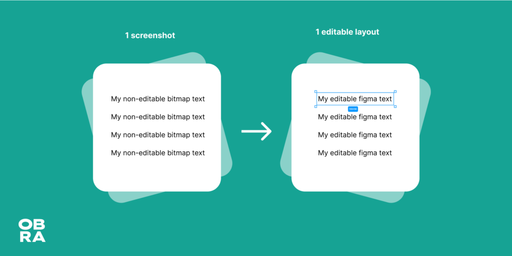
Over the past month I’ve been on a little indie hacker journey, where I built my first freemium plugin for Figma: Screenshot to Layout.
Essentially it’s an OCR plugin: it recognizes text from screenshots and renders it back to Figma.
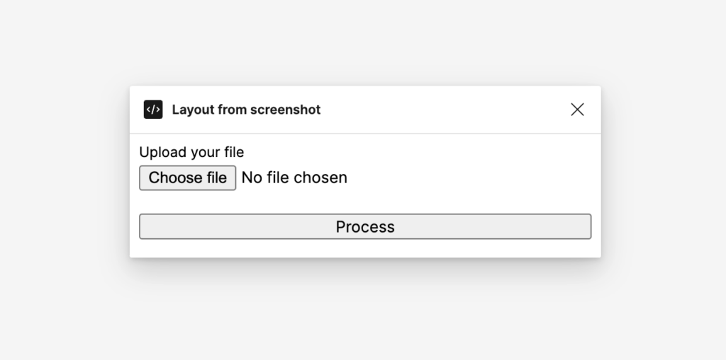
In my first version, I used a file input.
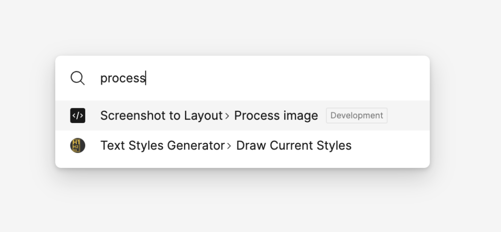
I felt I had a nice breakthrough when I realized I could run my plugin as a command, and have no user interface at all.
Using the command palletteLoading…… and done!
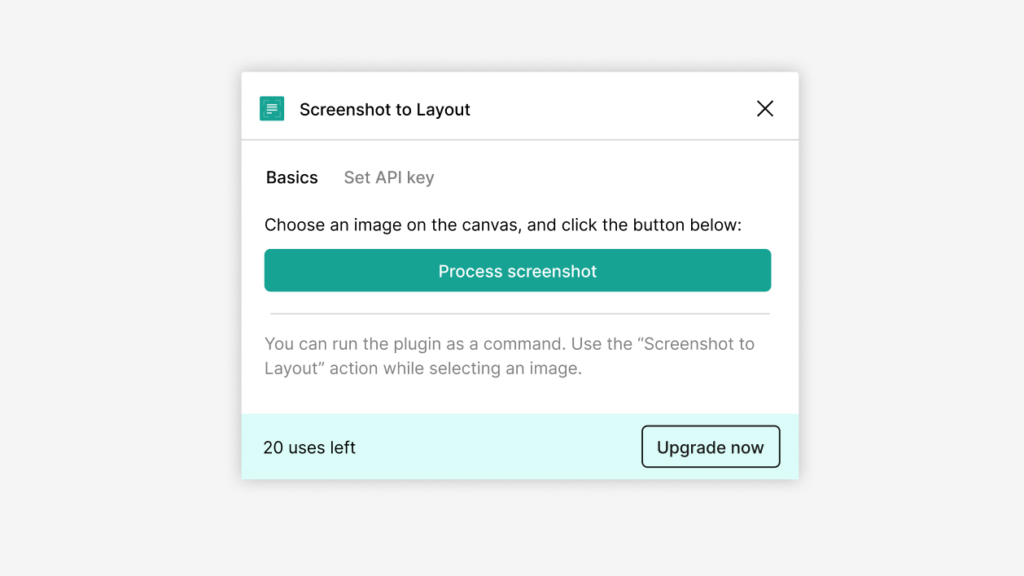
Over the past month I’ve contemplated various UI options but I always keep coming back to having no user interface at all. Except to enter the API key, upgrade your account, there are no UI options to be seen.
Right now I am close to launch, and looking for testers. Testers will get free usage of the plugin for their honest feedback. Register your interest here!
Hey all, my bootstrapping journey is reaching an exciting point where we are able to provide real value to designers with the Obra Figma plugins, starting with the Screenshot to Layout plugin.
To bring things over the finish line, I am looking for a Svelte developer with (some) design chops to develop and fine tune more of the user journey. Most of the work would be happening in August.
There are lots of details to be handled, and I am looking for a communicative developer who can execute work but at the same time bring their own thinking to make the end result better.
Skills I am looking for are:
JS/TS + Svelte + Sveltekit knowledge
Insight in Figma
Bonus if
You can develop Figma plugins
Extra pro
Supabase knowledge
The biggest part of the job would be Svelte and Sveltekit related.
If you are interested to work with me, reach out with your portfolio/resume/personal site, your hourly tariff or pricing logic, to jobs@obra.studio.
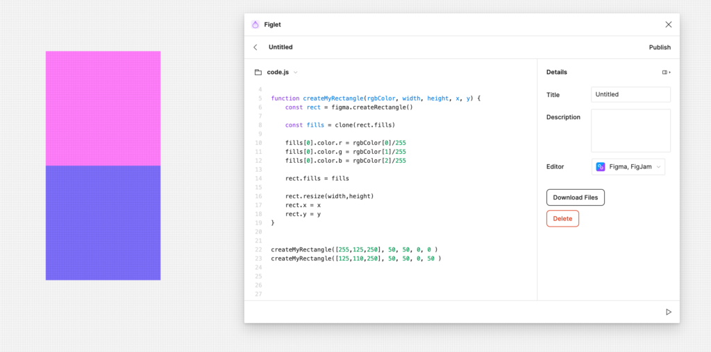
In the previous tutorial, we ended with 2 rectangles.
The second building block that’s good to learn about is rendering text to the canvas.
Working with text is its own challenge in Figma, because there are a lot of edge cases.
The first thing to understand is that a font needs to be loaded in order for text to be able to render. Fortunately, there is a font that we always know will be there, which is Inter, used by Figma for its UI itself.
So for the sake of the simplicity of this tutorial, let’s start using Inter to render text. Later we can move to a more difficult use case.
If you are starting out, you don’t need to have followed the previous tutorial to do this one. You can start this one from scratch.
We will once again use the Figlet plugin, which makes it so you don’t have to set up a development environment and you can start coding right away.
Getting started
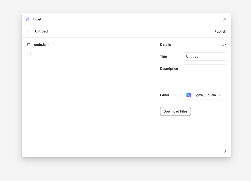
If you don’t have one already, make a new Figlet account inside the Figlet plugin.
Now, create a new Figma design file, run Figlet, and click the new Figlet button (the + button)
Now you have some code to write! The second building block we will look at is creating text.
Notice how I also used the y part to set the y position of the 2nd text variable.
Let’s see what else we can do with text.
Let’s add a bit more text:
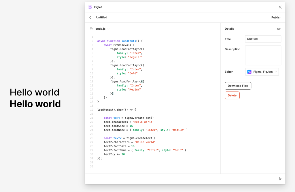
// Make sure the loadFonts from previous example exists

loadFonts().then(() => {

    const text = figma.createText()
    text.characters = 'Hello world'
    text.fontSize = 16
    text.fontName = { family: "Inter", style: "Medium" }

    const text2 = figma.createText()
    text2.characters = 'Hello world'
    text2.fontSize = 16
    text2.fontName = { family: "Inter", style: "Bold" }
    text2.y += 20

    const body = figma.createText()
    body.characters = 'Lorem ipsum dolor sit amet, consectetur adipisicing elit, sed do eiusmod tempor incididunt ut labore et dolore magna aliqua. Ut enim ad minim veniam, quis nostrud exercitation ullamco laboris nisi ut aliquip ex ea commodo consequat. Duis aute irure dolor in reprehenderit in voluptate velit esse cillum dolore eu fugiat nulla pariatur. Excepteur sint occaecat cupidatat non proident, sunt in culpa qui officia deserunt mollit anim id est laborum.'
    body.fontSize = 14
    body.fontName = { family: "Inter", style: "Regular" }
    body.y += 40
});
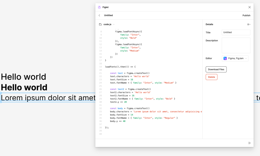
When you render this, you will see that is unseemingly wide – 2895 pixels to be exact.
Let’s make it a bit more manageable.
Add this code to the body variable and its subsequent manipulations:
body.resize(400,1)
body.textAutoResize = 'HEIGHT'
That looks a bit better.
Now, let’s try to create another style for links. This will involve working an “underline” text decoration, and a color fill.
Once again, place it outside of your loadFonts().then(() => { block.
Now we have a reusable setColor function to set colors, where we select the node as the first parameter and an array of RGB colours as the second parameter.
Let’s modify our existing code a little bit, to assume we are making a typographical system. Try doing the following:
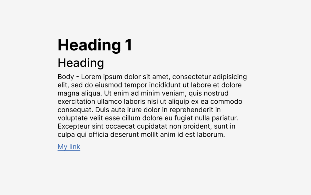
Rename the first Hello world to Heading 1, and set the font size to
Rename the second Hello world to Heading 2, and set the font size to 24.
Swap the bold and medium on heading 1 and heading 2
Add “Body -” in front of the lorem ipsum of “body” to make people understand we’re talking about the body text there
Space out the typography examples by adjusting the “y” values.
Your complete text code would look a bit like this:
const text = figma.createText()
text.characters = 'Heading 1'
text.fontSize = 32
text.fontName = { family: "Inter", style: "Bold" }

const text2 = figma.createText()
text2.characters = 'Heading'
text2.fontSize = 24
text2.fontName = { family: "Inter", style: "Medium" }
text2.y += 42

const body = figma.createText()
body.characters = 'Body - Lorem ipsum dolor sit amet, consectetur adipisicing elit, sed do eiusmod tempor incididunt ut labore et dolore magna aliqua. Ut enim ad minim veniam, quis nostrud exercitation ullamco laboris nisi ut aliquip ex ea commodo consequat. Duis aute irure dolor in reprehenderit in voluptate velit esse cillum dolore eu fugiat nulla pariatur. Excepteur sint occaecat cupidatat non proident, sunt in culpa qui officia deserunt mollit anim id est laborum.'
body.fontSize = 14
body.fontName = { family: "Inter", style: "Regular" }
body.y += 76
body.resize(400,1)
body.textAutoResize = 'HEIGHT'

const link = figma.createText()
link.characters = 'My link'
link.fontSize = 14
link.fontName = { family: "Inter", style: "Regular" }
link.y += 220
link.textDecoration = "UNDERLINE"
setColor(link, [65,111,181])
And that code would render an example like this:
That’s where we will stop for now. The final code can be found here.
If you followed along with both tutorials, you now have a basic understanding of creating a shape, and how to render text in a Figma plugin.
I don’t know yet what the next tutorial will be about, but I want to find a logical next step to code, to get to a useful plugin. If you have any suggestions. place a comment below, it will motivate me to continue this series.
In this blog post series I would like to give an introduction to building Figma plugins.
We will be learning using a series of “building blocks” and then turn it into a real plugin in the end. In this first tutorial we will be looking at the most basic of basics: creating a rectangle.
We will make our start using the Figlet plugin, which makes it so you don’t have to set up a development environment and you can start coding right away.
Figlet is a new thing in the Figma plugins community. It’s comparable to Codepen or REPL-like environments in the sense that you can share Figlets, you can easily run them without setting up a dev environment, and you can easily have multiple figlets.
Getting started
Make a new Figlet account inside the Figlet plugin.
Now, create a new Figma design file, run Figlet, and click the new Figlet button.
Now you have some code to write! The first building block we will look at is creating a rectangle.
Enter and run the following code:
figma.createRectangle();
You will see a rectangle created on your artboard.
But where is it? If you can’t see it, try to find your new layer called Rectangle in the layer panel.
Zoom in to the rectangle (manually) and let’s continue.
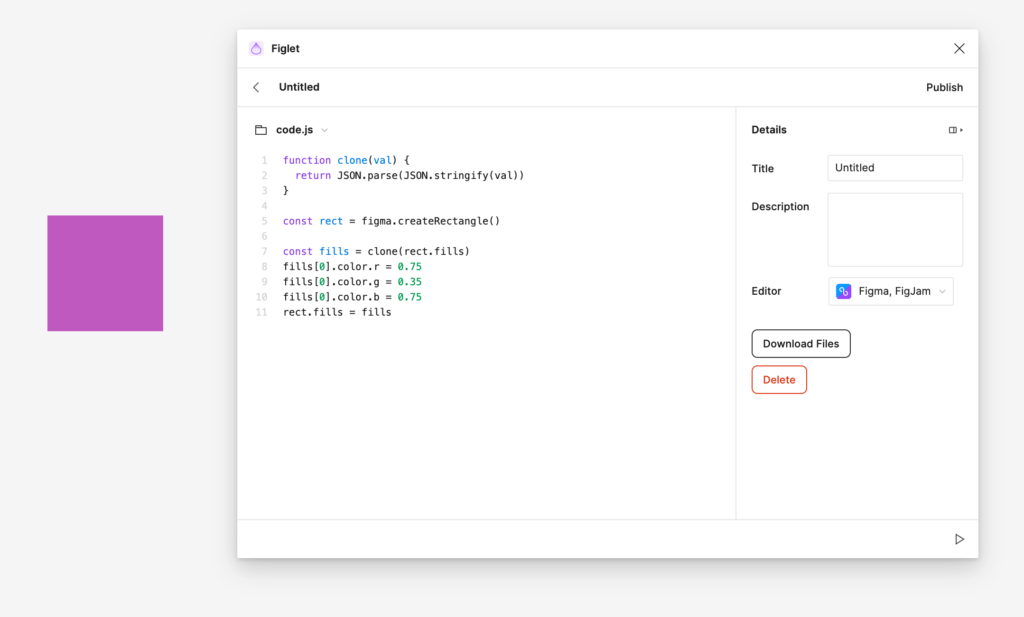
Let’s give the rectangle a colour.
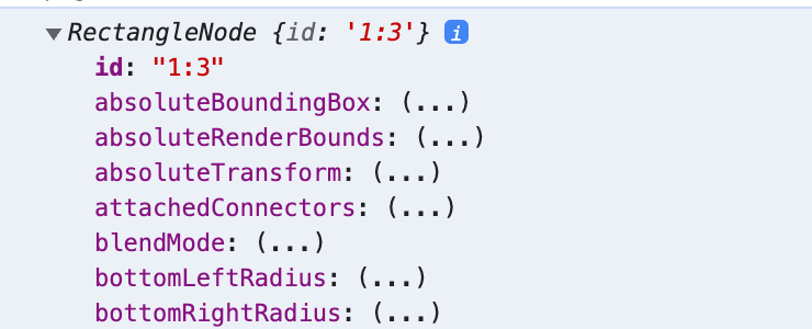
This is a good time to learn about nodes first.
Instead of directly running figma.createRectangle(), assign your rectangle to a variable, and log its contents.
const rect = figma.createRectangle()
console.log(rect)
Now, open the developer console using ⌥ + ⌘ + I (Mac) or Ctrl + Alt + I (Windows/Linux).
You will see the output of an object like this in the developer console.
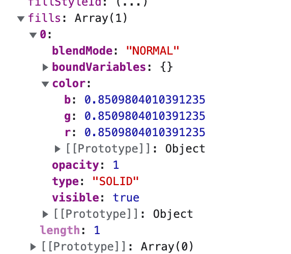
What we are looking for to change the color is the fills object:
At this point, you might be tempted to just directly change the values using some code like:
const rect = figma.createRectangle()
const color = rect.fills[0].color
color.r = 0.5
color.g = 0.5
color.b = 0.5
This does not work!
You can’t directly manipulate certain objects, you have to clone them in their entirety, then manipulate them, and put back the cloned version.