I looked deeper into Tailwind this weekend. I was aware of this framework and its popularity, but I wanted to dive deeper into it as I was researching it for a future project.
If you have to choose your CSS strategy in 2019, there are different options:
- Use a framework that “comes with everything”: frameworks like Bootstrap / Foundation / Fomantic UI / …
- Work with a utility first framework like Tailwind (…there’s probably others?)
- Custom: build it yourself
- A combination of the above
- … (and probably something else I forgot now)
And then, in regards to coding strategies, there are different techniques:
- Just keep on adding CSS (would not really consider this a strategy…!)
- BEM and ITCSS that can be combined well
- Use something like styled-components or emotion to have CSS-in-JS – which puts you on an entirely different path. And which is definitely something you want to avoid, but that is a topic in itself.
For development speed purposes, a framework is a good thing, especially if it has an underlying layer of Javascript components that are well maintained (I am thinking about the more complex things like datepickers, popovers, etc.)
First up is a disclaimer, I am by no means experienced with Tailwind – I am merely looking into whether it’s a good idea to invest time in it in the first place.
Feel free to counter my arguments in the comments and let’s make it a conversation.
What is Tailwind? What’s the coding strategy?
Tailwind is not as opinionated as most frameworks. It is a set of customizable classes, almost like a set of pre-defined design tokens that you can then use to customize your UI.
This is interesting, especially if you create lots of different things with different looks. You can then change the tokens based on the project you are working on but use similar code to lay out responsive designs.
The general code strategy is to use lots of utility classes to build up a component, for example (from the Tailwind homepage):
<div class="bg-white rounded-lg p-6">
  <img class="h-16 w-16 rounded-full mx-auto" src="avatar.jpg">
  <div class="text-center">
    <h2 class="text-lg">Erin Lindford</h2>
    <div class="text-purple-500">Customer Support</div>
    <div class="text-gray-600">erinlindford@example.com</div>
    <div class="text-gray-600">(555) 765-4321</div>
  </div>
</div>
This code strategy leads to new problems, especially when used at scale. Most notably the problem with Tailwind is that your template code is littered with CSS classes. Below is an actual example from the docs for a simple card component.
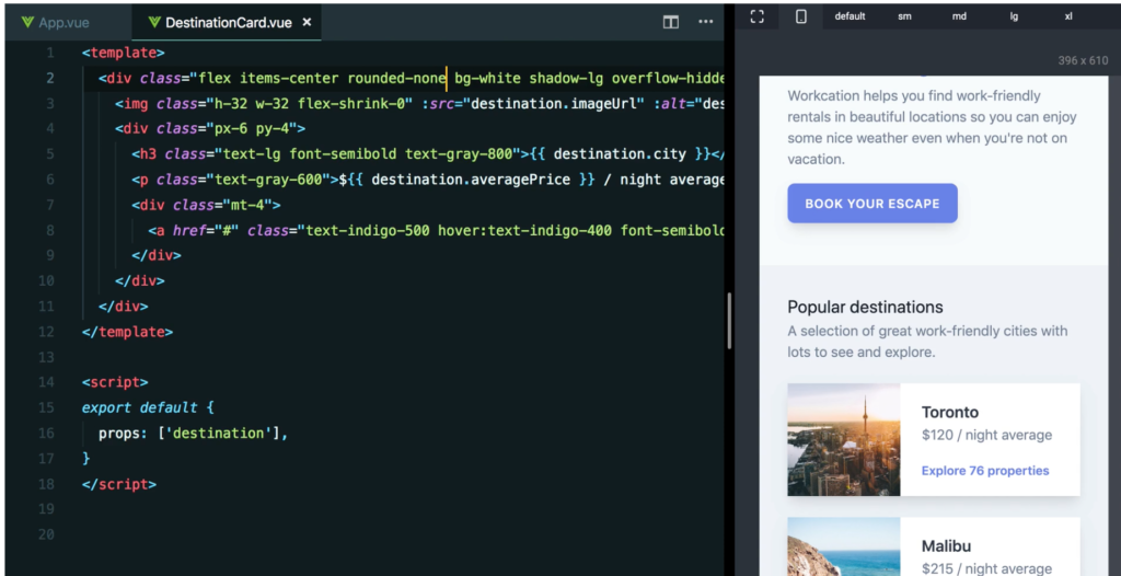
In my opinion this template code already looks complex, and there is not even any logic going on. So a real-life template could become a bit of a monster. And a real-life template is just one of hundreds in a web app codebase.
In the Tailwind documentation there is a page called “extracting components” which talks about strategies to counter this problem. This is good as it shows the framework authors are aware of the disadvantages of their methodology.
The first method the author argues for is to simply extract the code into a component, for example if you are using Vue, you would create a new Vue component and then put the markup in that component. In the “overview” page you can then run v-for loop so the markup for something like 6 items becomes 1 item. The author claims the code is clean enough that way, and the right abstraction is made.
This might be the logical for some situations, but I am not sure about this for the reasons stated above – real world templates are just simply more complex than the stated examples. At least they are in the apps I am working on. However, your mileage may vary; I heard on Twitter that some people were very happy with Tailwind, but then they pointed to their small-ish websites as proof.
The second method for reducing complexity is using something called @apply. This is a Tailwind-specific thing where you use @apply to combine Tailwind utilities into its own CSS class.
For example:
.btn {
  @apply font-bold py-2 px-4 rounded;
}
This would then make .btn available as a CSS class, with the consistent design tokens. The processing for this is done with PostCSS.
I think this is interesting but then I worry about how this actually simplifies my code.
Here is some button code from a recent project. This is BEM/ITCSS based. Warning, it is quite long. First up is just the layout code, this is not even about the different variants of the button. I made the code boxes scrollable so you can scan this blog post.
/* ==========================================================================
  Component: Buttons
  ---
  This code is about button layout.
   ========================================================================== */

/* Variables
   ========================================================================== */

// Border radius
$c-button-border-radius: 0.3rem !default;

// Sizes (heights)

$c-button-height: 3.6rem !default;
$c-button-height-small: 3.2rem !default;

// Font size

$c-button-font-size: 1.5rem;
$c-button-font-size-small: 1.4rem;

// Line height

$c-button-line-height: 2.4rem;
$c-button-line-height-small: 1.8rem;

// Horizontal padding (border included)

$c-button-padding-horizontal: 1.6rem !default;
$c-button-padding-horizontal-small: 1rem !default;

// Spacing between icon and label

$c-button-icon-spacing: 0.8rem !default;
$c-button-icon-spacing-small: 0 !default;


/* Default size
   ========================================================================== */

.c-button {
  appearance: none; // Fix for Mobile Safari
  text-decoration: none; // to reset <a> element
  cursor: pointer;
  vertical-align: middle;
  border-radius: $c-button-border-radius;
  padding: (($c-button-height - $c-button-line-height) / 2) $c-button-padding-horizontal;
  font-size: $c-button-font-size;
  text-align: center;
  align-items: center;
  font-weight: 500;
}

a.c-button {
  display: inline-flex;
  justify-content: center;
}

button.c-button {
  appearance: none;
  margin: 0;

  &::-moz-focus-inner {
    border: 0;
    padding: 0;
  }
}

.c-button .c-button__content {
  align-items: center;
  display: flex;
  justify-content: center;
}

.c-button__label {
  line-height: $c-button-line-height;
  white-space: nowrap;
}

.o-svg-icon + .c-button__label,
.c-button__label + .o-svg-icon {
  margin-left: $c-button-icon-spacing;
}

.c-button:not(.c-button--icon) .o-svg-icon:first-child {
  margin-left: -0.4rem;
}

.c-button:not(.c-button--icon) .o-svg-icon:last-child {
  margin-right: -0.4rem;
}

/* Small size
   ========================================================================== */

.c-button--small {
  font-size: $c-button-font-size-small;
  padding: (($c-button-height-small - $c-button-line-height-small) / 2) $c-button-padding-horizontal-small;

  .c-button__label {
    line-height: $c-button-line-height-small;
  }

  .o-svg-icon {
    height: $c-button-line-height-small;
    width: $c-button-line-height-small;
  }

  .o-svg-icon + .c-button__label,
  .c-button__label + .o-svg-icon {
    margin-left: $c-button-icon-spacing-small;
  }

  &.c-button--icon {
    padding: ($c-button-height-small - $c-button-line-height-small) /2;
  }
}

/* Icon-only Button (Square)
   ========================================================================== */

.c-button--icon {
  padding: ($c-button-height - $c-button-line-height)/2;
}

.c-button--small.c-button--icon {
  padding: ($c-button-height-small - $c-button-line-height-small)/2;;
}

/* Block button
   ========================================================================== */

.c-button--block {
  width: 100%;
  text-align: center;
}

/* Link button
   ========================================================================== */

.c-button--link {
  padding-left: 0;
  padding-right: 0;
  font-weight: 600;
  text-decoration: none;
  &:hover,
  &:active,
  &:hover svg *,
  &:active svg * {
    color: darken($color-primary, 15%);
  }
}
Then, we have the code for the color variants in the button. This code has been simplified for purposes of this blog post.
/* ==========================================================================
  Component: Button Skins
  ---
  Rules of this file: you CAN'T touch the box model here, just colors.
   ========================================================================== */

/* Variables
   ========================================================================== */

$c-button-text-color: $g-text-color !default;
$c-button-hover-border-color: $color-gray-150 !default;
$c-button-outline-color: $color-primary !default;
$c-button-focus-ring-color: $color-primary !default;
$c-button-link-color: $color-primary !default;

.c-button {
  transition: 0.18s background ease-in;
}

/* Primary
   ========================================================================== */

.c-button.c-button--primary {
  border: none;
  background: $color-primary;
  color: #FFF;

  svg * {
    fill: #FFF;
  }

  &:hover,
  &:active,
  &.c-button--active,
  &:active:focus,
  &.c-button--active:focus {
    background: darken($color-primary, 15%);
  }

}

/* Secondary
   ========================================================================== */

   .c-button.c-button--secondary {
    border: 1px solid $color-primary;
    background: none;
    color: $color-primary;

    svg * {
      fill: $color-primary;
    }

    &:hover,
    &:active,
    &.c-button--active,
    &:active:focus,
    &.c-button--active:focus {
      background: $color-brand-blue-200;
    }

  }


/* Tertiary
   ========================================================================== */

.c-button.c-button--tertiary {
  border: 1px solid $color-gray-200;
  background: #fff;
  color: $color-gray-700;

  svg * {
    fill: $color-gray-700;
  }

  &:hover,
  &:active,
  &.c-button--active,
  &:active:focus,
  &.c-button--active:focus {
    background: $color-gray-50;
  }

}


/* Default
   ========================================================================== */

.c-button.c-button--default {
  border: 1px solid $color-gray-200;
  background: #fff;
  color: $color-gray-700;

  &:hover,
  &:active,
  &.c-button--active,
  &:active:focus,
  &.c-button--active:focus {
    background: $color-gray-100;
  }


}
/* Danger
   ========================================================================== */

.c-button.c-button--danger {
  border: none;
  background: $color-red-500;
  color: #FFF;

  svg * {
    fill: #FFF;
  }

  &:active,
  &.c-button--active,
  &:active:focus,
  &.c-button--active:focus {
    background: darken($color-red-500, 10%);
  }

}

/* Borderless
   ========================================================================== */

.c-button.c-button--borderless {
  color: $c-button-text-color;
  background: none;
  border: 0;

  &:hover {
    box-shadow: inset 0 0 0 0.1rem $c-button-hover-border-color;
  }

  &:active,
  &.c-button--active,
  &:active:focus,
  &.c-button--active:focus {
    background: $color-gray-100;
    box-shadow: inset 0 0 0 0.1rem $c-button-hover-border-color;
  }

}

/* Borderless
   ========================================================================== */

.c-button.c-button--borderless-i {
  color: rgba(#FFF,0.5);
  background: none;
  border: 0;

  &:hover {
    box-shadow: inset 0 0 0 0.1rem rgba(#FFF,0.25);
  }

  &:focus {
    outline: 0;
  }

  &:active,
  &.c-button--active,
  &:active:focus,
  &.c-button--active:focus {
    background: rgba(#FFF,0.1);
    box-shadow: inset 0 0 0 0.1rem rgba(#FFF,0.25);
  }

}

/* Shared disabled state for all buttons
   ========================================================================== */

.c-button.c-button--primary,
.c-button.c-button--default,
.c-button.c-button--danger,
.c-button.c-button--danger-hover {
  &:disabled,
  &.c-button--disabled {
    background: $color-gray-50;
    color: $color-gray-200;
    pointer-events: none;
    border: none;
  }
}
If we were to rewrite this last CSS partial to Tailwind, we might end up with something like this:
/* ==========================================================================
  Component: Button Skins
  ---
  Rules of this file: you CAN'T touch the box model here, just colors.
   ========================================================================== */

/* General
   ========================================================================== */

.c-button {
  transition: 0.18s background ease-in;
}

/* Primary
   ========================================================================== */

.c-button.c-button--primary {
  @apply no-border bg-indigo-600 color-white;

  svg * {
    fill: #FFF;
  }

  &:hover,
  &:active,
  &.c-button--active,
  &:active:focus,
  &.c-button--active:focus {
    @apply bg-indigo-700;
  }

}

/* Secondary
   ========================================================================== */

.c-button.c-button--secondary {
    @apply border-indigo-600 bg-none color-indigo-600;

    svg * {
      @apply fill-indigo-600 // Q: How would I reference this variable in a way that works with the framework? Would I now have to make a set of fill utility classes?
    }

    &:hover,
    &:active,
    &.c-button--active,
    &:active:focus,
    &.c-button--active:focus {
      @apply color-indigo-200;
    }

  }
}
I can’t help but wonder where this kind of code change actually helps us. With the @apply rules you the order of the CSS specificity is much harder to see. You get into niche issues – like, is there a utility class for SVG fill? Does @apply even parse in nested SCSS? (I guess not, and you would have to convert all code to PostCSS logic?)
I really don’t see how @apply would really help to improve the code to make it more legible or understandable. The only thing I can think of is that your design tokens stay consistent, but that’s what we have SCSS variables or native CSS variables for.
Default payload + controlling file size
The payload of Tailwind.css is +-475kb (huge!), which then they advice you can cut down by using PurgeCSS, a project to automatically cut down on the CSS used by scanning templates with a regex (More info can be found on the docs page about controlling file size.)
My first reaction was that I sort of object to this way of working. Automatic removal of CSS can lead to bugs and untestable code.
My feeling is that a real life codebase is just not as simple as scanning a few .html templates for whether a class occurs or not. Template code can come from a variety of places, it can get inserted dynamically through JS, you might build up class names dynamically… in my mind there is no way that a simple template scan can lead to good code.
Just to understand which perspective I am talking from I will talk a bit about my projects. The framework I am working with currently powers over 50 projects. The last project I did was a monolothic web app with over 50 modules (not 50 templates, 50 different modules of functionality, so we are talking hundreds of templates).
What if I fix a bug that only occurs inside an @print media query like I did just a few days ago? How sure am I that its code will remain in the CSS after running PurgeCSS? What if there is a bug in PurgeCSS? I find this a bit dangerous.
But! There is a big but. Eliminating dead code is super interesting. If you would be able to automatically remove the right code, then that is super great. If you would get hints about which code can be safely removed, that is also very cool.
I would need to know more about the PurgeCSS project and look more into it and how well maintained it is to make a final decision. From looking at the docs site it actually looks like quite a mature project, so the jury is still out.
What speaks for Tailwind: better customizability
All frameworks are made from a need, and a framework like Tailwind can definitely be helpful in a lot of cases.
I think it is immensely helpful to make sure people default to good design choices. Especially if you are not that design-savvy this is great. The flipside is that you end up with something that looks very default.
Tying in to the typical client wish for our agency projects to have a platform that looks branded, and incorporates just enough of the brand – a framework that (a) looks very – default – and (b) that is actually quite hard to customize will work against us.
The fact that you can customize Tailwind by first putting in the right design tokens makes a lot of sense. You can customize frameworks like Bootstrap, but “not really”, in a sense that the skinning mechanism only goes so far. By tokenizing your design logic (i.e. padding is multiples of 8, colors are x, y and z) you can basically -really- customize a design instead of putting a slight visual change on a framework.
Bootstrap vs. Tailwind when it comes to the resulting look
Using Bootstrap we have a problem: the project will look too much like Bootstrap. Bootstrap comes with a specific default look, which you might to avoid specifically if you have custom brand needs.
If you deliver custom designs (e.g. fully custom designs made in a design app like Figma) and then compare that to the standard look of Bootstrap, decide on Bootstrap as the base framework, you now have to marry the two. No matter how much work you put into it, the standard look of Bootstrap will always shine through. It seems like with Tailwind, you can entirely avoid that problem by using your own set of design tokens.
PostCSS and its stability
There’s other smaller reasons why I worry that Tailwind as a technology is not the best choice. It depends on PostCSS which is not as mature as SCSS. In fact, when I tried to install a PostCSS plugin for VSCode the first one I found was from an author who said she will no longer maintain it as she moved back to Sass/SCSS ?.
My Friday night experiment night led me to a lot of unfinished Github projects, niche issues with PostCSS, PurgeCSS combined with Vue etc.
I feel like these are not the kind of choices you want to make when you are developing a new project and you want the codebase to have some kind of longevity.
Stable ground
For any web app codebase you will want to use stable ground, frameworks that have proven themselves, and then customize that.
Bootstrap is a great example of a framework that I have extensive experience with and that has proven itself over and over again for a good CRUD app. I am coming back to what I stated in the beginning of this post, a framework is powerful especially if it has an underlying layer of Javascript components that are well maintained.
In our position as an agency delivering different solutions for different clients we will never have the time to dive so deep into every detail as the Bootstrap team did over the years.
It is naive to think that if your project is 2 months long that you can do better than an open source project that has been worked on for 5+ years with thousands of contributors.
My preferred methods – a bit about BEM/ITCSS
I have very good experiences with BEM/ITCSS, so that’s where I am coming from, and that’s what I am comparing Tailwind based CSS against.
A good BEM/ITCSS codebase is probably anyone’s best bet for the most custom look and to build upon for the future. But it does require certain skills to make it.
BEM is a set of manual code conventions, and requires some specific knowledge to be able to follow. Not just any dev in the team can typically do a good job in a BEM environment. In my experience, in any dev team there’s only a small percentage of developers who are really into that front-end part and who really get how to write proper BEM-based CSS.
Many developers simply don’t understand how to do it properly. That’s the reality out there. And we can’t be naive to that fact. It is because BEM is too hard to understand? Is it because too many people write production CSS when they really shouldn’t given their skillset? I don’t know, but I see a lot of bad BEM-based code, and that makes me think.
I still believe it is one of the best methods to deliver a good code base. The reasons why are varied and I would have to explain the whole ITCSS metholody to make sense of it. This blog post is already way too long, so I am just going to focus on one aspect.
If you have to start your project today, and you start with BEM/ITCSS, you can easily simplify the logic if you have scoped components in the future, because the right abstractions are already made (1 CSS file per component ).
E.g. with BEM style CSS you could start with SCSS partials in your main SCSS file e.g. main.scss:
@import _c-component.scss; // import the component
@import _c-component-2.scss; // 2nd component
In _c-component.scss:
.c-component__child { }
.c-component__child--state { }
These are the styles for a single component (where .c- is a custom namespace for components)
As the web will move on to newer tech, this can become simpler.
For example, if you have a compiler like in Svelte that automatically scopes the styles to a component (a trend that I can see become really popular next 1-2 years), the code from the original BEM/ITCSS component can simply become:
.component-child { }
.component-child--state { }
So, without the namespacing, but still with the double dash (--) naming convention for --state – because it still makes sense to see the difference.
So my point is that you can easily refactor a BEM/ITCSS based codebase to a styles-per-component style codebase in the future.
In some cases, depending on the framework, you could even do away with giving everything a CSS class. Here’s a link to a Svelte component where all the styles are very simple, just because they are scoped to its own component. This is not unique to this REPL, it’s the case for every Svelte component.
With the kind of CSS scoping provided by the compiler you can even directly style <button> in a component itself which is awesome for custom components. No more inventing of the umpteenth variation of a button and giving it a specific name.
(Do note this example is just a code example, a real finished component would be prettier.)
I believe this kind of CSS scoping is the future, but while Svelte is only now getting popular, and we need to ship code today, sticking to BEM/ITCSS for a while is a logical thing.
Especially because it is not tied to any given JS framework, and because of its set of conventions you can easily refactor it to a simpler version if called for; you could do a global search on all .c- substrings within all _(.*).scss partials and you would be literally done in minutes to simplify the code.
Now, what does all of the above have to do with Tailwind? Well, if you litter hundreds of templates with hundreds of utility classes, you are pretty much ****** if you ever decide to refactor the codebase.
That would be one of my main worries with Tailwind, and that’s why I would probably only use it for smaller projects.
The problem then is that for smaller projects, I don’t want the burden of a framework – I will just write things custom, even in plain CSS, not even using SCSS, and be much faster.
The point of a framework is re-use. But then again, Tailwind is maybe not a traditional framework, but it does come with the “stack burden” of a framework (e.g. a specific way of compiling and cleaning your CSS).
I am aware that I have other “resources” than a single developer (I am a designer – we have a whole design team that can come up with good designs) so I can definitely see the usage for a developer who is not that design-savvy.
Conclusions
Like most technology choices, Tailwind has things going for it and comes with its own set of disadvantages. I am not entirely convinced but the framework is interesting enough that it triggered me to write this super long blog post, so that’s something.
There are definitely good ideas in there and I will have to use the framework in practice to come up with a more conclusive opinion.
4 Comments
Thanks for the write up.
I’m keeping my eyes on Tailwind but at the moment, it hasn’t justified the overhead of dealing with another dependency, PostCSS, etc just yet. BTW: egghead.io has an introductory course for Tailwind made by the author.
I’m curious, what’s your view on how you’d do a *redesign* with Tailwind?
I still don’t understand how we got here. One of my favorite books is The Little Book of HTML and CSS Frameworks, and one of the best lines there is probably that frameworks should still be light on the HTML. And that they must serve our needs. I don’t see any of that with Tailwind. It’s hell in HTML and it serves the whole Universe’s needs.
Thanks for a great blog post.
I’m a devoted BEM/ITCSS user, but also plan to switch to component-specific code (while still reusing BEM components between many JS components).
Very good point about Tailwind potentially discouraging refactorings. With the recent State-of-CSS results, people go crazy about Tailwind without even understanding that it might only be perfect for a specific type of web projects.
And unfortunately there’s some deal of Tailwind devs’ fault in this confusion, with them screaming from the framework’s front page about “Best practices” not actually working”.
Hey lets pollute the DOM with unreadable nonsensicaly symbology ???
This is probably one of the worst frameworks out there that promotes nothing but sheer laziness and incompetence.
Buyer beware. You will become a css noob.