Ik ben wegens aankomende verhuis vanalles aan het wegdoen, en wat een deugd is eigenlijk dat buurtplatform Hoplr niet?
Ik heb gisteren een tiental mensen iets kunnen geven, en sommigen waren échtig blij met wat ze hadden gekregen.
- Posted in positief
Ik ben wegens aankomende verhuis vanalles aan het wegdoen, en wat een deugd is eigenlijk dat buurtplatform Hoplr niet?
Ik heb gisteren een tiental mensen iets kunnen geven, en sommigen waren échtig blij met wat ze hadden gekregen.
- Posted in development webdev
It is time to drop some esoteric knowledge again, for the Googling people that get into the same pickle as me. And for myself, when I have this problem on a new machine.
So the problem is as follows: sometimes you get into a situation where formatting on save goes against the rules set in your project’s .stylelintrc. I got into this situation where, for a reason unbeknowst, the editor was intent on removing the spaces between the parentheses in code like this:
@media ( max-width: 500px ) {

}
So basically changing it to…
@media (max-width: 500px) {

}
I personally think that is the best formatting, but to stop syntax discussions the coding gods have invented eslint and stylelint, and who am I, as a new dev on the team, to go against a rule? I don’t even want to have those discussions anyway.
If you’re curious, it’s this stylelint rule.
"media-feature-parentheses-space-inside": "always"I took me a while, but… after combining several blog posts I found the right settings. You will need to go to Tools > File Watchers in the settings (you will need the File Watchers plugin), and create a new setting. These are the settings you need:
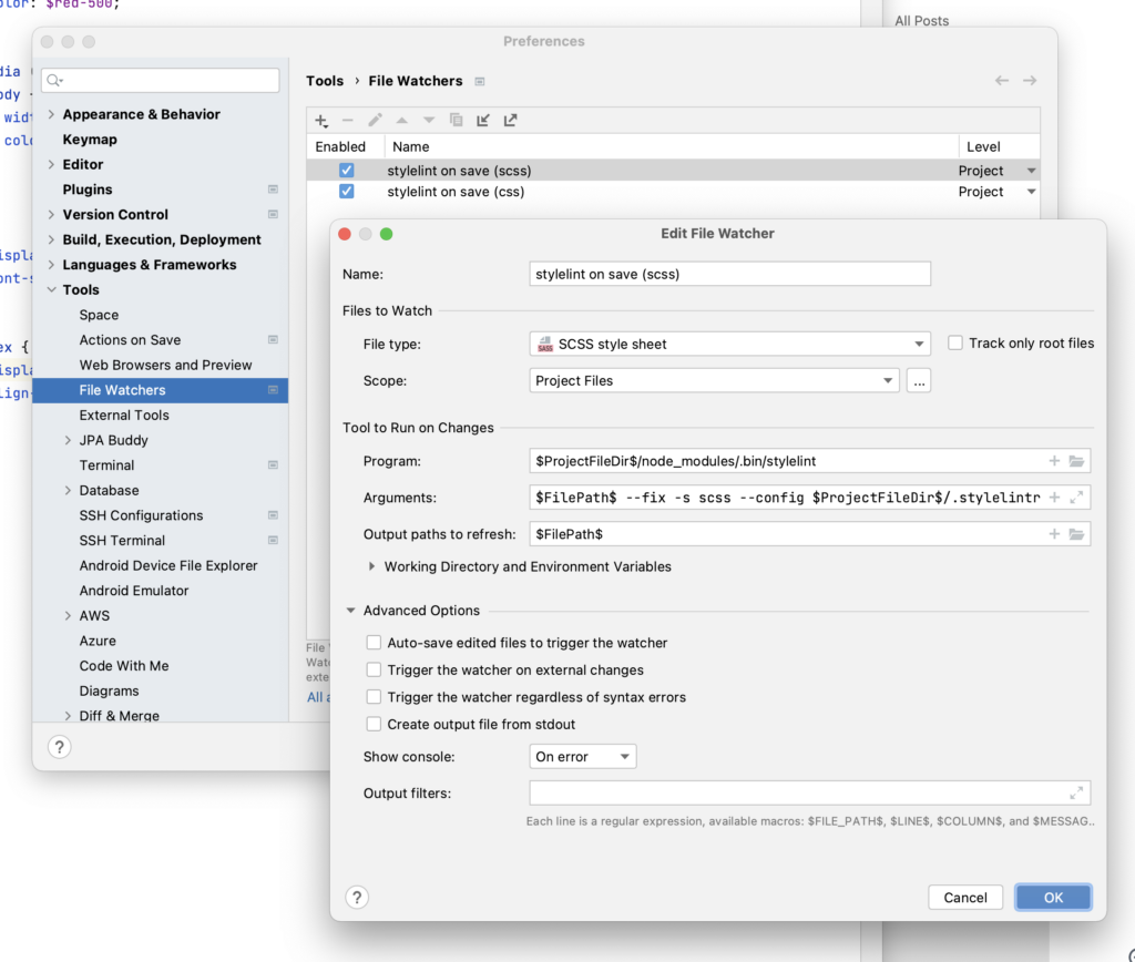
$ProjectFileDir$/node_modules/.bin/stylelint$FilePath$ --fix -s scss --config $ProjectFileDir$/.stylelintrc$FilePath$In the process I learned that IntelliJ Idea has even more settings than I thought.
BTW. I think after many years of just happily coding without any IDE “help”, I think I might have found my new editor. VSCode never really sat with me. But I can work with this.
Happy coding!
In the video above I demonstrate a little app and its code in a slightly unorderly fashion, so I thought I’d put some words down and hopefully make things more clear.
First of all, this is just a demo app and not a real-life application, although it contains concepts that a real-life application will need like environment variables, progressive enhancement, data fetching, calling an API etc.
I re-architected an earlier version of this todo app to use the latest changes in SvelteKit. The old version used fetch calls all over the place and was hardly optimized. I made it a few months ago to practice with HTTP verbs like PATCH, PUT, DELETE etc.
This new version works way better, and behind the scenes it’s using the latest SvelteKit logic. This means using +page.js – +page.server.js, the new load function etc.
These todo demos might seem silly but serve the purpose of showing how a real-world app could look like in the fewest lines of code. They’re a way to practice and evaluate the concepts behind something.
In the case of the Sveltekit todo app (I mean the official one, which you can see by generating a new SvelteKit project), an API is called, and you can add, edit and delete todo items.
In my demo app, there is similar functionality, although a Trello board is being used as a back-end.
The reason that I do this is so that this way I don’t need to build an API (a skill I currently don’t have) and I can (1) use their excellent documentation and (2) I can focus on the heart of the matter, which is building a working app where I can experiment with doing things that a real-world app should do i.e. all your CRUD-y goodness: add stuff, modify stuff, delete stuff.
Buuuut here I can do it in a way that is super modern. The gist of the techniques used is that you can have all the benefits of an MPA + SPA combined.
It’s quite hard to explain, because you’d have to piece together a few of Rich Harris’s Svelte/SvelteKit talks to really make sense of it. But I’ll give it a shot.
In one of them he had a progressively enhanced form demo. He disabled JS and his form still worked. Because everything ran on the server, and was only progressively enhanced by the client.
In his newest talk at the real-life Svelte Summit (which I just attended in Stockholm) he came up with another demo, this time implementing Sverdle, a Wordle clone in SvelteKit. The same logic applied here – fully running on the server, enhanced on the client.
If you ever read about Remix for React this will sound very familiar. SvelteKit is built using as much of the web platform as possible (we are talking FormData, actions inspired by HTTP verbs etc.).
I think all of this is very exciting and I couldn’t wait to try it out, so that’s what I did. You can watch the video for my full explanation.
I find the code logic behind this to be beautiful.
For example, the code belows shows a simplified delete button, tied to a form action. The first part of the code lives in the +page.js template, the other in the +page.server.js file.
  <form
    action="?/delete"
    method="POST"
    use:enhance={() => {
      return ({ form, result }) => {
        if (result.type === 'success') {
          deleted = true
        }
      };
    }}
  >
    <input type="hidden" name="id" value={data.id}>
    <button>Delete</button>
  </form>
export const actions = {
delete: async ({ request, locals }) => {
const form = await request.formData();
await api('DELETE', 'cards/'+form.get('id'));
}
}You could make a small form for every CRUD action on the page (like in SvelteKit’s demo app) or work with bigger forms that do more.
I love this new approach of working in SvelteKit. It is so concise, yet it does so much. I believe SvelteKit form actions are the bomb and usher in the future of forms in web apps. No more controlled inputs. Hello server side rendering and progressive enhancement!
You can find the GitHub repo for this project here.
- Posted in development wordpress - 1 comment
Ik heb zitten nadenken over de veranderingen in WordPress 6 “Arturo”, met als nieuwigheid dat full-site editing gegeven.
Ik heb dat eigenlijk eerlijk gezegd nog nooit zien werken in de praktijk, dus ik sta daar wat skeptisch tegenover.
Voor een eenvoudige website zie ik het nog wel werken, maar ergens ook weer niet. Elke vrijheid die je krijgt in de editor heeft een “andere kant”, die voor mij in de weg staat van de finale kwaliteit.
Stel dat je bv. iets in 2 kolommen zet. Dan moet je eigenlijk ook weer een definitie hebben van wat er mee gebeurt op een klein scherm.
Stel dat je een knopje een kleur geeft. Oké, goed, maar wat met de hover, active, focus state enzovoort?
Als designer die let op elk detail wil ik een goed eindresultaat. Hoe geavanceerder de vorm van customization door de eindgebruiker, hoe meer “controle” je afgeeft. Of hoe meer werk je dan hebt om de oneindigheid aan variaties die dan mogelijk zijn te kunnen voorzien.
Ik besef wel dat het keurslijf waar je enkel een tekstveldje kan aanpassen een beetje 1997 is, en je als content editor wel wat opties wilt om de layout te krijgen die je wil.
Dat is altijd al een moeilijke balans geweest, sinds de eerste dagen als web designer. Vanuit technisch vlak moet je dan eigenlijk beslissen: wat is hardcoded, aanpasbaar, en indien aanpasbaar, in welke mate? Ik wil niet weten hoeveel werkuren er al verspild zijn in de wereld om iets aanpasbaar te maken, waar het dan in de praktijk nooit werd gedaan.
Ik gebruik WordPress al 16 jaar. Door de jaren heen heb ik vooral minimale thema’s geschreven die de standaard have_posts loop gebruiken, met volledige controle over welke HTML en CSS er allemaal binnen komt. Zo min mogelijk plugins en zo veel mogelijk gebruik makend van functionaliteiten zoals custom post types en de manier om in te haken op zaken uit het CMS zoals de navigatie (wp_nav).
Voor use cases waar ik mijn eigen klant ben, ben ik overgeschakeld op een systeem dat ik voor sommige pagina’s vooral statische content had.
Dat is echt doodeenvoudig, je maakt een nieuwe PHP file, en als die zo geformatteerd is, wordt die beschikbaar als template:
<?php
/**
 * Template Name: home
 */
?>
Omdat het toch vooral voor mezelf/mijn bedrijf was, en we als team de skills hadden om zo te werken was dat lang “the way to go”. Dan pasten we gewoon de template aan, hardcoded, en hup, deployen maar.
We hebben ook ooit eens een WP-expert ingehuurd om het allemaal wat properder te zetten, met een moderne PHP logica.
Aan de kant van het bloggen en websites beheren ben ik tevreden met WordPress omdat er effectief een CMS-kant is, en als ik in schrijf-modus ben dat ik écht niet naar mijn terminal wil gaan, een markdown file openen, de laatste git versie uitchecken etc…
De trend van static sites (onder devs) is misschien leuk als tech-demo en voor sommige mensen werkt het misschien (als je dat dev-gegeven toch al leeft), maar voor mij niet. Ik heb geen zin om mijn website elke 2 jaar te herschrijven in het laatste framework. De code van vandaag gaat al mee sinds 2015, en dat was dan weer een evolutie van code van daarvoor.
Af en toe schreef ik er een stukje bij als ik het nodig heb of motivatie heb, zoals dark mode of de code voor propere code-blokken. Maar eigenlijk is al die code al jaren vrij stabiel, en doet die wat het moet doen.
Ik ben ook eens erg onder de indruk geweest van Advanced Custom Fields, en heb dat onthouden als dé manier om iets geavanceerd en gestructureerd in WordPress te krijgen (samen met custom post types). Ik heb eens een heel portfolio systeem uitgedacht voor de Mono site, om dan erna een jaar gefrustreerd te zijn dat we bijna niks in ons portfolio mochten zetten.
Terug over full-site editing dan.
Ik heb er ook schrik voor dat die evolutie misschien zorgt voor een niet-juiste scheiding van de data en de layout.
Met het Gutenberg project (en in het algemeen de “blocks” trend in zaken als Coda, Notion etc.) krijg je eigenlijk data exports waar de metadata van de layout vervat zit op de plek van het “blokje” zelf.
Of situaties waar die informatie tout court niet aanwezig is, waardoor je export eigenlijk een onvolledig beeld geeft.
Dat wordt wel ingewikkeld om te onderhouden en te transporteren naar toekomstige systemen.
Ik ben in het algemeen toch een voorstander van iets dat jaren kan meegaan. Ook daarom hou ik niet zo van die headless CMS trend, waar ik weinig stabiliteit in zie.
Dus… ik ben eigenlijk niet geneigd om als ik een nieuw web project heb, mee te gaan met heel die nieuwe WP redenering.
Misschien is het dan toch tijd om eens een ander CMS te overwegen. Of misschien moet ik me openstellen voor deze manier van werken. Ik werk dagelijks als UI designer in een software context, met af en toe een front-end development uitstap.
Ik ben te weinig met web design in de praktijk bezig om er echt een mening over te formuleren. Misschien zit er in mijn lezerspubliek wel iemand die deze nieuwe problematiek beter beheerst. Wat denken jullie?
- Posted in development javascript rant - 1 comment
I was doing some administration in the awful BillToBox (seriously not happy with this “solution”, but that’s another topic for another day), and to try and make sense of my uploaded documents I sorted them by name:
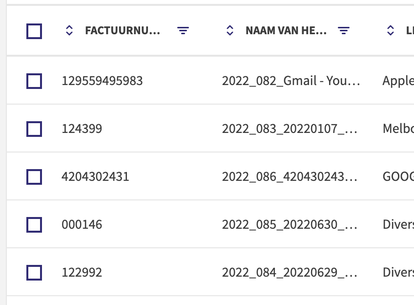
Look at the “Naam van he…” column.
What the hell is going on with this sorting? 82, 83, 86, 85, 84? Hu? (Expected behaviour is 86, 85, 84, 83, 82…)
In which world does this make any sense? It doesn’t even seem to be a case where they forgot to implement natural sort order – it’s just… wrong?
This Svelte REPL shows a quick implementation of natural sort order sorting. Jeff from CodingHorror explains the problem in this 2007 blog post.
Reminds me to maybe go for a tried and tested solution instead of reinventing the wheel when we revamp filtering & sorting in my current project… as there are always lots of things you don’t think about, until you encounter the problem.
Dropping some esoteric knowledge here.
First of all, when you have an HTML e-mail signature, you want it to have inline styles. We won’t be covering that in this blog post.
When you have your source with proper inline styles, the next challenge is to add it to a mail client.
With Outlook 365 it is as easy as copy/pasting from a web page (by selecting the text) and it will just work®.
If you try to do that for Apple Mail you will see that the Signatures part of the preference panel is intent on breaking your beautiful signature.
So in order to fix this, do the following.
~/Library/Mobile Documents/com~apple~mail/Data/V4/Signaturesls -lt and check which is the latest signature (the date will show up in the output).240D00D1-048D-4F86-BF8B-6050AD0F5D97.mailsignature.sudo chflags nouchg 240D00D1-048D-4F86-BF8B-6050AD0F5D97.mailsignatureContent-Transfer-Encoding: 7bit
Content-Type: text/html;
charset=us-ascii
Message-Id: <12EF408B-34C4-4E68-B1AE-080F8BD43AE7>
Mime-Version: 1.0 (Mac OS X Mail 15.0 \(3693.20.0.1.32\))
<body> code:<body dir="auto" style="caret-color: rgb(0, 0, 0); color: rgb(0, 0, 0); letter-spacing: normal; orphans: auto; text-align: start; text-indent: 0px; text-transform: none; white-space: normal; widows: auto; word-spacing: 0px; -webkit-text-size-adjust: auto; -webkit-text-stroke-width: 0px; text-decoration: none; word-wrap: break-word; -webkit-nbsp-mode: space; line-break: after-white-space;">PASTE HERE<br><br></body><br class="Apple-interchange-newline">
sudo chflags uchg 240D00D1-048D-4F86-BF8B-6050AD0F5D97.mailsignatureNow open Apple Mail, and you will see your beautiful signature.
*Note: after some testing, locking and unlocking the file does not seem to do much.
- Posted in film
Zijn er nog Marvel films die niet de hele tijd over-the-top moeten gaan? Deze film is Guardians of the Galaxy in een Thor-jasje. Af en toe grappig maar niet echt mijn ding.
Een heel mooie film met één van mijn favoriete acteurs, Joaquin Phoenix. Hij speelt een sociaal ietwat ongemakkelijke radio-maker die een docu-reeks aan het maken over hoe kinderen de toekomst zien. Onverwacht moet hij op een jongen van dezelfde leeftijd letten, en bouwt er een band mee op.
Een goed opgezette biopic over Venus en Serena Williams – en hun veeleisende vader. Uiteraard gedramatiseerd maar goed gebracht. Over dat ene incident zullen we maar zwijgen zeker?
Vrij lange Japanse film, maar eentje die wel prima in elkaar zet. Stukje bij beetje ontdek je meer over wat in het begin toch eerder mysterieus lijkt. Gebaseerd op een boek van Haruki Murakami. De beeldtaal is top… en nu wil ik ook een Saab Turbo 900.

Borgen is terug na bijna tien jaar afwezigheid! Het 4e seizoen heet Borgen: Power and Glory en is te zien op Netflix. Ik heb er van gesmuld.
De reeks bouwt mooi voort op de vorige seizoenen maar toont de vertrouwde karakters in een nieuwe dynamiek. Daarnaast komen er ook enkele leuke nieuwe bij – een groentje in de administratie en een zenuwachtige slimmerik, die werkgewijs voor een hele nieuwe uitdaging wordt gesteld. Het hoogtepunt was voor mij Katrine Fønsmark zien zweten in haar nieuwe rol als baas van TV1.
Als je iets hebt met politiek of Scandinavische series: gewoon kijken die handel.
Ik heb een serie-aanrader op Netflix: Monarca.

Maar wat kan ik zeggen zonder veel weg te geven? Het is een beetje de Succession van Mexico.
De serie gaat over een familie die in de tequila-handel zit, maar eigenlijk vooral een bekend merk heeft en de naam gebruikt om hotels mee te bouwen en te runnen. Het speelt zich af in Mexico, vooral in Guadalajara maar ook in Tequila (wat blijkbaar een echte plek is).
Er zijn 2 seizoenen. Het is spannend. Er is seks, intrige, geweld, … in typische Netflix-fashion wil je telkens de volgende episode zien. Het is geen typische narco-serie maar er komen soms wel elementen naar boven.
Ik was het vooral aan het bekijken om mijn Spaans te verbeteren en daar actief mee bezig te blijven. Maar of die strategie vruchten afwerpt valt nog te bezien: ik leer gewoon veel woorden als pendejo, chingar etc.
Het lukt me nog niet helemaal om naar Spaanse series te kijken met ondertitels in het Spaans en alles te begrijpen, maar er is wel evolutie.
Kijken die handel!

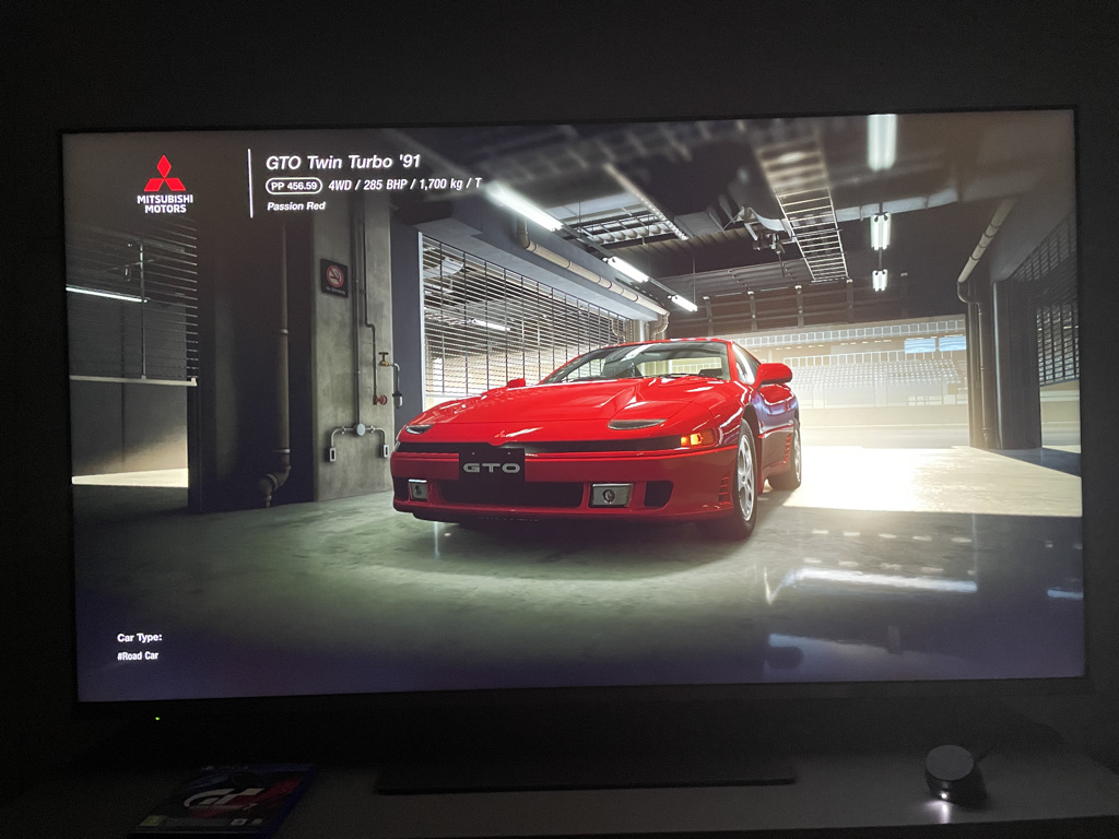
Een spelletje waar ik al lang naar uitkeek.
Vroeger was Gran Turismo auto’s verzamelen, en via een soort opbouw toegang krijgen tot telkens betere auto’s. In GT Sport hebben ze dat min of meer laten vallen, maar het concept is terug.
Gisteren wat gespeeld: ik heb goud gehaald in alle “B” license stukken, waarmee ik een Mitsubishi 3000GT (ook bekend als GTO) heb verkregen.
Met de centjes gewonnen met de races heb ik een GR86 gekocht (natuurlijk). Je kan de auto’s ook tunen met onderdelen die je kan kopen of winnen. Hoe uitgebreid dat is en of het veel effect heeft valt nog te bezien.
Er was één race in de regen en dat voelde vrij crappy aan qua handling… niet echt een fan van de implementatie daarvan.
Ik heb de indruk dat tot nu toe de races iets te makkelijk zijn, dus misschien moet ik de “hard” mode opzetten. Want anders wordt het een beetje flauwe kost.