Ik heb gisteren mijn rechterhand gebroken – en typ dit bericht onhandig met 1 linkerhand en een beetje rechterhand. Dat deed me denken aan de inclusive graphic van Microsoft:
Ten eerste, hulde voor ons Belgische gezondheidszorgsysteem: van spoed naar radiografie naar een arm in het gips: 2 uur. Wauw. UZA in Edegem ftw?
Wat betreft het ongemak, ik moet zeggen dat het wel meevalt, maar alles zal 50% trager gaan de komende weken vrees ik. En sommige taken eerder 100% trager of gewoonweg niet.
Ik ging iets actiefs doen met de rest van mijn vrije tijd maar ik ga me wegens fysiek incapabel maar op iets intellectueels storten denk ik. Ik heb nog een stapel boeken liggen.
Aujourd’hui je vais travailler sur le champ. Planter des tulipes. Un changement d’en face développer pour 3 jours et juste sortir pour acheter de la nourriture et du fitness. A l’extérieur! C’est une belle journée, nous avons de la chance.
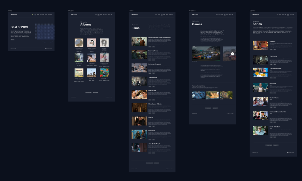
The structure is more or less the same as other years.The content might be interesting to some (as if there are not enough end of year lists already ;)), but for me it’s my personal excuse of the year to play with some technology.
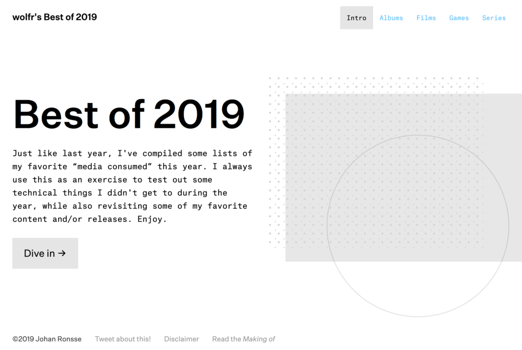
The home page
This post is a technical write-up of some of the aspects of building this website.
Powered by Svelte
This year I got really interested in Svelte, so it was only natural to use Svelte for my yearly tech exploration. Svelte offers an incredible developer experience and highly optimized bundle sizes.
I used the Svelte starter template together with a new file-based router project called Routify.
?Svelte lovers, head up. I started a new meetup group called Svelte Society Belgium. We are organizing the first event in March. You can join the group and find out more here.
The main advantage from a viewer standpoint is no page reloading – the changes from page to page are instant. Using Svelte in general led to some new possibilities in regards to animation and smoothness, but also led to new problems. Nothing that we can’t fix of course!
Design
In 2018 I went content-first, but this year I went design-first. I more or less created all of the designs first, then implemented them as opposed to last year.
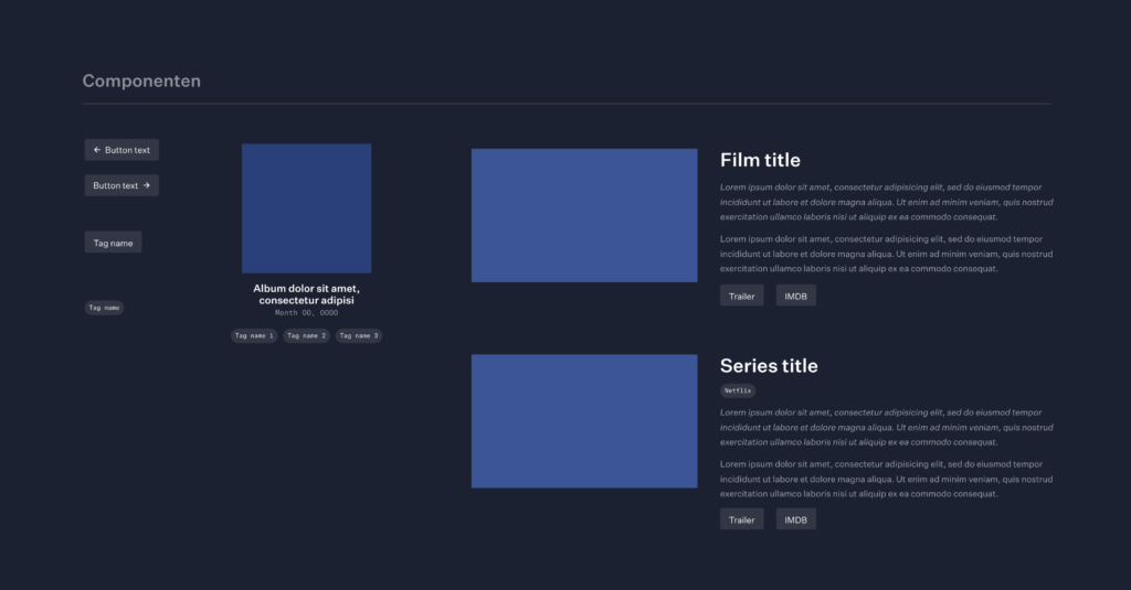
I tried out the new AutoLayout features in Figma to create an accurate design. It was quite handy to have a few auto-resizing components
As my colleagues will know, I am not the one for clean design files, I just visualize what I need to visualize as fast as I can then and then move on.
So if you are curious, you can check out the design file here; but don’t expect a document full of clean layers.
?Commercial break. I am giving a new Figma workshop on January 30, 2020. You can find out more here.
Content
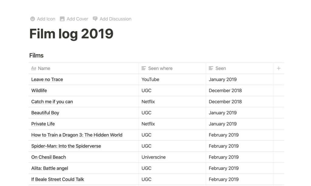
During the year I logged the films I saw in Notion. This has been an incredible tool for us at Mono and I also use it for my “personal” things. Here’s a screenshot of my film log.
Looking at this I should really add Spider-Man: Into the Spiderverse to my list. Talking about missing content, the series page should also include Succession.
I also thought about a podcasts section but didn’t get to it (even though I listened to a lot of podcasts!).
I used images I found on Google Images, and some of the content is from IMDB. I hope that’s alright and put the usage of this in the disclaimer.
Klim offers test downloads for all of their fonts. You can download the package of test fonts on their site.
What I like about these foundries is that they have permissive licenses that are just a one-time purchase. When I make a website I don’t want to worry about the font licensing for years. With our Mono website we use Benton Sans and every year I have to deal with the bill and administration for that.
I plan to change the typography of this website to Untitled Sans as well. I have my own personal “brand” that no one ever sees (except the recipients of my invoices :D), and I slowly want to transfer it over to this website as well.
Routing
I put a version of the source code on Github that people could use for learning purposes.
You can see in /pages/ that the different routes are simply files: albums.svelte, series.svelte etc. There is a _fallback.svelte for the 404 and a _layout.svelte which contains the general layout used by every page.
The Routify examples site provides more examples. My needs were rather simple, and I got this up and running quite fast.
Animation
An example of animation is the fading of the albums on the albums page. Implementing this was as simple as writing this:
Notice that when animating out, we set the duration to 0, as otherwise the animation will delay the routing.
Another example of animation is the slider on the games page. I implemented it based on this REPL I had made before, which in turn was based on someone else’s work. If you are that person, please tell me so I can credit you.
For the slider, I am using a custom easing function called hslide.js.
It has to be noted that Svelte’s easing functions are simply mathematical functions, such as this one:
function expoInOut(t) {
	return t === 0.0 || t === 1.0
		? t
		: t < 0.5
			? +0.5 * Math.pow(2.0, 20.0 * t - 10.0)
			: -0.5 * Math.pow(2.0, 10.0 - t * 20.0) + 1.0;
}
You can import functions from Svelte, and then use them:
import { expoInOut } from 'svelte/easing'
The slider as it is is nicely abstracted away to its own component.
Within that component, there are scripts and styles specific to the slider. In this case, I chose to keep most code related to the slider local to the component.
I quite like the clamp function in this code:
let cur = 0;

function changeSlide(slide) {
    cur = slide;
}

const clamp = (number, min, max) => Math.min(Math.max(number, min), max);
function prev(e) { cur = clamp( --cur, 0, slides.length-1 ) }
function next(e) { cur = clamp( ++cur, 0, slides.length-1 ) }
What is “clamping” then? clamping is used to restrict a value to a given range.
A clamp function clamps a value between an upper and lower bound. It takes three parameters: a minimum value, a preferred value, and a maximum allowed value.
Side note: Svelte and the power of the REPL
Think of Svelte’s REPL as a sort of codepen to save your Svelte experiments. The REPL provides shareable links to Svelte code.
Throughout the year I am saving bits of code here and there which I can reuse in my projects. For example, I can’t wait to use this radial selector or do something with maps.
Scrolling: set the scroll to top when visiting new pages
Since an SPA simply reloads the content, but the visitor’s expectation is that when you visit a new page you end up at the top, I had to set the scroll position manually:
(A new version of Routify will support this automatically.)
Responsive images
When you have a few days to make something, you have to make some choices, and implementing responsive images did not make the cut.
What are responsive images?
First of all, what do I mean by responsive images? In short, it’s loading the right image based on the viewport. For example, if you have a viewport of 320px wide, and a screen that has a pixel density of 2x, the widest image you will ever need (bar zooming) is 640px. If you see something on a 4K screen, at 3840×2160, but the website image container maxes out at 1280, and the screen is 1x, then the max width you will need is 1280.
Thus, given a combination of instructions to the browser and providing the right images on your server, you can provide the end user with a highly optimized experience. Instead of loading lots of heavy images they could load specifically the images that are optimized for their environment without any quality loss.
Implementations
I thought about responsive images a lot though. In our current implementation of the Mono website, and also this very website, responsive images are handled in part by WordPress itself.
The server generates image sizes on upload, and when used in a post, provides the right markup automatically.
Now, in a Svelte environment, there is no CMS, there is no server doing thing for you, so you have to do it yourself.
Generating the smaller images
In the past I have used packages like gulp-imagemin and others to generate images. I read up about Sharp now (thx Jérôme), but didn’t use it much except for a small experiment (thank you @Coma).
In my experiment I noted that Sharp is blazingly fast, but generating the right mages is creating workflow problems in itself. Something that I would only want to work on for a larger project.
I’ve always thought that putting the implementation work with the user was a bad idea. My colleague and business partner Xavier wrote about this a long time ago “The Responsive Image Solution Does Not Belong in HTML”.
Responsive images conclusion
In the end I didn’t get far with actually implementing responsive images, and the images in the deployed version are not responsive.
I used a combination of Save for web using Photoshop CS 2020 (I hate paying so much yearly for only using a few functionalities but OK) and the website TinyJPG.com to get to smaller images.
Dark mode
Naturally, with all the dark mode hype, I had to implement a dark mode.
I didn’t use CSS variables or anything, just manually declared an alternative in the context of the SCSS.
I find this to be more manageable than cross-referencing lots of variables, especially because there are often subtle tweaks that you need to make to the colours.
This also falls nicely in line with my philosophy of keeping code portable across projects.
Deployment
This was my first time deploying an “Single Page Application” (SPA) with multiple pages (confusing, isn’t it?); so I ran into a little problem where links wouldn’t work. Then I remembered that I would probably need to redirect all requests to index.html. On an Apache server, you can do that as follows:
Then later on, I wanted to link to images directly, and the requests to images would be caught by this RewriteRule, so I had to extend the rewrite conditions:
Routify is a new-ish project, so I had some small implementation issues, but Jakob, the author was super responsive on Github. Eventually we even got into a chat and I started logging issues and thinking about how they could be solved to move this project forward.
CSS strategy: framework for general components + local, scoped CSS through Svelte
Svelte has built-in CSS scoping to a Svelte component. But just because a language has a feature doesn’t mean you have to use it for everything. I see this a lot in other people’s SCSS code: they go crazy with all the Sass features and in the end have a bunch of complex code.
For most of the CSS, I went with a separate SCSS file that got compiled separately. I found it quite handy to have an existing div-based grid implementation readily available (code), as well as a setup for differentiating between “styled” HTML and HTML that should be left unstyled (a simple version of this logic can be found in Ygdir here).
This past January I wrote about the need for a new CSS framework. These thoughts have crystallised into a new project called Ygdir, which is pretty early stage now. The general idea behind Ygdir is that is a convention-first framework.
Home page graphic
For the home page graphic, I was trying some things with generating SVG with Svelte. This kind of code generates a bunch of SVG circles:
<script>
    let gridSize = 14;
    let dotSize = 1.5;
    let countCols = 30;
    let countRows = 10;
</script>

<svg>
    {#each Array(countCols) as _, i}
        {#each Array(countRows) as _, j}
        <circle cx="{dotSize+(i*dotSize*gridSize)}" cy="{dotSize*gridSize*j}" r="{dotSize}" />
        <circle cx="{dotSize+(i*dotSize*gridSize)+10}" cy="{dotSize*gridSize*j+8}" r="{dotSize*1,2}" />
        {/each}
    {/each}
</svg>
I had lots of ideas for this graphic, for example what I wanted to do is animate the circles based on whether you were hovering over them, and then animating nearby circles, creating some a sort of “shockwave” pattern.
For the globe (circle) in the illustration, I was thinking I wanted to animate a radial gradient in some way. I had this concept of the sun rising, or a 3D sphere full of stars.
Something that could serve as inspiration in my future experiments
I also wanted it to react to mouse movement in a natural way. I didn’t get to this, and I also believe implementing that requires a lot of studying first to get smooth with graphics programming.
I ran out of time so these graphics programming experiment will be something for 2019. For the responsive version, I even completely hid the graphic on the homepage because I didn’t want to work on making a responsive dynamic graphic with animated layers. Pick your battles I would say.
Data logic
I am directly importing JS data in my Svelte templates:
In 2017 I experimented with using AirTable. In 2018 I looked into using a headless CMS.
The thing here is that the data is simple enough to manipulate directly, so I couldn’t be bothered to set up a big technology stack for the content.
This does remain an interesting issue to work on. Where do you manage the data? How do you link it properly? What is the “backend” and how do we provide the right mix between editability by devs and non-devs? We do not create a lot of content websites in our company, so we don’t have to deal with this problem often, but it’s an area that interests me.
I would love to experiment with a headless CMS, but the current offering does not really inspire me. Although to be honest I only gave Netlify’s CMS a real try. Maybe I should do more tests. There’s a lot of tech out there: TinaCMS – Contentful – Forestry etc. – or I should maybe just do a test with headless WordPress.
Conclusion
In my 2018 writeup I wrote: In a lot of ways the end result is exactly what I made last year, but the technical underpinnings have changed.
You could say the same about this year’s version. In a lot of ways the result is similar, but under the hood, a lot of changes have been made. The biggest one this year is using Svelte, which in my mind is a big upgrade from using a static site generator.
In some ways it’s also a downgrade – I’m from the school of progressive enhancement, and a JS error might just break this site, making is quite fragile. I’m also not sure about the accessibility of it all. But I felt like I needed to make some moves and move on from regular old HTML/CSS/JS; the industry is moving towards a certain way of building things and you have to work with it to form your opinion. Maybe in a few years I’ll decide that this “SPA” thing was a really bad idea.
Please comment with your thoughts – I am curious as to what people think about this project, whether I should continue doing it, what you picked up from my technical write-up.
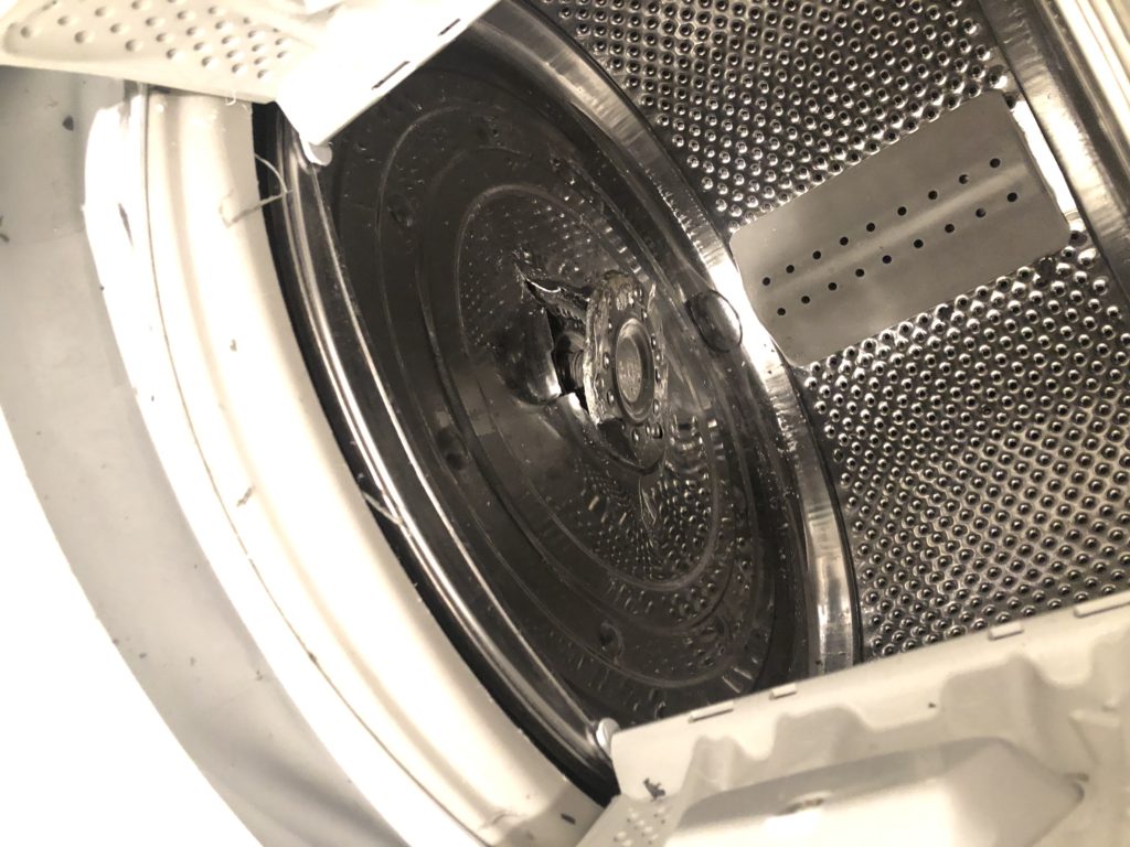
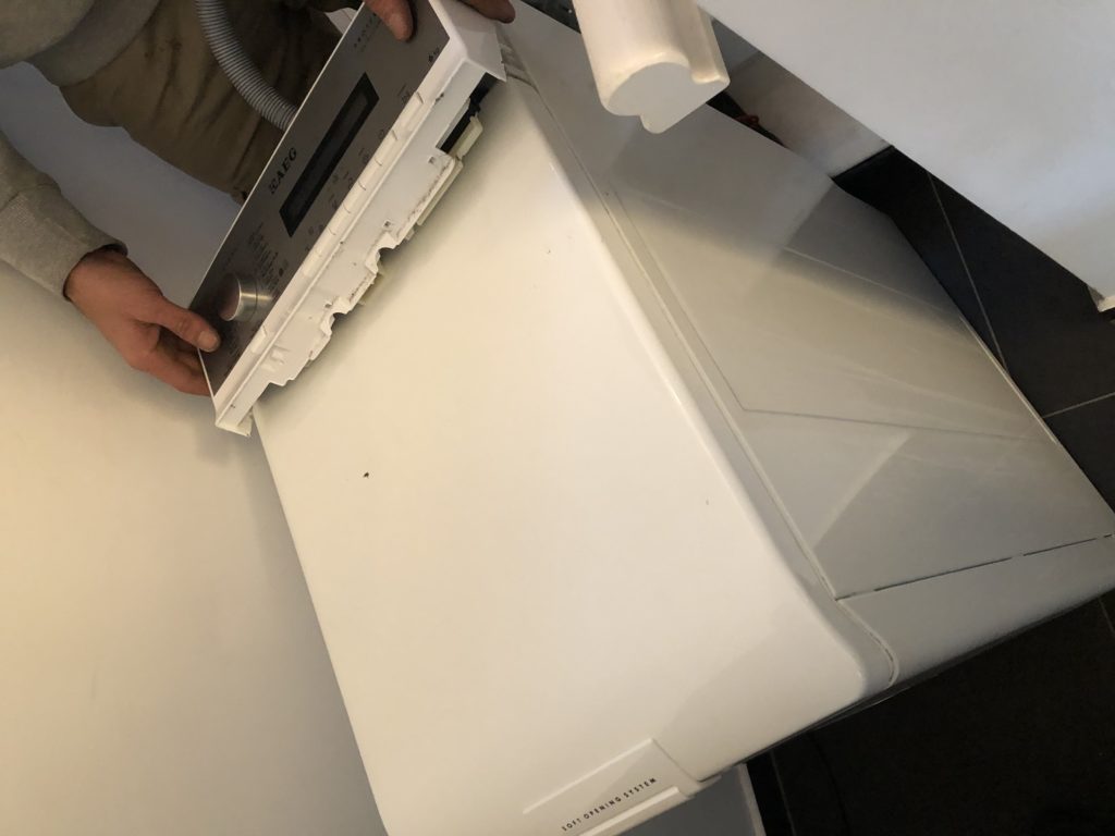
J’avais commandé une nouveau machine à laver, parce que la dernière était cassée. C’était just le tambour qui était brisé.
Les installateurs de Vandenborre arrivent, et ils prennent la veille machine de troisième étage au rez-de-chaussée.
La machine était un peu lourd en il glissera des mains d’un des gens; je me plais et je dis: je vais prendre un photo. L’installateur réponds: pourquoi? C’est la poubelle. Je pense pour un instant: pour prouver vos erreurs; et je pense aussi: mais enfin, 90% de ca machine est en état parfait, pourquoi ils n’essaient de ce réparer? Finalement je bafouille: “…OK, dans ce cas, c’est comme ça.”
Je vous presente: la société du tout à jeter. Je ne veux pas cette situation mais voilà – c’est comment ça fonctione.
Je pense que c’est stupide que dans Belgique nous avons deux langues nationales mais il n’y a pas beaucoup de gens qui parlent les deux d’une bonne manière. J’ai moi-même une théorie que la plupart des problèmes politiques ont leur source dans le fait de ne pas se comprendre.
Je doit admettre que mon francais est rouilé. Terrible en fait. Le contenu de cette article de blog est probablement risible. J’ai utilisé Google Translate et ça fait douze ans que j’ai écrit quelque chose en français. Mais si vous n’utilisez-pas, si vous ne commencez pas, rien ne va passer.
Donc, c’est avec un peu d’honte je presse le bouton “Publier”. Et j’éspère dans 2020 de travailler à mon bonne intention de rafraîchir le français. Et que mon français peut s’améliorer considérablement.
Ik krijg een mail dat overal in mijn district de analoge watermeters vervangen zullen worden door digitale watermeters. Ik lees in de infobrochure volgende:
De verbruiksgegevens worden op een beveiligde manier doorgestuurd naar onze servers. Concreet gebeurt dit 1 keer per dag. Indien gewenst, kan u bezwaar aantekenen tegen het verwerken van uw persoonsgegevens.
Er komt dus een apparaatje in mijn huis dat elke dag gegevens stuurt naar een server waar iemand uit kan afleiden dat ik thuis ben. Hmz ?.
Weet iemand hoe dat dan werkt, zo’n digitale watermeter? Moet die gekoppeld zijn aan je WiFi? Heeft die zijn eigen internetverbinding?
Er is een reëele samenlevingskost gekoppeld aan roken.
Roken is ongezond. Roken leidt tot longkanker. De productie van sigaretten veroorzaakt een onnodige ecologische druk.
Er wordt iets geproduceerd dat per definitie wegwerpbaar is. En dat velen ook wegwerpen, op straat, wat leidt tot vervuiling.
Roken kan nooit aangemoedigd worden.
Maar mensen die willen roken zijn vrij om dat te doen in een omgeving waar ze anderen daar niet mee storen. Als iemand in zijn woning een pakje per dag wil roken moet die persoon dat kunnen. Ik zou het niet aanraden, maar dat is iets anders.
De landen die we graag als voorbeeld nemen van hoe het moet zoals Nederland en Canada hebben een hogere verbruiksbelasting op een pakje sigaretten dan België.
In Australië kost een pakje sigaretten 18,4 euro. In Noorwegen 11,8 euro. In de UK 11,7 euro (bron)
Ik ben voorstander van het verhogen van de accijnzen op sigaretten, zodat de gemiddelde prijs van een pakje naar 8 euro stijgt.
Dit zal er voor zorgen dat roken minder toegankelijk is voor jongeren. Dit zal ook zorgen voor meer inkomsten voor de staat. Dit kan helpen om het gat in de begroting dicht te rijden.
Door de prijs op te trekken naar het niveau van de buurlanden Frankrijk en Nederland vermijden we ook dat mensen over de grens gaan om te kopen. Voor een halve euro per pakje heeft dat weinig zin.
Vele rokers willen bewust stoppen en gaan van pakje naar pakje. Het aankopen van een “sloef” is een grotere stap die je verslaving herbevestigt. Dit doe je niet zomaar. Neem het aan van een ex-roker.
Eén van mijn favoriete films is Tot Altijd, een Vlaamse gebaseerd op het verhaal van Mario Verstraete, een MS-patiënt die vecht voor zijn recht op een waardige dood.
Onlangs keek ik voor een tweede keer naar de film Still Alice, over een docente aan de universiteit die op jonge leeftijd dementie krijgt (met een schitterende Julianne Moore).
Ik ben normaal niet zo’n bleiter bij films, maar bij bovenstaande titels kan ik u garanderen dat de tranen over mijn wangen rollen bij bepaalde scènes.
Waarom raakt mij dat zo? Het gaat over zoveel dingen tegelijkertijd. Het recht op zelfbeschikking. Het onnodig lijden. De onnodige bezetting van het leven van anderen, tegen je eigen wil. Het verlies van intellectuele capaciteit. Onrecht en je eigen beslissingen niet meer kunnen maken. Of zelfs niet mogen maken van hogerop.
Ik heb persoonlijke ervaring met dementie. Mijn oma leed aan dementie. We gingen met de familie op bezoek in het rusthuis. Mijn oma takelde telkens verder af. Na een tijd herkende ze ons niet meer.
Ik heb het één keer aangedurfd om alleen op bezoek te gaan. Ik was daar helemaal niet goed van. Ik was een vreemde voor haar. Ik, die als kleine jongen zoveel was komen spelen. Ik kon geen afscheid meer nemen. Net op de leeftijd dat ik een serieus gesprek kon voeren met mijn oma, was dat niet meer mogelijk.
Het verliezen van de capaciteit om voor jezelf te denken moet één van de ergste dingen zijn die er zijn. In de film Still Alice is de hoofdpersoon een internationaal erkend professor die haar hele leven bezig geweest is met het vraagstuk over hoe mensen taal leren. Na een tijd kan ze niet meer onthouden wat ze het vorige dagdeel gedaan heeft.
Als iemand die ook sterk “met zijn hoofd werkt” komt zo’n film hard aan. Voor sommigen is de jongdementie die in de film getoond wordt harde realiteit. Ik hoorde vorige week nog een verhaal over iemand die zijn vader verloor door jongdementie. Er wordt niet zo vaak over gesproken, maar het is de realiteit.
Iemand die dement is, is nog altijd mens. Je naasten zullen voor je willen zorgen, als je het geluk hebt nog dichte familie te hebben. Maar jij wilt dat misschien zelf niet.
Het is aan de persoon zelf om te beslissen wat er moet gebeuren in zo’n situatie. Net zoals je kan beslissen of je gereanimeerd wilt worden na een bepaalde leeftijd, of wat er met je organen mag gebeuren, is voor mij het ook belangrijk dat je als persoon zelf kan beslissen dat, moest het noodlot toeslaan, dat je zacht kan gaan.
Ik vind het daarom zeer goed dat er een debat is in de Kamer over het recht op euthanasie bij dementie. Ik vond het ook zeer goed dat er een zeer genuanceerd gesprek over was vandaag in de Zevende Dag.
Dat er voorzichtig en zeker niet lichtzinnig met dit thema moet omgegaan worden is duidelijk. Maar ik vind het belangrijk genoeg om hier de nodige aandacht aan te besteden, zodat de juiste wetgeving kan volgen.
Wij hebben met ons bedrijf een schaduwboekhouding. Dit is niet de echte boekhouding, die zit in een specifiek boekhoud programma. Het is een reeks Google Sheets documenten waar onze inkomende en uitgaande facturen in staan. We gebruiken dit om een overzicht te houden.
Wat ik af en toe doe is de data er uit halen en analyseren. Dit doe ik liefst in een aparte omgeving waar ik wat vlotter een aantal zaken kan aaneen koppelen (bv. Apple Numbers.)
Nu wil ik deze tussenstap graag optimaliseren en op basis van de data die er in staat grafieken en data genereren. Van het genre data tabel met top clients, grafiek met top clients per year, revenue per client year over year, enz. En dit rechtstreeks in Google Sheets.
Wie kent er iemand die dit voor ons zou kunnen oplossen? Ik zoek een expert die ook zelf een beetje kan meedenken over wat er nuttig kunnen zijn voor een betere workflow.
Ik zag iemand op Twitter die zei: nu ik op Windows zit, mis ik Preview.app. Want dat opent allerlei formaten zonder last.
Dat is zo, en het doet nog meer. Je kan PDF’s los van elkaar trekken. Je kan PDF pagina’s combineren. Je kan je handtekening digitaal zetten. Je kan PDF’s annoteren.
Je kan een slideshow maken van een hoop JPGs. Je kan een PDF presenteren als slideshow. Er zit heel wat “verborgen” functionaliteit in Preview.app. Van die handige dingen waarvan je niet beseft dat ze geweldig zijn tot je ze moet missen.
(Blog post gecategoriseerd onder: redenen waarom ik niet zo snel naar Windows zou switchen.)