Johan Ronsse

  • Home
  • Projects
  • Blog
  • iPad Pro – Tidbits (3)

    June 25, 2016 - Posted in Uncategorized

    Graphic by Autodesk

    Yesterday I was talking to Sander Spolspoel, who is a freelance animator that specializes in small videos that explain concepts e.g. what a company does. You can find his website here.

    He’s had an iPad Pro since December. He uses it a lot for creative work. He showed me tons of drawings that he made using the iPad, mainly created using an app called Graphic. Here’s a screenshot of the app:

    Basically it works a lot like Adobe Illustrator. It looks very promising and I think I’ll use this the next time I am drawing a design on the iPad.

    Git clients and coding on the iPad

    Did you know there are Git clients for the iPad? I spotted an app called Working Copy on Federico Vittici’s home screen and I was curious – it turns out to be a Git client. It looks like this:

    I’ve got a whole separate blog post coming up about coding on the iPad, but it’s interesting to know that this exists.

    What I think about the iPad Pro after about a week

    One week in, I know I freaking love this device. I’ve had iPads for years, but they mostly went unused. The main use case for the iPad would be entertainment on long trips. In a work-like situation I would either go to my iPhone or my Macbook to do something, but now my go-to device has become the iPad Pro.

    A huge part of this is because I am obviously testing the device, but I think it’s going to stay this way. I have the feeling I’ll have to relearn a lot of my existing workflows but in the end they will be better. At the very least I’ll learn something new. 

  • iPad Pro – Tidbits (2)

    June 24, 2016 - Posted in Uncategorized

    Skype

    Today I tested Skype on the iPad Pro. The camera is pretty good – it’s not full HD but it’s not bad at all. I had no issues Skyping with my colleague. One thing worth mentioning is that the angle is quite weird – it’s not frontal, it’s a bit “from below”. Like this: 

    IFTTT and automation

    I didn’t like the process of tweeting these blogposts and was glad to find out there is an IFTTT app for the iPad called IF. From the iPad I created a recipe by logging into WordPress from the IF app. It used the Twitter credentials that were  already stored inside the system.

    I ‘m curious to read more about automation. In the past I’ve read some stuff from Federico Vittici at MacStories who seems to be the master of automation; he’s been doing this since 2012.

    The keyboard

    When I was writing yesterday’s post, it was already dark, and I noticed I really missed the keyboard lighting that you have on Macbooks. I’ve also been missing an indicator whether caps lock was on or not. There’s some small luxuries you have on a Macbook that you don’t have on the iPad Pro.

    So far I’ve really liked the keyboard though, and I think the iPad Pro is a fantastic writing device. If I was a full-time writer I think I would be able to use it as my sole computer.

    Over and out!

  • iPad Pro – Tidbits

    June 23, 2016 - Posted in Uncategorized

    In my goal of writing about the iPad Pro everday, here’s some small bits that will eventually make it into the long research article.

    Apple Pencil

    I haven’t used the pencil at length. I am looking for an app where I can draw vectors but still see the underlying pixels so I can draw icons on the iPad Pro. I’ve yet to find something.

    Ergonomics

    To write about the ergonomics of the iPad Pro it will need some more “testing in the field”. From what I can tell it will probably be rather comfortable to use on a plane compared to a laptop because of its shape when set up with the keyboard.

    The cover is rather difficult to switch from “keyboard” to “flat” position. I could do that with ease on the old iPad – maybe it’s just something I need to adjust to.

    If you expected the iPad Pro to be able to be used at a 5 degree angle like a regular iPad with a smart cover you are mistaken; it actually just lies completely flat. I’m not sure why, maybe it has something to do with drawing on it and having a paper-like surface to work on.

    Wider color gamut

    The iPad Pro uses a new kind of screen that has a wider color gamut than a regular screen. Apparently you need to export your assets in a different way to be able to use this. I guess it will be mostly useful for photography and for games. There is a whole WWDC talk about this, which I have yet to check out.

    Blogging workflow

    I found a good blogging workflow. First I use iA Writer to write the main article. Then I use the WordPress app to post it. It looks like this:


    Over and out!

  • iPad Pro – Part Three – Using the iPad as an external screen

    June 22, 2016 - Posted in computers interface

    Time for part 3 of the iPad Pro review. I already wrote part 2 before, but I lost it due to having no clipboard history. See, that’s working on an iPad for you!

    image

    An iPad acting as an external monitor. The iPad is showing the desktop version of Spotify using Duet.

    Anyway, I have to do a lot of design presentations and for me it makes a lot of difference whether I can show my designs on a decent screen or on a crappy projector. I can’t tell you how many moments people huddled together before my Macbook to see the actual colors of the design and not the ones of the crappy projector.

    But hey, here’s a novel idea: why not use the iPad as a screen to present your work? The regular iPad is a tad small for this but the 12.9″ iPad Pro is pretty much perfect in this regard.

    There are two main apps to accomplish this. One is called Air Display 3 and the other is called Duet.

    Basically they allow you to mirror your Macbook’s screen to an iPad. This way you can set up the iPad to be visible to your presentation’s audience while you still comfortably control it from your Macbook. For a 1 on 1 meeting it is realistic to just sit side by side and look on the same laptop but when it’s 2 or 3 people it’s better to have an external screen. Projectors require a lot of room and a proper setup… Air Display only requires proper WiFi.

    Now, things are a bit confusing because first Apple didn’t allow apps to communicate over USB, so the people who developed Air Display were relying on WiFi. Since Air Display 3 you can also use USB which is more reliable. Duet – the main competitor – only has USB support.

    Both apps do some hacky things to get the iPad to show up as a 2nd display and are pretty prone to require some trial and error before it finally works. When testing things this morning I had to reboot my Macbook at least once, kill the Duet app on iPad at least once and was presented with a black screen on my Macbook a few times. After a few minutes it came back to life. So this is definitely on the hacky side – but it’s cool that you can do this.

    Imagine a travel kit where you have an iPad Pro and a small Macbook. You have dual screens to work on yet it’s still relatively tiny.

    Now imagine a travel kit that is just an iPad Pro…

    Anyway, over and out. Tomorrow I will try to rewrite the 2nd part which was about using the iPad as a graphic design tool.

    Follow me on Twitter to stay up to date: @johan_ronsse.

  • iPad Pro – Part One – Introduction

    June 21, 2016 - Posted in computers

    This is the start of a research article about the iPad Pro. My goal is to try and use the iPad Pro as a serious working device.

    Apple touts the iPad Pro as the future of computing. They say that it’s an uncompromising vision of personal computing for the modern world. That it makes complex work as natural as touching, swiping or writing with a pencil.

    As someone using a computer to make a living, it’s natural to want things bigger and better. For years we (and then I mean pro users) have been asking for more processing power, more ports and bigger screens.

    If there’s a new development in computing I want to test it. If there’s something that could improve my productivity – even in a minor way – I have to try it. At some point in the not too distant past I had three 27 inch screens on my desk at the same time. Maybe that was a bit too much, but it was worth the try. I wanted all my screens to be retina, I wanted a faster Macbook, I wanted all of it.

    Around that time I moved to Japan, and because of the fact that was in a coworking space moving from desk to desk I had to rely on a single screen to do my work. It was just my Macbook and nothing else. In the beginning I thought I really needed all that screen space to be productive but what ended up happening is that I had some of the most productive work months of my life there – all on a single 15″ screen.

    For years for every Apple Keynote I’ve been hoping for a better Macbook. But I think what Apple is showing us with the iPad Pro is that the future maybe isn’t a continuation of the past. Maybe iOS as a whole is a new break in computing that in the end will make us much happier than the old school world of moving files around.

    I think that with every release they are trying to make it more powerful without turning it into something bad. And maybe they’re succeeding. This is the first one in a series of posts where I examine the iPad pro as a serious computing device. I wrote this blog post on the iPad and I must say that went quite smoothly.

  • A way to export Keynote presentations as proper HTML

    May 23, 2016 - Posted in Uncategorized - 6 comments

    When I give a presentations, my notes are the full text that belongs to that slide.

    It looks like this:

    Screen Shot 2016-05-23 at 14.27.20

    This is great because when you are in “presenter mode” and you stumble over your words, you can just read the slides. I try to rehearse every presentation I do but I don’t always know it 100%. The notes are my fallback to deliver a smooth presentation.

    Now, when I want to share my presentation online I have a problem: the slides are pretty bare and minimal, and the actual content is contained within the notes.

    In the past I reworked some of my presentations to contain the notes text within the slides. It looks like this:

    Screen Shot 2016-05-23 at 14.21.47

    I would then share these on my Slideshare.

    It was a lot of work, and most of the time when you just did a presentation you kind of want to let it go and work on the next thing.

    But I knew that this method conveyed the presentation’s message in a much better way. Some of these slideshows got really popular.

    What’s not ideal is that the text is contained in images. It’s not accessible, it’s not very SEO friendly… it’s against everything I learned when people still cared about web standards .

    Next to that what has always bothered me here is that my content is living on someone else’s platform. Apparently SlideShare has been bought by LinkedIn now which makes things even worse. As hundreds of startups have learned us by shutting down without any export options, you have to own your data. Everyone should have read FUCK THE CLOUD.

    I tried to solve my “slide sharing problem” with video, but that’s even more work. Next to editing a whole video project I spent hours making subtitles for this talk and gave up somewhere around the 10 minute mark.

    This doesn’t work. How do I fix this?

    Some people have argued that I could use something like reveal.js to create the slides, but this is not a solution to my problem. It’s simply an alternative to Keynote.

    For the kind of presentations I do I want to be able to do a bit of layout, drag images in slides etc. It’s very hard to do this in reveal.js style presentations.

    Now, I’ve read presentations on the web in this way before, and I always thought that was a good idea:

    screen shot 2016-05-19 at 15 16 38

    This is from Maciej Cegłowski’s “Internet with a human face“, which you should really check out.

    Another example is Scott Jehl’s Delivering Responsibly, which is very well done.

    Basically it’s just a really long HTML page where the slides are next to the text.

    It’s pretty simple, but how to achieve this without a lot of copying and pasting?

    I wrote Maciej on Twitter how he did his work and he said there’s no trick to it for him – just manual work.

    I don’t like to do manual work when a computer can do it… so I found a way to do it. It involves some steps but it’s nowhere near as labor intensive as doing it manually.

    • First you do an image export of your presentation
    • Then you do another export, in the Keynote ’09 format
    • Rename the keynote 09 export (in .key format) to .zip
    • Unarchive it and find a file called index.apxl
    • Now run this script on the index.apxl file
    • Now you have an index.html file with your notes. Place the output of the image export step in a folder called ‘images’
    • Then install Keynote extractor. You can install it globally using npm install keynote-extractor -g (This code was written by my great colleague Thomas ? Great job!)<
    • Run the keynote-extractor command in the folder containing the index.html and the images folder
    • Tadaa! Here is your presentation.

    I’ll share the slides of my recent talk soon.

    Give it a try for yourself… and let me know what you think.

    P.S. Keynote has an “extract to HTML” option, but what it returns is a big pile of bloat. It also eats your notes in the process. It’s not usable for my use case.

  • A few words on open data, local apps and government-subsidized application projects

    May 3, 2016 - Posted in Uncategorized - 1 comment

    I read the Flemish Government is holding a contest where you can win €20.000 if your application makes use of open data provided by Flanders.

    You have to use a dataset provided by them to be eligible to enter the contest.

    The power of open data is that application makers can combine data from multiple sources to create an app that delivers something that otherwise wasn’t possible before.

    Toon Vanagt who manages data.be has the perfect example. He manages a website that combines data from multiple government sources (Staatsblad, FOD Financiën etc.) to create a website that lists public information about companies in a very good way. A much better way in fact than the official websites.

    A few weeks ago I downloaded an app called Bikey. It lists bike sharing stations in a handy app. And no matter whether you are in Brussels or Antwerp, it just works.

    The interface is beautiful, and if you use these bike sharing systems I can recommend it.

    This is great: instead of downloading a separate app for Velo Antwerpen, the Brussels bike sharing system Villo etc., you can rely on a single application. What would be even better was if this data was integrated in your favorite mapping application.

    A few years ago I helped to make an app called West-Vlinderen. It’s an app that helps you to plan walking or biking routes in West-Flanders. That’s too local: bike for an hour or two from any point in the province and chances are you left West-Flanders already.

    It would be much better if it would help you plan walking or biking routes across the whole of Belgium.

    The data is there, but the money behind the project comes from the West-Flanders tourism organisation. So the natural focus is to limit yourself to one region, which is a pity.

    A quick search for biking route apps on the App Store only returns a handful of terrible looking amateur offerings (search for “fietsknooppunten”).

    Last week I downloaded an app that lists the museums in Antwerp. It should just have been part of a responsive website about tourism in Antwerp. Now the museum opening hours are locked inside an app that nobody can search.

    What we end up with is a lot of local apps that are just too small, either in geographical scope, in vision, or in quality.

    You have to look at the economics behind these things. Creating a good app takes a lot of time and effort.

    The government money is divided between so many levels: federal, regional, province and city.

    The organisations behind these applications are not software houses. They are government organisations that lack the capacities to build their own software. So they perpetually have to rely on agencies to do their work for them.

    Hiring a team to do a good application that is limited in scope can easily run you €50.000. Less than that and you’re going to have to make concessions that nobody likes, like releasing an iOS app only, or knowingly making a worse app than you actually could by choosing for inferior technology.

    The market is updating constantly. If you have an app, every year there is a new version of iOS and Android you have to support. It’s not just that initial cost: there’s an ongoing cost. There’s a graveyard of apps out there that never get past their version 1.0.

    I won’t even link to the app I worked on because I am ashamed of what it looks like now.

    Tax money is used to build apps that really shouldn’t exist in the first place. The government is then proud to report a thriving “app economy”, built on the backs of the highest taxed workers in the world. That’s just stupid.

    It’s the government’s job to provide the open data; then app makers can go to work to build experiences around that. Lower our taxes, provide the data, and let the free market do the work.

    Those museum hours from before? If you Google for a museum, you get the museum hours. That’s because Google got that data from somewhere. Google has a lot of resources. If we want to avoid a world where Google is the only lens to information, data needs to be open.

    I feel that if the government wants to help they should do so by policy: force government organisations to open up their data.

    This is happening right now and that’s a good thing. But there should be enforced quality standards as well.

    If you look at the reality of open data, it is pretty painful.

    If you search the various portals, the quality is just not there.

    There’s the federal data.gov.be, the Flemish open data portal, the Walloon open data portal; but then there are separate sites for Antwerp, Ghent and Brussels.

    Why do we need so many websites for this when all I want are documented JSON APIs?

    A search on TEC (Walloon bus company) data returns 1 Word document and a page returning 404. A Word document is utterly useless as an open data point. This should really be forbidden. Word is not a structured format that can be used for apps.

    And what about the aforementioned contest? I think a contest is the wrong way to go about things. I for one don’t welcome a proliferation of rather amateuristic Phonegap apps made to impress a jury, only to die a quick death afterwards.

    Technically my friends at iRail and Railer can’t apply for the the contest. They are using data about “Belgium”, not “Flanders” – even though they are providing a very valuable application to the people of Flanders.

    Railer is the top rated application to find Belgian train times in the iOS App Store. People like it much more than the official NMBS application. It would really be helped with €20.000 so the developers can find the focus to make it even better. Now it’s literally being made in someone’s free time.

    iRail is doing a Kickstarter-like campaign to find money to develop the Spitsgids; it’s a feature to check which trains are busy and which ones aren’t. The NS (Netherland Railways) has had this feature for a long time.

    If we are to make things better, there’s definitely some more work to be done. To this end, Mono is once again supporting the upcoming Open Summer of Code.

  • Symbol workflow in Sketch 3.7

    April 26, 2016 - Posted in apps

    As posted in a comment on Designer News:

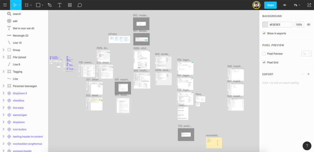
    I love the new Sketch features and in fact they have been helping my current workflow a lot. I am working on a project with a ton of complex forms. My symbols look a bit like this depicting every state of the form:

    This is just 1 small part of the UI.

    Lack of in context editing is the #1 lacking part to the implementation now. I often have to measure how many pixels I have to move something to make it “correct” and then apply it within the symbol.

    I would love some way to have 2 panes open: 1 with your symbols and 1 with your designs. In fact I think I saw a screenshot with just that in an old thread about Sketch 3.6 but maybe I was dreaming.

    The styles syncing is debatable, I don’t think it’s in the way of experimentation and direct manipulation. For me the situation that you are looking at elements on multiple artboards at a time occurs way less than the situation where an inadvertent change triggers a global styling change. For example if you have 1000 layers that use the “standard text” style, and you change it without remembering to make a new style or set the text to “no layer style” you effectively get into a massive beachball situation where Sketch is trying to apply your styles to many layers at once.

    I also have some minor quips about not being able to detach a symbol until it’s “focussed” (you have to left click first and make sure it’s the selected artboard). I think that’s just a bug.

    By the way, did you know you can turn an entire artboard into a symbol? So you can prepare your states separately on small artboards and then match them together using instances. This might not mesh with some people’s workflow but I love it.

    Currently to migitate the in-context editing issue you can try the following: if you position your symbols close to the designs you are working on you can kind of do in-context editing if you have a large enough screen. But it involves a lot of direct manipulation to position the artboards correctly.

    I also have to do a lot of “symbol hunting” now where I have to go and look where Sketch positioned the new symbol. I think it’s placed right of the rightmost artboard but it can be pretty far. A trick to get to a symbol fast is to use Command + 2 to zoom in to a selected symbol in the layers list.

  • Got the 80D

    March 31, 2016 - Posted in photography

    DSC02520-1

    Got my new camera! I am pairing a Canon EOS 80D with a Rode Videomic Go and a 10-22 mm F3.5-4.5 lens (becomes 16-35mm). Time to make some awesome videos.

  • Looking for the perfect video camera

    March 27, 2016 - Posted in photography

    I had a lot of fun learning the basics of photography a few years ago. I was a real gearhead in the beginning, always looking at gear as a way to improve my photography. I would test new cameras (mirrorless was all the rage!) and I would do intricate light setups in my living room to practice product photography.

    But, at some point I realized that to make the images I wanted to make, the hard work wouldn’t be in the technical but in the search for the right subject; and the subsequent work to make the image happen.

    In terms of actual cameras I used I went from a Nikon D70 to a D7000 and eventually to a D800.

    I decided to sell all my “professional” photography gear and got myself a small camera: the Sony RX100 III. If you are looking for a great point and shoot look no further: this is it.

    Now, I was a bit bored with regular “random” photography (travel, daily life etc.) but I had this idea for a side project: I would make a small video on a conference in Tokyo and learn Premiere in the process. This side project threw me into the world of video, which was exciting, because suddenly there was a lot of new stuff to learn again.

    The above video was shot with the RX100 and my iPhone. The RX100 is pretty great for video. It has a nice codec and the quality you can get out of it is so much better than your typical DSLR footage.

    But, as you can probably notice, the audio is terrible. I did the audio with a combination of small mics but that ended up being a lot of work for not a lot of quality.

    I decided I would need a camera that can have an external mic to improve the sound on future videos. I was thinking about what I wanted in a camera and landed on the idea that I need to switch to using digital SLRs again.

    They have better autofocus, the battery life you need for video, a mic jack, a mount for a shotgun mic, they are versatile with lenses etc. So I’m at the point where I want that SLR quality again, but this time with a camera that’s suited to video.

    I tested a EOS 760D (also known as 8000D, it’s the same thing) for a while and I thought: holy shit, this is awesome. Canon had won me over. This thing had a touch screen that was also a fully articulated screen, and the IQ was great. I forgot how good SLRs could be.

    So I did some research and it turns out that the Canon 760D is pretty similar to the Canon 70D.

    I’ve been watching a lot of Youtube lately and the 70D is super popular with vloggers. It’s cited everywhere as THE best camera for vlogging. There are hundreds of Youtubers that have copied famous video blogger Casey Neistat’s setup that includes a 70D on a Joby Gorillapod. Casey is using a 10-22 lens (a quite expensive one at €500). The 70D is an APS-C sensor (1.6x) so this 10-22 becomes an effective 16-35mm.

    This range seems perfect to me for small documentary style videos, interviews, product videos etc. – the videos I am looking to make. Interestingly a few weeks ago Canon announced the 80D. It’s showing up in stores around this time with a €1299 price for the body only. I ordered mine a few days ago and hopefully I will have it next week. I’ll be trying it with that 10-22 lens.

    This 10-22 lens has an EF mount which basically means I can reuse it if I ever buy a full-frame camera again. I hope that in the future Canon comes out with a lightweight full-frame camera. In the meantime I will be making videos with my new setup. Onwards!

← older
newer →
  • ©2025 Johan Ronsse
  • X
  • Mastodon
  • Portfolio 2024