My business trip to Belgium is nearing it’s end. It’s been a productive three weeks with a lot going on. Now the time comes to return back to Mexico. I can look back at a productive period where I got lots of work done and set up the logic for the rest of the year for Obra Studio.
I gave two talks: a talk about designing with AI at Mobile Vikings and a guest class about understanding user interface design at Artevelde in Ghent (the pandemic version of that talk is here)
I met my startup client Beam and had some real-life workshops/work sessions to move the startup into the right direction
I had some great talks with agency founders, thanks Bert, Pieter-Jan and Thomas for the great discussions.
I had some great conversations with a person who is helping me with business development. He is helping me much more than he realizes (you know who you are!)
I met some prospective team members and potential business partners, and I signed the first Obra employment contract (more on that below)
We signed the first medium-sized project, with some interesting leads for bigger projects. Surprisingly there are quite some leads from the US, which is a great signal.
Over the past next days I will be posting about some conclusions from the trip, both in company positioning, hiring and in the vision of how to incorporate AI into design going forward.
Within AI, there were a few “breakthrough” moments after I thought that there wouldn’t be any breakthrough moments any more.
After OpenAI’s GPT4 released, there was a period of around 6 months where I felt what we could get from AI kind of stagnated.
I felt the quality of images created via Midjourney was kind bad
I felt that AI was semi-useful for some kinds of very concrete coding questions (for example to give you a script that converts Celsius to Fahrenheit) but otherwise not so useful.
I would sometimes use AI as a writing help, to check an article for grammar; or as a quick translator between English and Spanish.
But all in all I felt AI was a helpful tool, but not a revolution.
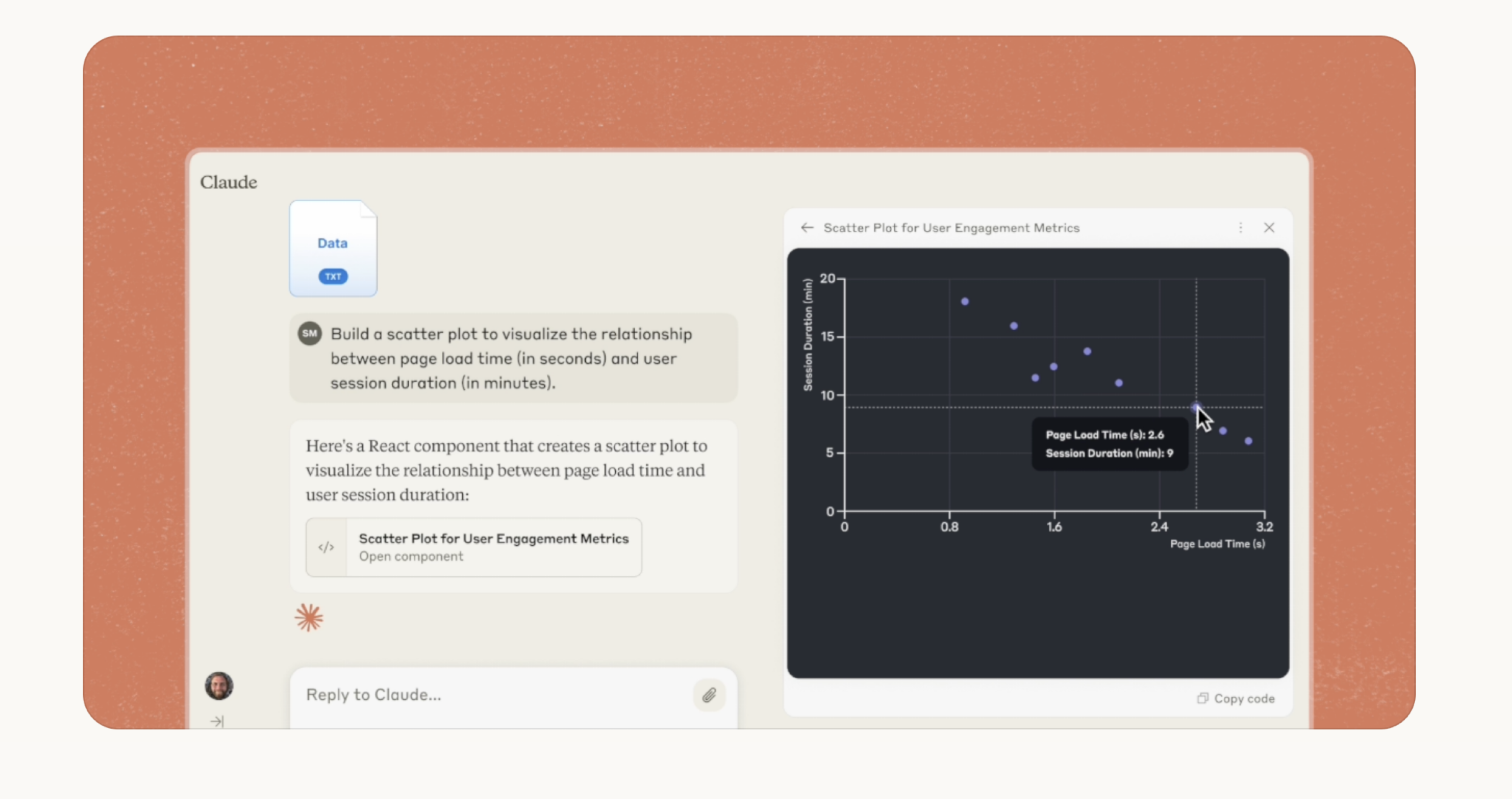
In artifacts, instead of asking something and getting a text-based answer back, you would get actual rendered piece of UI back that you could see and play with.
In the above screenshot you can see the feature where you have the prompt on the left side, and then a rendered UI piece on the right side. You can also switch to the code as well.
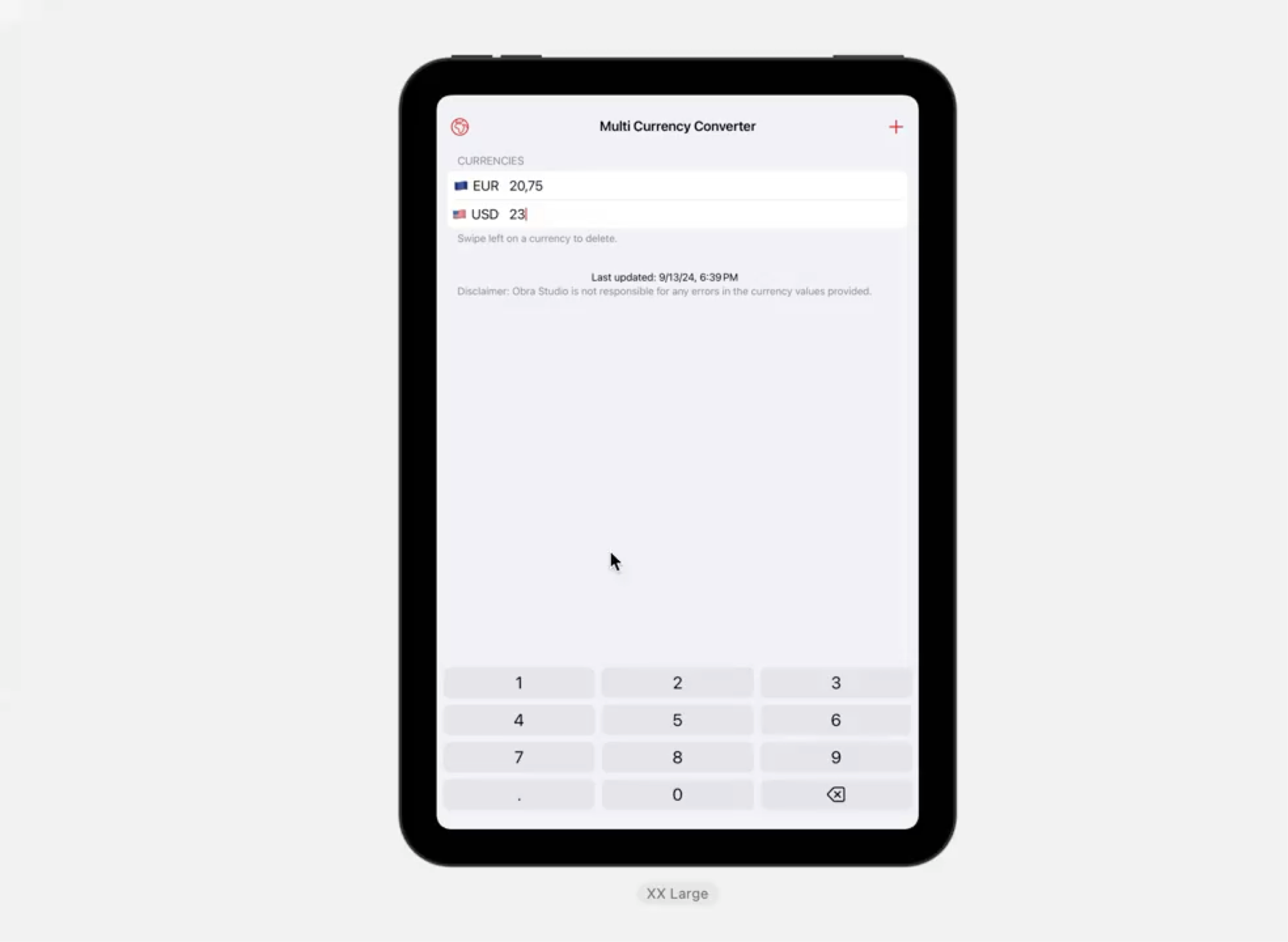
I started experimenting with both Claude and Claude Artifacts and also Cursor and created a first app, that was more or less 90% prompted.
It was called Multi currency Converter, it was a web app written in Svelte. This app converts currencies in more than 140 other currencies.
I started experimenting with how far I could go with Claude + Artifacts.
Turns out, I could go quite far.
The AI would help me with “boring“ tasks. After building the core functionality, where I connected to an external currency API for accurate rates, I easily got the app localized in more than 8 languages, and added dark mode.
At one point, I wondered if I could create a native app with Claude as well, and lo and behold, I got a working version of my multi currency converter app done for iOS and iPadOS in less than a day.
One that included all the features of the web app as well as offline support.
I learned to separate my conversations with Claude by topic. In a way it’s nice to work in one long prompt, because the prompt has context of all your previous questions, but after a while, it breaks down, and sometimes it’s better to work in multiple prompts.
All in all, I was very enthusiastic about Claude and artifacts, but there was another tool in the mix.
Around the same time news around a new code editor called Cursor started popping up. I started seeing this everywhere on Twitter and got super curious.
Cursor is a fork of VS Code that has an integrated panel to ask the AI questions about your code, in the context of a project. Its main feature is something called “composer” you can ask questions about your codebase. Cursor will then help to directly implement the changes.
So instead of the “traditional” approach of asking an LLM and copy pasting the code in your project, the code would change for you directly in the project itself.
This helped immensely when starting to build more complex apps and helped to scale the workflow.
Now, around December I got a new client, with the task to do an application design.
I started with the traditional way of setting up components in Figma. I was doing some detailed designs to experiment with the brand. It was kind of slow to design screens; and I didn’t really have much budget and time.
There was not much budget since it was a pre-seed startup. Not much time since I was also starting up my new business and agency.
I was driven by the idea of validating the ideas behind the screens. I didn’t just want to deliver the client design mockups and be done with it. I wanted to actually knew what people thought and move the product along with user feedback.
In a traditional “design offer” I would have written about going through the motions of designing screens for a few weeks, having weekly meetings about them, and moving towards a clickable Figma prototype.
This is something that we did a lot in the past with my previous agency Mono, we had an alternate offering where we moved towards a front-end based prototype instead of Figma prototypes to go towards a more life-like validation, without actually developing the app.
As a true startup client, the client had lots of feature ideas that kept coming in. Discussions were flowing on Slack and the team was on fire in quick calls. Ultimately what was left for me after those calls was that I saw that there were so many features to design, but that also the core idea behind the whole app was not validated.
I wanted to convince the client to start testing with users too. They were the ones who could tell him his ideas were valid. For this I felt he needed something interactive.
I combined all of the ideas I talked about before, and started making an interactive front-end prototype based on AI. On January 7th of this year, I remembered my success with Cursor and Claude and I started working on the prototype.
Four days later we had a clickable version of the application UI, with many interactive parts. By prompting Claude and separating out the parts of the UI that I needed I got to around 15-ish separate Claude conversations with UI pieces.
I would prompt for the UI parts and iterate on them independently in Claude first.
In Claude, you can also make projects, where you can give top level instructions that apply to all conversations within that project. One of my prompts was that all users of the app were Belgian, so whenever there would be output, like a data list, or a grid of people they should have Belgian names. These top level prompts help you to not have to reprompt for details in every individiual conversations.
I would take screenshots of what I was doing, and bring those back to Figma, to have a bird’s eye view of the project. So, I would have this UI piece in Claude, make a screenshot, put it in Figma, zoom out and see how all the screens connect (and connect them with arrows).
I would also sometimes use the Figma context to think more broadly about the app. In a prompt you are forced to give direct instructions. In a design app a different kind of perspective unlocks for me, where I can think more broadly, place comments and work on more abstract thinking. This output piece also helped a lot when having meetings with a bigger project team to get to a shared understanding.
So, how does it all tie together? At a certain point I would have like 10 separate Claude conversations, and the general wireframe idea in Figma based on screenshots.
In a next step, I would download the code for all the UI parts in Claude and copy that code into a fresh Next.js app. I would create an overview page where would I clearly link to every UI part. Having an overview page is a common thing to do in wireframes so that a client can validate all the possible UI paths.
Now came the part where different UI parts needed to be combined. I would use Cursor to have an understanding of the whole codebase and start connecting every part of the app with a sidebar component. To work faster, I would use a dictation app called wispr flow, to give detailed prompts inside of Cursor.
To work faster, I also never bothered with changing much of the defaults that came out of Cursor. Even though I have opinions on their tech stack, it was ultimately quite irrelevant for me, because
I am not actually working in the code; I am prompting and changing stuff
This is a prototype meant for validation, not for production
As a result, we created a prototype with 7 different modules, there are two main user perspectives to it (a user facing public part and an expert backoffice app part), and 20 different connected UI screens. The screens themselves had a moderate complexity level (a calendar, some CRUD modules for content, a block-based editor) with one of them having a bit more complexity (the part where you edit your profile with a live preview next to it).
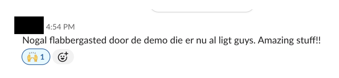
I was so enthusiastic about this workflow. The client was super stoked with the result.
“Quite flabbergasted by the demo that is there guys. Amazing stuff!”
I asked him to use the prototype to test with his prospective users and a few days later he came back with enthusiastic reports, where he showed the prototype to the prospective users and they could really imagine what it was like to use the app.
My goal of getting a user-testable app prototype was achieved; and we did this work in a few days, instead of what used to take a few weeks (excluding an initial design phase).
A presentation-version of this blog post with more details was delivered earlier this month at a private company presentation.
This blog post shows the seeds of a new workflow that will definitely influence how we makes prototypes at Obra. Have a software company and curious to ship faster? Get in touch.
I am working on a new talk. I’d like to give it in several venues if I find interested parties. Here is the outline of the talk below:
In this talk, I would like to present a workflow to prototype interfaces using AI.
In this workflow, we are using prototypes to validate an idea; to get to the same understanding, by having an example that is the closest we can get to reality in the shortest amount of time.
By using a combination of LLM-based tools, sticking to some specific strategies, and combining different workflows, leveraging the strengths of both designers and developers, you are able to create front-end prototypes at scale.
This is an early version of this talk, but because the space moves so fast, it might be worthwhile to sit down and share experiences in a lunch session.
Talk: 20-30 mins
Group discussion around usage of AI tools: 20-30 mins
I’ve noticed that a lot of people are following my story, which incentivizes me to write.
Currently, I am doing design work for a start-up I believe in, while also juggling recruiting and business development.
I am working 10 to 12 hour days and most weekends. It’s not sustainable, but I have the energy. My theory is that if I set up a solid base from the start, I will profit from it later.
Some days I have 8 to 12 different calls. Today was different. I actually had a block of 7,5 hours of solid design work.
I am doing focused work for a specific startup because this project I am doing is an excellent example of what I want to do with Obra: to help startups get to the next design level.
The deliverables so far include a brand guide, a website, a web application design, a web application prototype, and help with the pitch deck. The company is ramping up to get funded. If the funding lands, it’s the ultimate proof that I did my part.
I came up with a simple but effective tagline for Obra: design partner for startups.
I’ve been helping a junior designer find his path. I really considered taking him on as my apprentice, but I don’t wish him remote work at this stage of his career. Ideally, I can find someone to mentor in Mexico City. I also want to get a bigger insight on the median wages here and find talented freelance designers and developers.
I’ve been thinking a lot about how to combine AI with design work. I have blogged about it in some posts on this website (1, 2). If there is some interest to teach this at your company, let me know. There is a very good chance I might be preparing a workshop about this, because the methods are just too good not to share.
I’ve been thinking a lot about individual work and consulting.
Some of the individual consulting at a high enough rate would help me to have an income while I focus on getting the bigger projects and setting up the company. On the other hand, too much time spent on consulting will not help Obra forward as a studio.
I’ve been talking about business with a great collaborator. We set up a business development pipeline and are checking out the market. There are some promising leads and a good sales pipeline so far. Nothing really big has landed yet. That’s actually good, because I first need the right team.
One of the main topics has been clear pricing packages for our target audience – startups. There are clear things we can help them with, and for some things, there is definitely a fixed price that gives clarity.
At the moment, I don’t have a convincing website. It contains the intro that I’m starting. It has the 6 job descriptions I am hiring for.
There is no team page yet. I need to get to hiring as soon as possible; but on the other hand, hiring the wrong persons can also mean a bad start for the studio.
Negotiations with potential business partners are well underway*, portfolios are being shared, and the various job-related talks are being had. I hope to present my team to the world soon, but realistically, it will probably take some time.
There is no portfolio yet. I think I have enough references from the past (1, 2), and I would rather show something meaningful than just quickly put the first few projects that we did with Obra on there. It might be a few months until there is an actual portfolio.
I’m working with a recruiter and even signed up myself for LinkedIn Recruiter to sift through all the profiles. I’ve been making Number files with wage calculations and thinking about the market in Belgium. What I am looking at now is a pipeline of potential candidates for Obra. I need to figure out the great freelancer, the great payroll candidate, and the business partner as a first priority.
-Saludos, Johan
(*Don’t hesitate to still reach out!)
I’ll be flying out to Belgium this Sunday. I’ll spend the next three weeks in Belgium, doing business development, finding the right people for Obra and having coffees with several people. Reach out if you want to catch up or have something to discuss! E-mail: johan@obra.studio or DM on X.
I am rebooting my agency and hiring designers. As an exercise, below is my idealized 1-year evaluation of a new team member. If you are interested, take a look at the Obra Jobs page.
Dear designer,
Thank you for your first year at Obra. In this year, we did a lot of work as a team.
As a founder, I’m happy we grew the team to seven people. Now we have a solid base of designers to grow the company once more.
We’re aiming to become a design reference worldwide, and it’s thanks to your work that we’re well on our way.
I want to thank you – your work has been more than stellar.
From working on massive application prototypes, to helping three startups get funding because of your rich prototypes, to mentoring a new designer in a team, you really helped Obra get further.
It was an awesome year. I loved our time at [undisclosed conference]. Remember that talk that inspired us to look at startups in a different way?
We found new workflows where we found better ways to validate product decisions. We experimented a lot with AI to use it in meaningful ways. But you never lost sight of the actual humans using your designs.
You already knew how to work with Figma like a pro when you joined the company, but you stepped it up by making a custom plug-in to help our internal workflow.
When there was a new feature, you immediately learned how it worked and applied it to your projects.
I’m also happy with the new design app [undisclosed]. It really upped the animation level in our projects and made it easy to ship animations to development.
What I like is your collab with our Mexican brand designer. You interpreted her brand work, upped your visual skills along the way and took the base of the branding in [undisclosed project] and applied it in a perfectly executed way to the application UI. You made excellent derivative work of the brand and upped your illustration skills.
For the biggest project, I loved that you took the lead in the strategy for the features and that you actually worked on the hundreds of screens for all the user stories alongside a new team member that you were mentoring at the same time as executing the project. This shows both the ability to execute and to grow as a leader.
Actually, I have to mention that your communication skills have been great. You are very good at ”Slack etiquette”.
In meetings you are making sure that meetings don’t go off-topic. When I mentioned that every meeting needs an agenda, you took it to heart and you executed on that comment.
That one time the team was discussing a new technique in one of our Friday sharing sessions, you actually improved upon it and came back with a logic that made sense and that we could as a templated way of working company-wide. You documented it on Notion and we used it successfully internally for three more projects until we discovered another better way.
You also stepped it up when you gave a scoping workshop for the client. Maybe there is a future product manager in you?
I would like to know how you want to grow as an employee and where you want to take your career.
With the right mix of skills, we can build an awesome theme and become that design reference that we all strive for.
I want Obra to be the place to do your best work. So let’s decide what your focus points are for next year and how you can grow as a designer.
A client might come to us with the question to design a logo; but in our minds, it’s the start of a larger branding process.
A logo can hardly be designed in isolation; it’s necessary to cement it within a cohesive brand, with considerations for typography and colours. Ideally, there is room to work on stylistic brand elements and brand icons, but this depends on the project length.
With our startup clients, that project length is usually short, and we hardly have the time to think about a brand guide and strict guidelines for weeks. They need something fast, because their new company will be announced in three weeks.
This is not a made-up example, but it’s is based on a true story, which is why it’s easy to write about: we just went through this process.
The brand process starts with an intake meeting where we talk about the company the logo is for, with questions about aesthetic preferences and references in the market.
We usually design for tech startups. There are choices to be made: do you want to blend in, or do you want to stand out?
There are budget concerns to be discussed such as the cost and licensing of fonts. Font licensing can be prohibitely expensive depending on the choices you make. There are ways to “level up” your brand over time and start with something that doesn’t have to cost an arm and a leg, and that can be upgraded.
Next in the process is investigating how the logo will look. There are of course a myriad ways that any logo could be designed. We will sketch, on paper and digitally, to find out what the logo could look like. We will look at the shapes of the letterforms, how the typography should be set, how the logo could be perceived. This usually results in a crazy big Illustrator file with tons of variations and ideas.
Usually a logo has two main elements: an emblem and a typographic treatment. However, a logo could be typography-only or even emblem-only (such as the Nike logo). We don’t recommend the latter unless you are so famous you can drop your brand name and simply exist as a by-then iconic icon.
For the typographic treatment, we might choose to set the chosen brand name in all caps or lowercase. For higher-end branding, a typographical treatment on the brand name itself or even custom typography might be the chosen way to go. This last option can be costly and might be more of a thing to do later, when the startup has become a scale-up.
By the “emblem”, we mean the illustrative part of a logo. Many logos have this on the left side next to the text, but this is not always. For software, I myself prefer this type of logo because the visual on the side of the logo can immediately be used for an app icon (and subsequently a favicon).
What the logo references is usually one of the biggest questions. What meaning does the logo convey? This is a question you can think about forever, but let’s say we’re designing a logo for a company called FlowerKing. Obviously you will think of flowers and royalty. Now what visual do you choose? Will you draw a crown of flowers, keep things abstract, or something else? This thinking process can lead you very far. As a startup, your most viable asset is speed, so you need to make a decision. But at the same time, you want to be viewed as a professional party, so you do need to spend a bit of time on this, to avoid logo disasters and unwanted copyright issues.
A lot of logo work in the world is lazy. You can see that the creators avoided the logo thinking process by simply referencing the first letter in a logo, not having an illustrative emblem and simply a typographical treatment in a simple font. If you forego the creative process, you are also foregoing building a recognizable brand.
As we explore different directions, we will find proposals ways to display a brand that feel right. As you look at that crazy Illustrator file, some direction jump out more than others and might stay with you. That’s usually a good sign.
In a design review meeting, multiple directions are usually presented and talked about. We consider the bigger picture of the brand and the scope and timing of the project.
When a decision is made on how to move forward, final tweaks can be made. How does a logo look alongside other logos? What if it’s on a T-shirt? In the context of a website? An app? How does the logo tie in with the overall colour scheme?
As a final step, there is the logo delivery. Variations of the logo are made for several online applications such as a favicon and an app icon. Colours are considered for print. The logo is then delivered and ready for use.
As Obra, a brand new design studio, we have the capabilities to design a brand for you. If you’re interested, get in touch.
As I mentioned in my previous blog post about AI wireframing, your biggest asset as a startup is speed.
The last two workdays were spent using a combination of Claude, Figma, Cursor, and Wispr Flow to work on an HTML prototype.
I created a large desktop React prototype with seven modules (launch checklist, [secret module x5], settings), all interconnected in a clickable prototype to showcase the app concept.
In this workflow, I would first upload mockups to Claude 3.5, which would then process them into React components.
I would then fine-tune that part of the UI, download the code, and use the Composer functionality in Cursor to combine the modules.
Cursor is a fork of Visual Studio Code with enhanced AI capabilities, and it costs $20/month.
Composer is a feature within Cursor that allows you to ask questions about your entire codebase, not just a snippet of text. Your codebase is indexed, and when you ask a question, the answer involves changes across multiple files, which are made for you. Afterward, you simply accept the changes. You can even request consistency changes across the entire codebase.
I would use Wispr Flow to provide enough context for each prompt, simply speaking to my computer. It’s important to be clear about what you want to do—mention the affected routes and the module name, as you’re prompting the entire codebase.
About 10-15% of the prompts would need to be reverted, either because the tool misunderstood what I was trying to do or you would end up with a rendering error. Composer in Cursor has a “restore point,” so you can easily go back.
The changes would then be committed to a Git repository and immediately deployed to a live URL, allowing the client to view the changes in real-time, click through the prototype, and comment in Slack.
At the end of my workday, I would record a 2-minute high-quality video, clicking through the screens to demonstrate what is clickable and what is not (with minimal commentary).
This would serve as an artifact for the evolution of the prototype and give us a reference point. Since you can now effectively recreate a UI from a screenshot, the video becomes a snapshot of a concept you had.
The final result—a clickable prototype—can be used to validate an app concept with potential users, weeks or months before you’re able to develop the real, working version. Because it’s a real, clickable demo, where users can click through multiple paths and even do data entry and change content, they get a true impression of what the app would be like, as opposed to presenting them with a lower-fidelity, linear Figma prototype.
Interested in this workflow? Check out the Obra Studio website. With Obra we help startups get to the next design level.
I’ve used a new technique that I’ve called prompt wireframing where I use a combination of tools to get the job done.
There is this moment in a project when it’s unclear where things are going. There are designs somewhere. There’s a user story spreadsheet somewhere else. There are discussions happening, but there is no clarity about what should be built.
The designer’s way to solve this roadblock is to visualize it. Make a design. But how do you visualize something quickly? What if there’s many medium to high complexity UI parts, that have to come together?
Of course you can try to find the UI kit and draw the interface. At this point, you might be slow for certain UI elements and some complex interfaces.
You can start sketching, but that misses fidelity. Whatever you are drawing cannot be repeated. If you have a new idea, you basically have to draw a new sketch. You easily end up with 15-30 different sketches and now you’re losing track of which paper is for what.
I have a new technique that I’m pretty excited about: using LLMs to generate UI artifacts to then combine them into wireframes.
The way I would do this, is to start new Claude project and give context within the project. For example, what I put for a recent project is that users of this app that we are describing are Belgian, but that the UI is in English.
I use a dictation app called Wispr Flow. The reason to use this app is that I can talk faster than I can type.
First of all, you kind of need somewhat of an of what you’re going to build. It helps to have (some) sketches. With the sketches in front of me, I start describing the sketch by talking.
By holding down the Fn key on my Mac, I make sure that Wispr Flow is listening to my dictation.
I try to be literal in describing the sketch eg. this sketch shows a heading, a paragraph, an input with a value of ‘Enter your email’, a button that says ‘Subscribe now’ etc.
Whay Claude is essentially generating are pieces of UI that use React, shadcn/ui for the UI part, Tailwind (ugh) and Lucid for the icons.
The technical aspects behind it are actually not important. I would screenshot whatever is shown in the UI and use it as part of my wireframe. My process is not to actually use the generated code, but to take screenshots of the generated code and then sometimes use the screenshots to revisit the design of a screen.
(Although what you can also do is download the .tsx files and drop it into a Next.js project with some light edits. Then you’re on the way to make an interactive prototype)
Because the artifact is contained in a Claude conversation, you can come back to edit it in the appropriate Claude conversation. As I discover problems with the user flow by visualizing it in Figma, I would then go back to the individual conversations (usually about one screen) and re-prompt to add something, remove something, or change something.
I would composite the the screenshots into Figma and draw arrows between the screenshots to make sure that the user flow makes sense.
If you use this technique, you will quickly run out of tokens, so you might want to pay for Claude Pro, which is about 20 euros a month.
In a way this feels like a new discovery to me, but it also feels incredibly obvious given the tools we have today. Has anyone else been doing this? Do you have any variations on this technique? I’d love to find out.
As the year draws to a close, I saw a few “year in review” posts pop up, like this one by Pawel Grzybek. This seemed like a good idea, so I wrote one.
I used to make these year in review websites, where I would experiment with new technology. I also used them as a way to summarize my favorite music albums, movies and video games of the year. The last one I made is actually five years old now. It was the first one I built using Svelte, a web framework I love.
This post is a bit of a different format, as it’s a personal reflection about the year and a look forward. I decided to write about my favorite music, movies, games etc., but also throw in the categories of travel, work and sports to have a more balanced view of what happened this year.
As I noted today on BlueSky to an acquaintance looking for the right “content” to write, this is more for myself than for anyone else. I either write to promote something, to remember something, or just for fun. I find that if you have to call it content, you’re already on the wrong path.
As my wife and I were driving back from Puebla, a city two hours from Mexico City, I looked through the photos on my phone and looked at what happened this year. And boy… it was a lot.
Travel
This year, I traveled to the US twice for work reasons, went to Europe twice (once for work reasons), traveled within Mexico three times and went on a honeymoon. Suffice it to say, this year’s travel schedule was quite packed.
I’ll focus mostly on the things that might be interesting for (techy) readers of this blog.
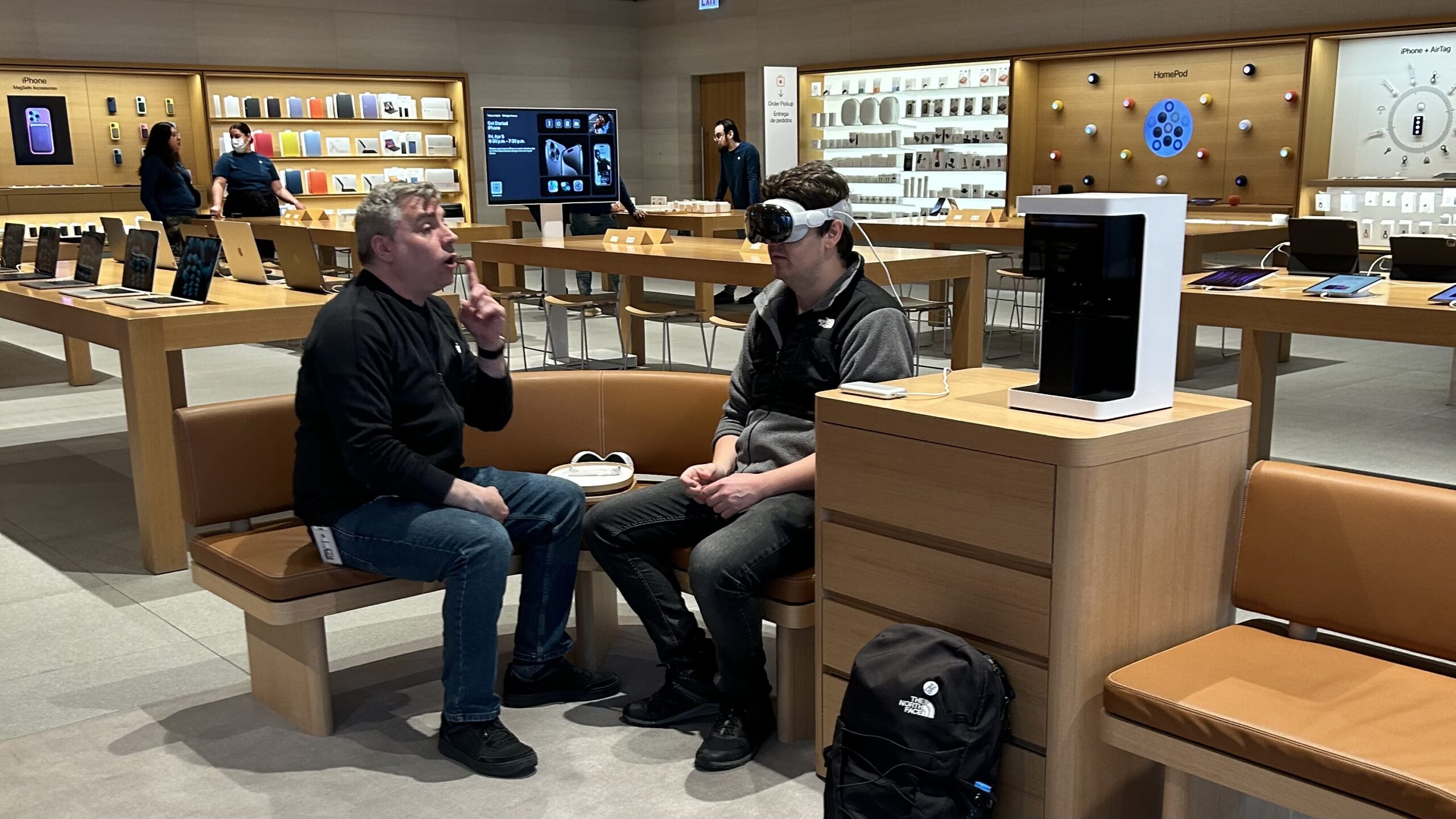
Vision Pro in Chicago
In April I felt I just needed to experience the Vision Pro, and at the time it was only available in the US, so my wife and me took a trip to Chicago. The demo in the Apple Store was impressive, but I ended up not buying it because of the excessive cost, and the fear that the product would just end up collecting dust somewhere.
The Vision Pro hasn’t been very successful up so far — and I don’t see much talk about it anymore. I think there is a bigger future in computing that feels human enough. The ad of the dad filming his kids with the Vision Pro was really off-putting: that’s not really the future we want. The Orion from Meta is maybe showing glimpses of what could be cool, although I would also find it very off-putting that anybody could just film anybody else without them knowing.
SF for Figma’s Config
In June, I travelled to San Francisco to visit Figma’s config conference. I enjoyed this trip, with a really well organized conference, but also came away with the idea that a conference organized by a single software package is maybe not conducive to a lot of different perspectives.
I also remember thinking for days about the impact of the AI announcements on design tools. Figma kind of removed the feature and more or less silently re-launched it after all the bad reactions. I haven’t felt a need to use the AI features in Figma at all, except recently for the Rename layers feature. I have to admit that’s a nice addition.
Wedding & honeymoon
This year was the year that I got married. As a couple we spent a considerable time organizing our wedding (my wife more than me admittedly). A lot of Belgians travelled to Mexico to attend the wedding. I’m very thankful for everybody who came to attend our special day. We had a ton of fun and it was a really memorable time.
After the wedding, my wife and I went on a honeymoon to Singapore and Bali. I had been in charge of the holiday planning. We discovered Singapore is a foodie paradise. Bali was beautiful, and truly a recommended destination, but for us, coming from Mexico, it was sooo far. Even though it is very beautiful, I feel like we kind of travelled halfway around the world to see a beach and a resort most days. Not that we didn’t do anything cultural there, but I felt part of that trip could have been made here in Mexico.
My personal travel resolution: See more of Mexico, like Chiapas and Baja California. Find a way to see nature in a deeper way, like a multi-day hike.
My work travel resolution: I already planned going to Belgium in February to network, see the right people for the start of Obra Studio as an agency and dive deep into the Belgian startup world. In May, I am going to Barcelona for the Svelte Summit.
A secondary plan is to visit a conference in the US, or do a city-to-city trip to visit several local tech meetups.
Music
Aside from a surprise concert by Interpol on the Zocalo (the main square in Mexico city) and a show of Jacob Collier, I don’t recall many live musical events throughout the year. We didn’t go to any festivals, and I also don’t recall a lot of albums that really caught my attention.
I mostly enjoyed music that I could put on while working, like Ocie Elliot, Kevin Kaarl, Kiasmos and Tycho. Peso Pluma (very popular here in Mexico) also works kind of well as background music.
All in all, it was not such an exciting musical year. I guess I had other things that I was focussing on.
My personal music resolution: Make a conscious effort to really listen to new albums. Go to at least two concerts.
Movies
I felt like there were not that many great movies in cinemas. Maybe we are still seeing the effects of the pandemic, and 2025 will finally be a year for better movies. Or maybe I am just not that much into it anymore.
I liked Inside Out 2 for the Pixar take on dealing with puberty and the surrounding anxiety. This might be a movie that parents will reference for years.
I thought Dune: Part Two and Joker: Folie a Deux were mostly more of the same and not that memorable.
I saw Furiosa: A Max Max Saga and Twisters on a tiny plane screen and I actually really enjoyed those. Maybe I should see them again on the big screen.
As for two other favorites: I really liked Challengers, that was a movie like they should be. I also liked watching Civil War in a near-empty cinema, a movie that hooks you until you see the credits roll.
I feel like just as with music, my attention wasn’t really too much on movies either (unlike some previous years).
My personal movie resolution: Dust off my projector and spend some more time watching quality movies. Look more closely what friends are recommending (e.g. on Letterboxd)
Personal finance
An interest that has popped up for me over the past two years is personal finance.
I keep a close eye on the stock market, and think about ways to invest. I talk to friends about investing and think of ways to increase my personal wealth. It’s interesting to see the numbers evolve. I listen to finance podcasts on walks almost every day – maybe a bit too much.
As I am setting up a new business again, I am researching how the tax system works here in Mexico and what my best options would be. Most people find this the most boring topic in the world but I find it interesting; the way that a country decides to tax its people and the policies around it are often a direct result of policies trying to stimulate specific behavior. It ties into a bigger economic picture that I find more interesting to follow year over year.
Series
I really liked watching all the seasons of Billions with my wife, but that’s not a 2024 show. Still, if you don’t know about it, I heartily recommend it.
The Penguin was really good up until the middle of the season and then it got kind of tedious.
I really, really liked The Gentlemen. That was brilliant, and I hope a second season comes.
There’s a few series I started watching, or watched only bits and pieces of, that maybe I should return to: Shōgun, The Bear, and Fallout.
My series resolution: Less random watching whatever pops up on Netflix or Prime, more conscious watches based on friend recs.
Work: main work
I was working as a product designer for Doccle up until the end of October. After 2,5 years there, I decided to leave to challenge myself to build something new.
After some soul-searching, I decided to pick up building an agency again.
There is something about the clarity and variety of project-based work that really appeals to me. I think the lessons I learned from being on the inside of a product organisation as well as those of my side projects can be very useful when going back to being a services provider.
My work resolution: Work hard to make Obra Studio a success.
Work: side projects
I worked on Obra Icons a lot. All of it got a real upgrade, from the website, to the icons in the set itself, to the addition of a Figma plugin and a React package.
My experiments with making apps by prompting where super successful. It’s crazy how far you can get with prompting, even to developing a native iOS app. I am looking forward to take this further in 2025, although I am not sure how much time I will have with me starting up Obra as an agency.
Sports
I bought a Trek road bike in the very beginning of 2024. It changed and influenced my whole year, and my perspective on biking.
I understand biking as a professional sport much better now. I met my Spanish language teacher while biking and he became a good friend. One bike friend led to another and right before my wedding we did a bachelor’s ride with a group of friends.
I had a fantastic ride in summer with a good friend and got to experience the Belgian roads with a new perspective.
Bike culture in Mexico city is phenomenal. Every single day you can find a group riding (if you’re willing to wake up early in the morning). I wrote a bit about this in Dutch here.
As for running… well… let’s say biking took over!
My biking resolution: Finally do La Venta and move on to more challenging rides such as Piramides (100km).
Language learning
In the beginning of the year, I read my first novel in Spanish. As mentioned, I met my language teacher on the bike. We first had two 1-hour lessons a week and then changed it up to a single 1,5 h session a week.
I got better at using the past in Spanish. I still have to work on being better at expressing the future, as well as being better in speaking in general. I would say my understanding has greatly improved, but it’s still not entirely where I want it to be. Especially at busy family parties I can kind of lose track of the conversation.
My language learning resolution: While the repetition was great to keep learning in 2025, I would like a more structured way to learn where I can pass a grade like B-level, eventually C-level.
Games
PS5
One day, I bought a PS Plus subscription for the whole year. At first I felt like I didn’t get the value from it, but then over time, as I checked out different games, I really enjoyed the variety. I re-played the beginning of GTA V, I enjoyed and even finished Dave the Diver and I remember an evening playing Cult of the Lamb furiously.
I am contemplating picking up the new Dragon Age, the Star Wars game on a sale sometime, but I am in no hurry to pay €80 for a video game I might only play a few hours.
As for boxed games, I bought AstroBot for the Christmas holidays and I am really enjoying it.
PC
I also play on PC, mostly games that are Xbox Games Pass. What I do there is dip in and out: I pay Game Pass for a month to play a certain game (like just recently Indiana Jones) and then I cancel my account again. I don’t feel the need to have a full-time subscription.
Switch
On the Nintendo Switch side, I picked up the Nintendo Switch again for the new Zelda: Echoes of Wisdom game and have really enjoyed it. An unplayed copy of the new Mario Party and Mario RPG are (shamefully) still in my Switch carrying case.
Other
I own a Playdate, but the screen is just too small to enjoy gaming for me. I even tried buying reading glasses to alleviate the problem, but I just don’t have the eyes of an 8 year old anymore.
YouTube
I am a big YouTube fan. I find that whatever I find on YouTube is so well catered to my interests I mostly prefer YouTube over TV.
For bike enthusiasts, I can recommend Path less pedaled, a channel about “alt“ cycling with much less of a focus on competitiveness and more of a focus on the joy of riding.
For gamers, I enjoy Gameranx and IGN for their compilation videos. However, I would like to branch out and see more interesting game related videos. If anyone has any channel recommendations, please send them!
Actually, for games, the most interesting media is I follow is actually written. I bought a subscription to Aftermath and GameFile to stay up to date on all things games-related. Some part of me sometimes dreams of being a video game journalist, but then I get back to reality where I know that software design is a much better way to make a living.
I’ve been coffee-curious for a while, and 2025 might just be the year that I invest more time into coffee as a hobby. For that, there’s of course James Hoffmann; but I recently also started watching Lance Hedrick‘s channels.
For tech in general, Marques Brownlee can’t be beat, although the wallpaper app he launched as kind of a miss. I like that Becca Farsace now has her own channel after she left The Verge. I still like that website though, and took the time to get a The Verge subscription when they launched it as it’s my primary source for tech news.
Looking forward
With each passing year, I feel as though time flies by faster and faster.
I already know that 2025 will be an interesting year, with multiple trips planned, the exciting prospect of building a new company, spending time together as a newly married couple, and much more.
Right now, I am looking at the designs for the new Obra website. Earlier last week, I posted an update to the current website, changing my positioning from being a solo contractor to an agency founder looking to find the right people.
My intent is to have the correct mix of working on the business itself and on design projects. Obviously a big part of my week will be filled with design work, and as things get bigger, a bigger project might consume most of my attention in some weeks; but with this new mindset I have, it’s important to work on the actual business.
That means hiring, talking to the right people, getting out of my comfort zone and bringing the ideas behind my new venture out there: I’m here, and I want to grow my company. I want to grow it faster than my previous company Mono. I want to take the lessons from that period and do better.
I was listening to the e-myth book on my walks around my neighborhood, Condesa. In this business book, the author narrates about the three different personalities living in all of us. The technician, the manager, and the entrepeneur. This book (thanks for the recommendation Ermeen!) is opening my mind: for a long time, I was a technician. I was focussed on the actual design projects, on executing them well, and not on the business part. The author states that most small business owners are 70% technician, 20% manager and 10% entrepeneur.
The technician fell in love with the technical aspects of their job. In my case design. For some period, there was nothing that I would rather do than make great design systems in Figma, convert those design systems to performant, accessible front-ends, and work on mostly technical aspects of a user interface. Do we need a dialog-on-dialog system, or should we go for panels? Should we use CSS modules, or do we try this new framework? The technician got their success from being a great technician; they are proud of knowing what they know; and they are ready to do the work.
The manager, he wants to manage the day to day. There are incoming client requests, there is someone who’s going on a holiday and we need to replace them, a vendor oversold their product and now we are stuck with something suboptimal. The manager, he seeks stability. He wants to make sure that everything is handled, and handled well. I was a manager for a while, in the Mono period, albeit for a small team.
Now we come to a part that I see myself taking more seriously now. The entrepeneur, he is the engine of change. He is discontent with the status quo, and he wants something better. He wants to have a bigger team, he wants to make more money, he wants to make his mark.
For the past 2,5 years, I have mostly been a technician. But in the past 6 months, the entrepeneurial side has awakened in me.
I’ve been living in Mexico for some time now, and I finally have the right to start a business here. My Spanish is getting better. I am meeting startup founders, VCs. I am discovering interesting small design studios that I didn’t know existed.
In my mind, this opens up a world of possibilities. I see what I did with Mono and how nice of a time it was; and I want to repeat that, but in new ways.
I get a little bit angry when I see bad design. When I observe what’s around me, I see so much opportunities to do better.
I want to help designers up their craft; I want to ship the work that I would be proud of; and I want to do it in an outfit that makes sense. Big enough to make a difference; small enough to keep that drive for quality alive, with an obsessive focus on quality.
How can you help?
I am looking for a business partner to lead operations in Belgium for Obra Studio. The job description is here. If you know someone, make sure to sent them this!
I am looking for freelance designers (coding designers or pure UI/UX) to help drive the first projects of Obra. Book a call to get to know each other — or if we know each other already, to get up to date — here.
Lastly, some real-life aspects:
I am looking to meet up and have a coffee with the right people in Mexico City the first few weeks of January. Startup founders, local designers, UI developers, product managers. Get in touch via my e-mail: johan@obra.studio. I will be organising a new Tacos y Tecnología in January. Keep an eye on my Bluesky account.
From end of January to mid february I am in Belgium, same deal: looking to talk to the right people. I will visit startup places like Corda Campus, Wintercircus Gent, and a few companies in Antwerp. Get in touch!
Lastly, I wish everyone great holidays, to have a nice time with family, and to start off 2025 with lots of positive energy.