With my “newfound” prompting superpowers, I tried to generate the code for an iPhone app and see how far I could go.
Once again, I was pretty amazed by the Claude/Cursor workflow. In a rather limited time I had the scaffolding for a wedding app done. I ended up getting a subscription to Cursor which I believe is totally worth it.
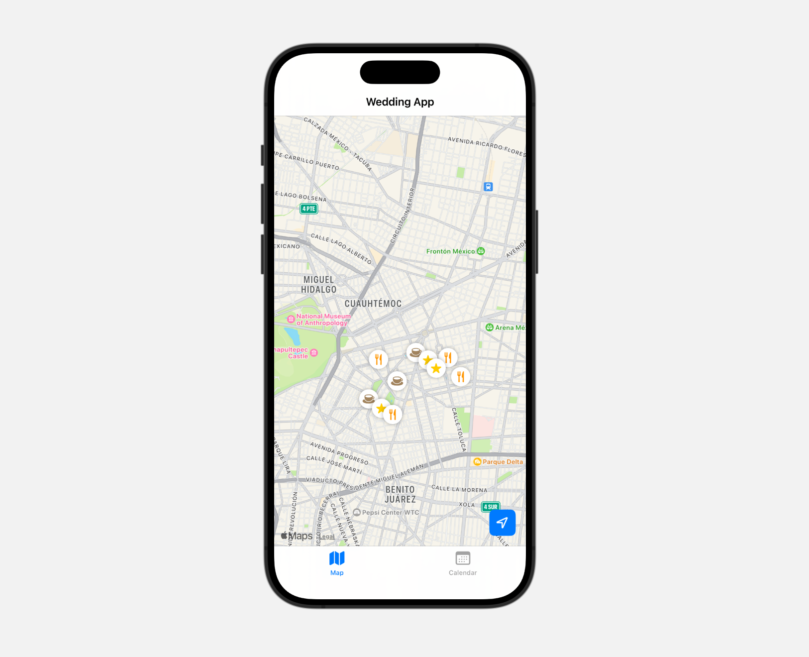
The main UI
The idea behind the app is that it shows a map of locations and a calendar, so people can have a reference of things they could do around a wedding. For destination weddings, there is also travel involved, so people might want to receive the couple’s specific tips for a neighorhood.
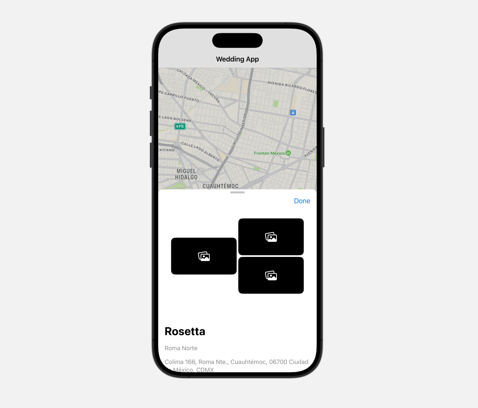
A sheet and a start for showing multiple images
This idea could also be transformed to a generic “travel guide” type of app, where you have lists of things to do around a certain location.
My tests creating a native iOS app went well. I was able to implement:
A table view with some important dates for the wedding (the calendar tab)
A map view with markers, where each marker shows a sheet with info
Within the sheet with info, details about said location
Location permissions and the ability to see your own location
Basic support for iPad
SwiftUI is pretty elegant and readable.
The only problem with the code generation at this point is that it doesn’t really know how to fix some issues around scrolling and combining views. It tries to fix things by wrapping (scrollable) NavigationViews into each other ultimately creating so many problems you have to revert back to working code.
Also, the iPad implementation was kind of broken from the start and I had to prompt quite a bit to fix it. I am sure a senior iOS engineer looking at the specific code to “fix” the views would avert their eyes in horror.
Another thing that I haven’t tried saving data to a database yet, and I can imagine that that part of dev might also lead to some “parts unknown” where I wouldn’t really know how to debug anything. I think prompting superpowers only happen when you have an idea of how you could fix code it generates, not when you are absolutely clueless. I have a fairly good grasp about how iOS apps work and should work (from designing them) – so I can prompt with the right terminology.
Anyway, I just wanted to report on my journey with these new tools as this is quite exciting.
Last work week I spent a good chunk of time on my projects Screenshot to Layout and Obra Icons. I also spent some time investing the hype around Cursor and oh boy… the hype is real.
I built a mobile-optimized Currency Converter app in a few hours of work mostly by prompting what I wanted. I estimate Cursor wrote around 80% of the code. I added some features that would be time intensive like language support for RTL languages, flipping the entire UI, just with a single prompt. Something like dark mode was just a prompt away too.
You might have seen videos of 8-year olds coding entire apps using Cursor. It’s pretty amazing what you can build. You have to be quite specific in your prompting but if you know what you want this is definitely a hyper productivity boost for a certain kind of work.
Naysayers will say this will lead to unmaintable code but in the prototyping/ideas stage most of my work lives in, the productivity is unmatched.
In my Twitter/X circle I see talented designers taking their product design skills to AI prompting and hacking things together that a few years ago really needed at least a 2 person team of designer and developer. For example Gabriel built Almanac and Christine a Chinese phrasebook app.
Around nine years ago I really needed a dev to help built Kana Master. Dev agency Underlined jumped in to help at the time. I believe current prompting abilities I could probably build that myself.
I haven’t tried creating anything in the iOS spheres yet (mainly because I don’t want to write the same software three times) but I am curious how far I could take things.
When I said I would quit my main contract my fiancée was worried about me finding new work – I told her that it would not really be a problem. In just one week I’ve been contacted for a short-term UI redesign project and to consult about implementing Figma in an organization.
I am exploring startup ideas, talking to different people about possibilities and overall enjoying some time figuring out what’s next. In the meantime I am available for short freelance opportunities.
My search for a new adventure is starting in earnest after some holidays.
Two weeks ago I wrote about two main options, one was getting a product designer role in a US startup/scaleup, the other one was restarting agency life.
I’ve been looking at jobs on read.cv and on workatastartup.com. Ideally I can find a role at a startup that does something exciting in the software space.
Another part of me thinks I should just build that startup. That’s been a lingering idea in the background.
The new agency idea seems pretty hard to pull off “from a distance” (my network is in Europe). I also feel like I could also do that in ten years, I don’t have to do it now.
I feel like I have to make use of the unique part of my life I am in now: no kids (yet), US time zone, easy flights to US, real-life access to build a local team (for example of local devs).
Back to the job sites – it’s pretty rare to see a cool job on the job sites. Some companies are already too big to do meaningful design work and make an impact. Most companies do something I can’t really get enthusiastic about (like crypto and blockchain things, ugh).
When I look at different companies I am focussed on the main ideas behind the company, their business model and (possible) engineering prowess. I am not stopped by a poor current state of design (I can come in to help fix that).
I applied to one company and got rejected outright because of my location in Mexico. Many US jobs are “US remote only” and “US and Canady only”. If anybody knows the logic behind that, I’d be happy to know. When I was an employer myself in Belgium, I didn’t like candidates outside Belgium for administrative reasons, so perhaps something similar is going on.
Some part of me thinks I need to fly to the US and network at the right conferences, but at the moment I don’t have a clear idea of where I would go or which conference makes sense.
In general, I plan to take enough time to find the right project/employer/business to work on and will be working as a freelancer while I figure it out.
I am available for freelance projects. Check out my portfolio to get an idea what I could help with and get in touch if you think I could help you with your project.
Fresh from the plugin press, this plugin by Vijay Verma provides some shortcuts to easily access important vector tools In Figma. This can help as a bit of a bandaid, since Figma’s UI team inexplicably decided to hide the vector tools behind extra clicks in UI3.
Did you know that macOS comes with some wonderful, super high quality fonts that normally cost hundreds or thousands of euros to license? I believe they came with an update to Pages templates a few years ago.
If you open Font Book — the app used to manage fonts on macOS — and then search for the fonts below, like “Graphik”- you can download the fonts directly there. These are fonts by some of my favorite foundries.
Today I was converting an mp4 video to a gif and I figured I’d document some commands that helped in the process. I used ffmpeg to do this. You can install it on Mac or Linux using homebrew:
brew install ffmpeg
For optimal quality, generate a color pallette based on a timestamp in the video:
When I started as a freelancer in 2011, I dove into the world of mobile apps.
But that’s the short story. The longer one is that I first did some branding and web design. Then, I had a stint as a photographer. I worked for advertising agencies (not really my thing…), development companies (interesting but hate to be the sole “creative”), UI/UX agencies (better),… all in all I tried a bunch of things, to then land at what we did with Mono: focus on UI design for apps.
The beauty of an agency is that you can choose your own adventure. In these summer days I am dreaming of a new adventure and defining what my new company Obra can be.
With Mono, we really wanted to build out a great design team and that requires working together, bouncing ideas off of each other, and skilling each other up.
At the time we denied working in a manner that we called “bodyshopping” i.e. renting out our designers full-time to companies. This didn’t feel right with the agency vibe we wanted, where we wanted to work together on projects.
We saw a lot of bodyshopping companies dropping unskilled designers, straight from school into projects they could probably not handle, for big consulting fees. These companies had no personality, ugly websites, and you wondered if they even understood design.
The designers hired into projects were essentially powerless to drive change in the company because they were too junior. They were put on a team because somebody rightfully thought that UX was important, but without any support.
My observation was that for a company to put out meaningful work backed by a design process, you’d typically need the right combination of people. A designer obviously, but also another design-minded person to challenge them, and for the implementation you’d typically need a design-minded developer (or a developer-minded designer that could guide a non-designer developer). Not every designer is also the same, so you’d need the right skillset for the project at hand.
Given such a team, you can do wonders with just three persons. With a team of just four, I’ve shipped an entire software design for Ticketmatic that involved a redesign of every module they had (and believe me, there were a lot of them). The speed of working in that team was amazing, due to a great feedback loop between CEO, CTO, a design-minded dev and me as a developer-minded designer.
With Mono, we found that combo in quite a few projects between the designers on our side and designer-minded CEOs, CTOs, product owners and product managers on the client side.
Today, I am wondering what my new adventure will be. My mind is mostly on running an agency again. A part of me wants an ambitious product job in the US: but I see most companies downsizing, or only hiring remotely within the US.
My goal remains the same: shipping the best software. Shipping world-class experiences that matter to people’s computer lives. And keeping that computer life human, por favor.
I am certain the formula to get there will involve multiple designers bouncing ideas and lifting each other’s work. There is simply no better way to get to great work than to revise it in a group of smart minds. I wrote about this a long time ago, in 2017, in a post titled The value of an external design team.
You need a real design team. With emphasis on team. Otherwise, the work will suffer.
It often goes like this: a company decides to hire an in-house designer. One designer, because there is not enough “work” for 2 designers. This person ends up doing — everything — without a feedback loop from another designer.
I find that this situation leads to idea stagnation. The single internal designer has no outside influences outside of his core project and ultimately it leads to poor work. The internal designer suffers from the lack of a feedback loop.
There is no particular golden number of designers and design-adjacent people. It really depends on the projects going on in a particular company and also how much design is being done by non-designers. I’ve always held the belief that design is being done by everyone on the team.
Why am I so obsessed with the number of designers? I believe that when you can get into that design feedback loop, when minds align, but different people come at a problem with different backgrounds and perspectives, the real magic happens. And all too often, that situation just doesn’t occur due to the team setup. If you think too small, the results are too small.
A personal observation is that there are actually relatively few companies in Belgium that have bigger design teams. A lot of companies make do with just 1 or 2 designers. Some of the biggest scale-ups might have… 5-10 designers, max? There are some banks with 15+ or 20+ UX designers, but they are divided into many project teams. The Silicon Valley size of 50-100+ person designer and researcher teams is unheard of in Belgium.
It’s always been my dream to scale things up larger, bigger, better. Why don’t the big tech companies come out of Europe? We are simply not ambitious enough. “One designer is okay” “We don’t have enough capacity to implement the designs anyway” “We already know what the problem is we’re trying to solve“. I’ve heard it over, and over, and over.
But; I did find some limits to my own ideas when I was running Mono. More people is not always the solution. They also need to be good. Upskilling people to the right level was extremely challenging. We held on to a small team of good designers because it was hard to scale up and find the right people. We wanted to deliver a consistent quality, and that was an uphill battle.
When I started in UX, the UX level of people coming out of school was not there. Basically after they graduated, designers needed another education to get to the right level. There were some exceptions (Courses like Devine and MCT were gradually getting better, and changing their curriculums to things that actually mattered in the real world); but the level of a junior was simply not good enough for the kind of work we were doing with Mono. I believe that 10 years later, there are a lot more skilled designers on the job market. But I also believe — I hear this all the time in job interviews — that they are underutilized by companies that seemingly can’t utilise their skills in the right way.
Around 2017 there was the trend towards larger and more involved projects – the internalization of UX was there. Companies had built their first apps with an agency (sometimes ad agency… oops) and were disillusioned, then took the work inhouse.
As Mono we had a problem: we needed to keep designers close to the team to skill them up, but the actual work was moving internally (all too often as part of a sad sprint setup).
Then Covid hit and suddenly all of the work was remote. There was no expectation anymore to send our designers to some random, uninspiring workplace somewhere in Brussels.
I should have used that opportunity to radically rethink the structure of our sales setup, and move more radically to contracting. We were already kind of on that track with 60% or more of our work being long-time contracts.
I remain with some unexecuted ideas as well.
There was an idea to sell product management as a role. As design managers we me and my co-founder were always doing more design management related tasks which have a big overlap with the internally held product manager role. Scoping work, research, getting the work shipped.
I held the belief that that was a deeply internal role to begin with, and it was difficult to juggle multiple projects as a product manager in the Mono context. I also believed it would be difficult to get the deeper internal knowledge often needed to understand every move you are making fully.
But now I’m not so sure anymore. First of all, with a contracting mindset, the person is there for 3 to 6 months or even a year. You can surely make an impact within that timeframe, and have enough time to deeply understand a problem. Second of all, whether someone adds a net positive to a project is not determined by how they are hired into the project, rather it’s about clear communication lines, access to information, and the drive of a company to move forward.
One final idea I am thinking about that has always been on the back of my mind but that we never executed with Mono, was also doing development.
With Mono we focused solely on design and besides front-end prototypes we never did actual development. I feel that restricted us too much to get to a final lovable user experience, since we would always depend on whether the devs of our clients were able to pick up the work. Sometimes it would work, sometimes it wouldn’t. A particular aspect of not doing any of the dev work that bothered me was often not seeing the product actually launch, but only seeing it come back after 6 months, sometimes after a few years, without a correct feedback loop.
Some reasons I remember for not doing development were the contractual risks, and the fact that none of the founders could actually fix deep tech problems themselves if push came to shove. We could also not upskill devs the way we could upskill designers. My argumentation had been at the time, that if we could find a deeply technical person with business aspirations to helm the dev arm of the company, that could be solved. However that’s easily said than done and finding the right person to be at the helm of that kind of position is extremely difficult.
So, to summarize, here’s my thoughts:
It’s time for bigger and better. I am working in the US time zone and promoting towards to US-based clients, but my network is mostly in Europe (Belgium/Netherlands). Ambitious Europe-based startups will look to the US anyway, so opportunities are there.
We’ll need multiple designers, bouncing ideas and designs off of each other. Probably with a structure of internal meetings, where one is about skilling up, and another about design review
Go for longer projects, accept that UX is internal now, the designers become part of the external team (contract-based)
Accept that there is a cycle to design, and design is not always needed: clients can choose to hire designers for three months, six months, one year contracts (renewable when it fits)
Look into starting out with a development arm, but highly dependent on finding the right partner
Product management might be able to be externalized at some level, if we are able to sell a project team to the client that can either deliver end-to-end, or that can build up trust between agency designers and client devs in a first project. However, finding the right product people might be a challenge on its own.
Change is afoot for me; After 2,5 years working with Doccle I’ll be working on finding new design challenges to take on with my agency Obra Studio.
At this moment, I am not sure where things will go. One part of me dreams of going back to agency life and build out a bigger, stronger version of what I did with Mono Design. Another is looking to find a deep product role like my designer role at Doccle, preferably in the US time zone, perhaps with some added product management responsibilities. Most of all I want to work with ambitious teams to ship software that matters.
I loved the deep work of an internal product role, but I also miss the focussed project logic and business potential of an agency. The next few months I’ll be looking for the right opportunity. I built a public portfolio of some of my design work which can be viewed here. I also have a longer, more elaborate portfolio presentation I can give to explain how I can help software companies.
If you’d like to talk about a potential collaboration, either as a potential colleague, employer or a client, reach out at info@obra.studio. I’d love to talk!
So far for me, it’s the most meaningful competitor to OpenAI’s ChatGPT. The software looks great and has all these neat little UX touches. Every time I use it I come back more impressed.
The company behind it, Anthrophic, also seems to make conscious efforts to do AI “well”. Whether that’s just good marketing or really true is hard to evaluate at this point, but it’s nice to put the messaging around AGI safety at the core of your company’s values.
Using ChatGPT, my workflow has been to paste Svelte code snippets and ask a question when I feel I can move my process forward by asking an AI. Usually I have a component and a page that is consuming the component.
Lately I’ve been wondering how the AI understands where one file begins and one ends. I usually put some manual markers in my prompt like File1.svelte: to denote beginnings and endings. ChatGPT always seems to figure out which files are separate and Claude does as well. I guess they understand that a new file usually begins with a <script> tag and use that as a way to delineate.
In my ChatGPT workflow to create Svelte code, I would often find the following problems:
The output would be React-like and I would have to steer the LLM to use the Svelte way of doing things
It did not know about some general logic that I already had in some other part of the codebase
For a part of my work I am researching all kinds of LLM solutions, including Google Gemini, Claude and running local models (like Mistral 7b).
I found that Claude can deliver quite impressive results.
Claude has 3 models: Opus, Sonnet and Haiku. Opus is supposed to be the “smartest” one for deep work. Sonnet is the most balanced model sitting somewhere in the middle. Haiku is the fastest one. This matters because running a more “intelligent” model requires more computing power and is thus more expensive.
I think what’s helping a lot of designer/developer/hybrid profiles these days is a new feature in Claude called “Artifacts”.
If you have an account on Claude and in the settings, you enable the Artifacts feature, you will see that when you ask Claude a code-related question, it will then spawn a window of your code on the right side. If you code related question concerns multiple files, it will even show those multiple files. If you then prompt toward an answer, you can view all the versions of the code as it evolves via prompting.
But what if you are a bit further into the code process? Wouldn’t it be useful if the AI knew about your codebase? I discovered you can use a package like ai-digest to generate a markdown file of your codebase. If you then give that context to the LLM, it will then understand that maybe there are general codebase things that can help in the generation of your code. A simple example would be that pretty much any codebase has a Button component. If it knows about this component, and its props, it can use it in its answers, thus potentially being able to give a better answer.
One interesting aspect about Claude code generation is that it gives active suggestions on how to improve your codebase, even touching on accessibility aspects. The suggestions are not always correct but they are interesting nonetheless.
I have to experiment more with Claude but I would encourage everyone’s who’s interested in using LLMs to answer code qustions or move their code forward to give it a try. It’s really, really cool.
At Config, I was particularly looking forward to what kind of AI features Figma would announce after acquiring Diagram.
This blog is a deep thought piece and also a piece of criticism thinking through those features. It’s also a reflection of what design app features that venture into the realm of creation mean for a designer’s work life.
I hesitated a bit to publish it, but why I did is to be the voice of a Figma user. I respect the work behind Figma features and how difficult it is to ship the way Figma is shipping (I wish some of my clients had Figma’s cadence!), but ultimately I wanted to voice my opinion.
Sho Kuwamoto refers to really listening to your customer in this tech and design talk. So my hope is that the Figma team will read this and perhaps do something with my feedback.
Diagram
I have been following the fun “I build things” tweets from Jordan Singer for quite some time, and recently started following his colleague Vincent who, for the past few months, has been steadily hyping up Diagram’s work.
Jordan Singer used to regularly post all sorts of creative experiments on X, usually a combination of design and code, with a strong focus on interaction design and making something cool. He was one of the first people to focus on the space of using design tools in combination with generative AI tools.
I really enjoy the “build in public” approach he practiced, but after Diagram was acquired by Figma, Jordan Singer’s work was seemingly done more behind closed doors. The tldraw stepped in to provide my fix of cool UI + AI experiments. In the meantime I was wondering what was happening at Figma.
The team behind Diagram had been building up expectations for months, so mine were quite high. I was also invested in learning about the AI feature, because I wondered if my plugin would be sherlocked by Figma itself. It’s somewhat in the AI sphere in a sense that the underlying Microsoft Azure OCR API it uses has lately been rebranded as being “AI”. I don’t fully agree with that naming logic but that’s a topic for another post.
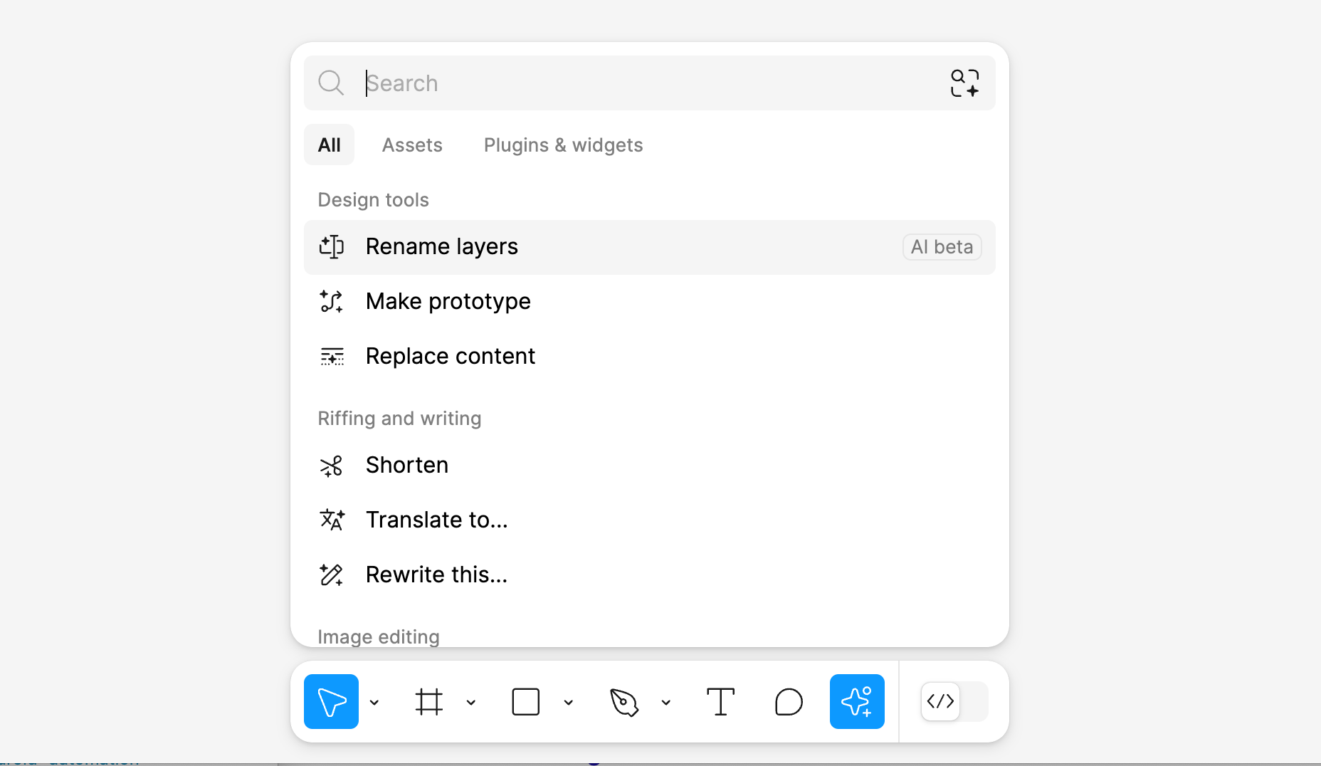
When it comes to the AI features Figma essentially announced 9-ish features intending to help designers in their workflow. I’ll refer to the Figma Shortcut blog post to explain what they are.
The AI features still live at this point: Rename layers, Make prototype, Replace content – Shorten, Translate to…, Rewrite this…, Make an image, Remove background
Make designs
There is one feature that everyone was discussing after the conference: Make designs. This feature generates a design inside of Figma based on a text prompt.
Earlier last week this feature has been taken offline after a lot of commotion. People — including me — were finding that the feature didn’t actually do that much, creating one screen based on a prompt that almost always had the same look (after creation you could choose between 8 “skins”).
Worst of all it sometimes generated results that looked way too much like existing designs — with the most prominent example being Apple’s weather app — leading to it being disabled.
After testing it multiple times myself and comparing it to what I saw on X, I did notice it kept producing the same type of results.
This makes sense because Figma explained that it draws its output based on components and autolayouted sections containing those components from a design system they created themselves.
They explained they use off-the-shelf LLMs to generate output that basically tries to match your query with parts of the Simple Design System they built, combined with, I suppose, a large instruction set that knows what kind of output it needs to generate (likely a JSON file) so that Figma can use that to draw the design.
When “Make designs” was announced, I had the impression people’s expectations over such a feature were all over the map. What does it really mean when a design app can “create” for you?
What do you expect then as a user? What does it base itself on in a seemingly infinite sea of possibilities? In Figma’s case, it seems to rely on a design system they are using.
They commissioned designers to create screens that would recreate a bunch of typical app patterns, and after your prompt, you get a kind of “composition” back where Figma mostly stacks autolauyouted blocks on top of each other, with the content within those blocks sometimes changing based on your prompt. The design system used in the background has eight look variations, and as a user can change the look after you see the result.
How does it work?
Let’s go on a hypothetical example run, where I try to summise how it works. I am sure I am making some mistakes here, I don’t work for Figma, but I am trying to wrap my brain around the concepts. What I am trying to summise is how Figma’s AI “reacts” to a user’s prompt.
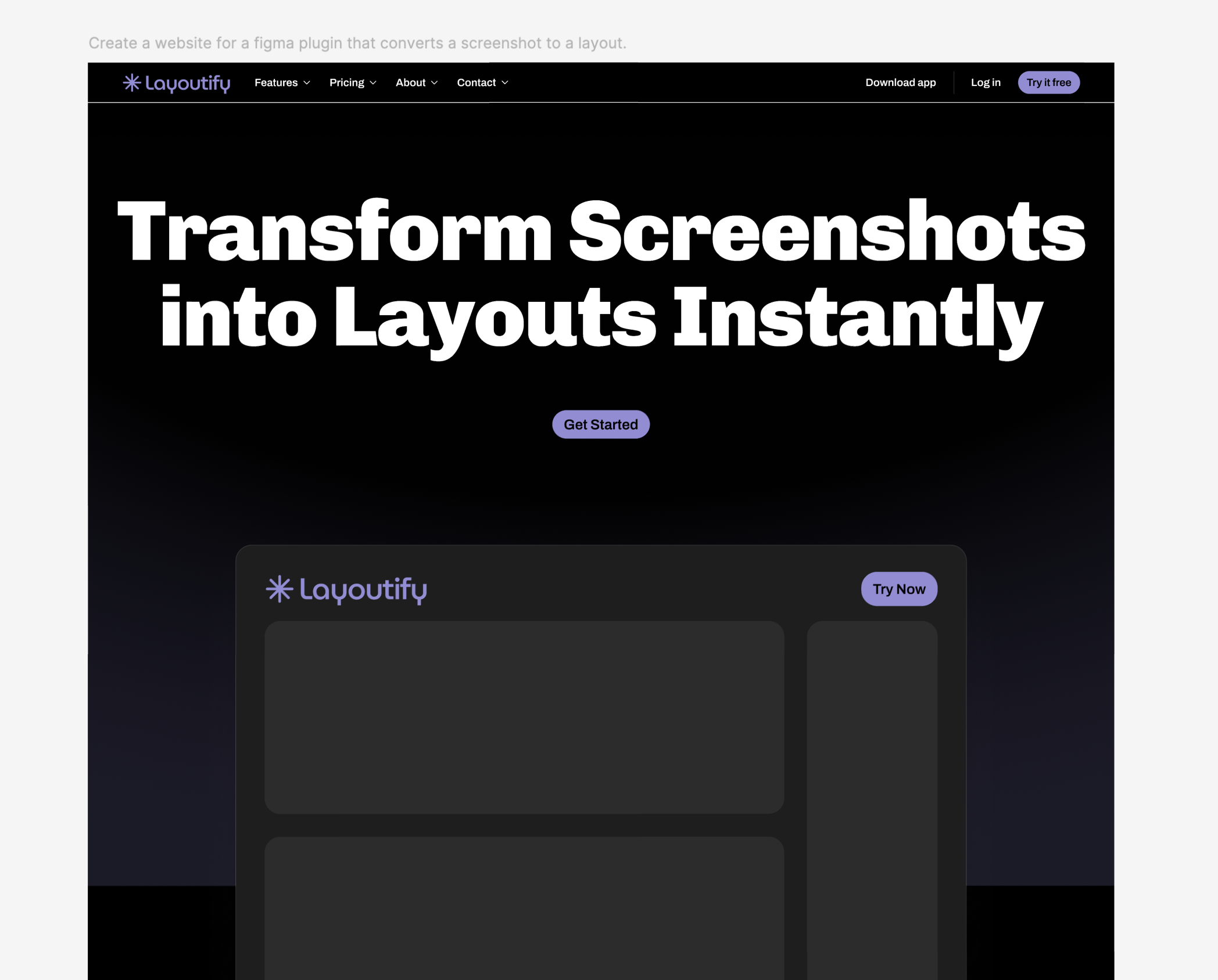
Suppose your prompt is “design an e-commerce website.” The first thing the design generator will then try to determine is whether it should be mobile or desktop, since it doesn’t ask questions back. In this case, seeing the word website might lead it towards desktop layouts. If it sees “app” as a keyword, it might leans more towards the set of components meant for apps.
Website test, with a prompt to make something similar to screenshottolayout.com. Exact prompt: “Create a website for a figma plugin that converts a screenshot to a layout.”
Okay, now it sees the word e-commerce with little other information to go on. A built-in limitation is that it will only design one screen. So now you’ll likely get a design for typical e-commerce site, without a specific theme, showing the most obvious version of what an e-commerce site would be: a header with a menu leading to product categories, a shopping cart on the top right – maybe below the header a hero section or a product section, possibly more product sections, and a footer with categories.
First of all the generator doesn’t have much to base itself on (since the prompt is very short) and it also doesn’t have much materials (since it’s limited by whatever Figma provided in the first implementation of this feature)
Suppose you now change the prompt to specify to “design a futuristic e-commerce website”. At this point I believe it will try to incorporate the futuristic aspect of that prompt and all of the above, but there isn’t much “creative wiggle room” – since the simple design system it is based on has 8 different skins.
It has to choose one of them so it does that, but most likely none of the 8 options decidedly look as “futuristic” as when a real designer would have been briefed to do something with that briefing.
What it will then try to do is put content within those blocks that is “futuristic” (whatever that may mean): for example, naming the store “FutureShop” and putting a futuristic looking generated image wherever there is a lot for an image. But since there’s not much about the content of the page in the prompt, based on my testing you will likely just get a photo of people or a flower.
I did not test deep prompts where I would ask the design build to put specific content in the pages; unforunately the feature was taken offline before I could do so.
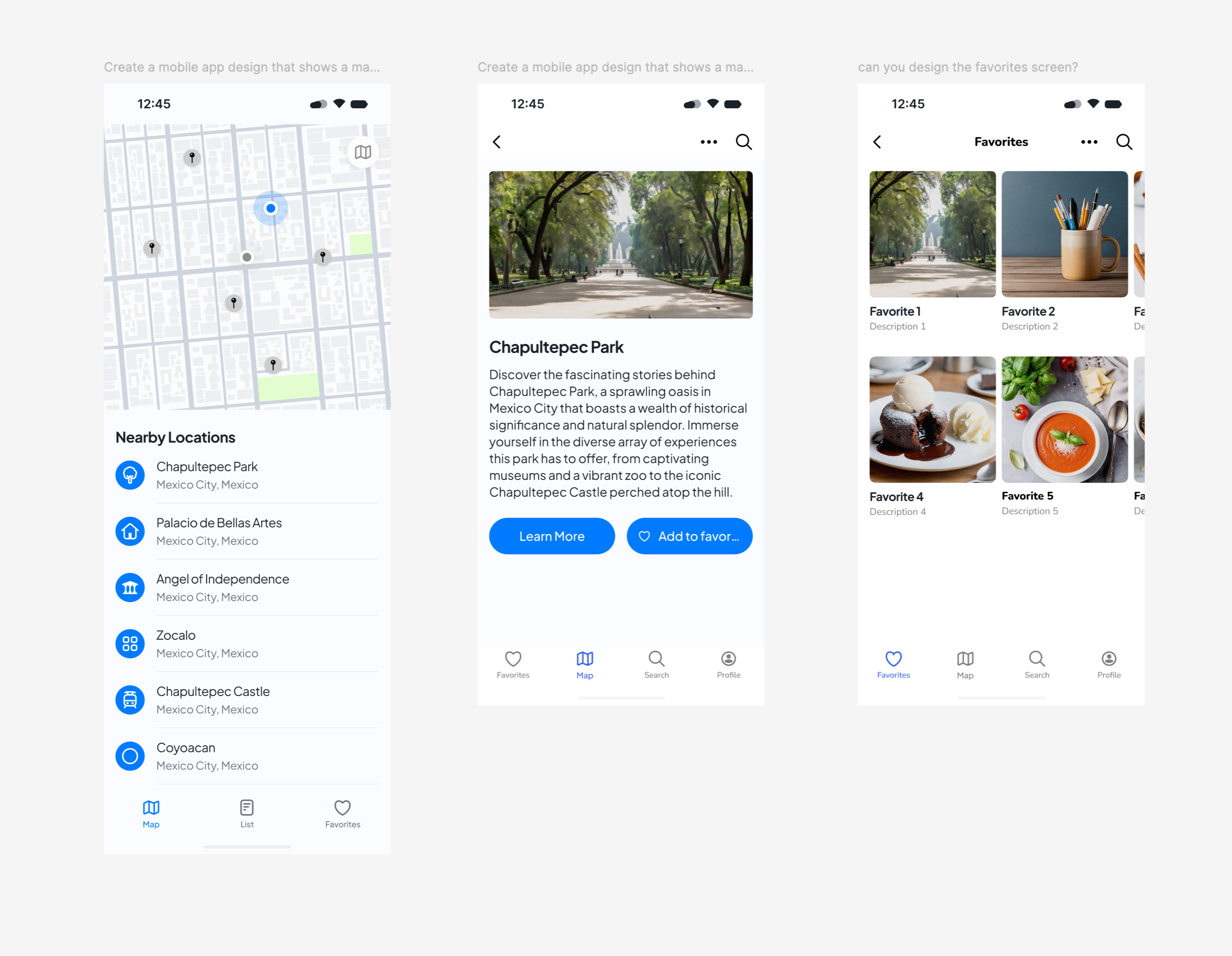
Let me give a slightly more complex prompt example: if you ask for an app design, with a map, and that map contains items in Mexico City, and you give it a second prompt (for a new design) asking for a detail page about the large Chapultepec park there, and on that detail page you give a new prompt specifically asking for an image of Chapultepec park.
Now you’re three prompts in, and with some layer organizing, you end up with something like this:
I think this could be a starting point for someone to start asking design questions; it could solve the “blank canvas” problem that Figma talks about. Because now you do have something to talk about.
Why is there a search button on the detail screen? What should be different? Shouldn’t we place that “add to favorites” in the top right corner? Seasoned designers will now squirm and say that they can make this in half an hour (and with better details), but I don’t believe that is the point. The point is to get started.
Talking to your design
For a designer, a next step might be to look deeper and to starting to adjust the design. That favorites list doesn’t refer to the heart icon in its content. The tabs seem inconsistent across the screens. Maybe you have other comments.
Could you then theoretically select the three designs, and fix inconsistenties, as well as add detail, via prompts? Figma’s feature could only help you make something from an initial prompt, not a design. Whereas a lot of the LLM magic is by correcting the LLM and giving it additional context. I am sure this is a “v1.0” problem that can be solved down the road.
Although I am a bit hesitant since in my experiments with LLMs, I find it severely difficult to have the LLM keep context of what you are talking about when using a custom data set.
I believe Uizard has this “talking to the design” feature but I’ve yet to test it. Switching design apps is a bit like switching IDEs for programmers; it comes at a big productivity cost for a gain in the future. I am now sometimes inclined to test competition like Penpot, Framer, Uizard – or go back to Sketch – but the years of habits I have with Figma (and the general lower quality of the competition) are making me stay.
With a messy, inconsistent design like the one above, you as a designer can try to “untangle” it manually, or theoretically in the future via prompting.
You have a way to generate things that would otherwise be time-consuming (depending on your skill level). You could also theoretically get triggered by an unexpected result of the generation engine; I find that sometimes, the answer an LLM gives you can put you on an unexpected path. Except in the feature that was shipped, the sameness of all the results is one of the problems why the feature was taken offline.
Do we need this?
It seems like the team worked under a lot of pressure and a deadline to create something that would count as “real generative AI” in Figma.
The “Make Designs” feature is somewhat similar to what Framer has had for more than a year for marketing websites, but with the ability to generate app-like designs
(The Framer feature also doesn’t work that well, but that’s another topic)
Initially, I thought the issue with the rather “basic results” might be due to the basic prompts people — including myself — were testing with (“generate a [website/app] design for xyz”). But based on Figma’s explanation, the lack of variation is mainly due to the fact that, as discussed above, the model combines a mix of autolayouted components that is very slightly remixes content-wise, and leaves it at that.
Is this real design work? Does it help you get started? Personally, I don’t struggle much with the “blank canvas” problem that’s mentioned as the reason this feature exists. And when I start designing, I usually don’t want too much of a structured logic that already contains auto layout; at the beginning of a design, those features get in my way more than they help. But maybe I am not the audience of this dfeature.
In Figma’s call for training data and the way they announced the feature, it’s clear that they also know that is just a start, and maybe not even the right one. From August 15, they will start indexing all accounts data that have not opted out of the system. For org and enterprise customers the training toggle is off by default. Pro and starter plans have it on by default.
I wonder if having all that customer data will actually help them. It seems very complex to untangle a good logic from design files. How are you going to train an LLM on all those random files? How will the model know what data is relevant to be trained on and what isn’t? If I look at the design space of my biggest client there are hundreds of files there and if I had the choice, a hypothetical agent should probably only train on certain files (not the messy ones, not the ones that are visually out of date etc.)
The optimistic side of me initially thought about the Make Designs feature, “we’ll see how it evolves…” while the pessimistic side thought: “you won’t get more than a few basic screens out of it, and they’re not even connected to your design system”.
What a Make Designs feature might mean for my work
After basic testing, I have a slight idea what the feature means for me personally: with the current Make Designs feature, you might get a certain starting point or inspiration, but I still prefer a real design process of sketching and digitizing. However I could only test the feature for a day or so, and from my experience of my behavior of interacting with an LLM I tend to start using it if I can find a clear aspect that is useful to me.
Just as ChatGPT can generate texts and code, generating designs might lead to something, but whether that something helps you is very individual.
For example I follow a business innovation consultant on LinkedIn that said he uses Uizard‘s generative AI, which also has a feature like Figma’s make designs, to drive discussions in workshops. That seems like a legit use case.
I also have some work situations where it’s perhaps not so important what’s on the screen, but rather that there is a screen, which can serve as a starting point for a discussion, for example, with middle managers in an innovation workshop who are not designers themselves.
I always dread making design for these use cases, as those middle managers will then kick down hours of work with one simple sentence. Depending on the importance of the project to the stakeholder, I will sometimes just copy/paste old designs and change a few words to fit the briefing, so I don’t waste too much time.
In that work situation it helps to visualize something quickly. I would then hate it if middle managers — hypothetically — would send over designs they generated, saying “just continue from here”. But the same counts for receiving a poor piece of AI-generated writing. A tool is just a tool: it’s how you use it that matters.
As a designer I imagine you need to be senior enough to interpret whatever you get from a colleague as a briefing, ask the right questions, and distill the ideas stakeholders like and dislike from the generated pre-design, to then deliver then a professional result that is way better than whatever comes out of the AI-mill.
But if that happens too much, I would maybe advise your colleagues to stop using poor tools or sending unprocessed AI output to me in poor taste. If you can’t be bothered to write something as a human, why should I be bothered to reply as a human?
I’ve already experienced this work situation with people who thought texts written by ChatGPT are somehow good enough, and I think it won’t be any different when someone “makes” a design and thinks that is good enough.
As any designer knows, you tend to receive briefings in the weirdest formats — from a combination of all sorts of cobbled-together bitmaps in PowerPoint. When I worked for a financial client I once got a dashboard design in Excel. Some sales person won’t be able to describe what he wants but will happilly sit in a two hour zoom to direct you as you design together. What if he could generate a design that can help visualize his thoughts? Would he eventually skip you in the process? Does that mean he is “taking your job”? (There’s a lot of debate around that)
Will a generative designs feature help to get something in front of non-visual persons, so that at least they can react to something visual? Or will the non-visual persons start using the tool and just skip the designer?
Just like the innovation consultant examples, I can see people using it as a tool to get to where they need to go. Except I fear a little bit for a work future where I have to deal with too much mediocre things slapped together without much thought.
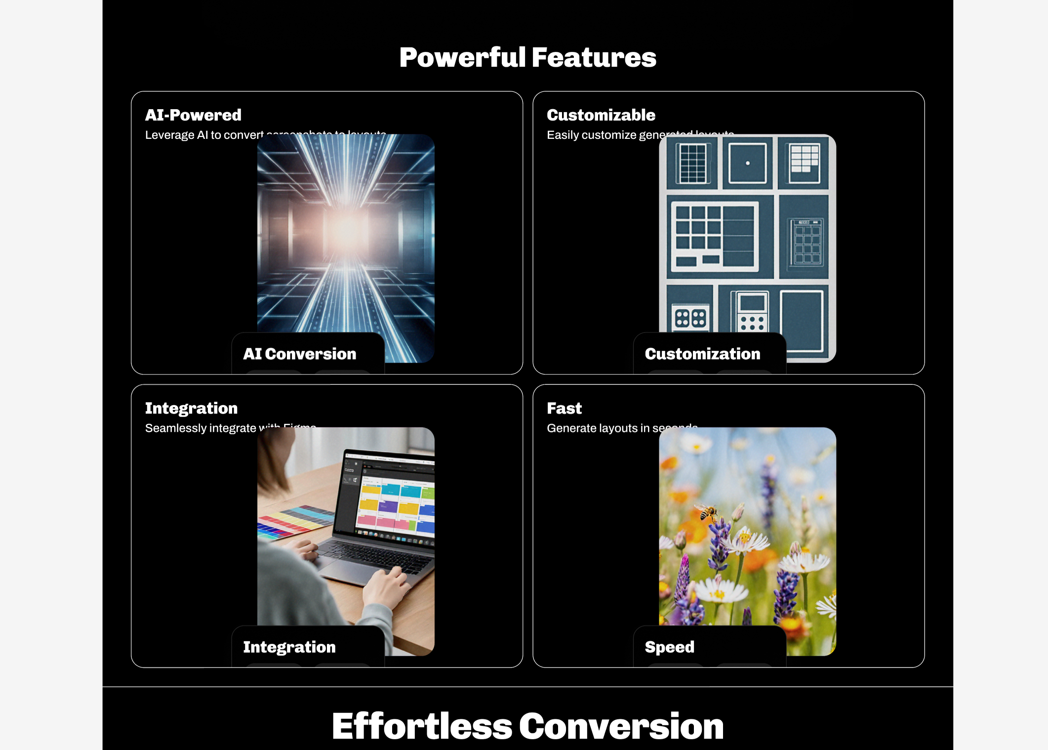
Generated design with ugly AI generated images
Components all the way down (but with fake logos)
Unshipped
The make designs feature has been temporarily disabled by Figma.
The feature did not meet the quality standards Figma desires. I suppose the combination of too many similar results, and a possible copyright breach in some of the app designs, was enough for Figma to make that decision. Dylan Field, the CEO, said, “We will conduct a thorough QA check before re-enabling it.”
What happened then? It was noticed by many that the designs generated by the featured all kind of looked the same. There were some examples of weather apps generated by the prompts were just a bit too eerily similar to Apple’s work.
This was likely due to the fact that the underlying was simply choosing components of a set of fake weather, shopping, navigation, todo apps etc. When users would give a similar (short) prompt, of course something similar would come out.
Figma commissioned designer teams to make those fake apps within a skinnable design system, and on a deadline, with the briefing of needing components for a weather app, of course they did what many designers would do: copy some else’s homework.
Figma faced the problem that they need a source for their designs. They specifically mentioned that due to a QA problem, the intended quality was not achieved. But can they really fix that in the long run? The idea seems to be to go towards indexing customer’s design systems instead of doing what they do now. Will you now get some other team’s work presented to you?
Is it possible to get to good results?
In the end, can you really achieve the intended quality of design work through prompts?
I can imagine that with a detailed prompt, within the logic of a custom design system, you might get somewhere. But you would have to also be able to continue the conversation after the initial prompt, and the LLM would need to be very aware of your design system(s).
Let’s say for example you prompt: Design an iOS app screen in the style of Company X with Company X’s design system. The user sees a header, a back button, and a more option in the top right. On the screen itself, there is a company logo, a title, and a date. Below that are 2 sections, each containing a list of items; this can use the standard document list. The sections are called “My Items” and “Shared with.”
If I see such a prompt, I immediately think: maybe the stylistic option of which library to use (iOS) should be taken out of the prompt because you often have multiple libraries. And how does the model know what the “standard” is? How much choices that a designer makes can realistically be handled by an “AI”?
In recent years, various larger companies have made various demos (as well as working implementations, I believe?) where they built out the UI from their own components with a prompt. I remember an Airbnb demo like that. I heard Snapchat has an implementation of recreating a screen in their design system based on a screenshot.
Within my research for Screenshot to Layout I came across this interesting talk, from four years ago where the author talks about an implementation of an LLM that can recognize UI elements and help you design. Recognizing UI elements for what they are is a crazy computer science problem. In this paper the authors talk about recogning UI elements from a screenshot. In reality this is very difficult to accurately do.
When building out the Make Designs feature in the future, Figma has the advantage that they both have structured data and can compare it against an indexed design system. As customers we see a glimpse of this feature thinking in the search that is indexed based on images.
As mentioned before, In Figma’s call for training data, I clearly hear that they know they don’t yet have a good LLM model that understands UI yet.
I also clearly hear they realize that what they have now is just a start – and maybe not even the right start.
There might be a lot of potential to go from a more generic model to more unique results by creating a more custom “agent” that understands the work that needs to be done between the prompt and the matching with the design system. Understanding a custom data set and being able to act on it is likely a very different approach from what has been shipped and then un-shipped now.
I wonder. Why is Figma so rushed to release AI features? Are the investors hungry to get returns? Is it to stay relevant as a design tool? Figma is not a publicly traded company. They earn hundreds of millions from the current SaaS logic.
One part of me is genuinely curious about where this feature will go. Another part of me thinks the feature is a bit tone-deaf to the profession of designer, Figma’s biggest customer base. Another part of me thinks I can only think like an “old” designer with 15+ years of experience. Maybe this is just the new way of working and we should embrace it.
It all comes down to what Sho Kuwamoto said in the video I linked at the beginning of this post: do people like it? With Make designs, is Figma making something that truly helps people in their work?
I am unsure if tools should really go into the realm of creation if the output is what it is today. What I saw coming out of “make designs” was so generic that I really wonder if it needs to exist. But if you never make a start with a feature, you can also never make it better.
The thing is that what came out now, was simply not good enough. I couldn’t do enough testing to really get to the bottom of it, but given the backtracking on the feature, clearly it was not ready for prime time.
This kind of work should maybe have released as an experiment, as an alpha, and perhaps not on the main stage, not as the main thing that Figma ships this year. But it wasn’t released as such. It was released as a the main Figma feature for 2024, that’s right there for every user. And they unshipped it a few days later.
Is this really a priority?
I have a ton of features that I actually miss in Figma, and Figma making generic looking app designs was not one of them.
I didn’t talk much about the other AI tools. Of the 9 announced AI features, for me 6 of them actually fall under the flag of being helpful for designers, as tools, which are more like aids to work faster and handle mundane tasks and stay somewhat outside creation.
Figma has historically created a lot of time saving features (like multi edit, like the grid arrangement tools and on-canvas spacing tools); the part of the AI tools that are focused on writing, on generating placeholder content and on generating noodles for you seem like natural extensions of these time-saving tools. I love Figma for this aspect and have been a staunch Figma advocate ever since joining the beta in 2017.
The make design feature steals the spotlight in the online discussion, because it’s so divisive. It does something else than the other AI features that were announced. Likely this kind of feature will be a discussion point for designers for many years.
When I said I got a small identity crisis as a designer after Config, I wasn’t lying. Because what this feature does, is that it starts creating something for you; and that’s a direct attack on your identity.
It feels weird to me as a designer.
I’m definitely not anti-AI tools. I experiment heavily with uses of all kinds of tools.
I use them for translation, for code generation, to push something forward, whether it’s an idea, a piece of code, a text… sometimes it helps, and sometimes, it really doesn’t.
You always need to interpret and reprocess the output. In code generation and in translation the LLM has a huge chunk of text to work with to then give an answer about. That’s where LLMs are at their strongest.
When it has almost nothing to go off of, it starts to hallunicate and give you weird or medicore output. I believe two main factors were in play when Figma released the first version of Make Designs; first of all, the AI had almost no context of what you are trying to achieve – and second of all, it’s severely constrained in the type of output that it can give you.
Since the limitations of generic LLMs are many companies started working on specific custom LLMs where the context they have is constrained to a specific dataset.
I am not a technical LLM expert but I am trying to understand the limitations and how to best use them. So take the following explanation with a grain of salt.
The combination of a generic LLM (to understand language), a custom dataset (a context to work in) and a user prompt is called the context window. The context window has a certain token limit. It’s this token limit that is constrained and takes a ton of CPU power. Just processing 20 PDF documents a few times the other day gave me a Claude bill of €0.5.
A big Figma library is probably a collection of more than a million tokens. Can you use that kind of data to then generate something out of it, with the model also understanding what is what? For example by also having indexed the Material design guidelines, or Apple’s HIG? I think it would require some serious computing power and thus get quite expensive. Figma promised to foot the bill for the AI features, to then later decide how much they should cost. Prices of computing are likely to go down, but I also wonder about what all this AI generation would cost in the end.
Low quality output – which problem does it solve?
Right now, you could compare the current functionality to doing a search on Mobbin for some UI pattern and then having editable layers right in front of you (in another design system than yours).
Except on Mobbin you see the creative design interpretation of teams, whereas within Figma with the current implementation you will most likely always get a very similar result.
For Figma, their customers are designers.
Do you provide your customers with AI generation tools with very low-quality output or not? Does this help at some point in the creative process, and is the value assessment then left to the designer?
Is AI it mainly a marketing vehicle to say or does it offer something new? At what point does a feature set degrade you as a company instead of making you look good?
Do the people working on these features also know that the inherent value is limited; or do they truly believe this is the new way of working? I am sure they are aware it’s not that good and they are actively working on whatever they can to make it better.
But as a customer I mostly see an alpha feature announced as the biggest feature of the year, then backtracked, and that saddens me a little bit. What if all this engineering time was spent on making Slides less of a 0.5 product, or having clear ways to transport files across Figma accounts, or supporting slot components, or a real responsive breakpoint feature?
Design tool vendors have the choice to decide what they stand for as a company, and users will vote with their wallets. Figma is the clear winner of the current crop of design tools. As a technologist I’m curious how it will all evolve. As a day-to-day designer I just wonder if I wouldn’t have chosen another focal point for Figma’s roadmap than trying to do something with AI.
Design generation is a difficult problem to solve. Understanding the relationship between UI elements and the entire logic of software design goes quite far. And such a tool can only look at the past, and generate what it already knows.
Some people online claim you can generate entire software with AI, but that’s simply not true. You can rehash a piece of repeatable code, especially if it’s a known concept (a game like Breakout, for instance), but ultimately you have to glue all the building blocks together yourself.
Yes, sure, the LLM can spit out code it found on Github and reproduce it as a whole, but that’s the equivalent of asking someone to paint for you, and them bringing you a stolen painting they found somewhere. Part of what is happening in this feature right now is that Figma presents you with this stolen painting.
The problem is that the machine does not really understand UI design. It understands an approach where prompts are compared against building blocks. You might end up with something correct or not; you might end up spending more time recombining the puzzling output into a proper whole than if you used your own intellect.
Conclusion
I am curious where this will go in the following months. For now, I am not so worried about my profession, and I am a bit worried about Figma spending a lot of time on a problem that for me was not even quite desirable to “fix” in the first place.