When I lived in Japan, I went to a meetup that would get organized every few weeks, and it was all about learning Swift. People with different coding levels, from beginners to more advanced devs would meet and share their progress in learning Swift.
I want to start the same thing for Svelte now, this kind of low-key meetup where we talk about what we learned, our struggles, how we are progressing etc. My idea would be to hold a first event with a maximum of 5 persons – and just get together for 1,5 to 2 hours on an evening, drink something, talk about Svelte and we’ll see from there.
It would be organized in Antwerp, probably close to Berchem station.
No current investment in Svelte needed, just an interest and the intent to get started. If you are up to it, send me an e-mail at svelte@johanronse.be or a DM on Twitter.
As a teacher of sorts, I for one don’t want to explain the difference between CSS3 and CSS4 to junior web devs. There is simply no point. CSS is just CSS. We should be happy that it’s stable. We should be happy that we dropped the 3.
What would one hope to achieve with marketing and putting attention on something? Especially when from the start it’s clear that the marketing is insincere…
*(somehow my comment couldn’t pass the spam filter, so I decided to post it here)
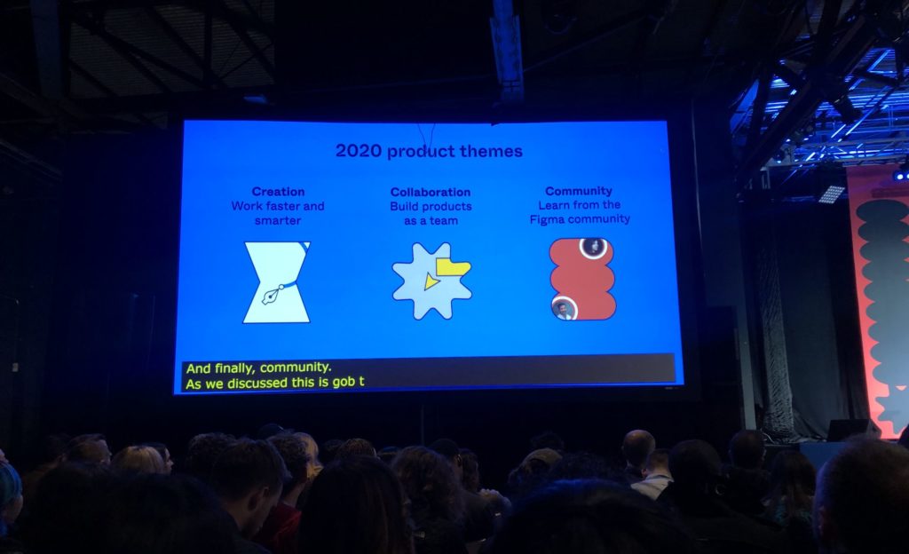
Dylan Field, CEO of Figma, talked about three product themes that the team will be focussing on to improve Figma in 2020. He talked about thi on stage at Figma’s first user conference Config, in San Francico, CA.
The three pillars are creation, collaboration, and community.
In true Figma fashion, the presentation was mostly about features that are releasing either very soon or are already released today.
The first improvement in the creation pillar is a better font menu. You can now search for a font instead of scrolling through a long list. You can also see what is already used in the document in a quick list.
When selecting multiple layers, there is now a list of Selection colors that appears on the right side – this lists the colors that are used within the selection, and gives you the ability to directly manipulate them. The Figma team found this to be a big time saver for them ever since implementing the feature.
There are now stretch constraints with autolayout ❤️. Basically instead of aligning to left, right or center there is now a “stretch” option. This got a bunch of applause from the audience. When autolayout was released, this was seen as one of the gaps in the implementation.
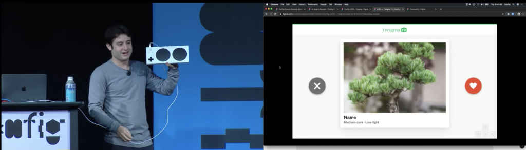
Mr. Field showed off support to navigate prototypes with keystrokes – with a demo where he used Xbox accessible gamepad to navigate through a Tinder-like interface.
Using Xbox accessible gamepad to show off Tinder-like UI prototype that works with keystrokes.
Moving on to collaboration. How do we work together more smoothly?
Mr. Field then moved on the show off the plugin relaunch API. This is a way to see where a plugin has been used in the creation of a file. For example, if you click on a Mapsicle map, and you have no idea what Mapsicle is, the layer will link you to the right plugin.
Clickable links within the artboard – to external URLs, or to part of a Figma document – improve Figma’s ability to serve as a Keynote/Powerpoint replacement.
A long-standing issue which allowed prototype viewers to have access to the full design file has been fixed, with better controls on who can access what.
New community improvements allow for open source design. Remixes allow for public feedback to the person who created it. Public profile allow design team to show their work.
I showed the beta website to a friend. I said it should be fast. He replied: fast is an understatement. It’s instant.
That’s the good. Now… the bad.
The realization has come that the Svelte community is still growing and many problems are still pretty much unsolved.
Sapper is a super cool project with really good ideas but it’s not that actively being worked on.
The Routify project that I am involved in is evolving at a rapid pace, but it’s nowhere near the maturity that projects like Gatsby or GridSome have.
If my overall goal is to just have a great website, shouldn’t we just use a more mature technology?
One that has validated and tested server side rendering – hydration – code splitting – all the goodies that you need to deliver the quality I want?
The speed benefit of Svelte is obvious, but won’t we have a similar speed if we use React or Vue.js? The speed benefit might simply be in the fact that it’s an SPA, and not in Svelte itself.
If you look at a project like Gatbsy, they have templates like a starter blog. On the Vue.js site there is GridSome (nice website!).
There’s probably many resources to be found and every conceivable problem you run into, somebody has run in before. For example, a current problem I have now is that the Open Graph meta tags (which are used when sharing links on social media) are controlled through the Javascript, whereas they should be in the static HTML to be picked up by LinkedIn, Twitter and the likes.
On our site we like to have different Open Graph preview images depending on which section of the site you link to. If you have control over the HTML output, that is very easy to do. But if everything redirects to index.html, what do you do now?
The answer is something with SSR, but I don’t know how to implement that myself. I have to depend on my router to do it.
This seems to be a solved problem in the GridSome and Gatsby communities as far as I can tell. I would like to hear from someone experienced if that is actually the case or it’s more like a not really.
Nobody has solved this in the Svelte community as far as I know. This is a problem that could prevent me from shipping the website in the end. It’s not the end of the world but quality problems can pile up.
I guess at some level, everything is a balance act, and who cares about perfect Open Graph tags when you have a faster site? Do you really need something like a sitemap.xml – and a perfect indexable site (actually… yes.)? Which website building techniques from the past — including SEO techniques — are still relevant?
It’s easy to shove the learnings from the past under a rug and ship a new cool website. But what if what you ship is just objectively worse? I read about the problems with SPAs and accessibility I’m almost thinking to just shut down this experiment completely and go for a fully static website.
What’s the point of fast loading if in the process you are making your content inaccessible to part of your audience? That’s just stupid and wildly irresponsible.
(BTW, I see there’s something like Gatsby cloud – I can’t help but wonder why you need a service to deploy a simple website? Did we really all collectively forget how to FTP and SSH?)
So let’s say that doubts are creeping up about whether this is the way to go.
Now, on the other hand. I have invested in learning Svelte. Our codebase is running Svelte. The other frameworks don’t have the same animation capabilities that I plan to use. I would hate to have to write code that looks like the examples here.
So… I think for now I am just going to push through and try to solve as many problems as possible. But there’s a business reality. There’s a set amount of time tp work on our website before we have to move back to client work. If we can’t make something better (technically), we’ll have to shut down the experiment.
Maybe we’ll just provide a content update on our portfolio, ship the CSS improvements we made and call it a day. I don’t know.
We might run a beta of our website in parallel with the real website and be transparent about the problems with it. There’s clear talk about these problems in the industry. Maybe a combination of our work and better tools will solve the needs that we have in time.
But for now, I really don’t know. I am learning a ton though. So that’s good.
I had to wait for 2 hours in a hospital today, so naturally I spend my time writing down long-winded thoughts in Notes.app.We are re-building our company website in Svelte. This seemed to spark some interest on Twitter, so I decided to write about it.
This is a draft for a blog post that will appear on https://mono.company/ . This is the long and wieldy version that needs an edit, but that some might appreciate. It’s about some technical beginnings, it contains some thoughts on routers, and then goes into thoughts about code splitting and ideas about how we could maybe replace WordPress(but probably won’t).
Replacing WordPress with Svelte: why bother?
We’ve recently started experimenting with using Svelte for our website. In this blog post, I’ll talk about some first findings and thoughts.
First of all, why?
To experiment with new technology
To make us excited about working on our site again
To have a codebase we can be proud of
To not have to fight WordPress’s caching mechanisms anymore
To not have to fight trying to make a WordPress site fast
Because we feel we are a bit stuck with our current site when it comes to experimenting with different ways to show our work
It’s an SPA!
First of all, what we are building is is essentially an SPA (Single Page Application).
This method of building a website comes with a different workflow than other methods of building websites, from static site generators to using CMSes like WordPress.
I am used to building sites with CMS’es; for years I experimented with static site generators like Jekyll; but I have never really built a site as an SPA. Up until I have always dismissed the idea, because I felt like there were too many disadvantages to shipping a site through a JS-only bundle. But a-hem -the times are changing – and I feel like I have to get on with the times. Which I might later regret.
SPAs essentially render all of your site’s content through Javascript. The biggest benefit is that an SPA does not need a page refresh. Clicking on navigation items or doing something on the page simply changes the content of the page, not the actual page you are on itself. The URL in the browser might change, but essentially every request you are visiting the same index.html. The requested URL is saved and passed into the router.
The biggest advantage here is speed. An SPA can be very fast. Once the initial bundle is loaded, you can navigate through it without any delays. We can see this in the test version of our site. It is fast. Really fast. And that makes me happy.
Let’s talk about routing first.
Routing
When you visit a web page, the page has a URL. The URL lets the browser know which page you are requesting. In an SPA you redirect every URL to index.html. In index.html, you then “catch” the URL that was requested (e.g. /work) and do something with it: typically render a page.
Routing can be very simple. You can theoretically write a router in 50-60 lines of Javascript (example; I did not write this code, but the fantastic pngwn did)
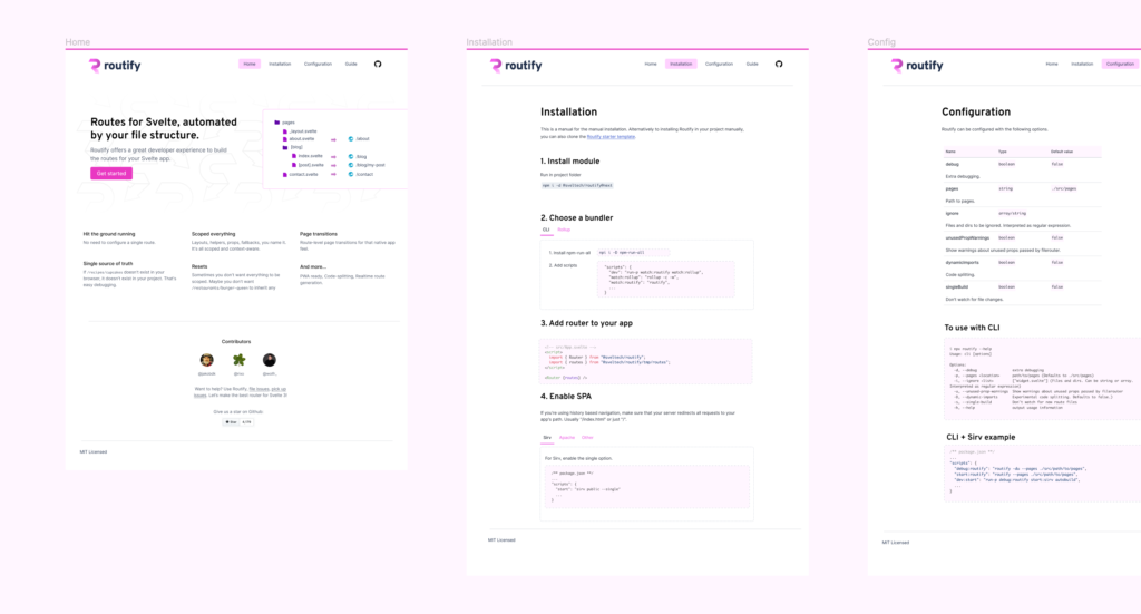
But a good router has more features than just simply displaying a page. For the Mono website, we chose to use Routify.
Routify is a file-based router. By constructing pages and paths you are essentially constructing routes that the router can derive. For me this is a super logical way to work as opposed to manually defining routes in a JS file.
If you’ve heard about Svelte, you might heard about Sapper. It works in similar ways.
A note on the Svelte ecosystem
It has to be said that Routify is quite new as a project. I am actively involved in this project to improve it myself. The authors are doing the hard work at the moment to create the best router for Svelte 3.
I see my role as promoting the router, explaining how to use it, providing good documentation, QA and being the “voice of the user”. The stated goal is that as a tool, Routify is so easy to that a beginner web developer could work with it and get things done.
Sneak peek of upcoming Routify website
Now, this is a good example of the state of the Svelte ecosystem. It’s young, there’s many things happening, but not a lot of it is locked down. This means that not every problem is solved yet, and some things might require some digging. That might not be up to your taste.
Bundle size
Earlier I mentioned that once the initial bundle is loaded, you can navigate through an SPA without any delay. This brings us to the topic of bundle size.
If your whole website is contained in a JS file, are you not loading a lot of things upfront that you don’t need? If your website has 30 pages and the visitor only visits 2 of them, aren’t you loading things that the visitor doesn’t need? What if they have a slow connection? Wouldn’t loading the code necessary to load 30 pages lead to a long initial render time?
All of the above are the kind of concerns you could have and that you need to be aware of when building SPAs. If your router supports code splitting (like Sapper does) you can migitate most bundle size problems (extended discussion here).
Code splitting is a technique to split your application into different pieces that are loaded on request. For section A you need bundle 1, for section B you need bundle 2, etc.
(Please note that this is how I understand it now – the whole notion of code splitting is pretty new to me).
Now, what about dynamic content?
If we take the example of blog posts, you could load dynamic content over an API and insert it in the page in a dynamic manner.
It makes no sense to make content part of your bundle. For example, we have about 95 blog posts on our web site. We can’t just add this content to our Javascript bundle. The simple act of bundling up, let’s say 15kb of HTML per post would lead to a bundle size of +-1.4Mb. What if the visitor never even visits the journal section of the site?
Having to request content dynamically comes with speed concerns. How and when do you build the page? Where does the content come from? How do we do this?
There are lots of solutions. To do things properly comes with new challenges. I think I am going to sidestep the “build a dynamic blog” problem for now and focus on rebuilding the website in a great way in Svelte except for the blog.
I’ll explain my rationale below.
The best of both worlds?
Our current site runs on WordPress.
Let’s consider the WordPress editing interface for a moment. I like having access to drafts, the multi user editing, the fact that I can easily add code blocks or callouts if I want to. I like that when I upload an image, WordPress automatically generates responsive images from the source, directly on the server. I can hit the publish button and have a post on my website in an instant, with a shareable URL.
Since we are rebuilding out website, it is now tempting to also rebuild the blog in Svelte. But there are a few technical realities.
First of all, the ecosystem around blogging with Svelte is not mature. There is no good sample Svelte blog project. There are no Svelte CMSes. You would essentially have to do the parts that you need from WordPress, from scratch.
There’s so many parts of WordPress that we actively use. We use categories, there is an RSS feed, there’s pagination; URL fallbacks; and that’s just scratching the surface.
And now I’m just describing the generated output side (i.e. what the CMS outputs). Then we have not even considered the user experience of writing and publishing. I’ve learned to love Gutenberg and for me there is no way back.
If we were to try and build the blog in Svelte, and try to “work with the least amount of technology possible” we would probably end up with something far worse in terms of user experience for us on the publisher’s side.
What about using WordPress as a data source and then using WordPress’s REST (or even GraphQL) API to pull in data? This technical solution could work, but creates a disconnect between the publishing side and the viewing side. How would you preview a post when you essentially decoupled the CMS from the data loading? How would you show the correct URL in the editing interface when the WordPress editor lives on a different server? (Or can you combine an SPA codebase in a PHP app?)
My current conclusion is that WordPress is just too powerful to replace, but the rest of our website can perfectly run in Svelte. If the WordPress runs on a subdomain, and the portfolio and every other page of the site is managed by a Svelte codebase, where both sites share the same header and footer, we might just have the best of both worlds – or we might just have created a technical monster.
Svelte is picking up steam, with multiple Svelte events in the world, you can find out about them via https://twitter.com/sveltesociety
I personally heard about a meeting in Amsterdam, one in Tokyo… there’s many things going on. Let’s hope some of these events will record their talks so we can all learn more about Svelte.
Speaking of recorded talks, there is a stream of the NYC event, with 3 talks, including one by Rich Harris, creator of Svelte.
In March we will sit together for the first Belgian event.
In the meantime, if you can’t wait to get started, you can give Svelte a try by following the official tutorial.
Support is available via Discord in the #support channel. People are friendly to beginner questions so don’t hesitate to ask something.
Regarding the event, we want to thank Lightspeed HQ for hosting us. LightSpeed is a POS solution that has an office in Ghent, Belgium.
The current attendee limit is 15. We might raise it to 20 people.
Ik keek onlangs nog eens naar Eyes Wide Shut, en besloot dat toch een bijzonder goede film is. Ik refereer af en toe in een melige bui naar een scéne uit Boyhood. En als ik nog eens nadenk over ooit een film maken, dan is Any Way The Wind Blows de eerste referentie die over de tong rolt.
Ik keek één aflevering van Over water, ik ga er nog eentje bijdoen, maar ik ben niet helemaal gegrepen.
Ik wil nu de Before reeks (Before Sunrise / Before Sunset / Before Midnight) herbekijken, waar ik erg fan van was de eerste keer dat ik dat bekeek.
Ik heb het steeds minder voor fantasieverhalen. Je zou me niet kunnen overhalen om een heel seizoen van The Mandalorian of het nieuwe Star Trek: Picard te zien (als dat al beschikbaar zou zijn in België). Ik heb wel genoten van The Witcher, maar dat was eerder een uitzondering.
Ik vond deze post terug in mijn drafts. Omdat deze slechte beslissing wetgevende realiteit aan het worden is (zelfs voor kinderen vanaf 12 jaar!), en de post actueel blijft besloot ik deze toch te publiceren. Dit werd oorspronkelijk geschreven op 3 november 2018.
Als je iets goed wil beveiligen, werk je tegenwoordig met tweefactorauthenticatie.
Je zorgt er voor dat er twee factoren zijn die bewijzen dat jij bent wie je zegt. Die twee factoren kunnen verschillende vormen aannemen. Vaak is het de smartphone met een authenticatiemechanisme via een app en een wachtwoord (time based authentication o.a. Google, de meeste banken). Het kan ook een sleutel op je computer zijn in combinatie met een sleutel op de server, gecombineerd met een wachtwoord (key based authentication o.a. Github).
Vele smartphones hebben ook een implementatie van de vingerafdruk om je aan te melden (bv. Touch ID van Apple). Je vingerafdrukdata wordt opgeslagen in een beveiligde laag.
Hoe veilig die data effectief is, is natuurlijk relatief. Vanaf iets beveiligd kan worden kan het ook gehackt worden. De ene implementatie is de andere ook niet. Er wordt wel eens gegrapt of je graag je informatie hackbaar wil maken op Russische, Amerikaanse of Chinese servers.
Of dit hacken dan effectief gebeurt is ook een functie van een aantal zaken. Is er iemand gebaat met de data in kwestie? Hoe moeilijk is het om iets te hacken?
De Belgische overheid is van plan om vanaf mei 2019 voor de identiteitskaarten het verplicht te maken om je vingerafdrukken mee te geven.
Dit is al zo met de reispas (voor 2 vingers, met een nogal crummy scanmethode, voor zover ik weet).
Eenieder die al eens gereisd heeft naar een land als de VS of Japan zal ook zijn vingerafdruk hebben moeten tonen bij de grenscontrole.
Ik vind dit niet onlogisch. Als land moet je weten wie je land binnenkomt. Voor de veiligheid, maar ook om illegale immigratie tegen te gaan. Maar als je de Belgisch identiteit hebt en naar je eigen land reist, moet je deze grotere controle in mijn ogen niet ondergaan.
Ik ben dus altijd blij om in Zaventem af te zwaaien naar de rij “EU onderdanen” en mijn gewone Belgische identiteitskaart te tonen aan de grenscontrole. Als ik in Japan of de VS aan de grenscontrole kom voel ik me dan weer niet echt welkom.
De stellingname van Jan Jambon (Zevende dag, 28 oktober 2017) is dat het plaatsen van de vingerafdrukken op de eID dient om identiteitsfraude aan te pakken. Als je identiteitsfraude pleegt, en je dus voor doet als iemand anders, is de kans veel groter dat je criminele feiten wil plegen.
Ik volg deze logica, maar moeten we daarom 11,5 miljoen Belgen hun vingerafdrukken gaan opslaan in een database?
Aangezien biometrische data een factor is in ieders persoonlijke beveiliging vind ik het gevaarlijk om die data in een externe database te stoppen die gehackt kan worden. Biometrische data verander je ook niet zomaar – je vingerafdrukken blijven hetzelfde. Eén lek ooit en deze “factor” is niet meer veilig.
Anderzijds is het ook maar 1 van de 2 factoren die een “hacker” nodig heeft als iets goed beveiligd is. Als we grenscontrole beschouwen heb je naast je legitieme documenten ook nog je foto, dus op zich zijn er al meerdere factoren.
In India kan je de database met vingerafdrukken van meer dan 1 miljard Indiërs volgens Vice kopen voor tien dollar.
Als je in een hypothetische situatie identiteitsfraude wil plegen, en dus een Belgische eID wil vervalsen, zou je dan in de toekomst op de zwarte markt ook zo’n database kunnen kopen?
Dan zou je nog toegang moeten hebben tot de software om zo’n eID te maken (wellicht verkrijgbaar bij elk gemeentebestuur op oudere, hackbare computers) Dan zou je de vingerafdruk-gegevens van jou moeten omwisselen met die van iemand anders.
En dan zou je nog genoeg op de pasfoto moeten lijken om een (grens)controle te doorstaan.
Eén probleem met overal zulke data te gaan opslaan is dat het gebruik ervan een hellend vlak is. Als de data er is, kan die gebruikt worden. Voor positieve en negatieve doeleinden.
We weten totaal niet welke regering we gaan hebben binnen 5 jaar, 10 jaar, 20 jaar. Wat als er een opmars is van extremisme? Stel dat de PVDA aan de macht komt. Willen we dan elke dag met het overheidsequivalent van Touch ID “badgen” om te bewijzen dat we aan het werk zijn voor de Grote Leider?
Michaël van Peel zegt het goed – uit “Van Peel Overleeft 2013” volgende clip:
Naar wat ik lees zijn ze in Nederland zijn ze al eens door dit debat gegaan, met eerst een goedkeuring en er na een afschaffing.
De laatste maanden wordt technologie telkens opgehouden als een schild. Ik vind dat er soms te veel geloofd wordt in technologie als oplossing van problemen (zie ook mijn vorige blogpost).
Een technologisch idee wordt uiteindelijk software. Als je een feature implementeert moet je ze ook kunnen ondersteunen.
Ik zie er weinig in om elke dienst bevolking in Vlaanderen te leren hoe ze vingerafdrukken moeten opslaan, om die dan via slechte software te beheren. Dit kost ook handenvol geld, terwijl we net moeten besparen in de overheidsuitgaven.
Is dit allemaal echt wel nodig? Kan de overheid zich niet iets afzijdiger houden in plaats van technologie op te houden als heilige graal? Kunnen we niet beter mínder doen, in plaats van elk probleem op te lossen met een overdaad aan technologie die toch niet ondersteund kan worden?
A few days ago I watched Rich Harris’s talk at JSCamp. It offers a different perspective on Svelte than the talk I usually recommend when learning about Svelte – which is called Rethinking Reactivity.
This talk is focussed on the idea “write less, do more” which was jQuery’s tagline.
Rich Harris says that one of the benefits of Svelte is writing less code. Because code is terse there is less boilerplate, which leads to less bugs. It also makes code more understandable. As a reader you have to follow less code paths and more code is visible on a single screen without scrolling. This leads to a better understanding.
Svelte is fast and the developer experience is excellent – but every framework claims this.
Rich realised that the unique part about Svelte’s compiler based approach is that it expands the problem space the framework can operate in.
Since it’s a compiler, it can do more, in theory the compiler can grow larger as long as the bundle sizes it generates stay small.
This offers possibilities such as code linting without bringing in another dependency. For example, Svelte warns when using the autofocus attribute on form fields because it is generally advised against, because it causes accessibility issues.
What about the “do more” part? Anyone who has learned jQuery might remember how easy it was to fade something in and out. Suddenly something that was out of your grasp before, you were now able to do. jQuery-based code has gotten a lot of criticism over the past years but let’s not forget that it was many developers’ superpower for a long time.
Taking things back to Svelte, I have a similar feeling. I’ve never been a hardcore developer. But Svelte enables me to make things that I previously could not do. Rich talks about where he wants Svelte to go – he wants to bring more people to the web, make coding interactive experiences more accessible instead of leaving it only to those who happen to very skilled at blindly manipulating symbols.
As for me, I want to do the same. I think web development shouldn’t be as hard as we tend to make it. There is a lot of overengineering in code out there. From a community perspective there is a lot of gatekeeping. Think “you are not a real developer if…”.
I remember when I got a computer and started tinkering with creative apps and later with HTML and CSS. I never got it until someone explained it well. Through reading many resources and being in the field for years I know what I know now; at the same time I feel the path should be easier.
We should break barriers and enable everyone to create. I can totally behind a framework like Svelte which is first of all just a great framework but secondly, where the original author has lofty goals that I can stand behind.
If you are interested in Svelte, I am organising an event on March 13th in a new Meetup group called Svelte Society Belgium.
It will be a code-along where we will code a small application together. There are not that many spots, so make sure to register! You can register using this link.
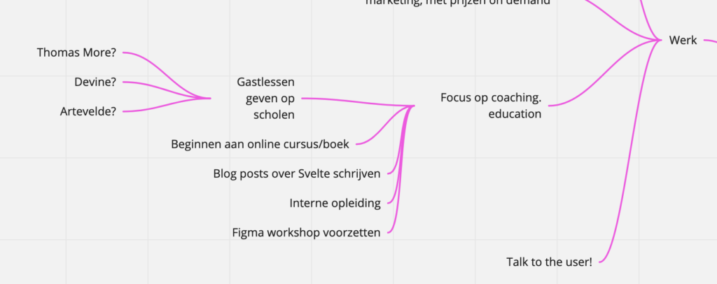
Ik heb met het fantastische Miro een brainstorm gemaakt over hoe mijn 2020 er moet uit zien, en op werkvlak zie ik dat er een duidelijke verschuiving is van wat ik wil doen.
Een stukje van de brainstorm
Ik maakte de voorbije 1,5 a 2 jaar al een verschuiving van design naar design management. Nu is het voor mij heel duidelijk dat ik in de plaats van zelf veel designprojecten op te leveren ik veel meer zie in het opleiden van mensen om dat op een goede manier te doen.
Eén van de zaken die ik een nieuwe kans wil geven is meer gastlessen geven op scholen. Ik heb dit ooit eens gedaan en dat viel toen een beetje tegen (het was vrijdagochtend en er letten maar weinig mensen op :)) maar ik geef het een nieuwe kans.
Daarnaast zijn er de community events. Vorig jaar organiseerde ik een evenement over design systems. In de zomer ging mijn interesse terug naar front-end en werd ik geïnteresseerd in het framework Svelte.
Daar moest natuurlijk iets mee gedaan worden, dus nu is er de Svelte Society Belgium, waarmee we in maart een 1e evenement organiseren. Dit wordt een code-along waar we een kleine web app bouwen.
Ik ben van plan om een combinatie van Figma en Svelte als methode te gebruiken om web design + development aan te leren op een moderne manier. Hoe dat juist tot uiting gaat komen moet ik nog bedenken. Maar voor mij zijn dit de tools van de toekomst.
Er moet natuurlijk ook brood op de plank komen. Naast UI design projecten met Mono wil ik mijn commerciële Figma workshop op regelmatige basis beginnen herhalen. Op 30 januari is de tweede editie. De eerste was heel tof, ik heb me er zelf mee geamuseerd, en wegens een ziekte en meer geïnteresseerden dan ik dacht is er snel een 2e editie. Misschien kan dit wel iets herhalend worden, we zullen zien.