Wat is het punt van iets te maken als je het niet kwalitatief kan?
In het videootje “De Wever ziet gelijkenissen met Thierry Baudet” van VTM gaat de audio mix de mist in. De video is ook een rare mix tussen een interview-citaat en een soort “informatieve” video waar je door middel van de titles ook kan volgen waar het over gaat. Waarschijnlijk om je te triggeren als het voorbijkomt in een Facebook news feed. Want zo’n rommel leren ze je tegenwoordig op social media school.
Dan zie ik 10 seconden later deze tweet van Monkey Politics. Waar Wouter Verschelden een uitleg doet voor zo’n afschuwelijk belichte muur dat ik de pointe van de video niet heb gesnapt. Ik ken dit soort slechte belichting met één lamp, want ik heb ook al eens zo’n video gemaakt toen ik aan het oefenen was. Maar ik heb die wel nooit gepubliceerd op een professionele nieuwssite.
Kunnen we het iets beter doen? Als je geen resources hebt voor een video, schrijf dan misschien gewoon een artikel. Niet alles hoeft een video te zijn. Beter één goeie video dan 10 slechte.
I’ve been thinking about coaching. More and more of my day job is about making other designers do their best work instead of me doing what I have started to call IC-type work, where IC stands for Individual Contributor.
I’ve been reading a book about coaching I picked up in the local bookstore. It’s not that good but I agree with its premise, which is that:
constant top-down direction is a sign of an immature organisation
interdependence between parties is a sign of a mature one
Looking forward to learning more about being a manager #newchallenges.
Een eigen website is een interessant communicatieinstrument, zowel op persoonlijk vlak als voor een bedrijf. In tegenstelling tot sociale media heb jij volledige controle over wat er op je website staat en hoe het wordt gepresenteerd. Maar hoe begin je daar nu aan?
Een eigen website heeft heel wat ingrediënten: de code, de inhoud, de hosting, de domeinnaam, het grafische, etc. Je kan zelf beslissen over hoeveel controle je wilt nemen. Je kan ergens een account aanmaken en enkele velden invullen en dan is je website bij wijze van spreken al klaar. Je kan alles zelf controleren zodat je een betere website hebt, zonder advertenties en waar jij volledige controle over hebt.
Dat laatste is wat ik iedereen zou aanraden, maar het hangt er natuurlijk van af hoeveel tijd en moeite je in je website project wil steken.
Domeinnaam
Om een eigen website te hebben, heb je eerst een domeinnaam nodig. Die kan je registreren bij een “domain registrar” dienst zoals dnsimple. Dit is een Amerikaanse dienst die ik gebruik om mijn domeinen te beheren. Daar kan je een domein naar keuze registreren. Bij voorbeeld jouwnaam.be of jouwproject.eu.
Sommige oplossingen die ik hieronder zal beschrijven bevatten een gratis domeinnaam, of je hebt misschien een domeinnaam van je telecom provider gekregen. Ik zou afraden om in te gaan op deze “koppelverkoop” omdat je uiteindelijk soms een andere technische oplossing wilt, en als de domeinnaam geen apart iets is, je technisch vast kan komen te zitten.
Hosting
Daarnaast heb je hosting nodig. Hosting is in feite het huren van een stukje computer waar je website zal staan.
Een bekende Belgische hosting firma is Combell. Daar heb je een “all in 1” dienst waar je zowel je domeinnamen als je websites kan beheren. Het is al jaren geleden dat ik hun diensten gebruikt heb, dus ik weet niet hoe goed hun “control panel” in elkaar zit. Een control panel is een website die je gebruikt om je hosting en domeinnamen te beheren. Wederom zou ik aanraden om het kopen van je domeinnaam los te koppelen van het kopen van je hosting.
Een andere bekende host is DreamHost. Voor het beheer van een domeinnaam betaal je rond de €10-€30 per jaar. Voor hosting betaal je typisch iets van een €10 per maand. Waar je op moet letten is de gebruiksvriendelijkheid van het control panel en hoe er wordt omgegaan met support. Je hebt hosting firma’s waar er een uitgebreide klantendienst is waar je vragen kan stellen. En je hebt ook het omgekeerde, waar er bijna geen ondersteuning is. Dit laatste is natuurlijk goedkoper.
De website zelf
Als je een domeinnaam en hosting hebt, heb je natuurlijk nog een website nodig. Een website is op zich iets heel eenvoudigs. Je kan een tekstbestand maken, dat opslaan als index.html, en er gewoon je naam in zetten, en dat is op zich al een website.
Je kan zelf leren werken met HTML en CSS om zo je eigen website te beheren op sites als CodeAcademy of TreeHouse. Als je wil leren ontwerpen kan je dat leren via een cursus op Lynda. Op zich is een basis HTML en CSS heel eenvoudig aan te leren, en het is een vaardigheid die je heel je verdere leven van pas zal komen. Ik vind dat het bouwen van een website een verplichte les moet zijn op de middelbare school.
Website builder tools
Als je ietwat technisch ingesteld bent is het voor kleine websites soms handig zijn om het gewoon zelf te doen. Maar als je hier allemaal geen tijd voor hebt, zijn er andere opties.
Eén optie is de vraag stellen aan een professional. Een andere is gebruik maken van website builder tools SquareSpace of Wix. Aangezien ik zelf weet hoe ik websites moet bouwen heb ik weinig ervaring met deze tools, maar ze kunnen een oplossing zijn om snel een eigen website te bouwen zonder coding kennis. De website van Binging with Babish is een voorbeeld van het soort websites dat je met SquareSpace kan maken.
Een eigen CMS
De beste setup voor de meeste mensen vind ik het gebruik van het CMS WordPress op een eigen domeinaam. Een CMS is een content management systeem. Dit is een stuk software dat je gebruikt om inhoud te beheren. Een soort Microsoft Word voor je website.
WordPress is open source software die je kan gebruiken om je inhoud te beheren. Met een goed opgezette WordPress heb je in mijn ogen the “best of both worlds”. Je hebt een stukje software om je inhoud te beheren en in groep aan inhoud te werken, en te controleren wanneer deze gepubliceerd wordt. Je bent erg vrij in hoe je je website opbouwt want je hebt controle over de achterliggende code.
Als je eens wil testen hoe WordPress werkt kan je een account maken op WordPress.com. Het verschil tussen WordPress.org en WordPress.com is dat de 1e site gaat over de software zelf en de 2e een dienst is die een aantal zaken voor jou doet (o.a. WordPress hosten).
Zo kan je ook heel snel een eigen website maken, die je ook kan koppelen aan een domein. Je kan beginnen met jouwblog.wordpress.com en later overschakelen naar een echt domein. Uiteindelijk is de techniek achter een goeie website ondergeschikt aan de inhoud.
Er zijn nog andere content management systemen zoals Drupal. Persoonlijk denk ik dat Drupal beter geschikt is voor erg grote websites en als je een kleine website hebt je beter met WordPress werkt.
We zullen anders moeten gaan leven. Voor iemand die liberaal ingesteld is, is dit een moeilijk te verteren uitspraak. Een moeilijk iets. Het is zoals de vrije meningsuiting. Ik kan wat jij zegt gezever vinden maar ik zal je recht om zever te verkondigen verdedigen.
Ik ben dan zelf wel een tijd geleden gestopt met roken, maar ik zal uw recht om uw longen kapot te maken verdedigen. En als jij elke week op de vlieger zit, dan doe je dat maar. Want het is jouw leven.
Tot het mijn probleem wordt misschien.
Want in hoeverre is de regel dat iedereen zijn goesting mag doen zolang die de andere niet schaadt verdedigbaar, als ons collectieve menselijk gedrag duidelijk schade berokkend aan de planeet? Een zeer pientere kennis van mij merkte op dat klimaatschade zo’n traag proces is, waardoor we het niet zien, en het een abstract idee blijft. Als iemand tegen je benen schopt is het duidelijk dat die jouw schade berokkent. Als je een hamburger koopt in een plastieken schaaltje voelt dat niet aan als een probleem.
Moeten we nu van ons gehele menselijke gedrag een probleem maken? In Zweden spreken ze al van vliegschaamte. En één van de eerste weerwoorden tegen iemand die opkomt voor het klimaat is een persoonlijke aanval op die persoon zijn gedrag. “Maar jij rijdt toch met de auto? Maar jij hebt toch zelf [insert iets dat niet goed is voor het klimaat gedaan]?”
Wat sommige criticasters zeggen is dat als je zelf iets niet-ecologisch doet is dat je niet consequent bent. Mag je dan enkel een klimaatmening hebben als je zonder auto leeft, nooit gerookt hebt en veganistisch bent?
We leven allemaal in dezelfde maatschappij, de maatschappij die ons opgevoed heeft met het idee van twee auto’s op de oprit en het idee dat de beste maaltijd ter wereld een goeie biefstuk met friet is (dit kan wel eens waar zijn). Een maatschappij die ons toelaat om voor een beperkt bedrag de wereld rond te vliegen – die ons opgevoed heeft met het idee van de auto als iets normaals.
Als je dan tot een klimaatbesef komt en niet onmiddellijk elke gewoonte die je had laat vallen betekent niet ben jij niet automatisch diegene die schuldig is aan het vernietigen van het klimaat.
Ik geef hier mijn eigen verdediging op de vraag: waarom doe jij niet meer voor het klimaat? Waarom leef jij zelf zoals je leeft?
Ik leef in een maatschappij en die maatschappij werkt op een bepaalde manier. Ik ben op een bepaalde manier opgevoed en ik heb bepaalde gewoontes.
Maar ik evolueer ook, samen met het maatschappelijk denken. Het is niet omdat ik in het verleden veel het vliegtuig genomen heb dat ik daar nu niet op een andere manier naar kijk.
Ik koop vlees in de supermarkt, en dat vlees ligt op een plastiek schaaltje. Moet ik nu onmiddellijk vegetariër worden om consequent te zijn met een nieuwe groene gedachte? Zo werkt het toch niet. Ik ben al heel mijn leven een vleeseter en ik ga niet van de ene dag op de andere vegetariër worden. Ik kook graag en één van mijn favoriete zaken om te maken is een goede bouillon.
Maar ik ben mij, in tegenstelling tot enkele jaren terug, er nu wel heel bewust van wat het is dat ik koop, en hoeveel vervuiling dat met zich meebrengt.
Hetzelfde met de auto. Ja, ik heb een auto. Moet ik die nu onmiddellijk gaan wegdoen omdat ik het milieu belangrijk vind? Nee, maar eigenlijk zou ik dat beter wel doen. Ik kijk rond naar alternatieven. Voorlopig ben ik nog niet overtuigd van een deelauto. Maar ik zie er zeker iets in. Waarom ik hem voorlopig bijhoudt is een persoonlijke balans en een saai verhaal dat ik u in deze blogpost ga besparen.
Iedereen moet zijn persoonlijke balans opmaken over zijn of haar ecologische keuzes, maar een samenleving kan wel evolueren. Kunnen we akkoord gaan dat je dingen kan doen die slecht zijn voor het klimaat en toch met het klimaat kan inzitten?
Politici kunnen beslissingen maken die bedrijven in een richting sturen die groener is. Mensen kunnen kiezen voor politieke partijen die effectief bewijzen dat ze er iets aan willen doen.
Niemand wil zeggen hoe iemand moet gaan leven. Maar door het huidige maatschappelijk debat verschuift de norm.
Ik ben geen klimaatwetenschapper, maar misschien is het wel effectief vijf voor twaalf. Misschien stijgt de globale temperatuur wel met 2 graden en kunnen we binnenkort bye bye zeggen tegen honderden kustgebieden, en moeten mensen massaal migreren naar andere oorden.
Sommige mensen zullen beweren dat het helemaal niet zo is. Sommigen zwaaien met klimaatrapporten en sommigen ontkennen het probleem klem. Mijn natuurlijke aanvoelen is dat het geen kwaad kan om voorzichtig te zijn. Dat het wel duidelijk is dat we wat beter ons best kunnen doen.
Ik wil niet tegen mijn kinderen zeggen dat we doorgeleefd hebben zoals we leefden, dat we niks gedaan hebben, maar het toch ergens wel wisten. Daar zit ik mee in mijn hoofd.
Wat mij stoort is dat in het huidige klimaatdebat het zo weinig over concrete oplossingen gaat. Ik zag net weer een video op Youtube die zelf met enkele kleine persoonlijke oplossingen kwam: een drinkbus, minder verpakking in de supermarkt toelaten en een bamboe tandenborstel. Onder het motto “Verbeter de wereld – begin bij jezelf” vind ik dit alvast goeie ideeën.
Maar we zullen wel wat meer moeten doen. En dan vooral op beleidsvlak. Ik dacht daarom na over concrete oplossingen, maar dat is voer voor een latere blogpost.
There are other media queries that can make a website accord to user preferences. Something that has existed for a while now is the “Prefers reduced motion” media query which helps users who prefer not to see too many animations. You can use it as follows:
@media (prefers-reduced-motion: reduce) {
  /* Your CSS code here */
  animation: none;
}
Accessibility has always been a topic that interested me. Writing standards-based HTML brings a baseline level of accessibility with it.
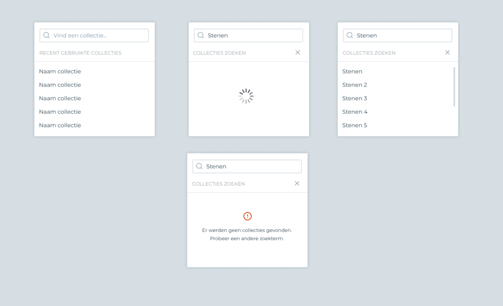
But a lot of times the interfaces that we make are a bit more complex than what you can do with standard HTML. Consider this design for a search dropdown.
As a UI designer with front-end skills you are always in between two worlds.
Do you follow the logic of the standards-based implementation or do you do your own thing? For some things like <select> dropdowns it is obvious that there are massive benefits to using the standards-based method.
In slide 24 to 47 of this old presentation about UI design you can view a whole argumentation as to the benefits of not customizing dropdowns. (This is a presentation from 2012 and I am still writing about this – Oops)
Knowing all of the benefits of not customizing dropdowns, I still often customize dropdowns in the interfaces I create. A standard <select> element simply isn’t good enough for some of my use cases.
So we have to provide a custom interface.
Which in turn is a painful choice, because we are basically throwing away the built-in accessibility of the system. We’re basically saying: sorry, it is more important for this group of users to work with this than it is to be accessible.
The knowledgeable person will point me to WAI-ARIA attributes; but because I don’t use a screenreader in daily life, it is quite hard for me to test a custom control for accessibility.
In my own presentation from 2012 I argued that engineers from Apple, Google and the likes have worked hard on providing interfaces. Fast forward 7 years later and there is little evolution in custom form controls. Just last week I discovered Safari still does not support <input type="date> on the desktop. The current situation is quite painful to say the least.
I’m pretty tired of some small-time bullshit that I see on Twitter sometimes. Some people really take their self-promotion too far.
Today I was reminded of someone, who, whenever I met him in real life thought he was a cool guy. I respect most of his writing and opinions. In fact I probably learned a thing or two from reading his blog.
But man… all the online communication I ever see of this person is about promoting his company, his new video web series, whatever.
I am a business owner myself. I understand the need to do sales. Sure, I drop my company name when someone asks for design help on LinkedIn.
But I can’t help but think… too much is too much. If the only thing I hear from you on social media is incessant self-promotion, I can’t find the mute button fast enough.
There are two main schools of thought in CSS frameworks.
There is the old guard (Foundation/Bootstrap) that is good for entry level work/learning but creates problems on bigger projects due to style leakage and not enough strictness in namespacing.
Then there is a new logic with lots of utility classes (which might get recompiled to a file that only uses these classes). Frameworks like TailwindCSS. The logic behind this might be sensible but it is too complicated, especially when considering reusing the utility class logic across multiple projects (answer: it doesn’t work).
Next to this there is a clear movement to “componentisation” in CSS. The CSS workflow used around MVVM frameworks (such as Angular) and React/Vue often have their ways to prevent style leakage. There are various projects like styled-components that make sure that styles don’t leak outside of components.
However these projects assume a full-on Javascript-based development environment and are too heavy handed in general. They re-implements parts of CSS and forego the strengths of native CSS.
It’s very painful to see a re-implementation of CSS in JS that only supports parts of CSS.
I have always liked a “pick and choose” approach for components. In Bootstrap for example you can take parts out of it that you don’t use (Jumbotron, Badges etc.) and the framework will still function.
However, Bootstrap suffers from overly complex code. Some parts of Bootstrap feel like somebody wanted to use every language feature of Sass just because they could.
In the end if you are trying to debug something you will end up reading the source that generated the code. If the source code is too complex that is no good.
One can wonder: why use a framework at all? There are of course several reasons. In bigger projects you never have enough time to to the deep work that is necessary to provide a quality user interface, especially when it comes to the more difficult components like datepickers or modals.
A framework that is already focussed on performance and accessibility and used in the right manner will help a project tremendously.
In my opinion, there is space in the “CSS framework market” for a great BEM/ITCSS framework that is well documented, namespaced and tested. Something that has good documentation and well-tested components. What do you think?
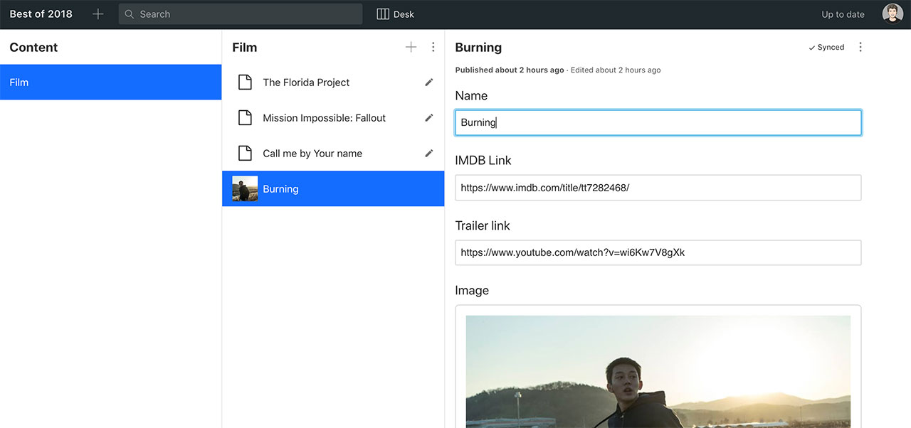
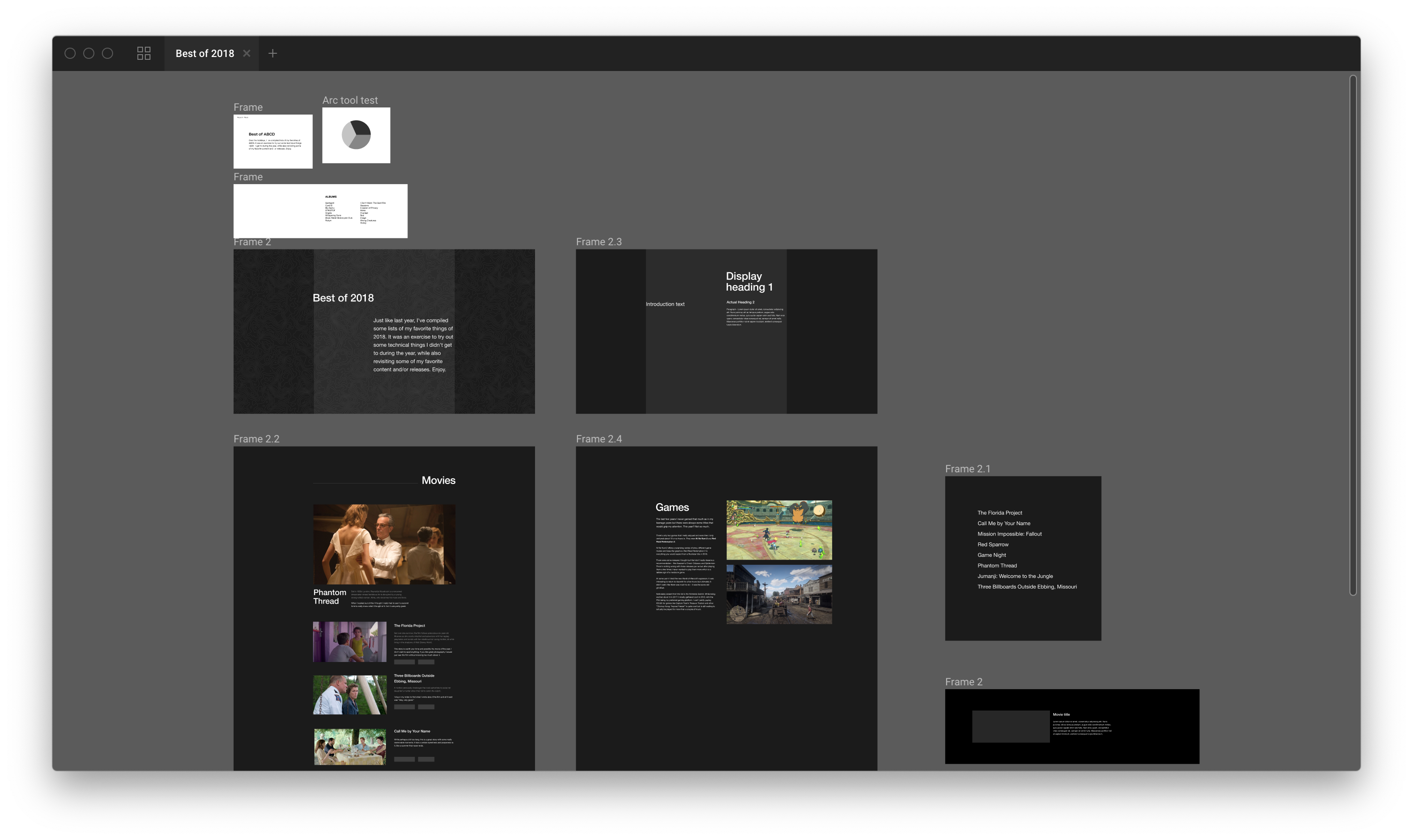
This is the making of blogpost in which I discuss which technical explorations I went through to get to the end result.
Making these kinds of websites is not a new thing for me. I made one in 2008, 2009 and 2012 as well – but these are offline by now. I like to use these projects to experiment with some new things in the (usually) quiet period of the Christmas holidays.
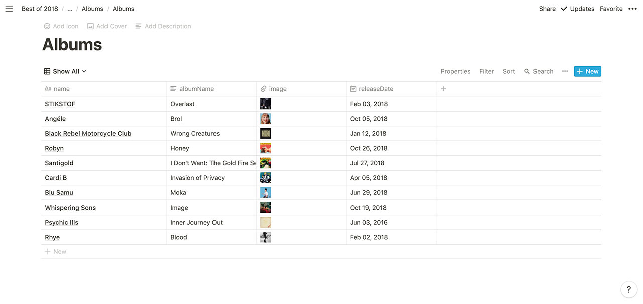
Content data sources
When I create HTML prototypes for work I’ve gotten into the habit of creating JSON data structures whenever there is repeating content.
This is pretty much a given when using the JAMstack.
In last year’s “Best of” I chose to pull data from an external source: Airtable. While it was cool I eventually realized this was pointless since now the data is hosted on Airtable and now I had Airtable as a dependency.
Using Airtable as a source also generated overly complex Javascript objects (example). This was good practice to learn how to manipulate them (practice I used during the year when experimenting with the Figma API) but ultimately not a great solution.
This year I tried some alternatives. One of them was was to use a headless CMS. I tried to use sanity.io to create data structures, with the underlying idea being to combine structured content with schemas that can be validated.
While this tech solution is really interesting I gave up it was just too much work to get into something totally new for a one-off thing.
I ended up writing the JSON structure by hand. This is better for the use case since there’s so few records in this “database”.
This is much cleaner than the crazy JSON files that came out of Airtable.
However, manually editing JSON files is not a “client proof” solution, so something tells me I need to explore the headless CMS direction a bit more in 2019.
The way to render the data looks like this:
<ul class="c-cards">
  {%- for item in albums -%}
      <li class="c-card">
          <div class="c-card-image">
              <img src="/images/albums/{{ item.fileName }}">
          </div>
          <div class="c-card-body">
              <h2 class="c-card-heading">{{ item.artistName }} - {{ item.albumName }}</h2>
              <p class="c-card-meta">{{ item.releaseDate }}</p>
              {%- for category in item.categories -%}<span class="c-card-category">{{ category }}</span>{%- endfor -%}
        </div>
      </li>
  {%- endfor -%}
</ul>
The templating language used in the above example is Nunjucks.
Content first
One of the conclusions of the 2017 edition was that I should worry about the content first instead of the tech. So for the 2018 I prepared all of the content in Notion and wrote most of it before even touching any technicalities.
Notion as an application has been one of the revelations for me in 2018. It’s a knowledge base – a note taking app – but also so much more. I used Notion to manage the todo’s for this project; to work on the actual content; and to write this very blog post.
In the process I learned how to add columns to pages in Notion, and a few shortcuts.
When I felt like I got far enough content-wise, I exported the content to markdown using Notion’s export function to start work on the actual website.
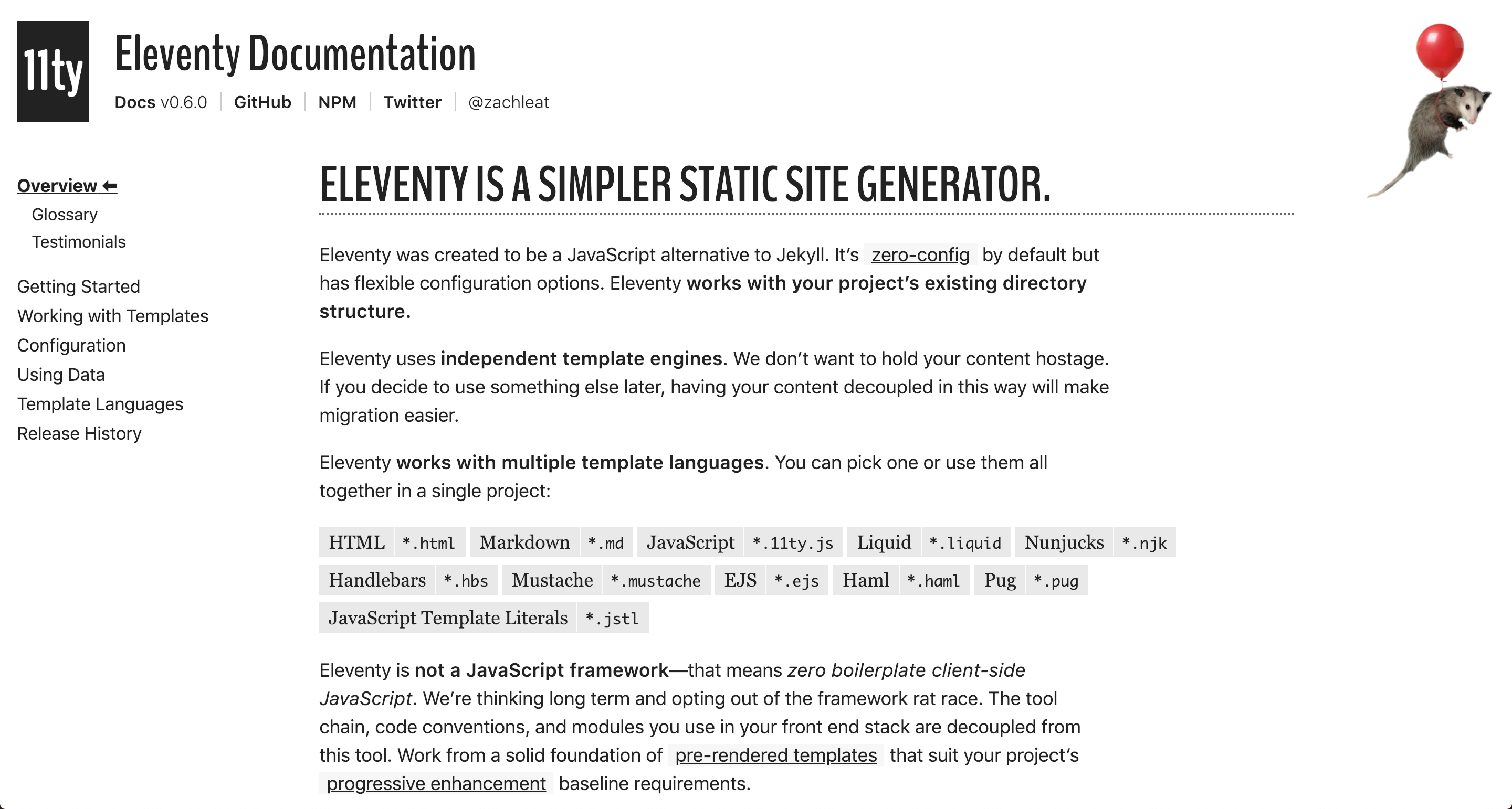
11ty (eleventy) instead of Bedrock
For the 2017 edition I worked with our static site generator Bedrock to create the templates for the Best of website.
While I obviously like working with Bedrock, the object of this project is to learn something new, so I wanted to give the new static site generator 11ty a try (thx Jérôme for the tip!).
11ty is pretty unique as far as static site generators go, since it tries to get out of your way by putting less restrictions on how you want to structure your content and in which format you write it than other static site generators.
This has its good and bad parts. In a way it is very flexible. In another way it’s also very ambiguous about what is possible and what isn’t.
Theoretically, if you want to create parts of your content in markdown, parts in Pug and parts in Nunjucks you could if you wanted to. I really liked working with 11ty but in the end it wasn’t as flexible as I wanted it to be. Perhaps it might be in the future, since the project is at version 0.6 – not a 1.0 yet.
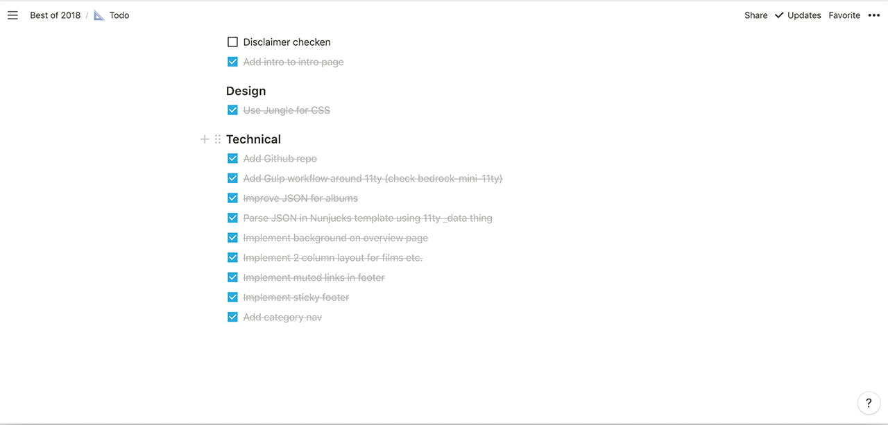
In the process of creating the Best of 2018 website I created a Gulp 4 based workflow around 11ty which I might share publicly in the future. It’s not perfect yet but it works. I discovered once again you can lose a lot of time trying to optimize workflows. First you think setting up Gulp is simple and hours later you’re still debugging the perfect sync between incrementally generating files and injecting CSS/JS changes live.
Design and CSS
Design-wise I had started on a concept design in October. I didn’t get very far because I decided I would keep a similar design as last year’s Best of.
Having decided that it seemed pointless to design things in a design app.
When I started coding I did change the technical underpinnings.
I used Mono’s internal BEM/ITCSS framework (called Jungle) which has matured over the past year. This meant I had to write very little custom code.
Because of the technical underpinnings I literally spent 1 hour on making the whole thing responsive.
Conclusion
In a lot of ways the end result is exactly what I made last year, but the technical underpinnings have changed.
In the process I took the time to look for tools and techniques that can remain staples of my workflow for years to come. Just like last year there’s going to be techniques that I will use immediately on my first day of work in 2019, and there will be things that I’ll probably never touch again.
All tech nerdery aside, I hope you enjoy the content itself. They’re my favorite things I watched and listened to this year. I wish everyone a splendid New Year’s Eve and see you all in 2019.